LinkedIn Concept
Concept of a new layout by Diegobutik
Concept of a new layout by Diegobutik
It may sound kinda wierd, but I'm quite new to LinkedIn. When I first logged in, I was totally confused by it's harsh and defenitly NOT user-friendly interface. And since I had some spare time last week, I've made some changes to the layout that were storming in my head ever since I've started to use LinkedIn.
First of all I've noticed, that most of the links at your LinkedIn home page lead you either to account upgrade, or adding new contacts to LinkedIn. I don't think thats a good solution to keep the traffic going because:
1. you usually ignore links that are clearly an ad to pay more for sth you're already using for free.
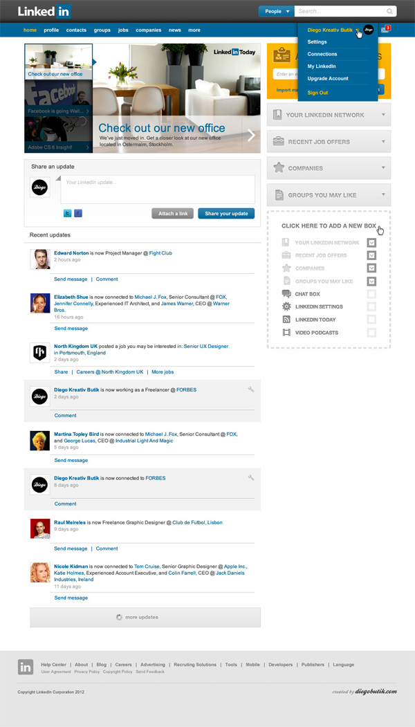
Therefore, I've focused on the things that in my opinion really matter to LinkedIn users: that is LinkedIn news, updates posted by people and companies user already knows (they usually consist of lots of useful information, job offers etc.) in the left collumn. At the right side, you have your own space. User can decide which boxes he want's to see and in what order. It lets people to personalize their interface, and that's a big plus, because different people focus on different things. Floating boxes give them freedom to organize LinkedIn space as they please.
At the top of the right collumn you can see a CTA box for adding new contatcs, and that's all what's left of all the update and contact links from the oryginal layout.
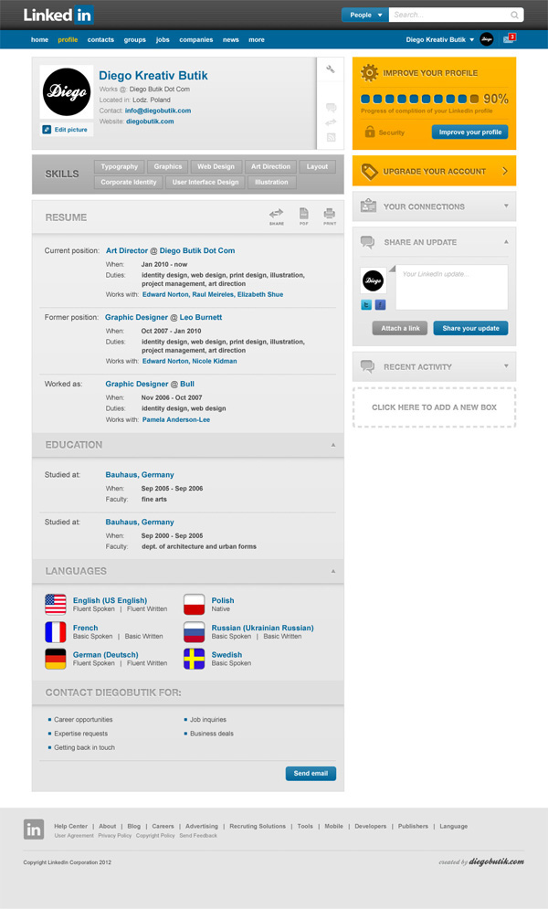
Profile site, on the other hand was very confusing because of lots of unsorted information and messed up priorities of things. What should be outlined the most is a main user profile (name, what he/she does, contact info) and what kind of skills he has, then full resume, which, again, you can build from categories of your choice. That gives you a clear layout, where you can fold unnecessary info, leaving only the stuff you're interested in.
First of all I've noticed, that most of the links at your LinkedIn home page lead you either to account upgrade, or adding new contacts to LinkedIn. I don't think thats a good solution to keep the traffic going because:
1. you usually ignore links that are clearly an ad to pay more for sth you're already using for free.
2. LinkedIn is not a Facebook, you're not here to make friends but to find employees / employers or co-workers that you usually already know or want to check out before making a direct business contact. Inviting other people to join LinkedIn just to be there doesn't make much sense to me.
Therefore, I've focused on the things that in my opinion really matter to LinkedIn users: that is LinkedIn news, updates posted by people and companies user already knows (they usually consist of lots of useful information, job offers etc.) in the left collumn. At the right side, you have your own space. User can decide which boxes he want's to see and in what order. It lets people to personalize their interface, and that's a big plus, because different people focus on different things. Floating boxes give them freedom to organize LinkedIn space as they please.
At the top of the right collumn you can see a CTA box for adding new contatcs, and that's all what's left of all the update and contact links from the oryginal layout.
Profile site, on the other hand was very confusing because of lots of unsorted information and messed up priorities of things. What should be outlined the most is a main user profile (name, what he/she does, contact info) and what kind of skills he has, then full resume, which, again, you can build from categories of your choice. That gives you a clear layout, where you can fold unnecessary info, leaving only the stuff you're interested in.