SMITHSONIAN FIELD GUIDES
Print Layout & Pattern Design
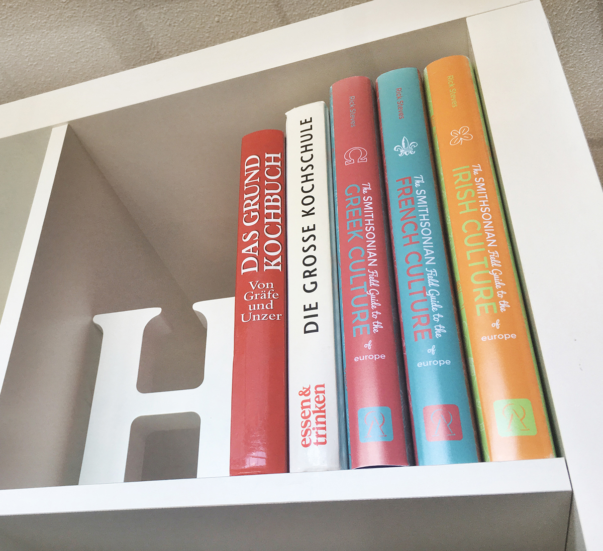
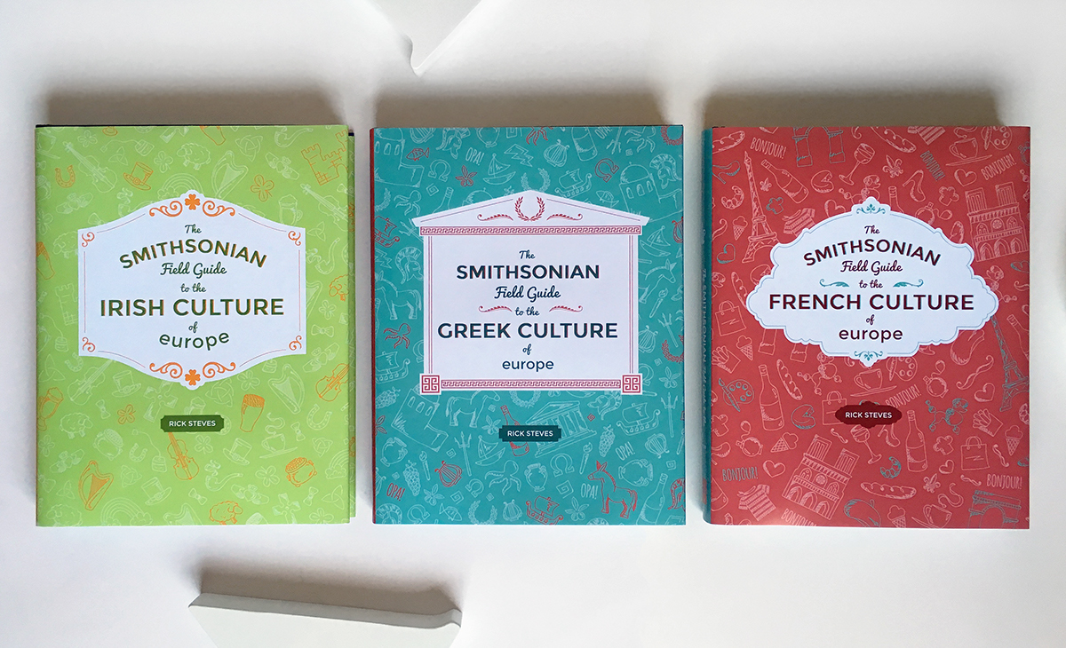
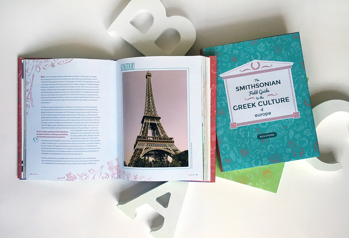
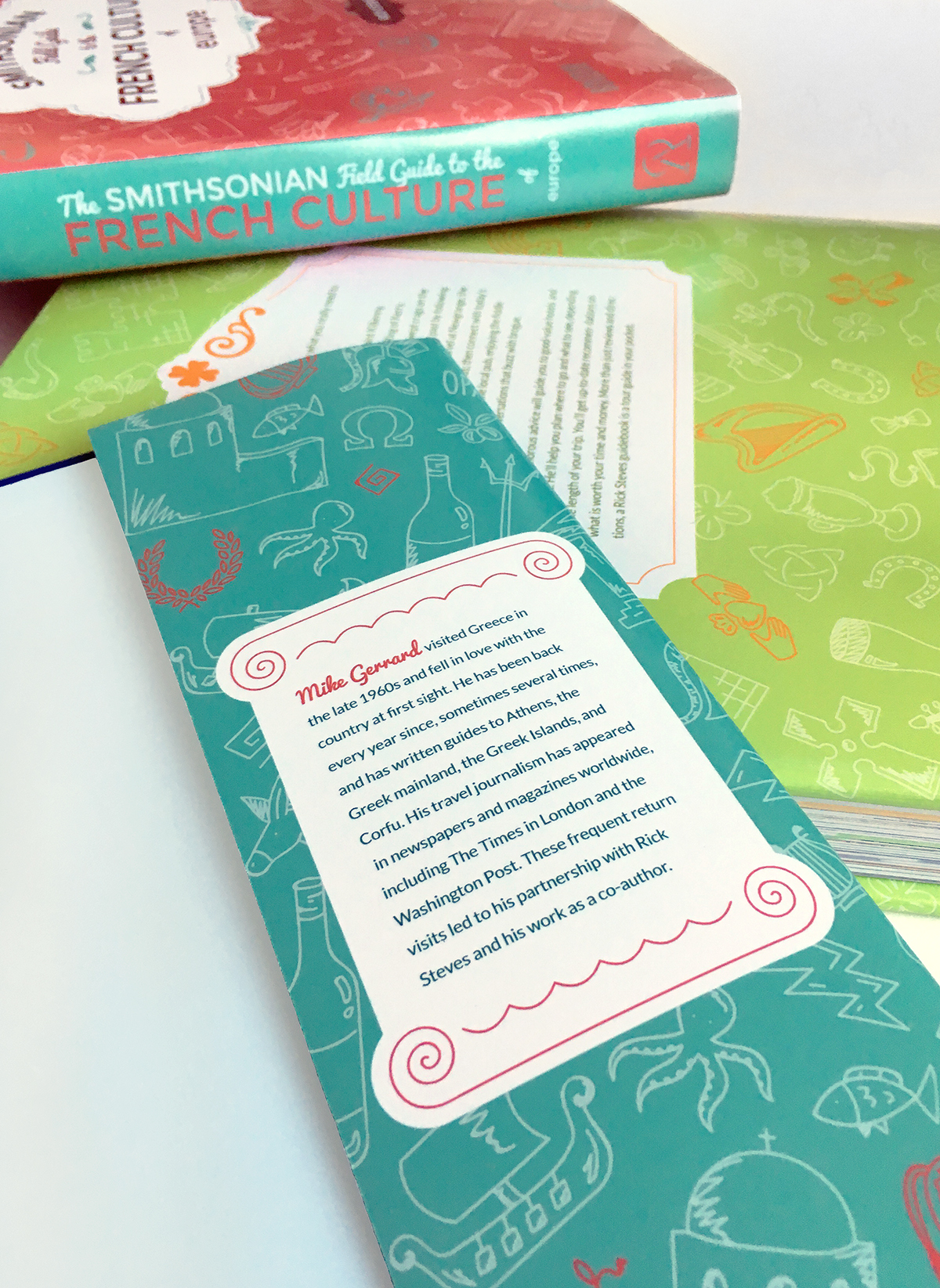
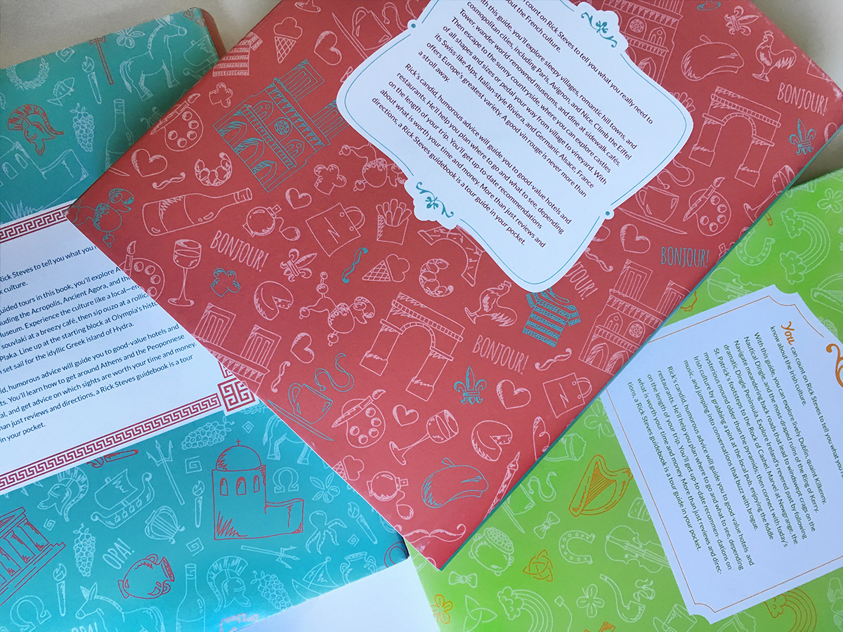
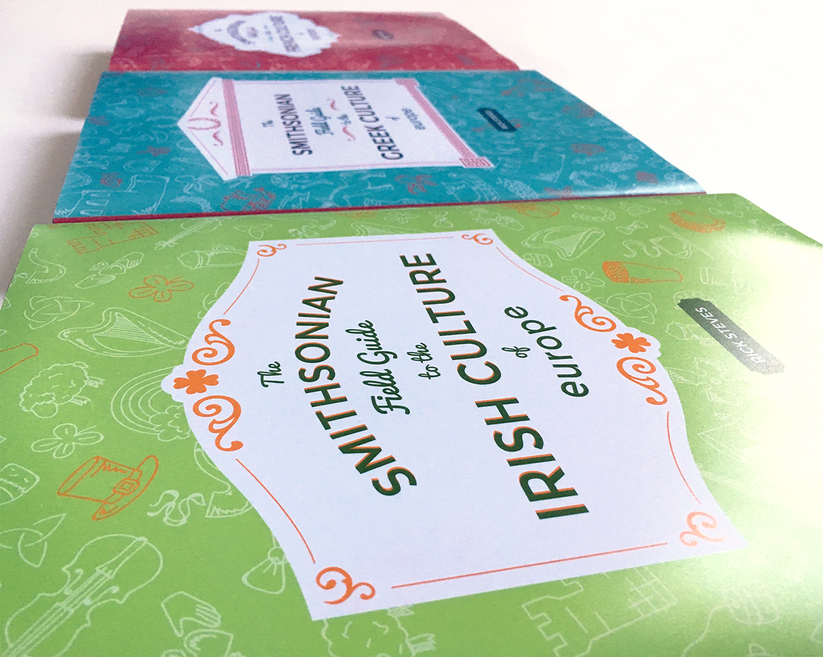
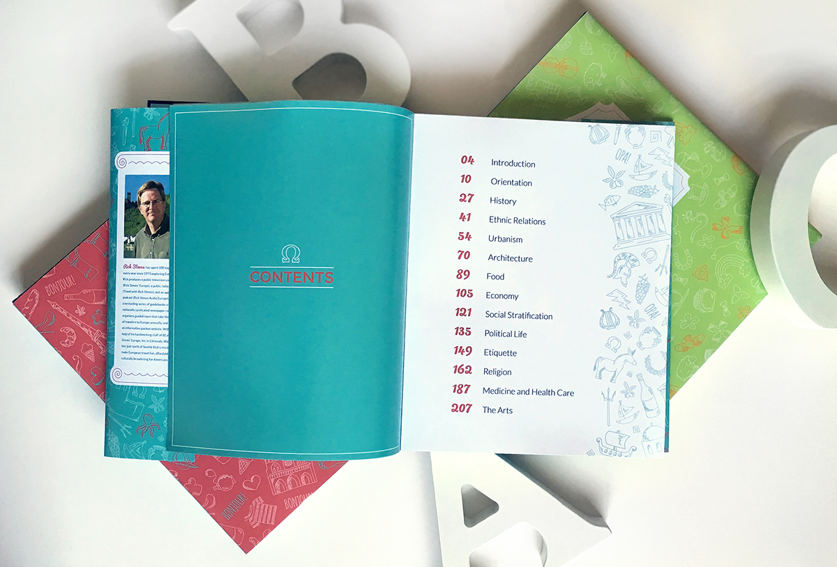
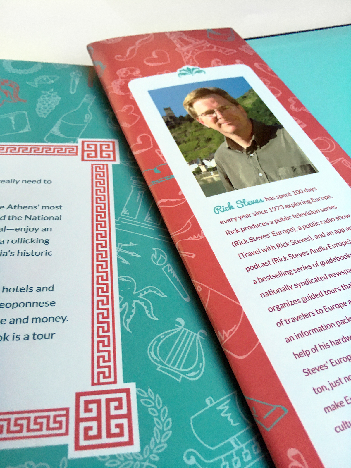
The objective was to create three Smithsonian Field Guide based book covers and the layout of how the pages would look like when opening the books. I chose the Greek, Irish, and French culture for the design direction. Understanding that travel based books are one of the most bought books, they would definitely have a better chance catching the consumers eye and make them want to pick it up and hopefully buy it either for themselves or for their children.
Most travel books are bright yellow, stuffed with so much information that is poorly organized, which is hard for the reader to know where to start. For this reason, I designed a modern yet friendly style for the book covers with hand illustrated icons that represent each country. The modern influence comes in when I used Montserrat for part of the title and Lato for body copy. The friendly representation comes in by using Pacifico script font for part of the title as well, mimicking the hand illustrated icons with a whimsical approach. The color scheme grass green, vibrant orange, turquoise, and rose pink expresses each country. Ireland’s flag has both green and orange, which is appropriate for the book cover as well as how extremely green the country is. France is known to be the romantic city, which the rose pink comes into play very well and Greece is known for white buildings with vibrant blue roof tops and is surrounded by rich, blue beach water.