2016 CALENDAR
Print Layout
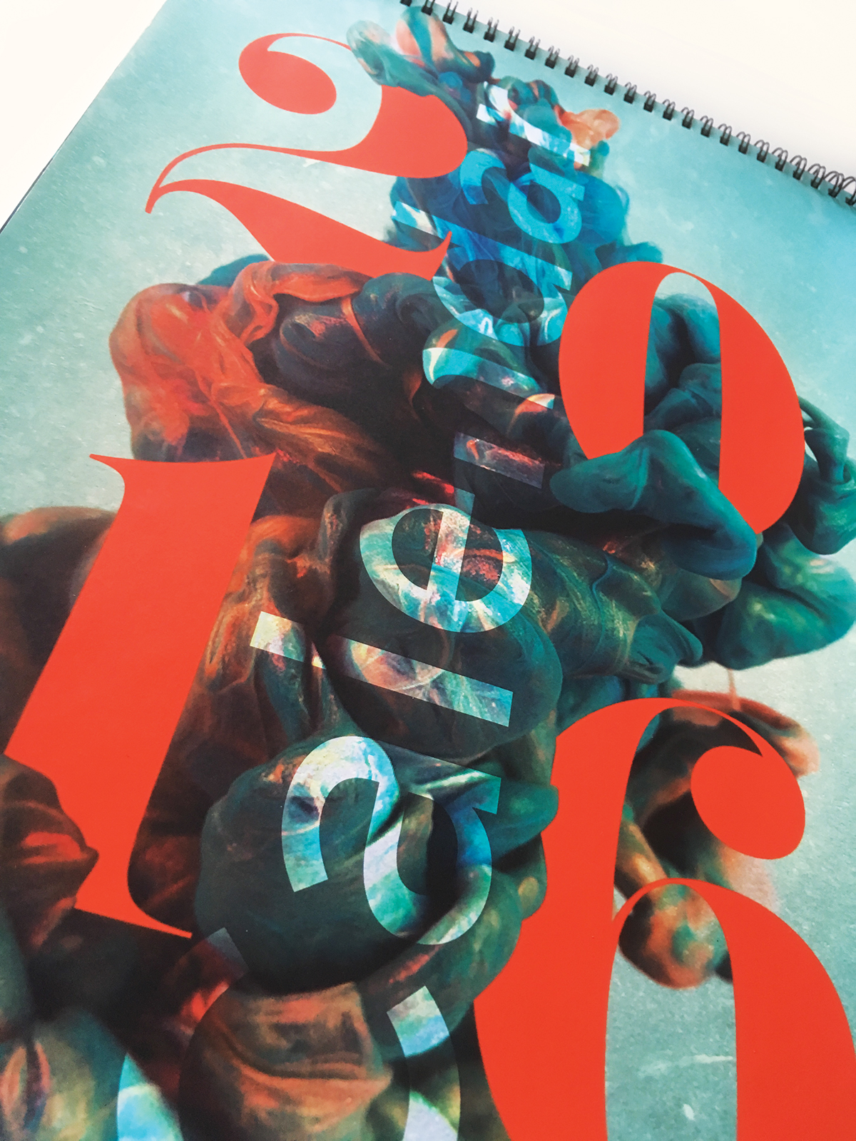
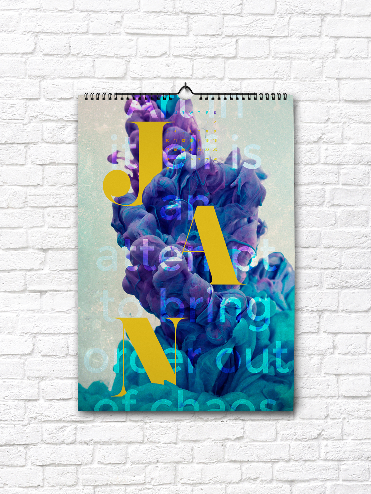
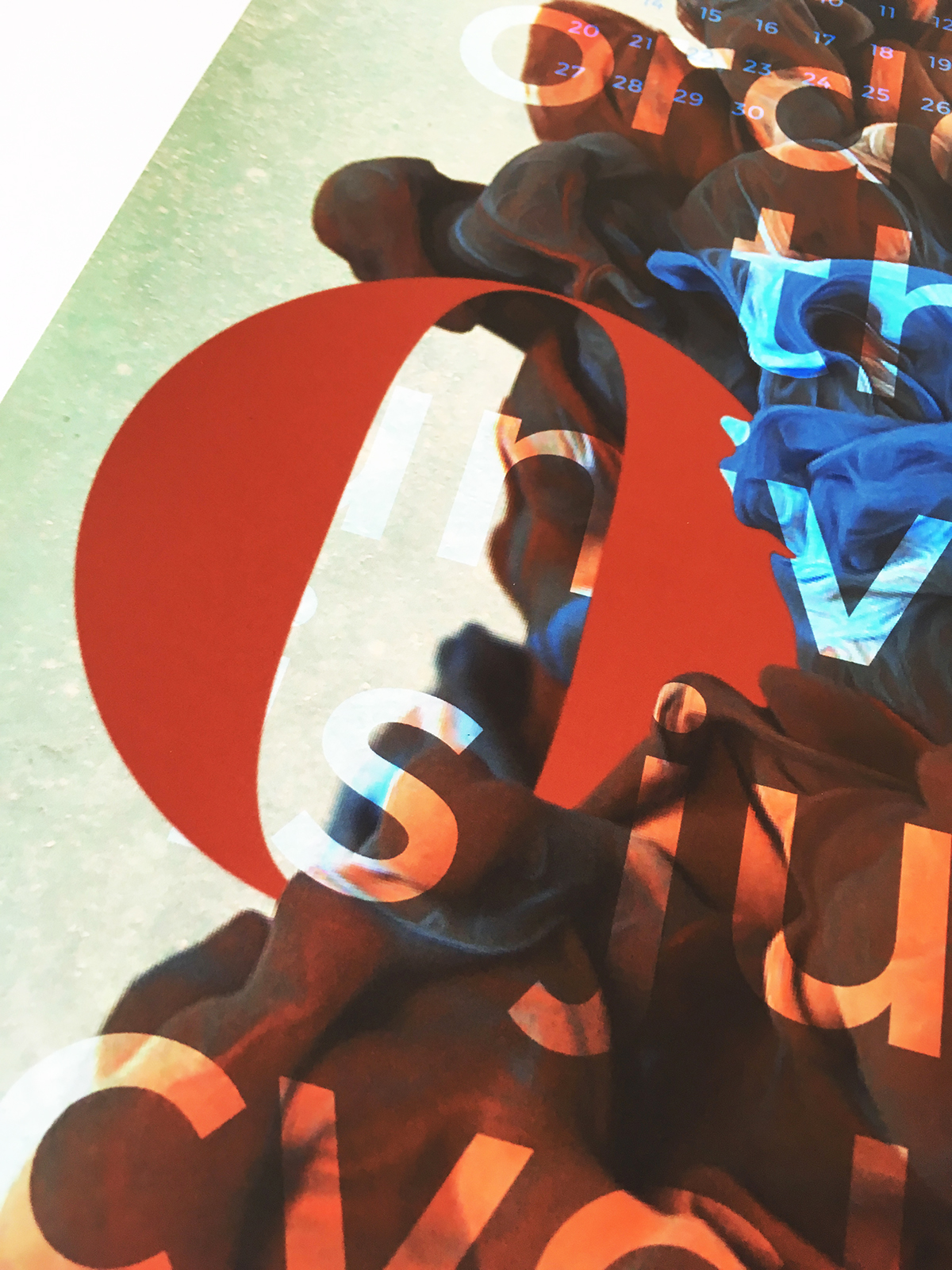
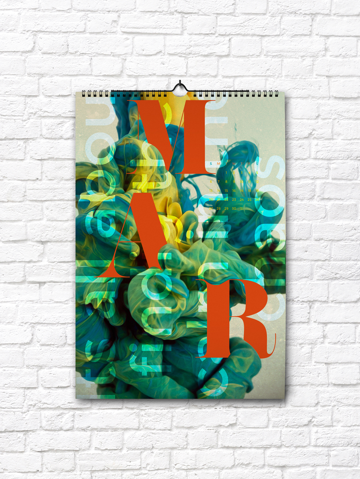
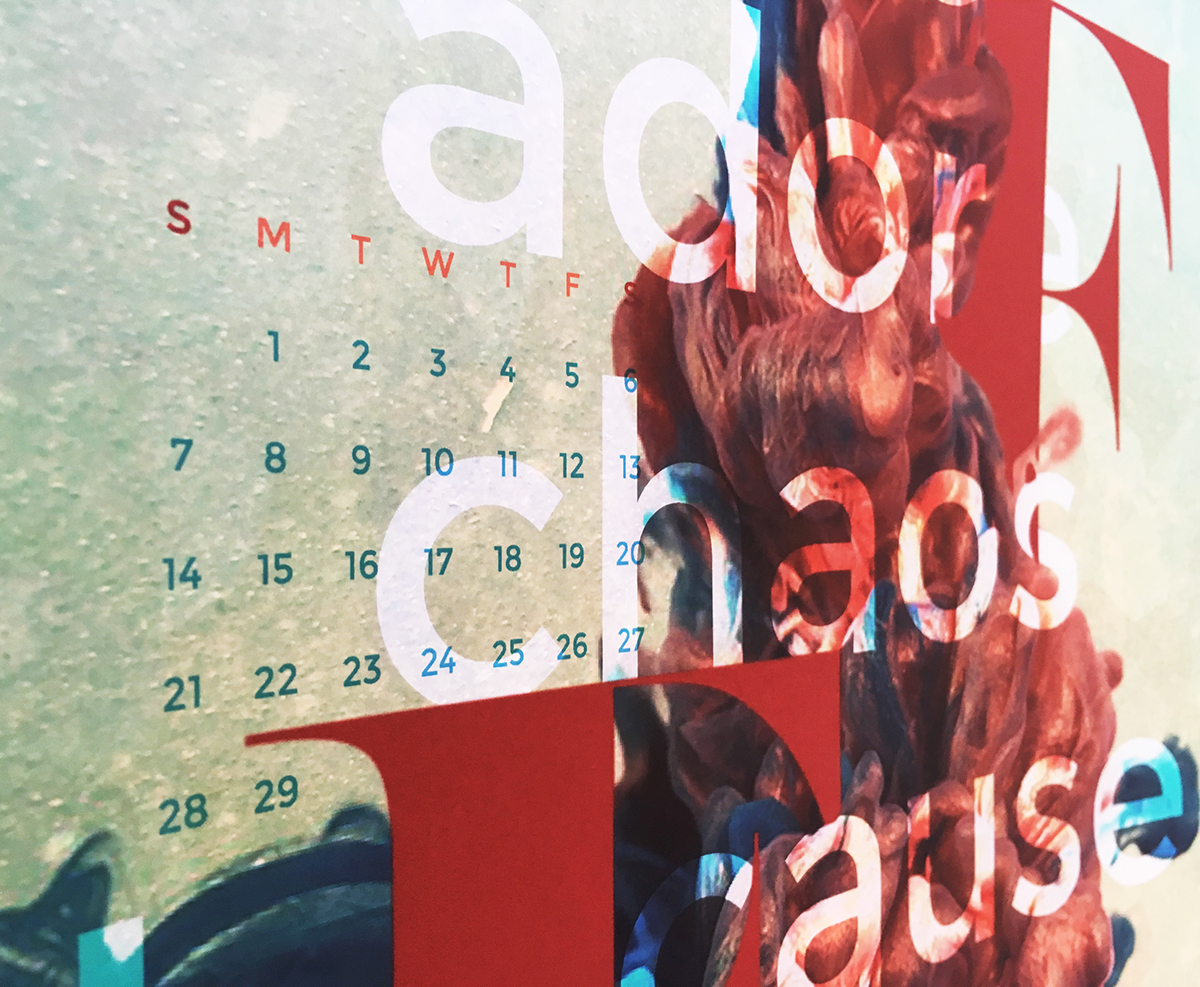
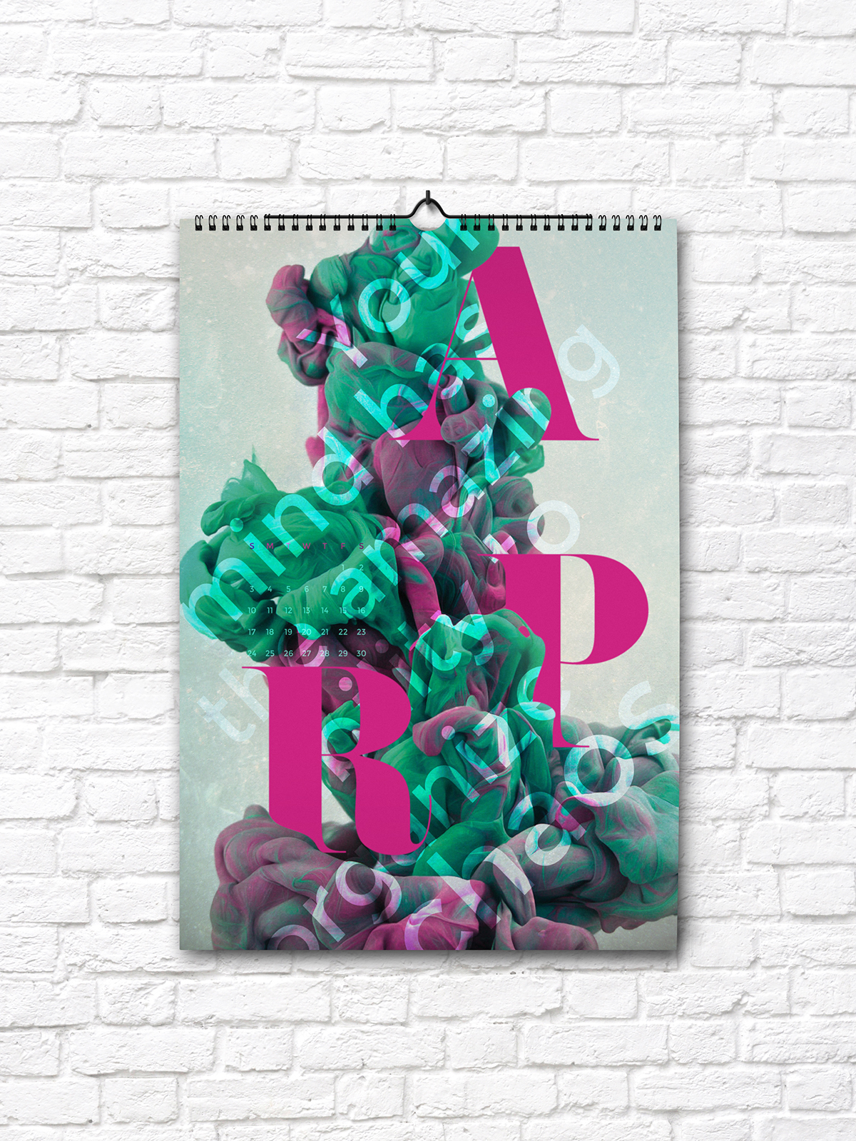
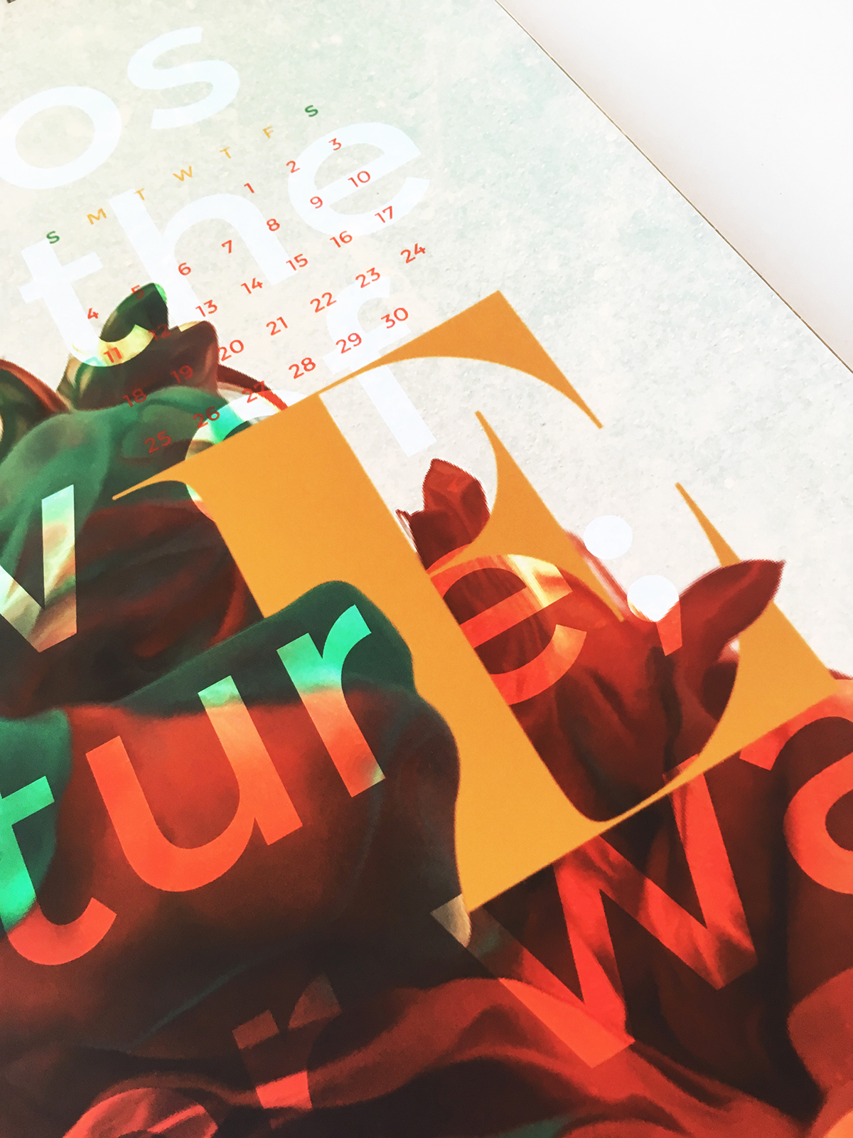
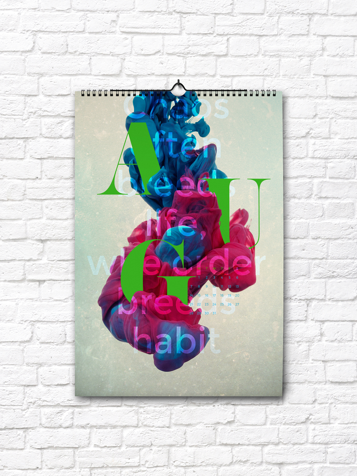
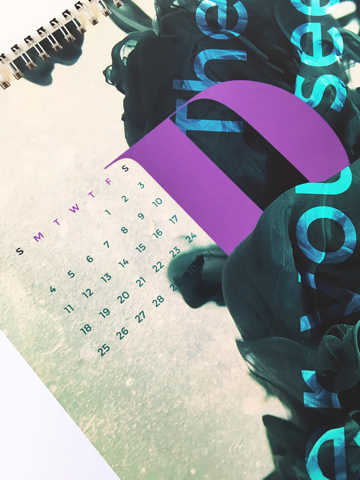
The 2016 Calendar is based on the idea of order within chaos, which is a common phrase and one many individuals can implement in their daily lives. I utilized Alberto Saveso’s photography and manipulated typography within his striking ink photos. The Calendar is not meant to be extremely functional, instead it is more for an aesthetic appeal with compelling imagery. It has an experimental approach with a fun splash of color that brings the room together.
The photographer I chose likes to experiment with his work and that is the same direction I chose to go in with these designs. This is also when I decided to base the concept off of order within chaos. His photography represented chaos, while my design represents order. The color palette was depicted from his photography and I worked with complimentary colors. I also directed which photo represented a certain month by the colors in the photo, as each photo had prominent color scheme. I added order within chaos quotes for each month for individuals to read. The typeface I used for the name of the month was Pistilli, an elegant, thick stroke matched with a very thin stroke serif. For the quotes and numbers of the months, I used Montserrat to maintain legibility and maintain a modern aspect. It also works well with Alberto's modern approach to photography.