


Free Newspaper specimen with first 50 family orders
Since the first draft of Morion typeface in 2014, the aesthetic vision of Morion has remained true, but has undergone constant refinement and critique. We are pleased to publicly release the final typeface 3 years later in 2017.
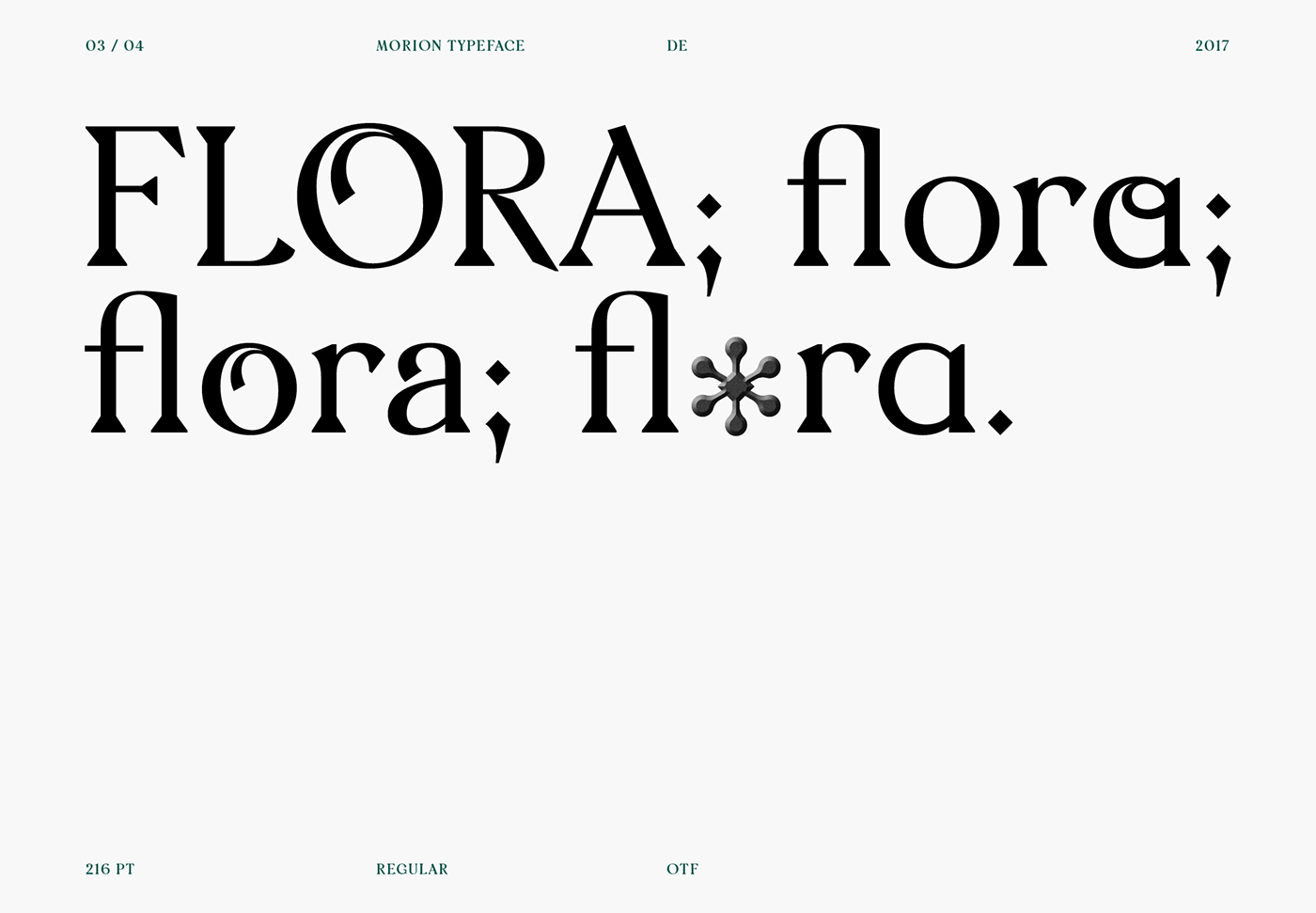
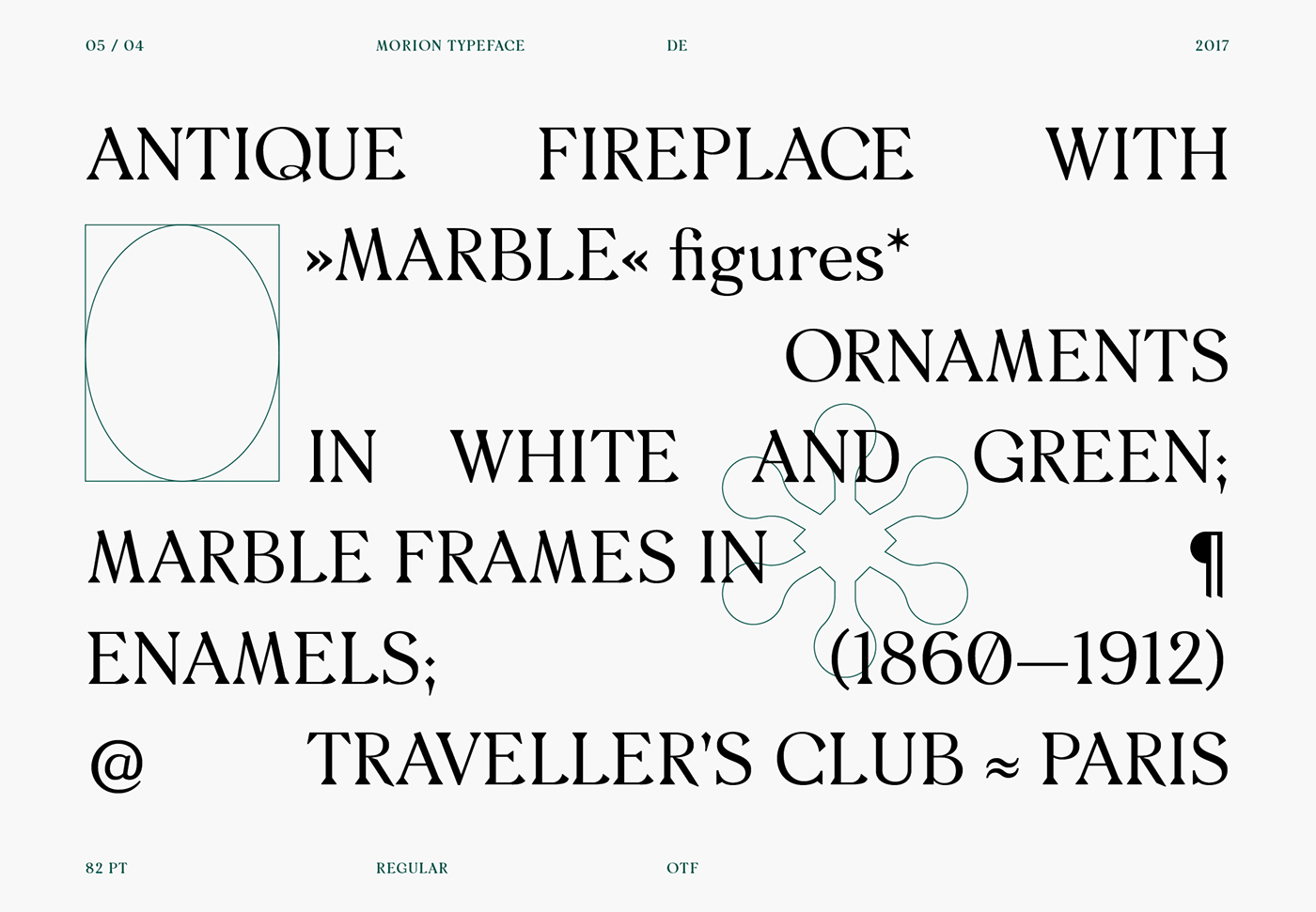
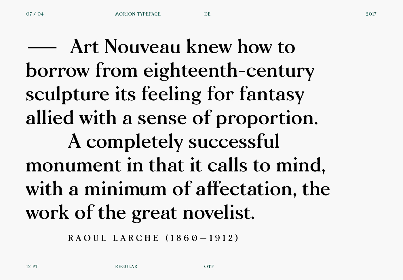
From combining two diverse stylistic elements in type-design, wedge-shaped serifs and floral terminals Morion has a slightly playful, calligraphic look that remains balanced and controlled. While Morion may function best in decorative, larger applications; OpenType features like an alternative lower case ‘a’ increase legibility in smaller text sizes. Morion is delivered in two weights and supports Latin-A Extended and was designed by David Einwaller for The Designers Foundry.
We also produced 50 rain coats to promote the release. The rear print ‘GLOBAL’ references the international nature of The Designers Foundry and the team that worked on Morion. There is also a small text print on the left sleeve.


