Branding / Corporate Identity Package
BIOFU Energy Solutions, Inc.
Portfolio Work
BIOFU Energy Solutions, Inc.
Portfolio Work
OVERVIEW
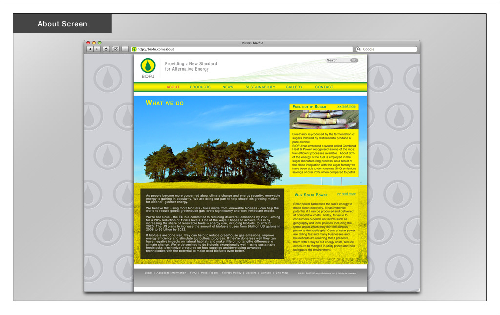
BIOFU Energy Solutions, Inc. is a fictitious corporation whose purpose it is to demonstrate the creation of a corporate identity system. The alternative energy corporation focuses on clean energy production and consumption in an age of constant war of natural resources such as oil. It is a newly founded organization that has strong ties to all of its nationwide suppliers and practices a fair agreement with social responsibility. Besides its products wind- and solar- energy the main selling feature is their domestic fuel production out of corn as well as sugar cane.
TARGET AUDIENCE
• Environmental conscious people of all ethnicities and both sexes
• Family oriented and eager to create a bright future for next generations
• Canada’s middle class including students
CHALLENGE
To create an image and emotion for this company that highlights environmental sustainable practices and products in a high-tech industry to draw users away from conventional oil based energy consumption towards a lifestyle that is environmental friendly, sustainable, and affordable.
SOLUTION
To position BIOFU as a technology based organization that incorporates sustainable practices and socially responsibility in all their business practices and communicate that this energy company cares about the environment and all living beings in it.
The colours and elements used in the composition need to convey this positive emotion and must speak volumes about the company, its philosophy, and vision. A balance between nature, environment, and technology has to be established while considering all other principles and elements of design.
RESULT
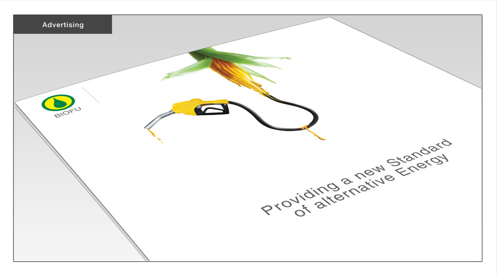
The logo mark incorporates a cross cut sugar cane with the fuel-turned juice inside, reminding of the main selling feature of BIOFU Energy Solutions, Inc., fuel made out of sugar cane.
The colour palette features a combination of bright yellow and green, colours that encourage communication and offer a sense of renewal and harmony. Especially green is considered the colour of peace and ecology.
As BIOFU is nonetheless a technology corporation, minimalistic style and arrangement combined with the Helvetica font-face adds this high-tech, corporate feeling.


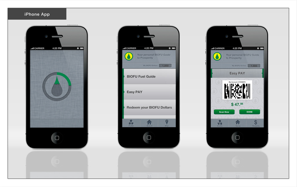
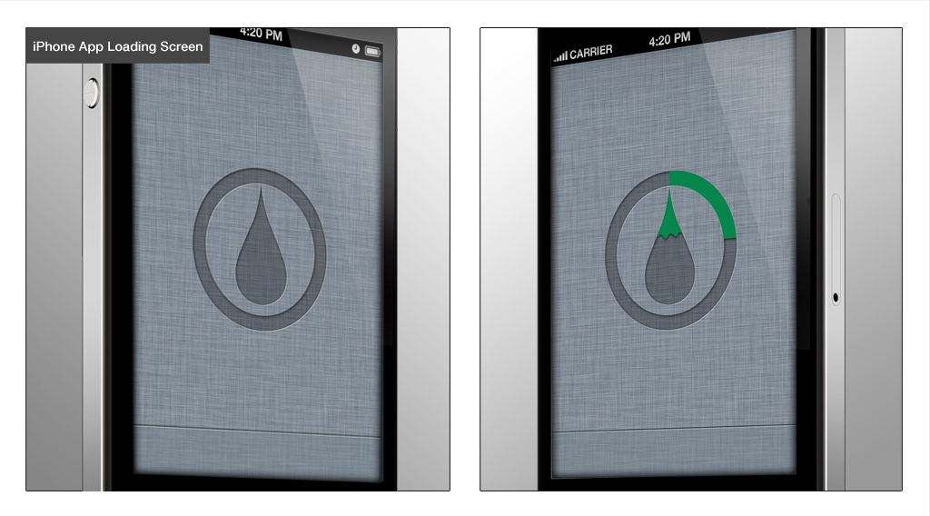
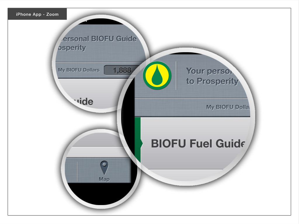
iPHONE APP
The BIOFU Smart Phone Application not only allows users to make environmental sustainable decisions but also rewards them whenever they do by giving out BIOFU Dollars. These BIOFU Dollars can then be redeemed for actual fuel, food, and public transportation.
The BIOFU Fuel Guide navigates the user via GPS to the closest or cheapest gas station that offers biofuel. It also offers a great guide to public transit in three major Canadian cities, Vancouver, Toronto, and Montreal.
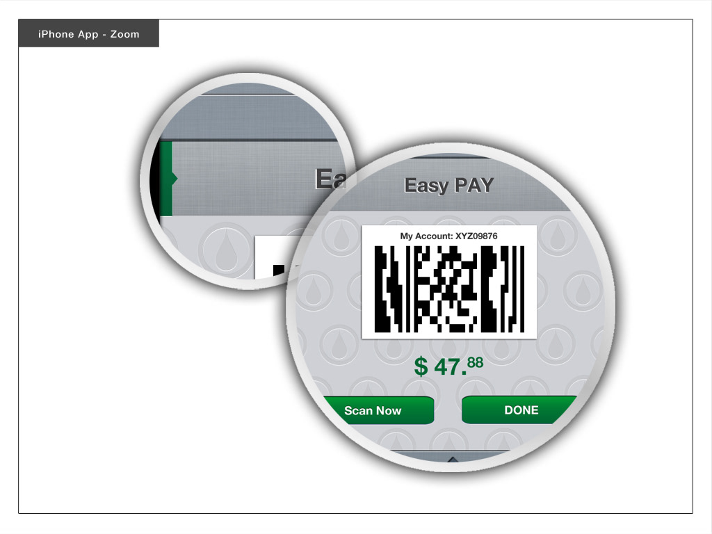
Another great feature of this iPhone app is that it enables the user to pay cashless at any gas station that offers biofuel by simply using the integrated payment system. Whenever a purchase via the application is made, 1 point for every dollar spent is transferred to the user's BIOFU Dollar account. Once 1,000 points are reached, the user can either redeem it at these selected shops and transit locations or leave it in his account.
The BIOFU Fuel Guide navigates the user via GPS to the closest or cheapest gas station that offers biofuel. It also offers a great guide to public transit in three major Canadian cities, Vancouver, Toronto, and Montreal.
Another great feature of this iPhone app is that it enables the user to pay cashless at any gas station that offers biofuel by simply using the integrated payment system. Whenever a purchase via the application is made, 1 point for every dollar spent is transferred to the user's BIOFU Dollar account. Once 1,000 points are reached, the user can either redeem it at these selected shops and transit locations or leave it in his account.