
Overview
The objective was simple: redesign Hasbro's online toy shop experience while being true to its brand, integrating it into the main site, and crafting a stellar user experience.
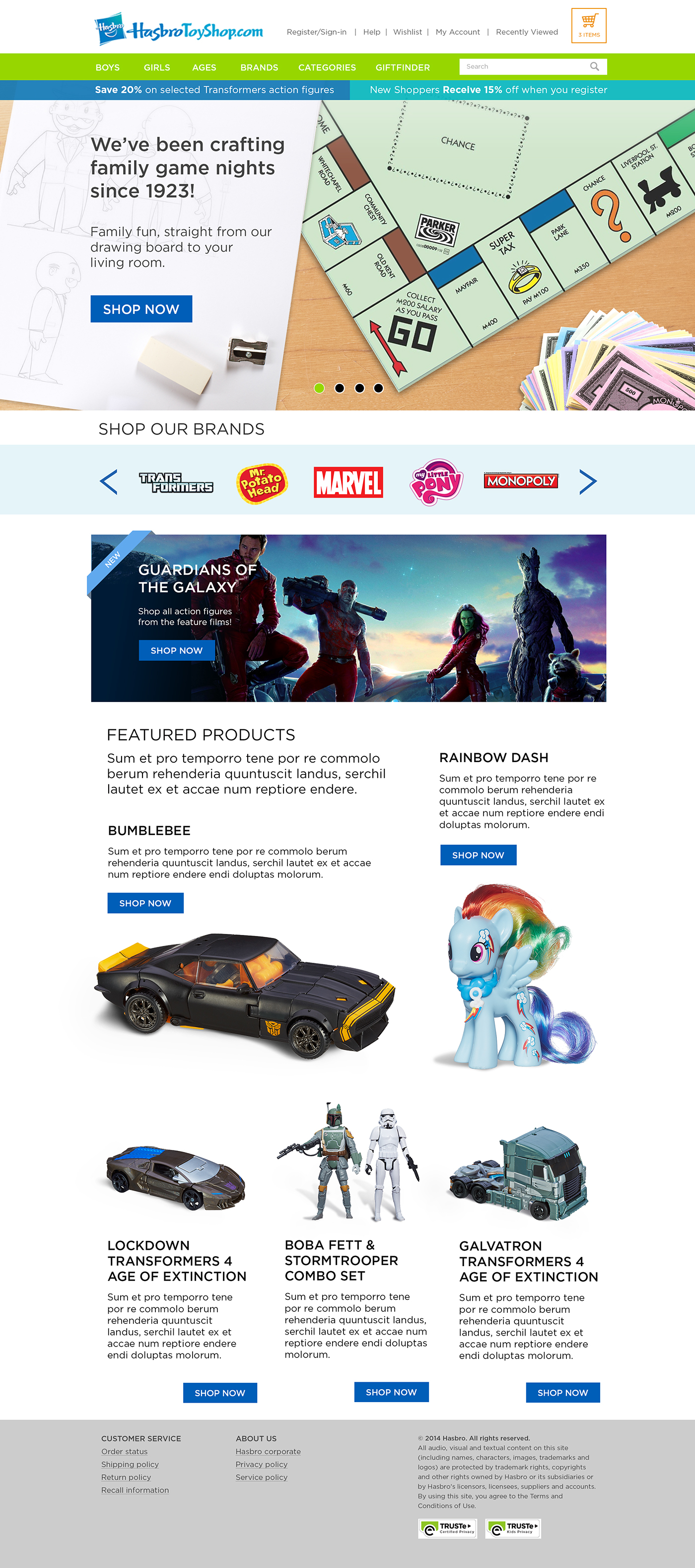
Opportunity
The objective was simple: redesign Hasbro's online toy shop experience while being true to its brand, integrating it into the main site, and crafting a stellar user experience.
Opportunity
We started with research and looked at who was doing e-commerce well. We looked at inspiration from New Balance, Nike, and Hasbro's direct competitors. Nike had a great user experience, especially in sneaker customization. A user could easily get overloaded with a large selection of customization. The New Balances site was beautiful, but their sneaker customization had many options a user would need to know. Nike cut to the chase. Simple, clean, and intuitive. We set out to do that, but that's more complex than we thought.
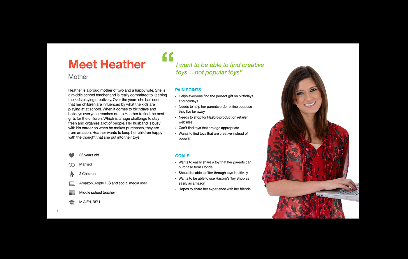
Our research led us to a few different user types The "tier zero" user and the "mother." We had a design thinking workshop with the client to discover their ambitions for the new site and understand how we could help them. We developed some key findings which focused our attention on the mother persona. We interviewed a small user base to discover insights about our users. While the mother is probably the best in knowing what to buy for a child, they are also the ring leader. They have to help grandparents, presents for birthdays, holidays and all sorts of different points of purchase.
We conducted a heuristic evaluation of their original site. The modern refresh was one of many things that needed to happen. There needed to be a better way to filter or discover new toys from new to familiar users.

Solution
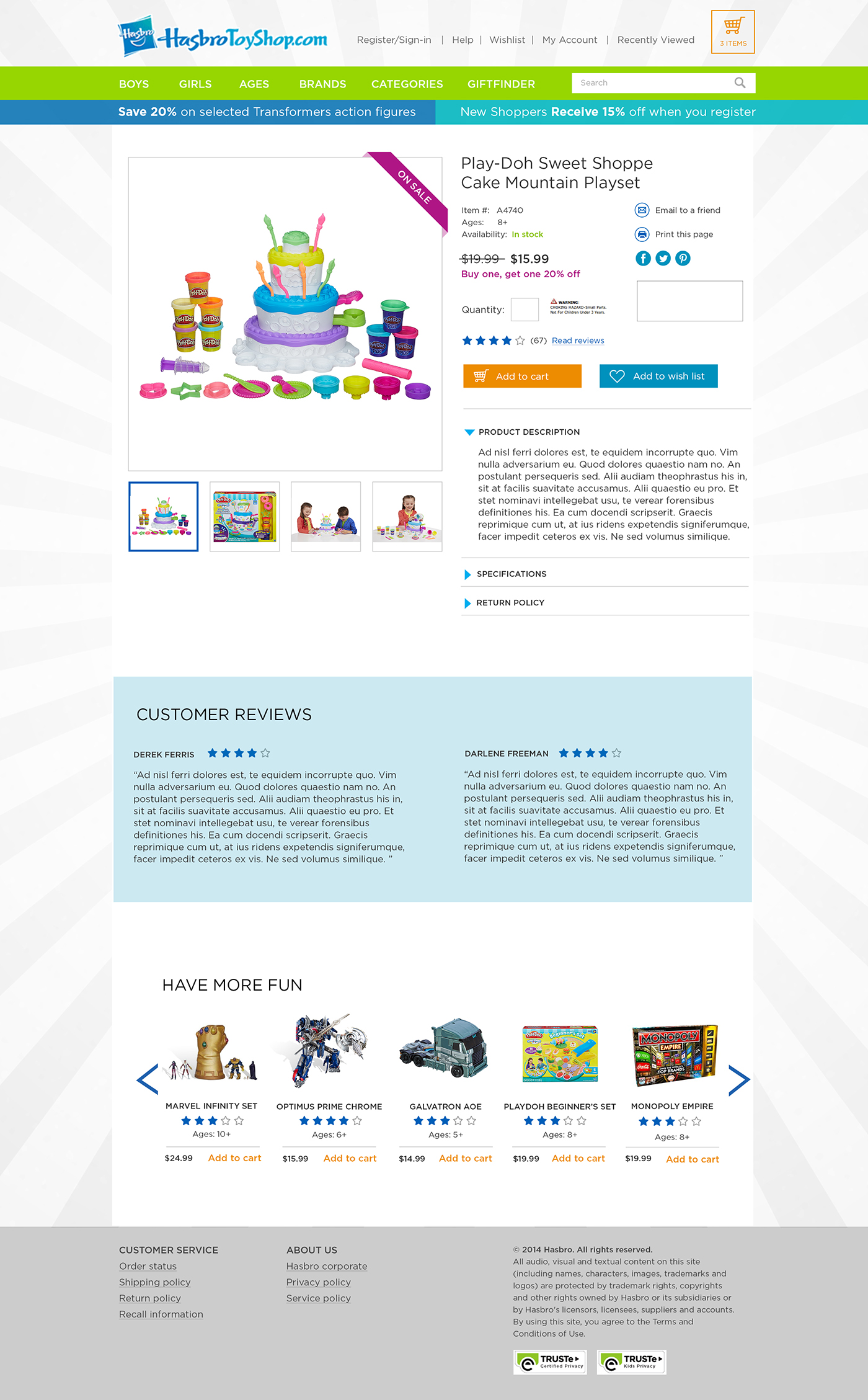
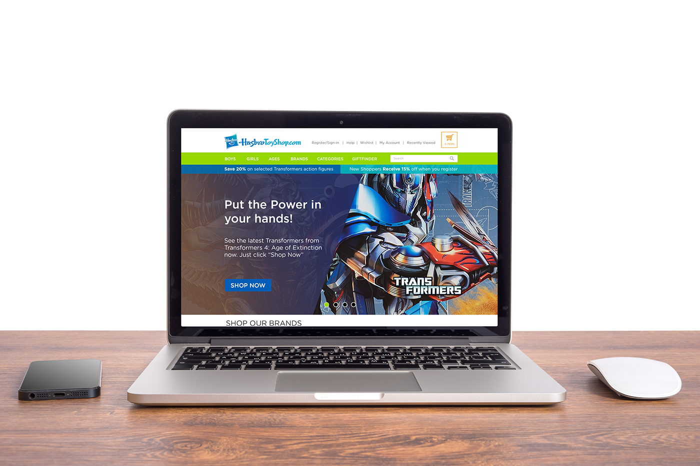
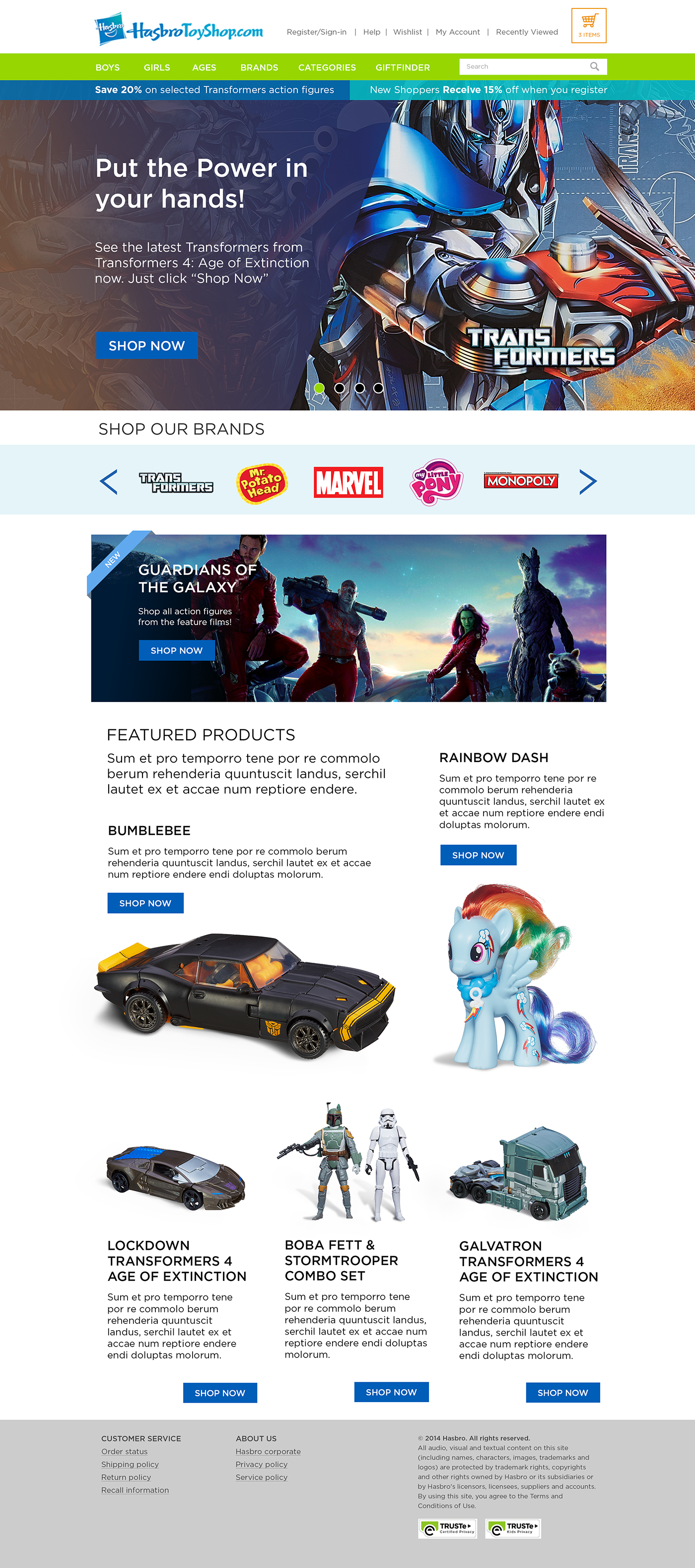
We wanted to ensure the experience was delightful from the landing page through the point of sale. As a team, we focused on what Hasbro had established on their main site, leading you to the toy shop site. The user can quickly sort types of toys by play style or brand.
The product space was given a lot of clean, white space to allow the toys to shine. Users could explore new ways to enhance their children's playtime by filtering "creative toys." They could see what was popular for each age and share it with anyone looking for a gift or purchase it themselves quickly.
My Role
I was the lead designer on the project and was responsible for more than just the look and feel; the design is more than that. I wanted to make the website fresh and modern. Early on, I worked with our information architect to establish the flow of our site. I helped build annotated wireframes while working on design concepts. There were a lot of ideas created with different approaches for each. We selected three different styles to share with the client. Once the client approved the design approach, we started on a design style guide.
We then started building a functional prototype that we could produce for user testing. The prototype was built in Axure, where I built different paths. For instance, a path where the user needed to find a product and make it to checkout. We had 20 users take part in the testing over three days. Halfway through the first day, we replaced the filtering options placement because our users should have noticed them. I redesigned the filtering on the spot and replaced the prototype the same day.
After everything was designed and tested, I worked closely with development to ensure our designs came to life. The developers had some great insights that I adapted into the final design, greatly improving the functionality. I needed to ensure the website followed accessibility standards. I tested the site and had it checked several times with accessibility experts within IBM.