HILLTOP GARDENS Brand Identity Design
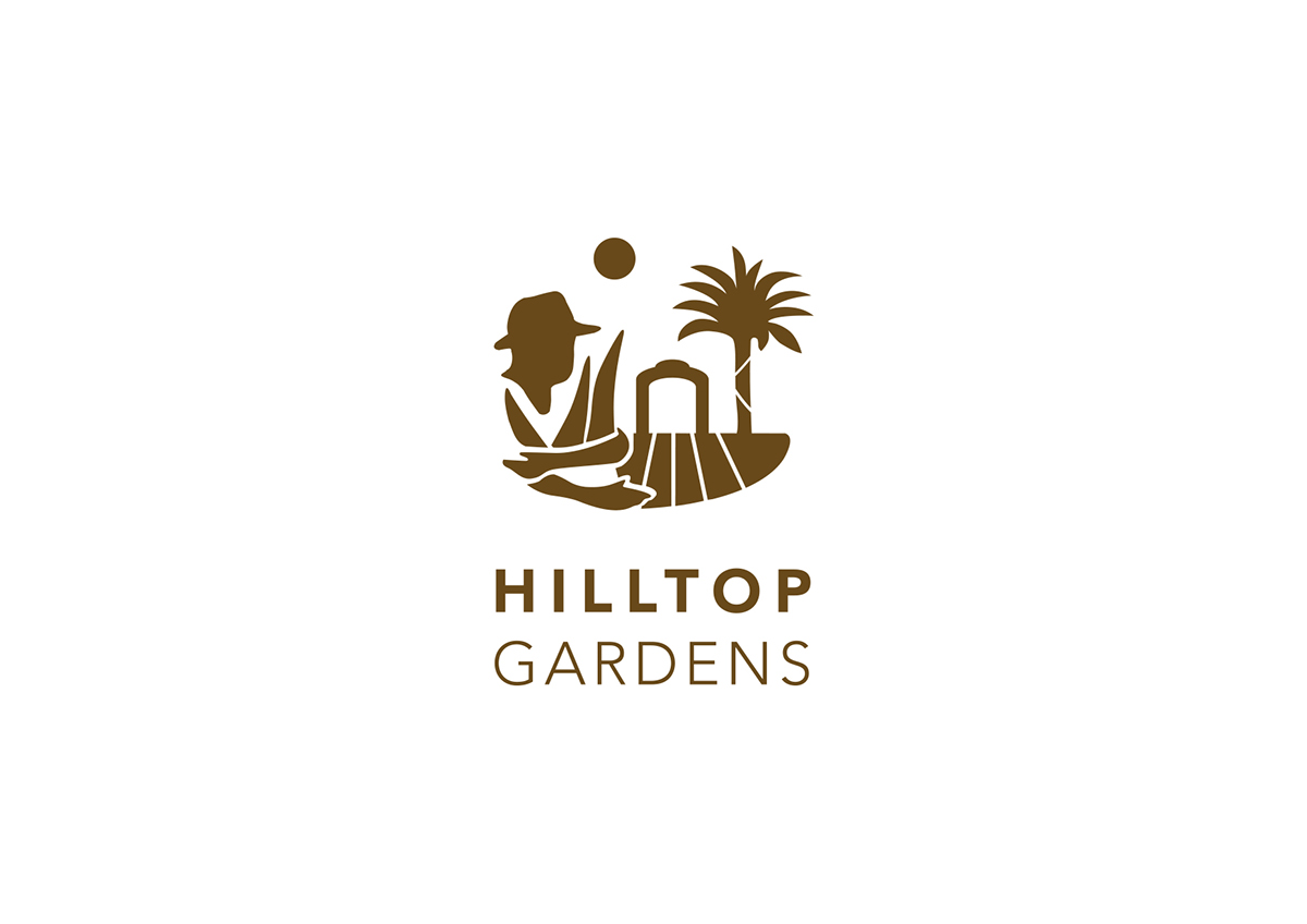
The Hilltop Gardens symbol is inspired by the farmers and environment.
The logo symbolizes the combination of farmers, the historical (Hiltop Garden) gate, and the palm trees on the field beutifully reflected by the sun-set, portraying nature's genuine picturesque.
The logo indicates the brand identity that emphasizes a half centuries commitment "to bringing the best nature" to mankind.
The product packaging also took further consideration on sustainability by using the eco-friendly, recyclable, and biodegradable soy ink. The ergonomic sensual design of the container, with its organic shape and feel, represents the original concept of the product and depicts the nobel history of Aloe farm.