

English Lakes Ice Cream is one of the most loved brands of ice cream throughout Cumbria. They needed a website that reflected that popularity and presence over the current design. The aim of the website was to serve as a marketing asset.
Home

I wanted to have an immediate impact through photography, to give an emotional response and a sense of luxury. A brief introduction was all that was necessary, as anything more would take away from the imagery.
“Gold” hues and black are part of English Lakes packaging, so maintaining consistency was fairly important. This can be seen in the products section.
Following the products, the about section was a great opportunity to showcase the Lakes themselves by using more photography and to go into detail about English Lakes.
Become a retailer

The page is a simple overview of what becoming a retailer is. Some testimonials to build trust and a downloadable guide to the freezer deals to get a better idea.
Products

Overall there are many different ice cream flavours—not enough to warrant a complex filtering system—which are part of a few different ranges. This meant a simple filtering system to narrow down by range made the most sense.
Product

All product imagery was portrait, which allowed for a nicely balanced layout. As if the layout had to be different, the page would have felt sparse as the amount of content is fairly limited.
With the product being ice cream, the image is very much the selling point. The image gives you an immediate emotional reaction.
Blog

Colour
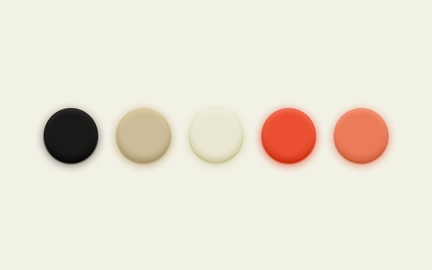
Black, gold and a fiery orange were already very much part of the branding. I stuck to this, however, I introduced a softer, more elegant gold colour.
Type

The typefaces chosen were Didot, Gotham and Sentinel. I chose Didot for large headings. If you’re looking to communicate luxury, a didone is the only choice. Didot has to be one of my most favourite typefaces, it just works perfectly for this design.
Complementing that with Gotham for smaller headings and buttons, it’s used much more sparingly. Finally, with Sentinel for body copy you have fitting typeface that is suitably readable and legible.

