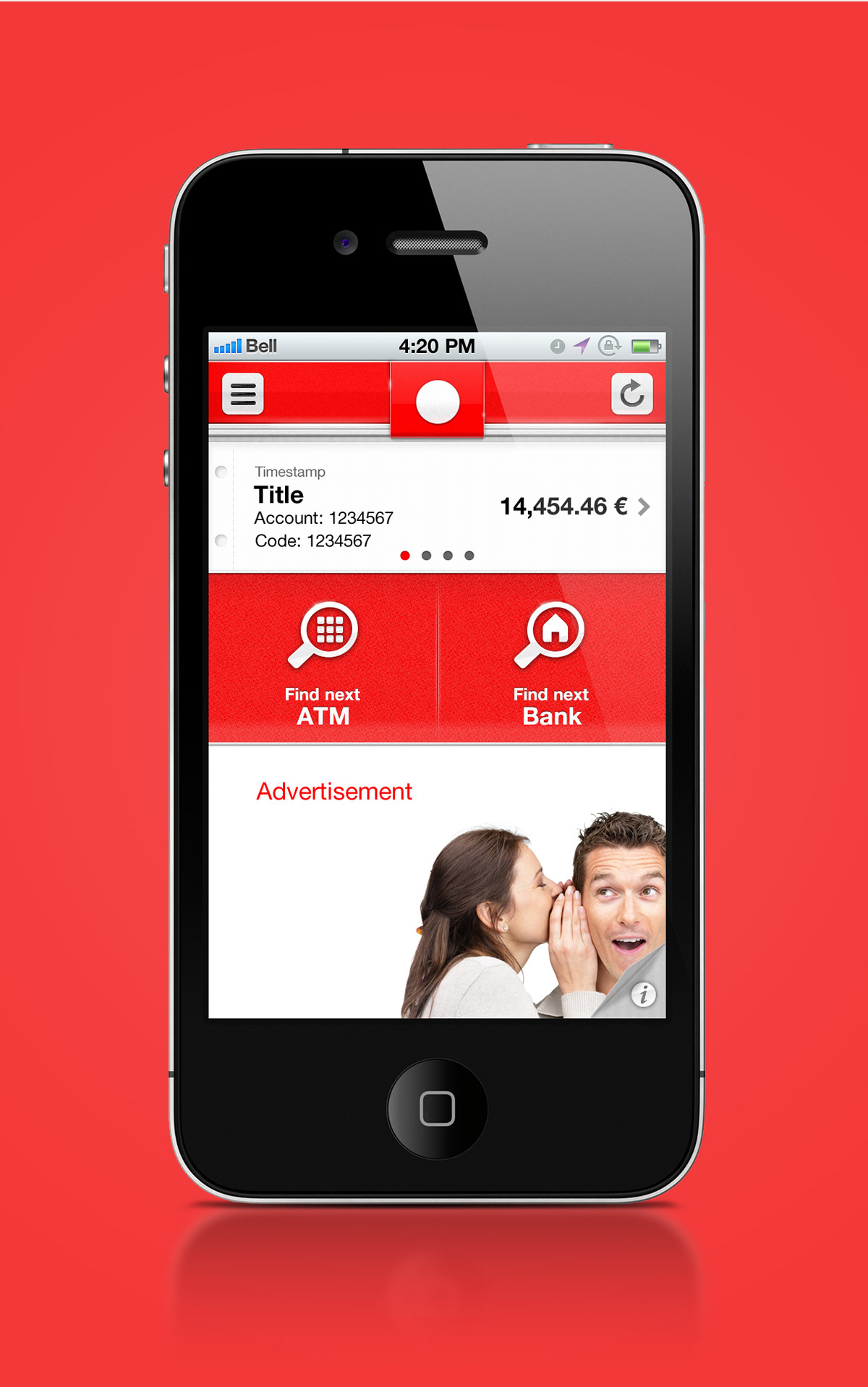
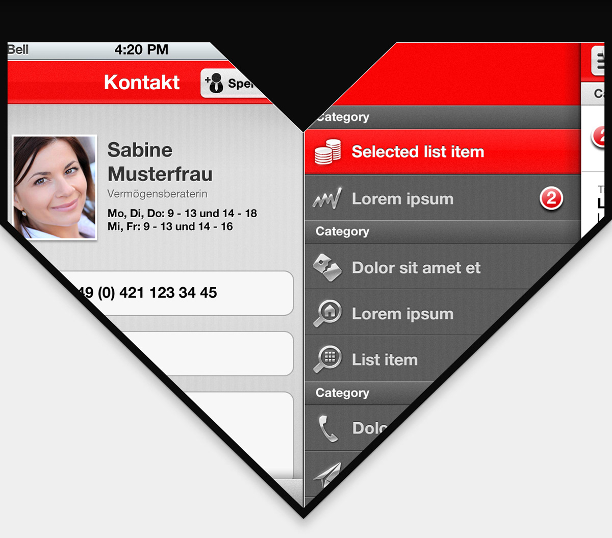
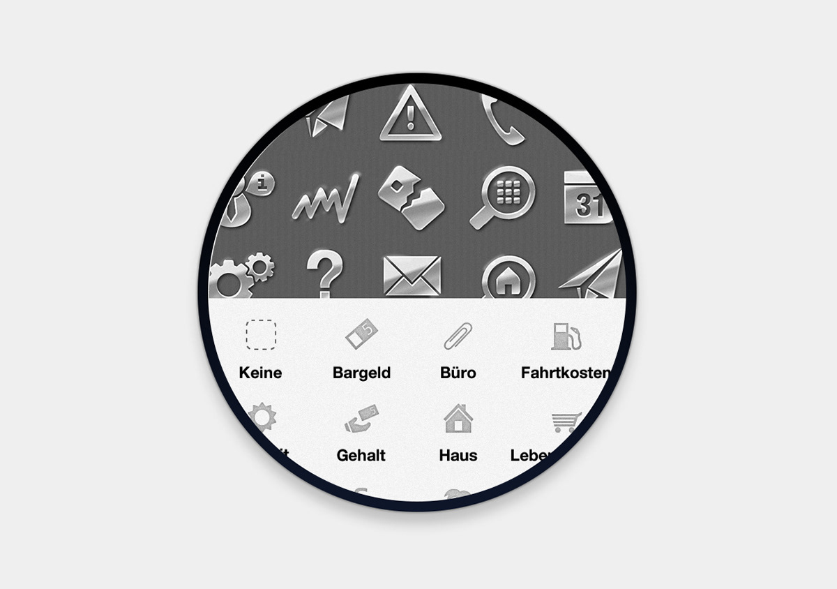
In terms of interaction, several features have been included that made the app easier to use, such as an ever-present context-sensitive action bar, a sidebar navigation and more. Speaking of design, the app has been granted more white space to make the large amounts of textual information more transparent and to give the app a more organised and professional look. Combined with high-fidelity textures and iconography the overall visual quality of the iOS app has been raised, while still staying subtle and productive. Please apologize that I had to remove corporate branding from the following previews. Not all projects can be presented as I wish to. The app has been created during my work at Enough Software.