As Film Noir is so stylized and recognizable, how does an identity for a Film Noir festival maintain the characteristics of the style, while being non-cliche and new? After researching and watching hours of film, I broke down Film Noir into main elements which set the style apart from the rest. These elements were used in the solution to this problem, creating an identity which can immediately be associated with Noir.
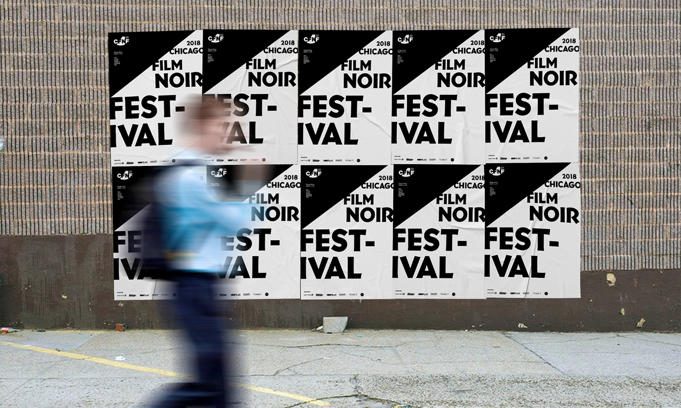
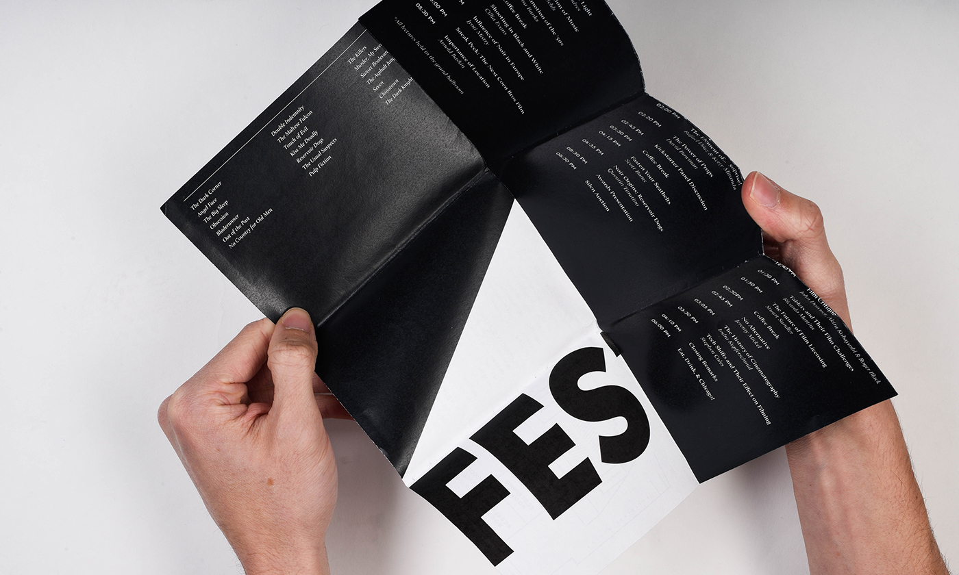
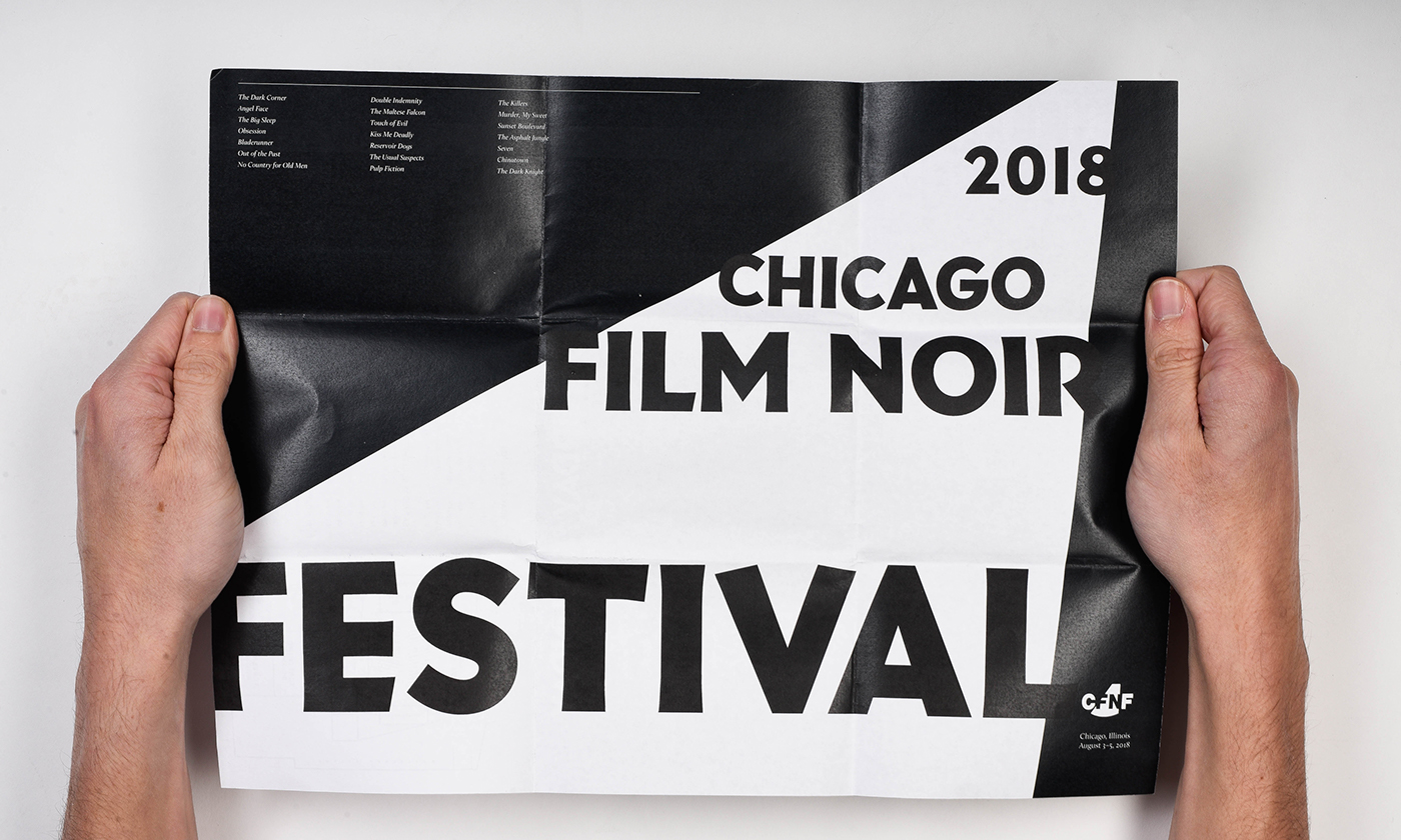
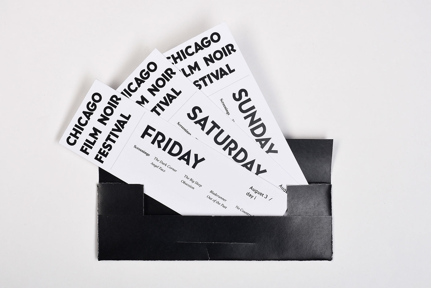
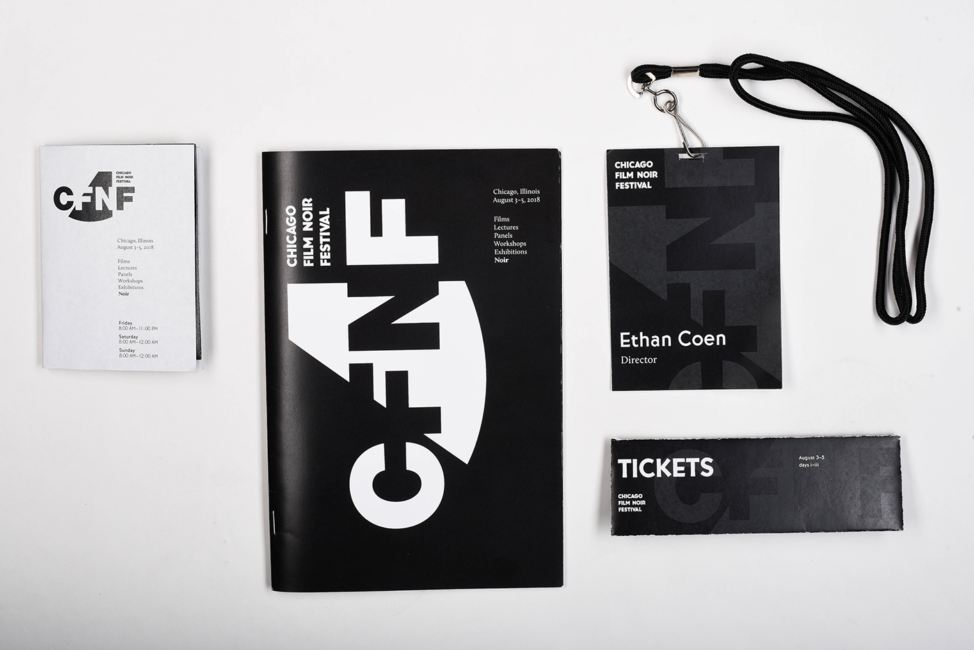
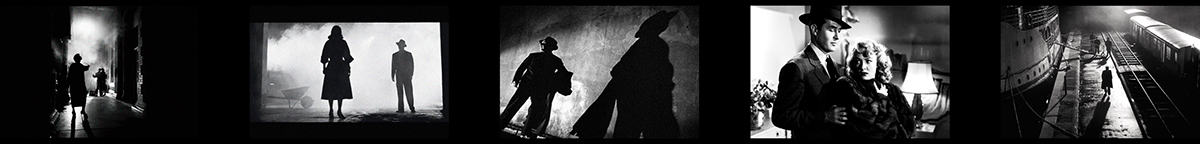
Perhaps the most distinguishable and unarguably the most repetitive characteristic of Noir is the high-contrast, black and white imagery. With contrasting yet complimentary typefaces, and a strict black and white color scheme, the element of high contrast was brought to the festival.
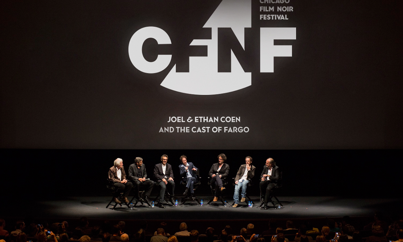
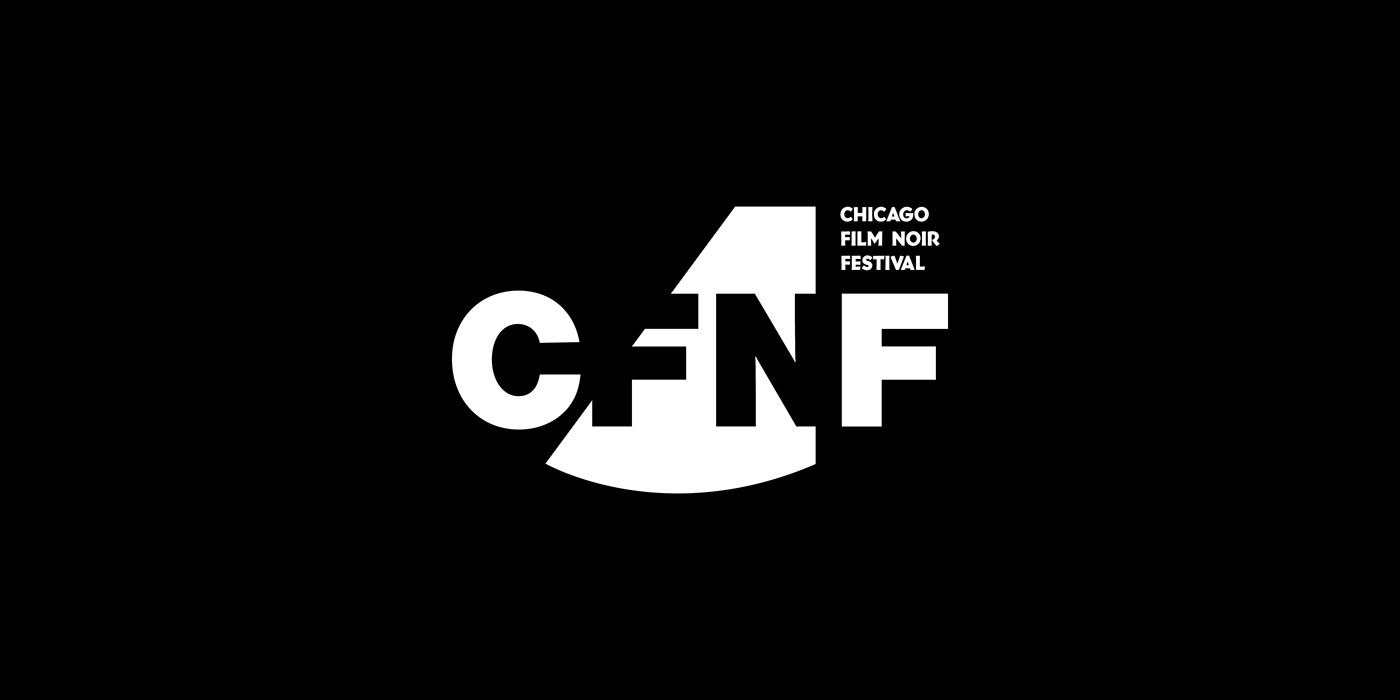
The logo features a sharp spotlight, high lighting the F and N for Film Noir in the acronym. Knocking out the letters outside the spotlight set an ambiguous tone, as ambiguity is one of Film Noir's most important characteristics.
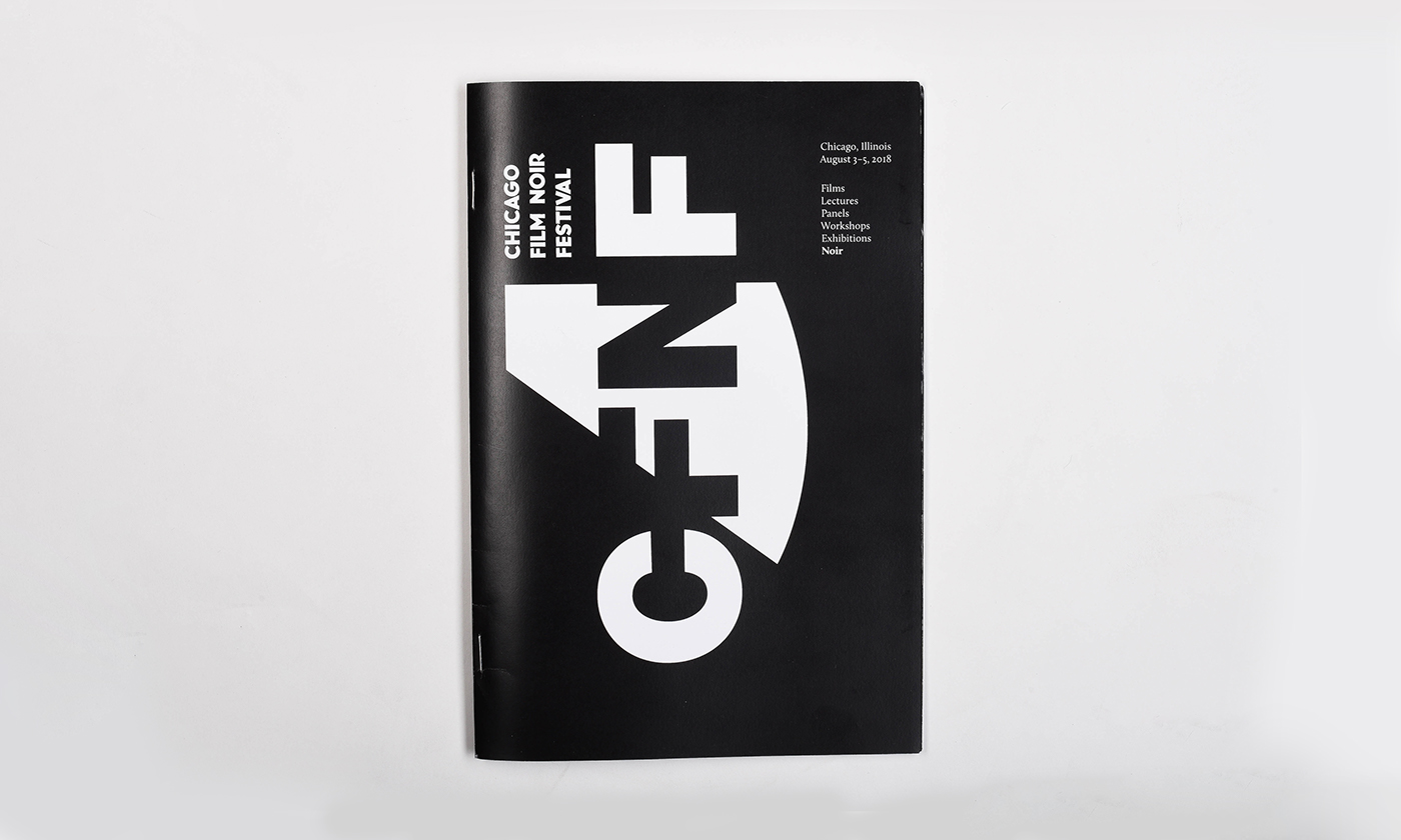
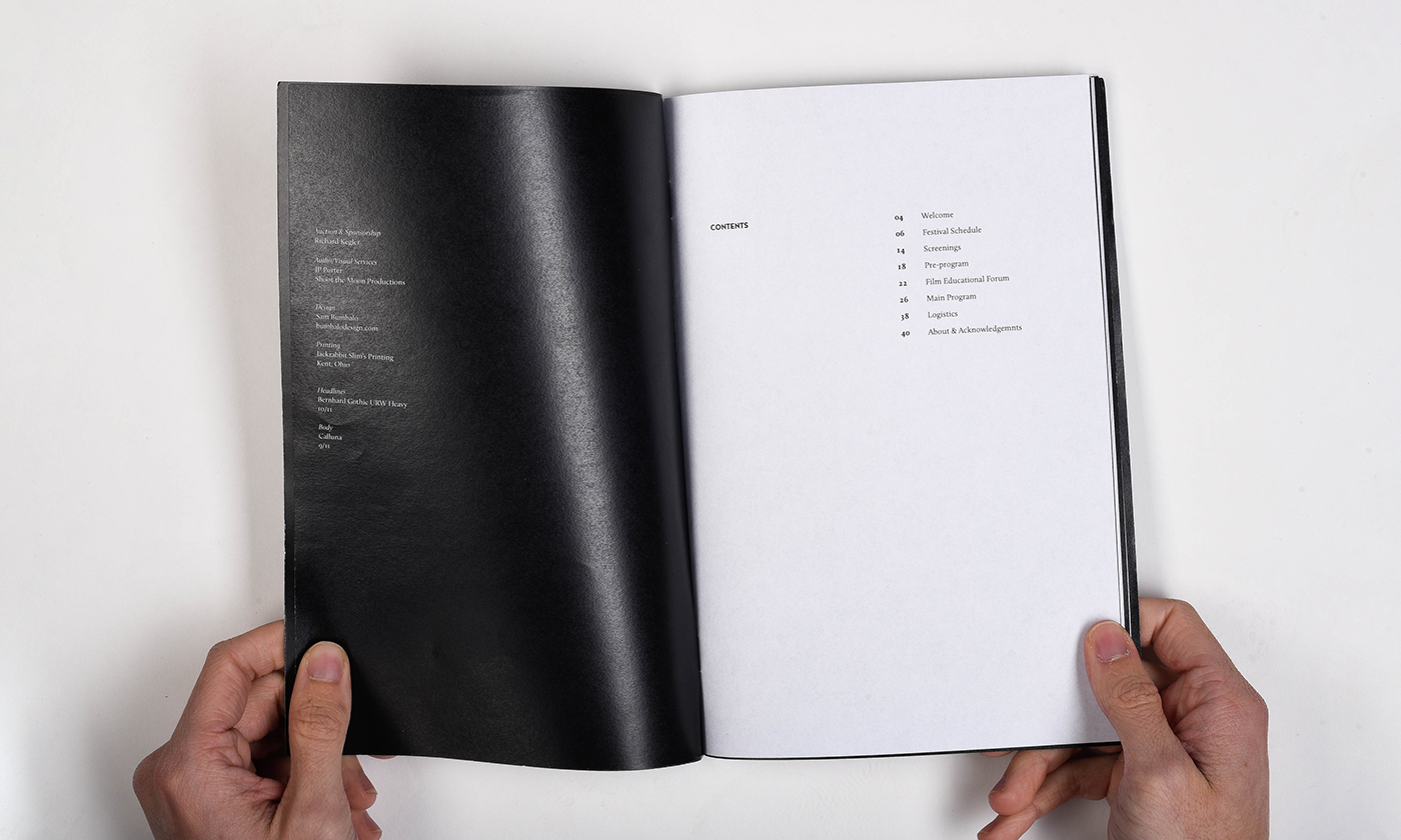
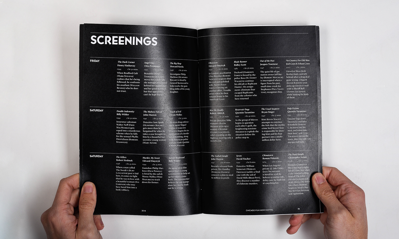
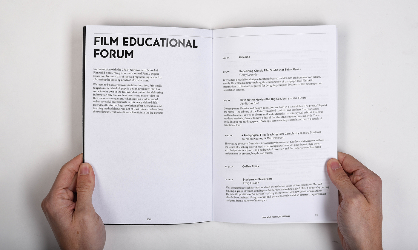
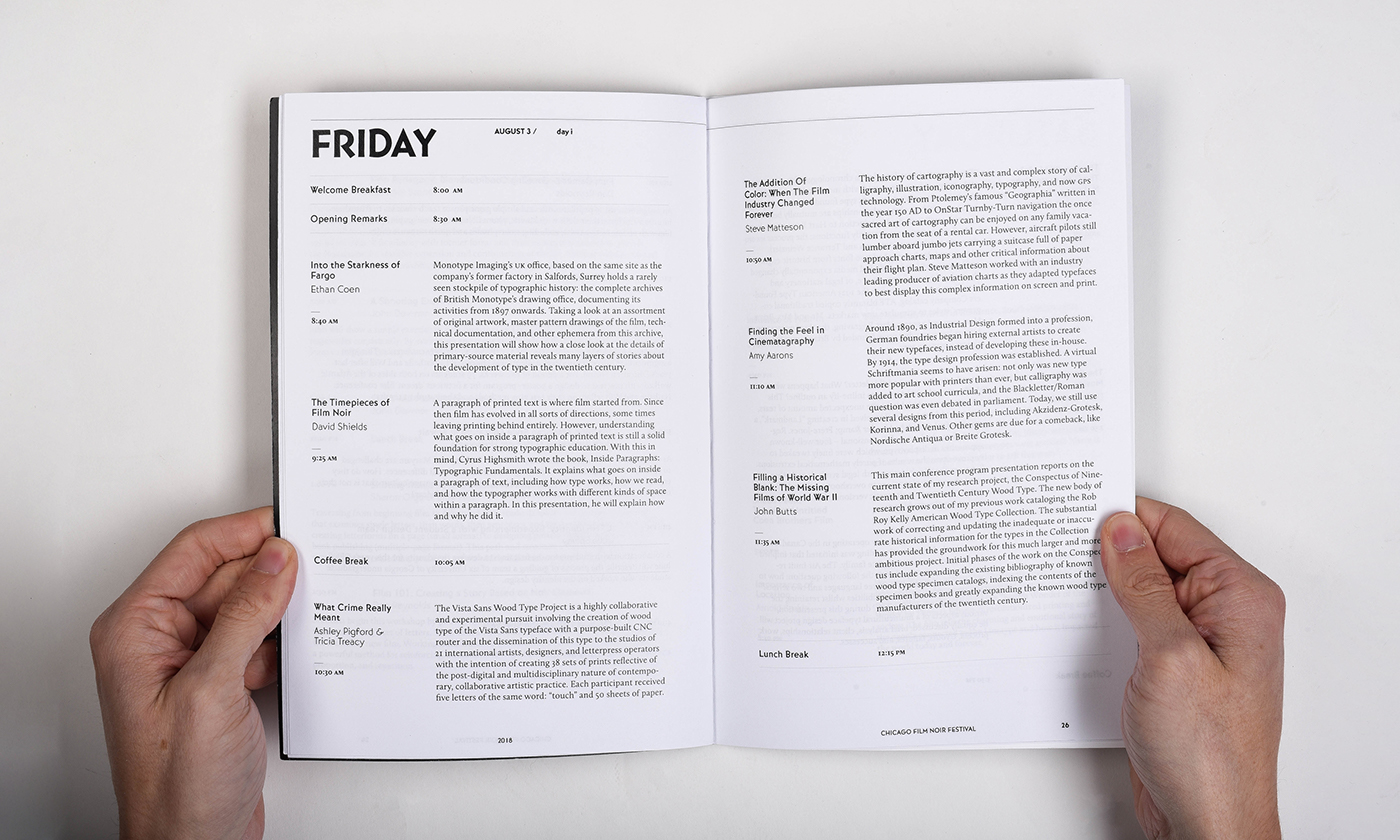
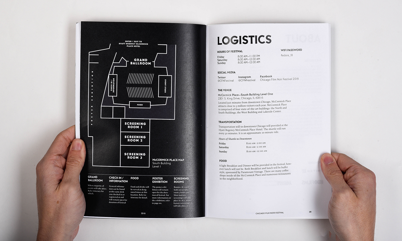
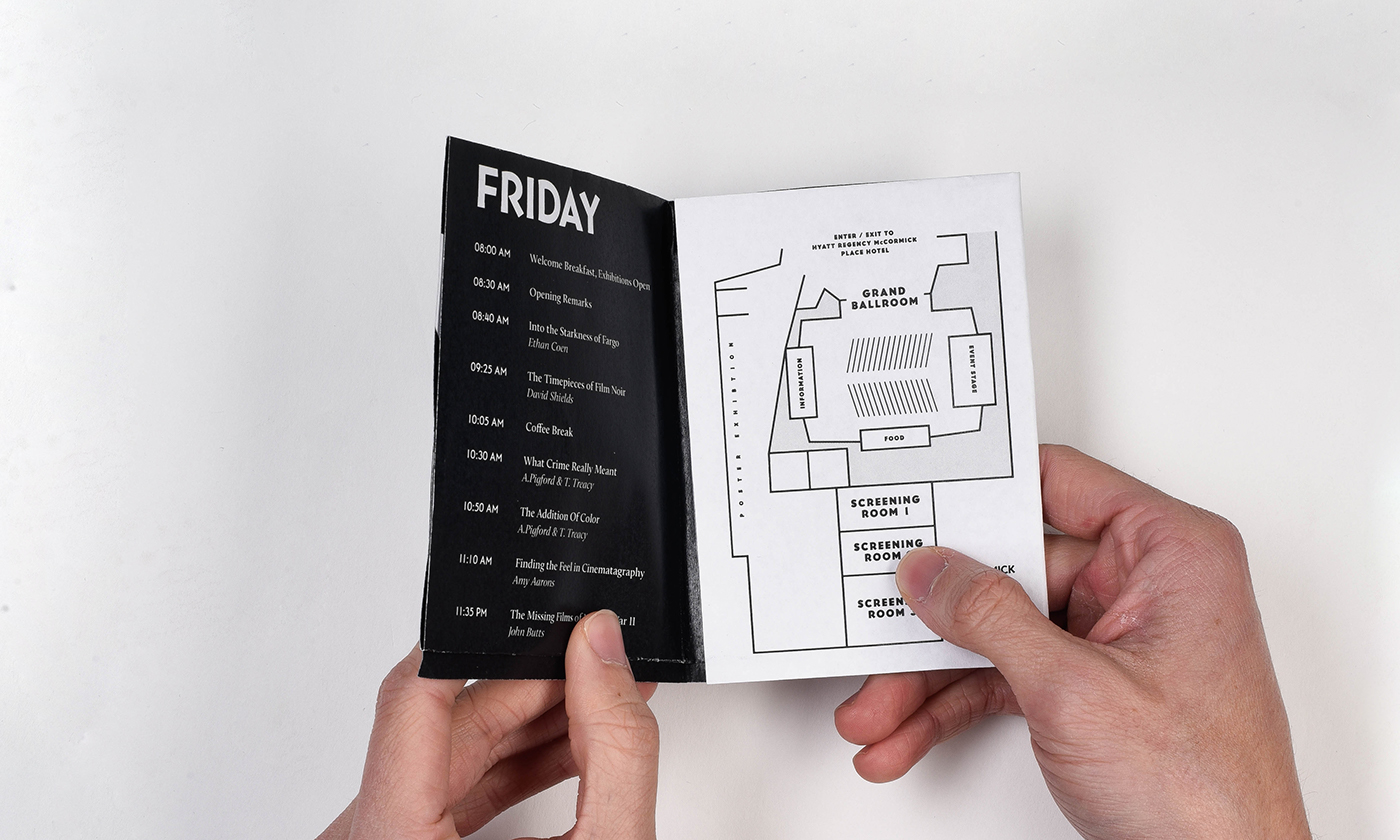
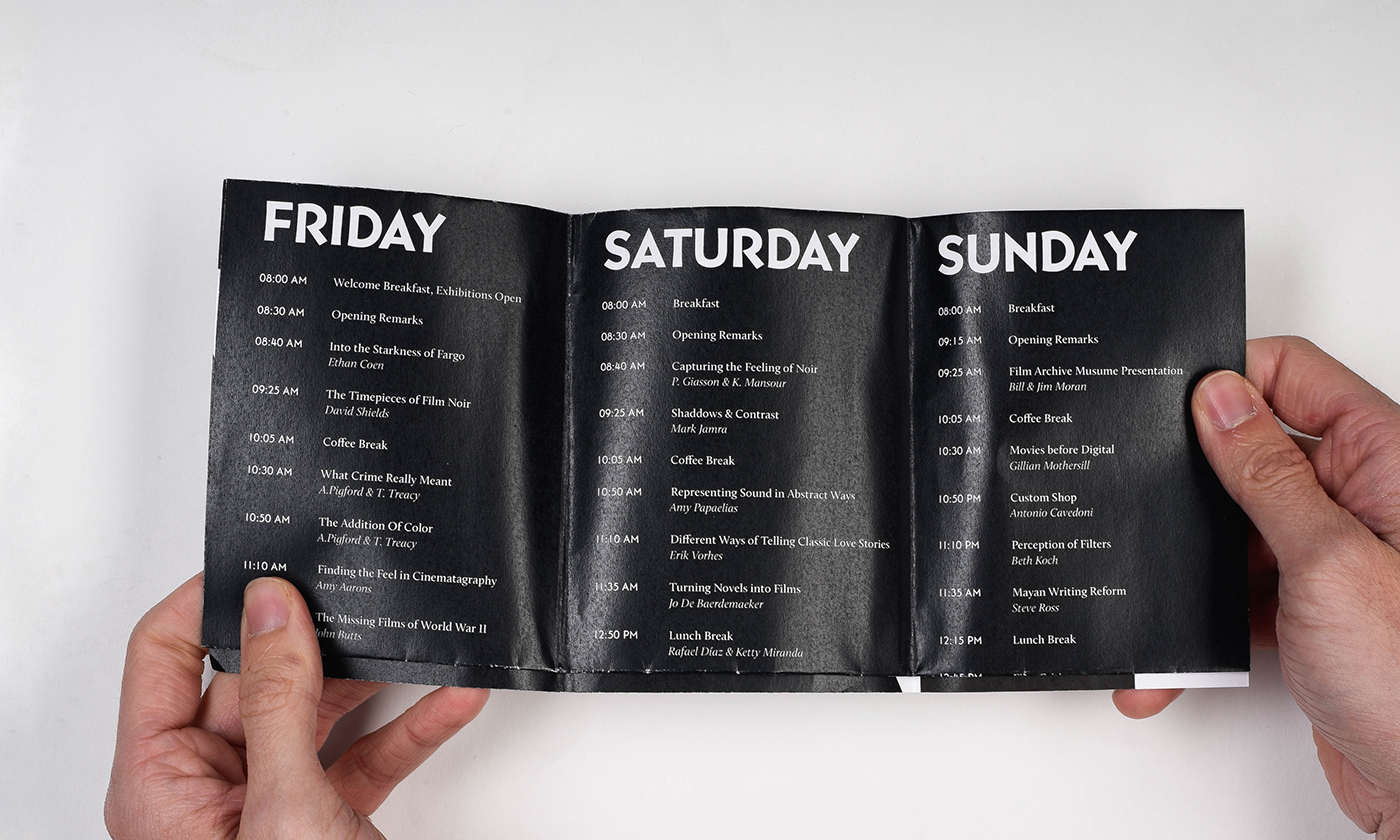
Another key element of Film Noir were asymmetrical shots Many of the program's spreads were asymmetrical. The spread of the booklet was also a 4:3 ratio, a nod to the most common aspect ratio of 50s film.