


Student GoldPack 2016
M.G Pasta Packaging re-design
M.G Pasta is a locally produced pasta that is made form a traditional Italian recipe. The pack design of M.G Pasta is dull and poorly designed . The packaging of the pasta does not stand out on the shelves in supermarket. The M.G Pasta brand was chosen to do a total re-branding and target re-positioning. The pasta is made in South Africa and is a major attribute to the brand, but the brand does not use it as a advantage.
When buying pasta at a supermarket, consumers always walk to the most known brand. Pasta Packaging designs are usually very bland and have an Italian influence. Designs are always executed in green, yellow and red. The small pasta packaging is very difficult to handle. It is packaged in a small plastic bag, that is not resealable. When opened and ready to use you always struggle to pour the pasta in a contained manner.
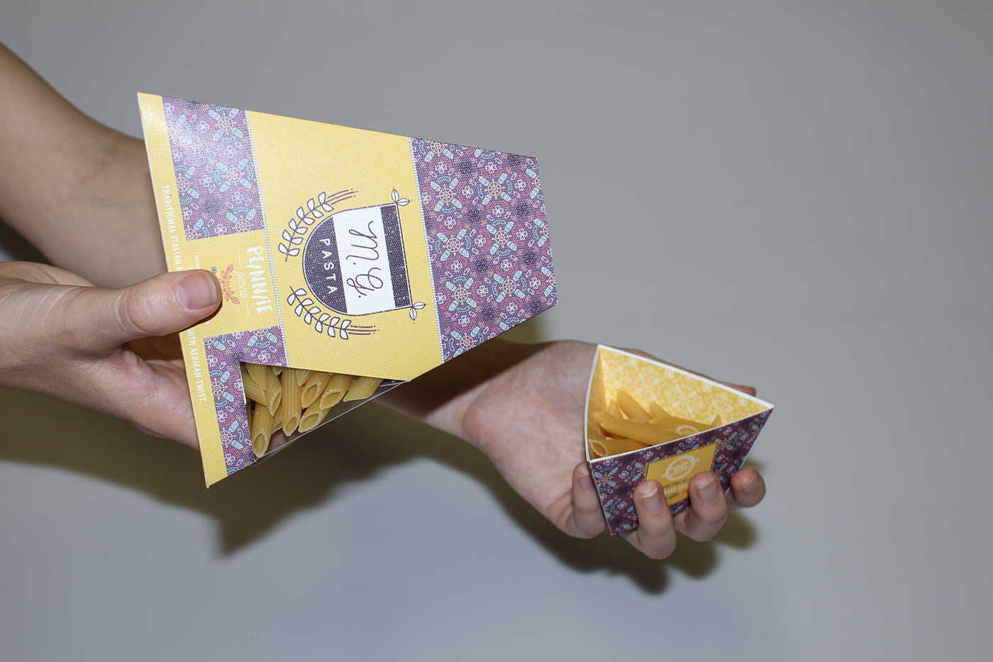
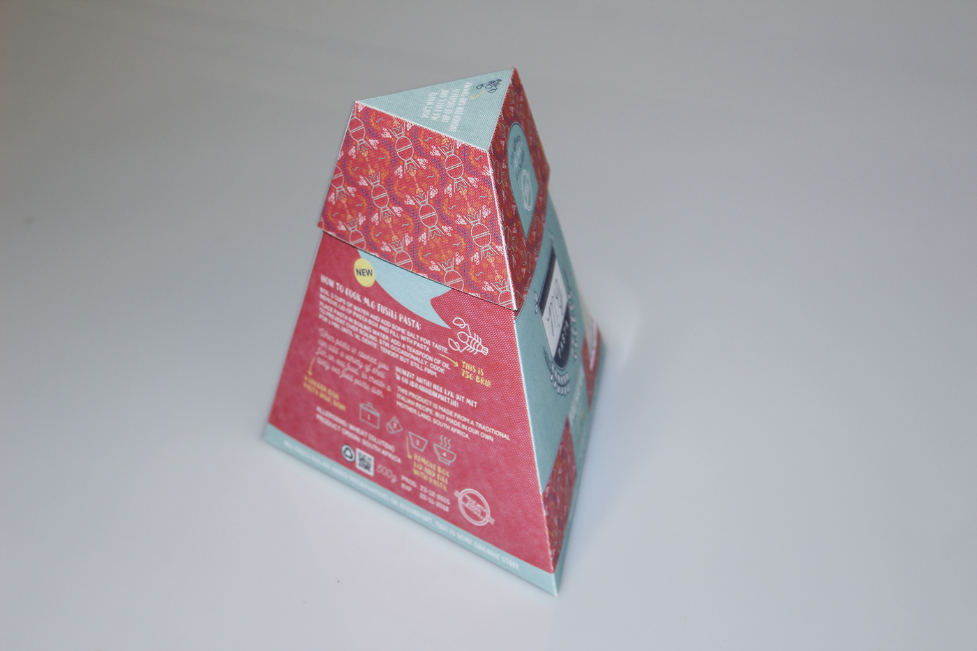
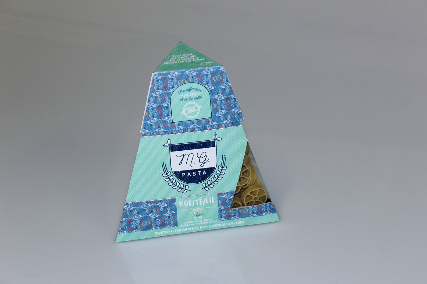
Thus the concept of M.G Pasta’s redesign is to show the influence of South Africa and Italian design. This is a South African product, thus the design shouldn’t look like a pasta imported from Italy. The pattern design used on the packaging is inspired by the Italian tile design but is compiled of South African illustrations and colour combinations, the colourful design will also stand out on the bland pasta shelves. The redesign of M.G Pasta will be a box containing 500 grams of small pasta. It will have a resealable lid that will double as a measuring cup for the perfect portion for one person. The pack is also in a pyramid shape so that it is easy to pour the pasta in the lid/ measuring cup.
The target market for this re-design still falls inside of M.G Pasta’s determined target market, it is just more focused and specific. The re-design is focused on the young stay alone South African. The box and measuring cup combo is created so that a young person wouldn’t struggle to cook meals. This person is alone living and don’t have a lot of experience cooking pasta. This person will fall in the 7-12 LSM group, but M.G Pasta is not a very expensive product, but the current branding also shows it. The target market consists out of males and females that loves to try something new, they are in the age between 19 and 26. The most important differentiator of the target market is thus that they live alone, they are at university or stating a new job. This target market is not yet brand loyal to any other product thus the brand could attract them to buy this product for life.
After the redesign of M.G Pasta’s new pack design speaks true to the South African consumer. A packaging design that communicated to a consumer in a manner that they feel this product is something that they need, something they want and couldn't walk out of the supermarket with out buying the product.
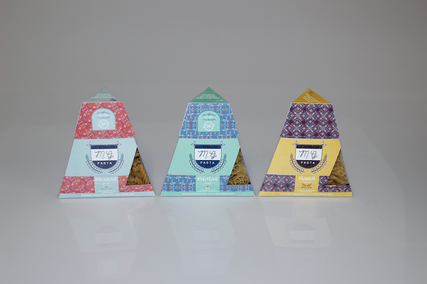


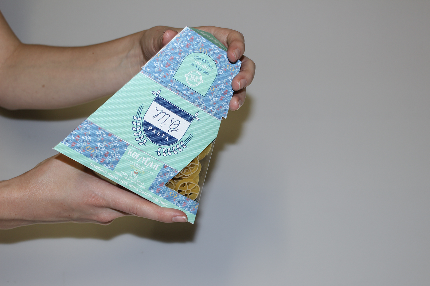


Packaging shell template design.
Thank you!


