2016 GRADUATION EXHIBITION
2016畢業展
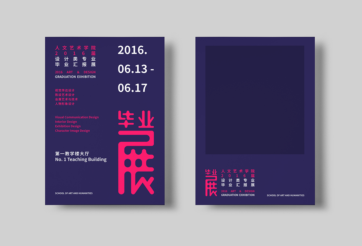
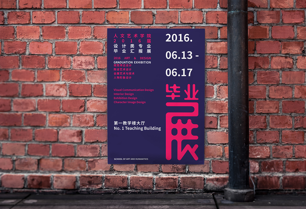
2016 graduation exhibition tries to integrate different characteristics of the subjects into an organic whole,
which combines design with different colors and elements, so that visitors can understand the same idea for
all majors -- Harmony but not uniformity. Meanwhile, the show pieces reflect the collision of Reason and
Sensibility, overlapped layers of consciousness and accumulation of four years’ exploration. The exhibition used four bright colors and dark purple as the main tone visually. The distinctive color symbolizes the ideals
of students and connects all objects of this exhibition.
2016畢業展嘗試將不同專業的特徵融入一個有機整體,把設計與不同的色彩、元素相結合,讓觀展者體會到
各專業間“和而不同,包容共進”的思想,同時以此表現展覽作品中理性與感性的碰撞,意識的交疊和歷經四年
時間不斷的探索和沉澱。視覺上使用四種鮮亮的色彩與深紫色搭配作為整體主視覺的基調,以鮮明的色彩象徵
學生的不同想法並以此連接本次展覽的所有物件。


