NANDO'S MENU
Nationwide design & revamp
Nationwide design & revamp
It began with an in-depth look & research of Nando’s signage (plus compiling an extensive research document), followed by many work-shops with various facets of the Nando’s business / franchise / marketing model to structure the menu items.
The aim was to leverage the valuable (and limited) menu space in order to best optimise sales from the ‘best-sellers’ to the ‘least’ plus include ‘up-selling’ off images on the menu and include 1 to 2 promotional menu panels (depending on restaurant size) that would show-case any promotion with the ability to be changed regularily. The rest of the menu roll-outs took the design lead from the main panel structuring but without any photographic images.
The eat-in menu cover was illustrated to incorporate oil-paint textures.
Client: Nando's South Africa
Creative Director / Designer / Illustrations: Antonia Morgado
Photographs: BlackRiver FC

ABOVE COUNTER PANEL 1
SIZES: 800 X 800 / 500 X 500 / 800 X 600
To be hung in succession with a promo panel with a special hung first. Some large restaurants had a second promo panel at the end increasing the amount to 5 above-counter panels.
SIZES: 800 X 800 / 500 X 500 / 800 X 600
To be hung in succession with a promo panel with a special hung first. Some large restaurants had a second promo panel at the end increasing the amount to 5 above-counter panels.

ABOVE COUNTER PANEL 2

ABOVE COUNTER PANEL 3

DINE IN MENU COVER
SIZE: 275 X 196 FINISHED SIZE
SIZE: 275 X 196 FINISHED SIZE

DINE IN MENU INNER

DINE IN MENU BACK

DINE IN MENU ILLUSTRATION CLOSE-UP

OLD ABOVE COUNTER MENU DESIGN

OLD ABOVE COUNTER MENU STRUCTURE

OLD ABOVE COUNTER MENU STRUCTURE

NEW ABOVE COUNTER MENU DESIGN

NEW ABOVE COUNTER MENU STRUCTURE

NEW ABOVE COUNTER MENU STRUCTURE

OLD PERI-OMETER DESIGN

NEW PERI-OMETER DESIGN

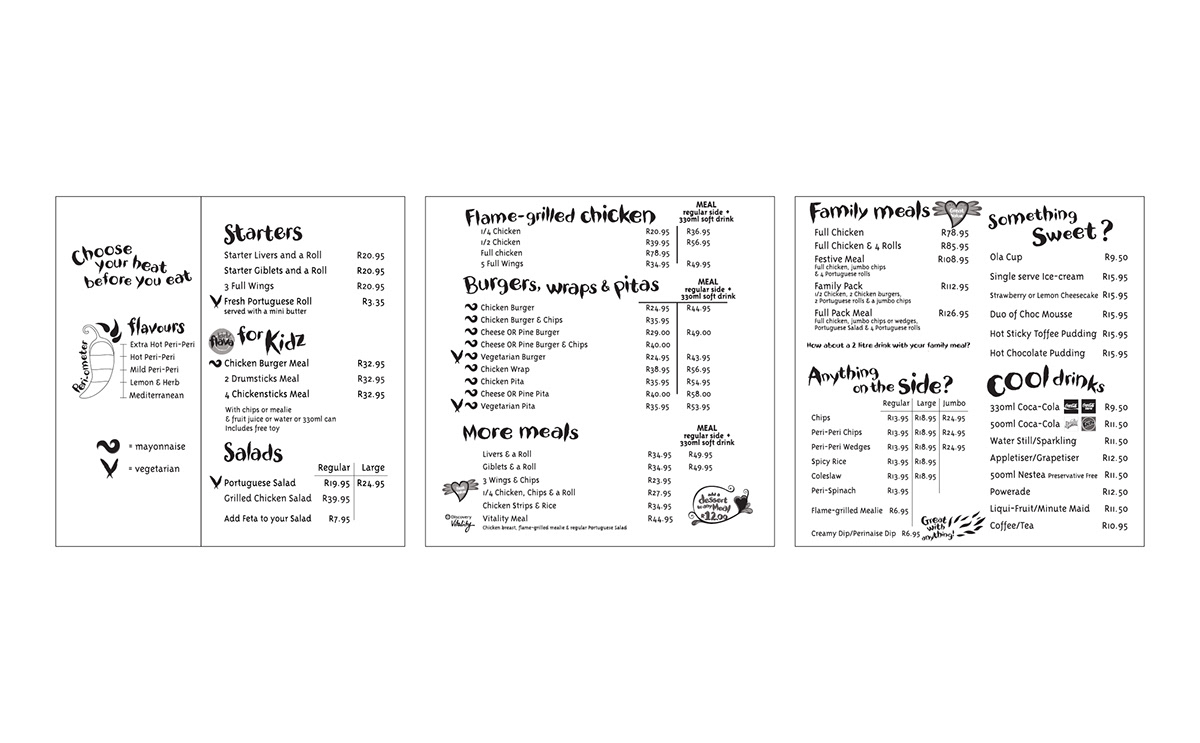
DRIVE THRU MENU PANELS
One example of three different formats used nationwide
One example of three different formats used nationwide

PROMO BACKLITS
LEFT: STANDARD BACKLIT with place for price stickers
CENTRE: DRIVE THRU BACKLIT
RIGHT: PLASMA SCREEN for restaurants that use digital screens for their menus
LEFT: STANDARD BACKLIT with place for price stickers
CENTRE: DRIVE THRU BACKLIT
RIGHT: PLASMA SCREEN for restaurants that use digital screens for their menus


