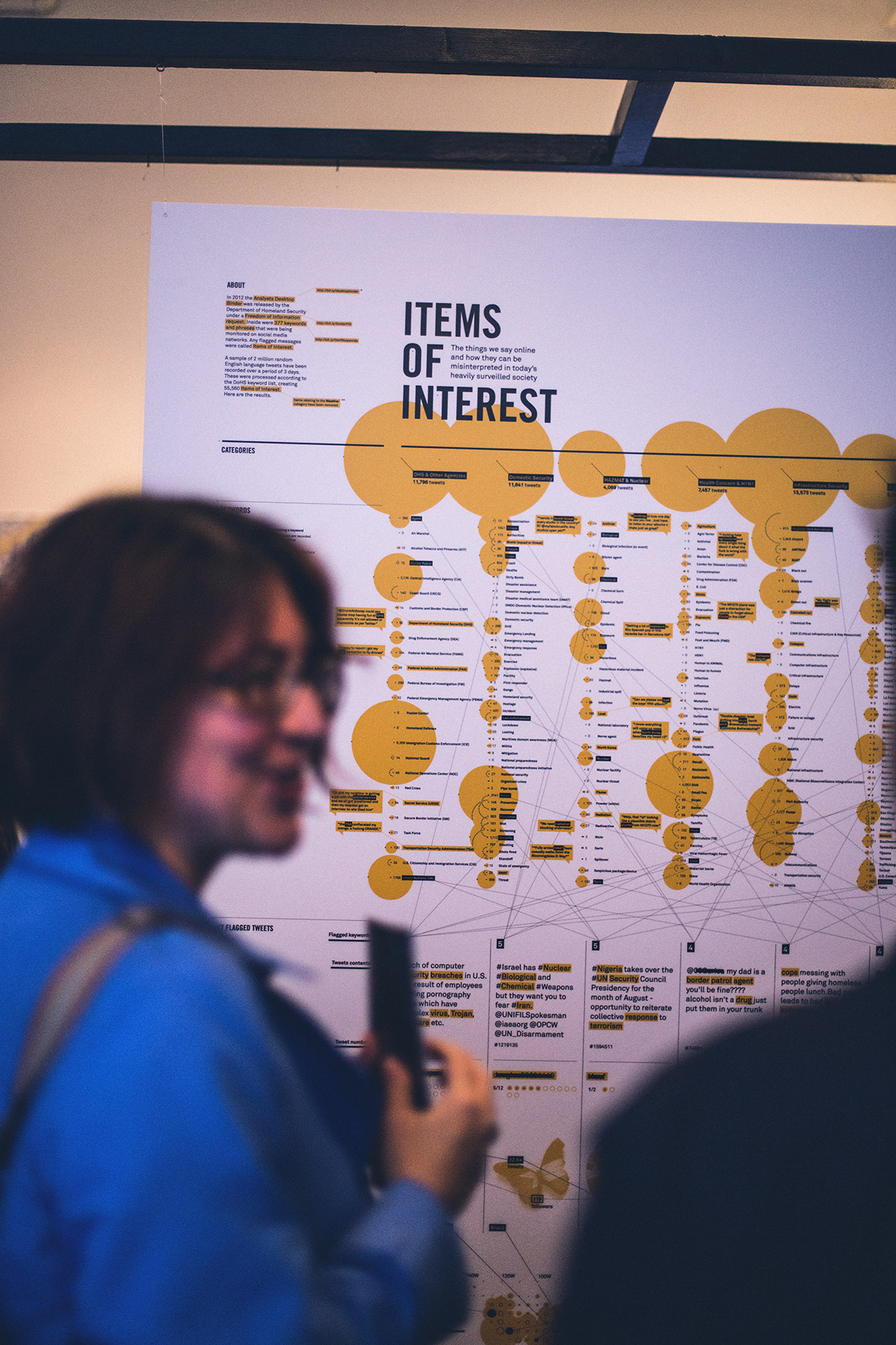
Every day we use social media to share with the world everything from the inane to our innermost thoughts. But could this digital footprint be misinterpreted as something more sinister? Can the use of 'trigger' keywords accurately reflect the context and nuances behind what we say?
This project explores the concept by filtering a random selection of twitter data using a list of keywords released by the Department of Homeland Security. We examine the most common trigger words and how the innocuous things said online could be flagged as suspicious content many times over. The same technology can then be used to track down to geographic locations, linking what we say online to our physical reality.
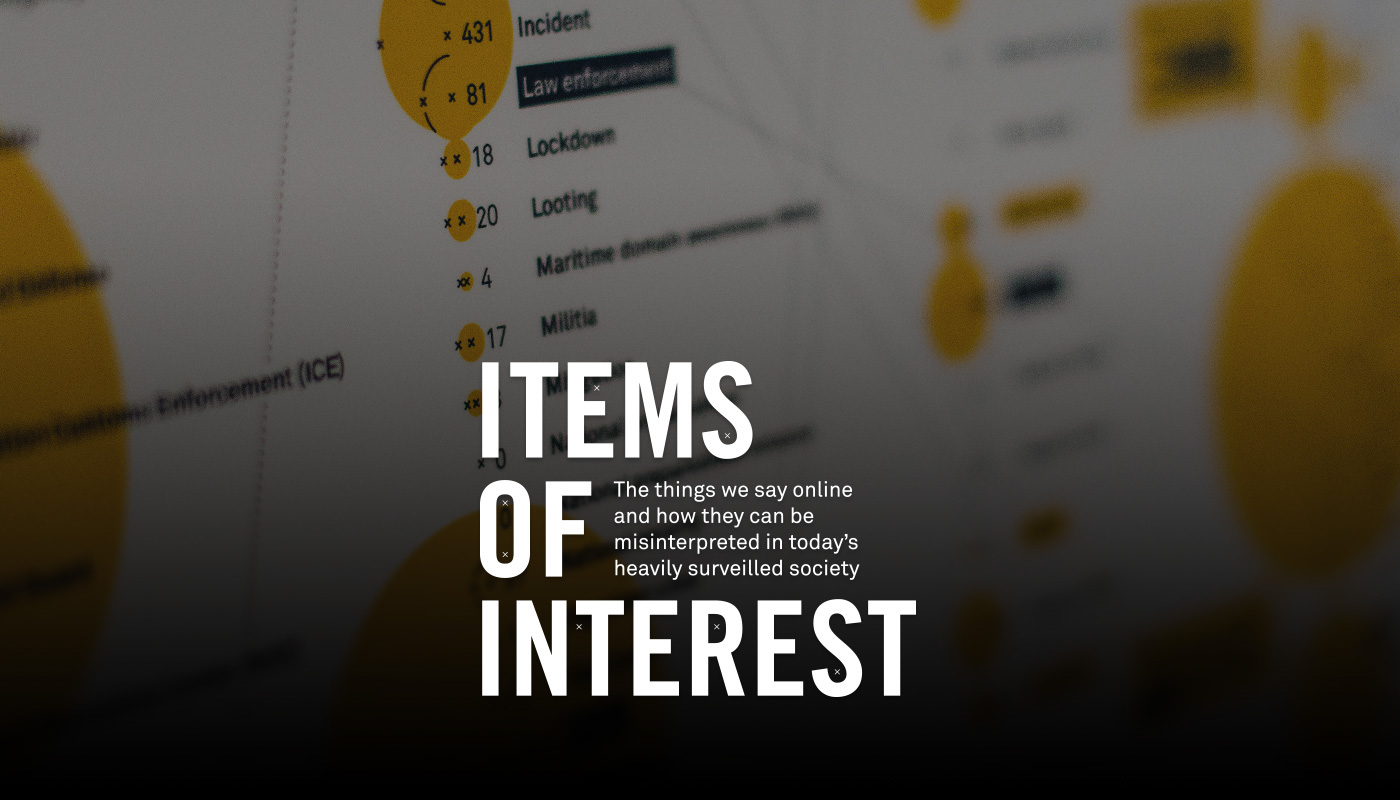
What have you shared online that could make you an Item of Interest?
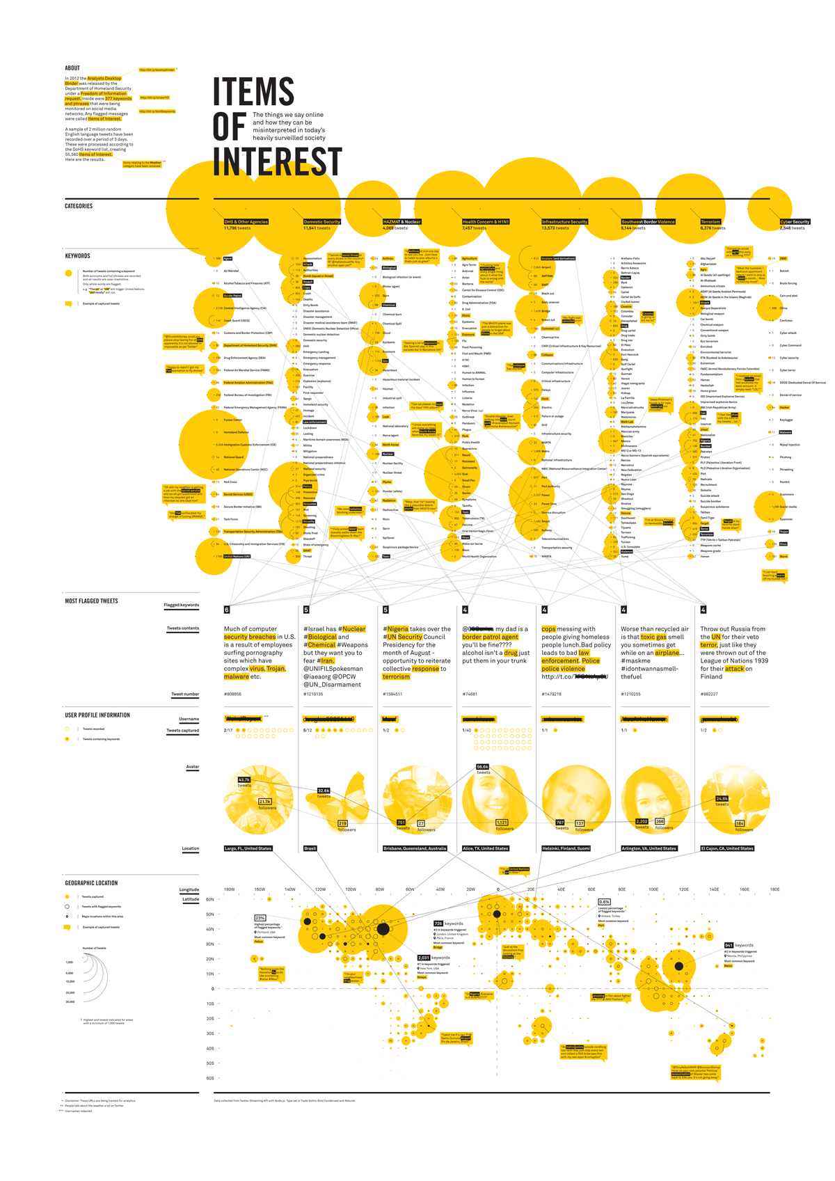
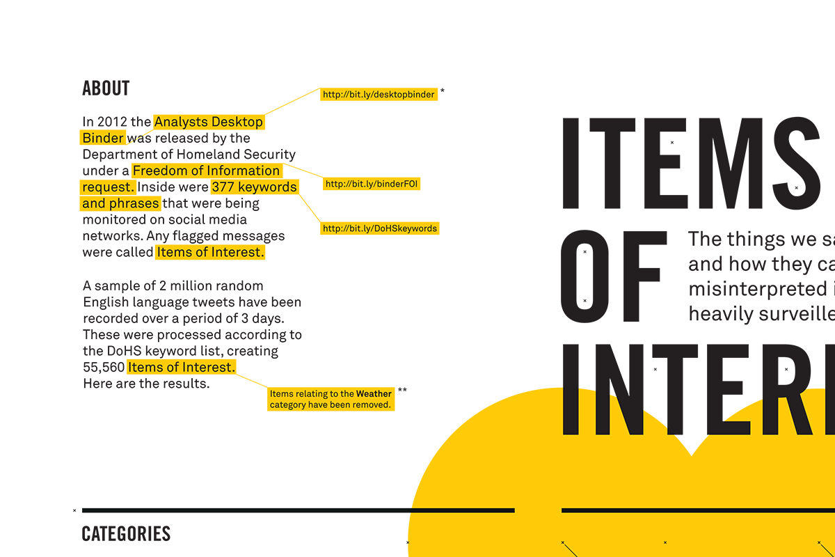
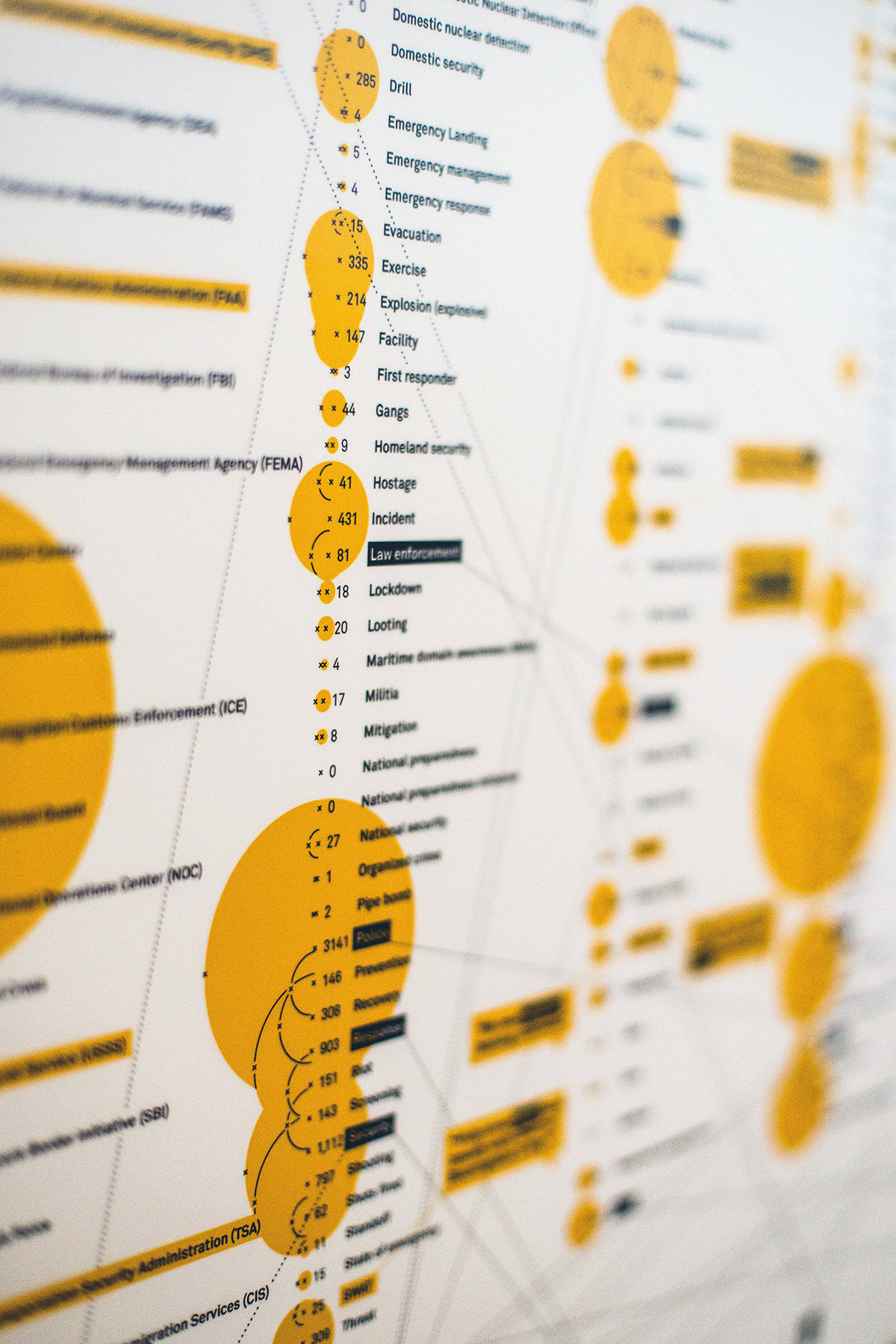
This was a conceptual piece of work originally created for the Signal Noise Private-i exhibition as part of London Design Festival. I used a Node script to harvest two million English language tweets into a database which I then cross-referenced with a list of 377 keywords that had been released by the Department of Homeland Security through a Freedom of Information request.
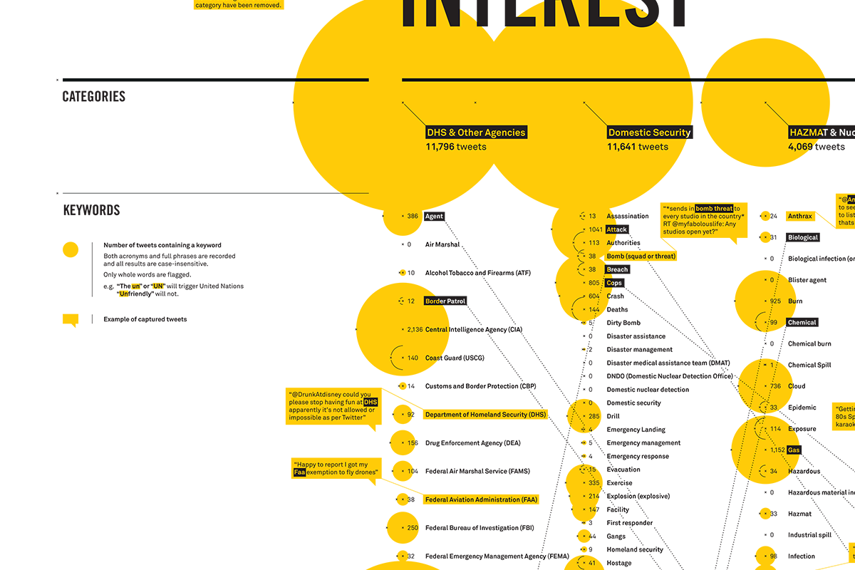
The totals for each keyword were collated and visualised in their respective categories with examples of captured tweets pulled out. Both acronyms and various spellings and grammatical differences were taken into account.
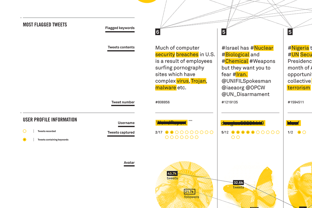
The seven most 'triggered' tweets were displayed with the flagged keywords highlighted, with links drawn back to the main keyword list. This was accompanied by more detailed profile analysis showing the number of tweets I'd captured off that user and how many of them contained keywords. I also visualised each user's twitter statistics to compare their general activity and influence.
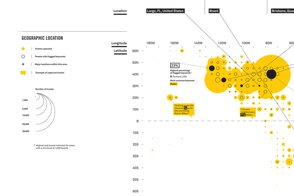
Each of the top users were then plotted on a map along with all the geographic data I'd scraped from the captured tweets showing overall volume and number of flagged tweets. Example tweets were displayed attached to their location and the highest and lowest 'triggered' locations were pulled out with further analysis.
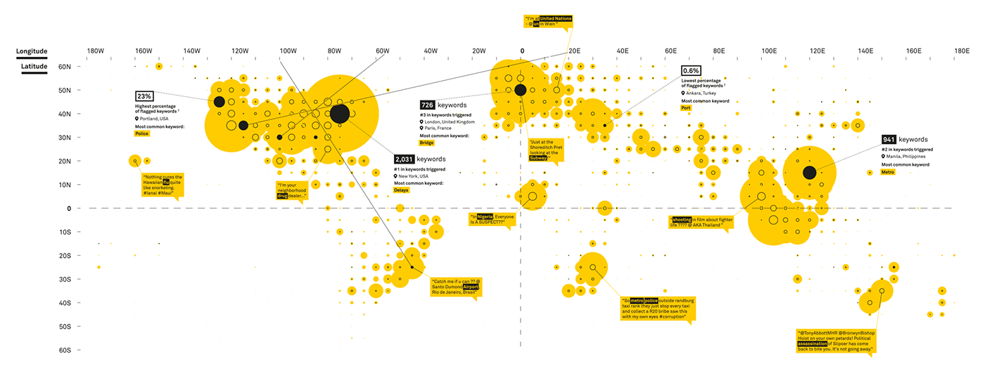
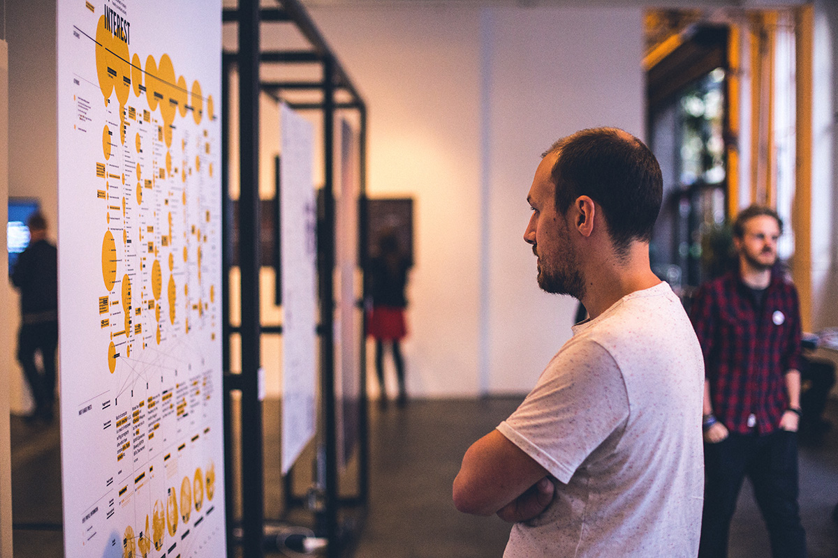
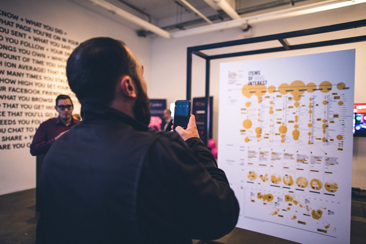
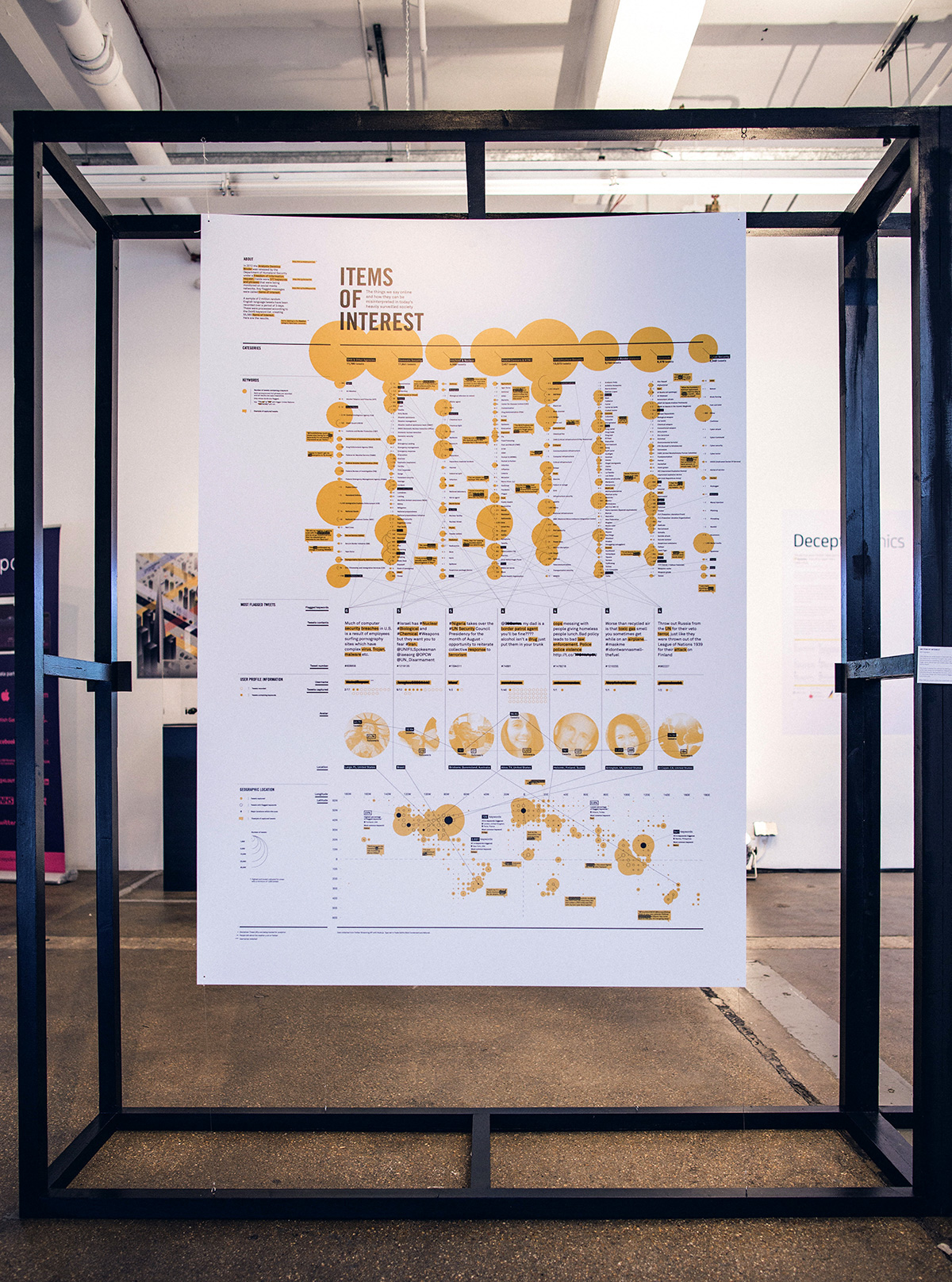
The final piece was printed at double A0 and mounted and suspended in a box frame. It was always designed to be large so I wanted to pack as much detail in as possible as a nod to the massive amounts of data we produce each day. The piece is designed to be read from top to bottom, the keys along the left-hand side guiding the reader down deeper and deeper as more information is extracted from the raw data.
I wanted to keep very strict with colour, going for a serious, high contrast look with a punchy overprint-style yellow. Featured words and phrases with block highlighted as though selected with a computer terminal, and usernames and other personal details censored with block strikethroughs.