Logo redesign
DOGKING
EVOLUTION
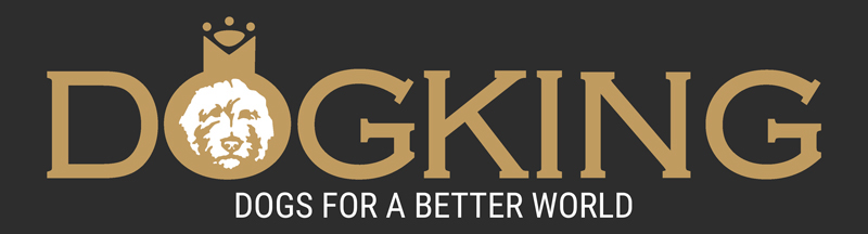
The brand updated their logo to feature an Australian Cobberdog instead of a West Highland dog, reflecting their recent investment in the breed.

SHAPES AND COLORS
It was decided to make some changes to the original design. The background color was changed from very dark blue to dark gray, and the gold color was made lighter. Additionally, the stroke of the typography was removed to create a simpler and less pretentious design that aligns with the new communication strategy.
CLAIM
Taking advantage of the redesign of the logo, the use of a slogan that summarized its philosophy was proposed for the brand. "Dogs for a better world" want to express all the work that DOGKING carries out to be able to offer dogs that make their families happy.

RESPONSIVE LOGO
The old logo did not have a horizontal version or applications with the different elements that made it up. In the new version, different options are offered that adjust to the different formats in which it can appear.

APPLICATION
We did not want to make an inverted version of the logo colors. Its application would always be with a dark gray box, and whenever possible, this box would appear translucent.


