I worked in a team of three to redesign the website for a local Co-op market. Our focus was on condensing the information on the original website into something more easily accessible. We also wanted to rebrand the Co-op's online presence to reflect a more modern aesthetic to attract younger customers.
The homepage above the fold.

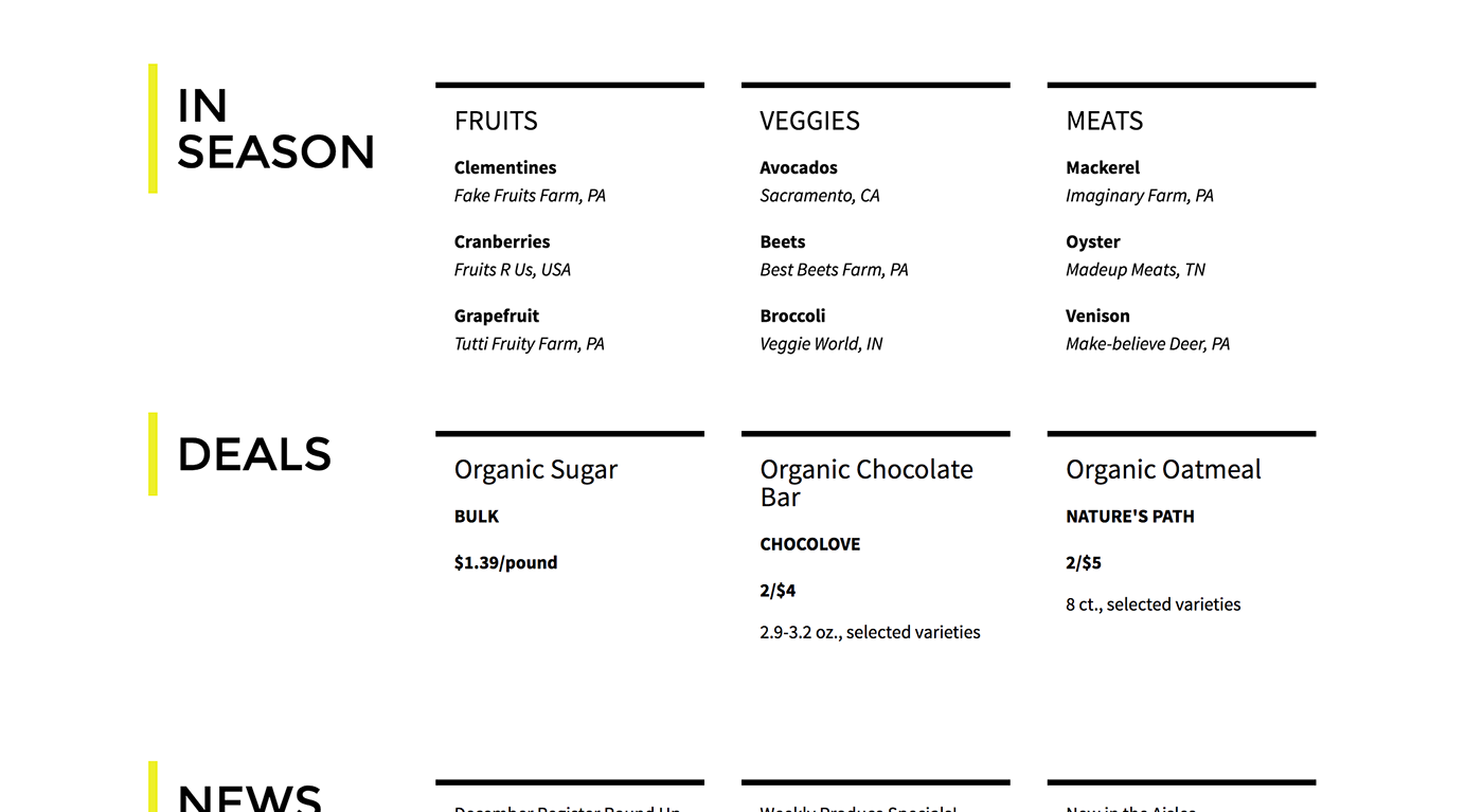
The homepage below the fold.
The market page.

Using the Google Maps API, I created a map of the Co-op's local suppliers and wrote a simple filter function so visitors to the site can view suppliers by product type.

This is an accordion folder I created to hold the text-heavy product information.


In addition to our desktop-optimized page, we also created guidelines to allow our site to transition easily to a mobile-view. Below are a few screenshots of the site on an iPhone:


