Legibilidad, asociación directa con el rubro, origen, rica historia y trayectoria, son los principales puntos en los que se focalizó para el rediseño de la marca.
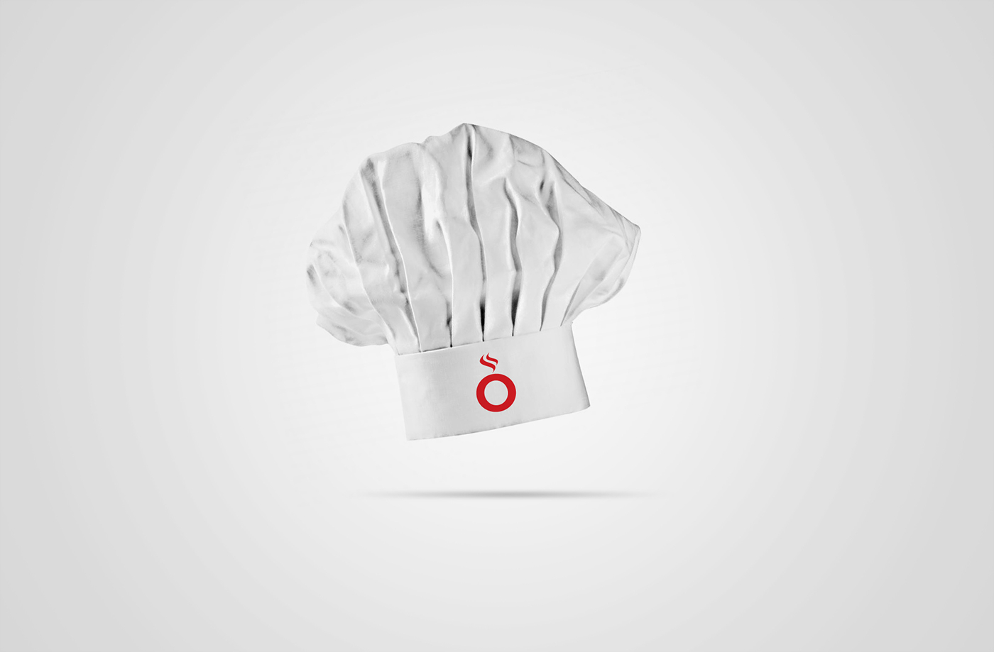
Se tomó la letra “O” como elemento principal por dos motivos: es el centro del nombre, representando así el equilibrio entre ambos extremos del público al cual se apunta; porque se relaciona directamente con la forma de un plato.
Se rescata el color negro de la versión anterior, por sus aptitudes de distinción en lo conceptual y de contraste en lo técnico.
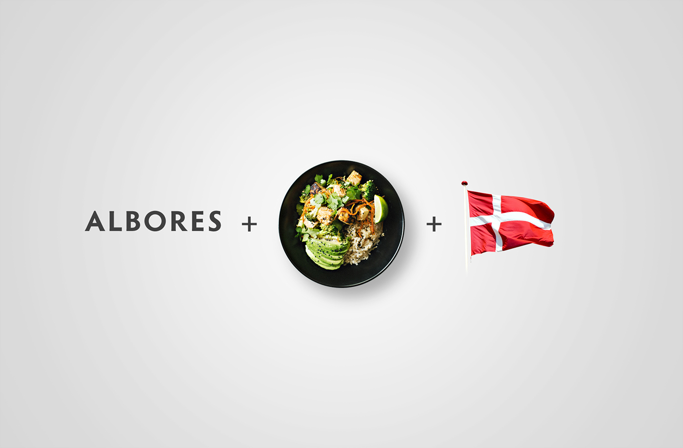
Además de representar los colores de la bandera danesa, el color rojo es elegido para transmitir la fuerza y presencia del lugar, como así también la pasión por la gastronomía.
Además de representar los colores de la bandera danesa, el color rojo es elegido para transmitir la fuerza y presencia del lugar, como así también la pasión por la gastronomía.
-
Readability, direct association with the item, origin, rich history and trajectory, are the main points in which it was focused for the redesign of the brand.
The letter "O" was taken as the main element for two reasons: it is the center of the name, representing the balance between both ends of the audience to which it is aimed; because it relates directly to the shape of a dish.
It rescues the black color of the previous version, for its conceptual and contrasting skills in the technical.
In addition to representing the colors of the Danish flag, the red color is chosen to convey the strength and presence of the place, as well as the passion for gastronomy.