In Fall 2015, the Auditorium partnered with IU Communications to create a holistic branding overhaul that both met the Auditorium's unique design needs and brought the Auditorium closer to the university-wide visual identity. The project scheduling left the Auditorium without a visual identity for the 2016–2017 season, so as the Auditorium in-house designer, I was asked to create a single-season style to bridge the gap between the existing design and IU Communications' forthcoming overhaul.
2012–2015 Identity Examples

Print, web, outdoor, and large format examples of Grey Loon's 2015 visual identity design. A more thorough overview of their work can be found on their site.
Existing designs relied heavily on the use of Helvetica, a single violator bar for important information, and stacked photo slices to represent the variety of IU Auditorium's performance offerings. While heavyweight typography, bold colors and complex photography gave a rich impression of IU Auditorium's offerings, over the years and through multiple applications, the identity began to become visually chaotic and a strong connection to IU was weakened.
The existing photo slices and brightly colored violator bars served a valuable purpose by showcasing the Auditorium's performance variety and drawing attention to the localization info (date, time, Auditorium's URL). Because of the value these elements contributed to the Auditorium brand, I reinterpreted them while moving the color palette and typography back into IU brand guidelines.
Preliminary Concepts

Preliminary and mid process concepts for the 2016–2017 season identity.

Preliminary concepts for show-specific sections of the 2016–2017 season identity, including individual show billboards and brochure pages.
For the 2016–2017 season, I developed concepts using an angled, layered interpretation of last year's photo slices, carried through both season-wide photo imagery and show-specific violator bars. On season-wide materials, the layers gave an opportunity to add IU brand colors into the stacks of photos. On show-specific materials, the layered, multi-colored violator bars became a vibrant focal point for our localization info and provided the flexibility to condense or expand as in motion graphics. Where possible, I added the IU trident to mark IU Auditorium's place in the university.
While the 2012 "Indiana University Auditorium" Helvetica lockup had to be retained for brand recognition and continuity, all other type phased out Helvetica in favor of IU-approved Benton Sans or Georgia Pro. For the 2016–2017 season, I created a vibrant, bold "best of both worlds" design that nodded to previous years' influence while taking a big step towards acknowledging its place in the Indiana University family.
Teaser Graphics for Season Announce
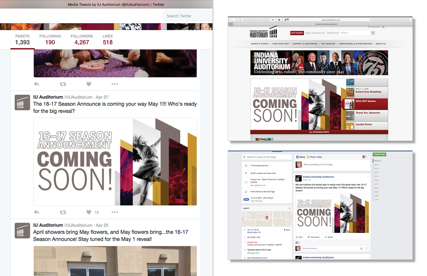
Twitter, website, and Facebook teasers for the 2016–2017 season show reveal.

And finally, season announce applications. . .

2016–2017 season announce billboards in action, promoting the a cappella group Vocalosity.

2016–2017 season announce billboards in action, promoting the Mamma Mia! farewell tour.

2016–2017 season announce billboards in action, promoting the off-Broadway adaptation of Into the Woods.

"Tombstone" posters announcing IU Auditorium's 2016–2017 lineup.

"Tombstone" posters announcing IU Auditorium's 2016–2017 lineup.

Interior lucite posters announcing IU Auditorium's 2016–2017 lineup.

Themed lucite posters announcing IU Auditorium's 2016–2017 lineup. From left to right: student interest show lucite, musically-based show lucite, general show lucite, and most famous show lucite (featuring Dance Theatre of Harlem, Into the Woods, David Sedaris, etc.)

Print ads (Left) and web ads (Right) advertising IU Auditorium's 2016–2017 season announce. I created web ads in each size for both the season announce and each of the Auditorium's 14 shows.

2016–2017 visual identity on IUAuditorium.com's preview of Into the Woods.

2016–2017 visual identity on IU Auditorium's Twitter account.

2016–2017 visual identity on IU Auditorium's Facebook account.

2016–2017 building banners in action above the entrance of IU Auditorium.

2016–2017 season announce trifold mailer (Left) mailed to infrequent ticket buyers, and 16-17 season announce brochure mailed to consistent subscribers.
Full 2016–2017 season brochure.

2016–2017 season branding as applied across print and web advertising for individual shows.


