The FFDys (Fédération Française des Dys) is a structured gathering of associations who act for better understanding, early detection, care and support of people with learning disabilities, from childhood to adult life. Dys is a french short for learning disabilities or a person who has a learning disability, ie. dyslexia, dyscalculia, dysgraphia...
This is the public face of the FFDys :
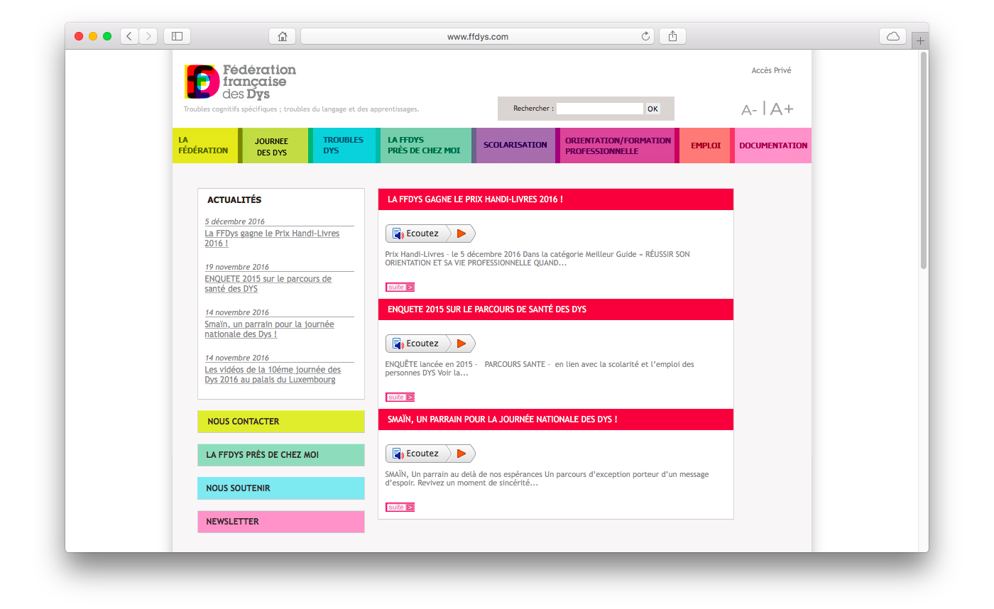
Current logo and website of the FFDys
Towards a new visual identity
It is tempting to focus on the disabilities, representing them instead of the FFDys itself, mostly resulting in something that even a person with no reading disability can hardly read. But we don't want to brand dyslexia, we want to make the FFDys stronger and recognizable.
A logo is meant to be viewed, recognized and read, and when it comes to reading disabilities, the various efforts that one can do to help making text more accessible seem to point towards one common goal : break monotony, break sameness. It can be through a proper choice of font — think open aperture, double story etc. details that will help making a letter different from the ones next to it, and help differentiating look alike shapes like a/o/e or p/q/g — or with alternate line colors for exemple.
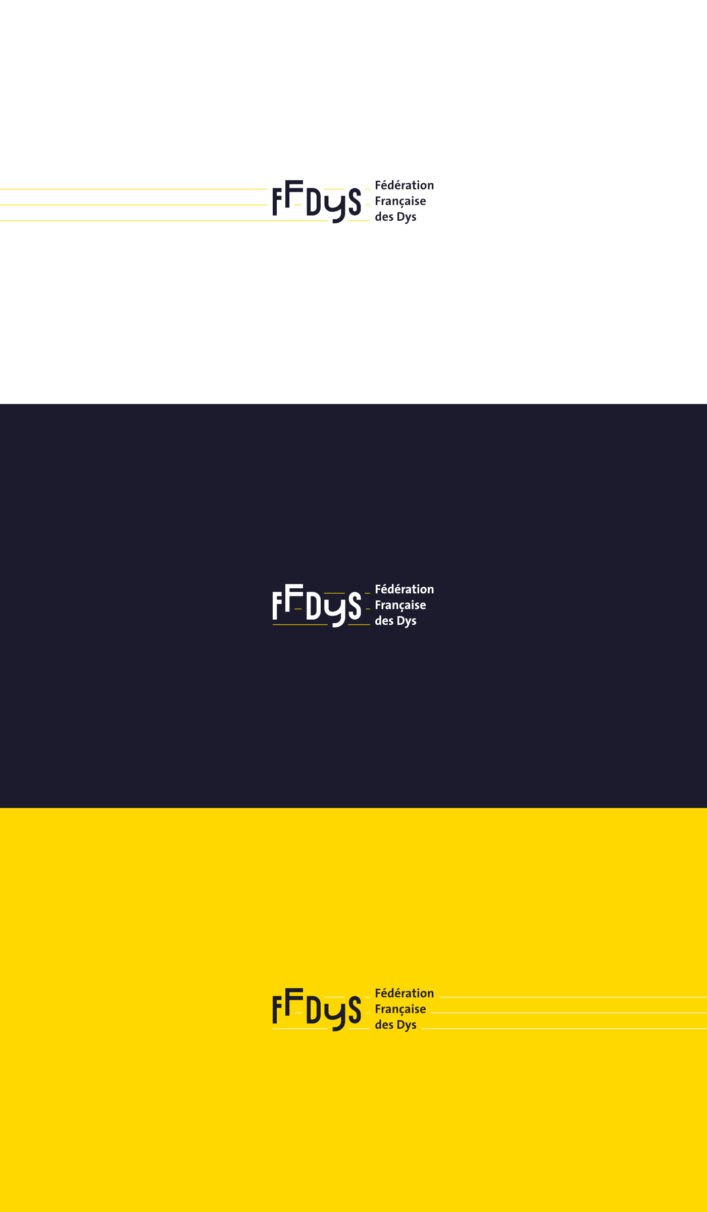
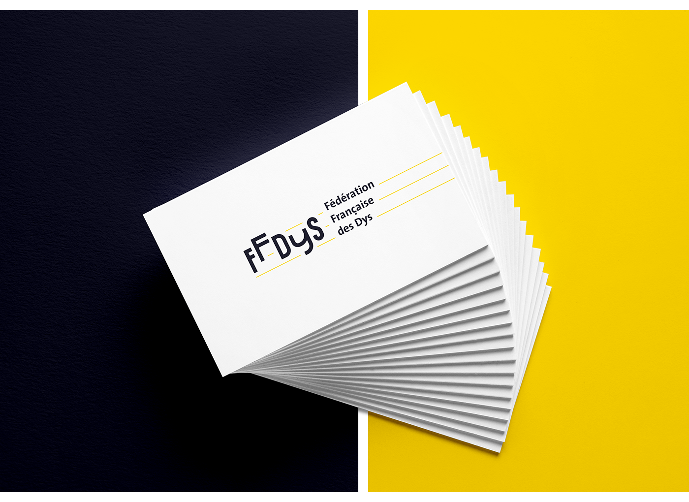
Here it is, using custom shaped letters for the initials and TheSans (from the Thesis font family by Lucas de Groot) for the rest of the words: