THE CHALLENGE
Fabio Viviani Wines was founded by Fabio Viviani, a celebrity chef known for starring in Top Chef. Fabio and his team sought to redesign his wine retail website to emphasize Fabio's personality as well as his recipes and wine pairings. I worked on a team of four to deliver style tiles, responsive website mockups, prototypes, and style guides.
Our client was interested in getting users to visit the existing e-commerce site often for food and wine pairings ideas, and thus hoped to transform it into something closer to a lifestyle blog. By leveraging Fabio’s personality and media presence, they hoped to get users excited about drinking Fabio’s wine and pairing it with his numerous recipes. Since the current brand was not well-established, the client was open to a complete rebranding of Fabio Viviani Wines. We distilled down to a single challenge to solve for.
How do we redesign Fabio’s site to emphasize food and wine pairings and visually embody his personality?
We first dug into the UX rather than immediately designing screens, a lesson learned from my experience on the UberGo project. The current site resembled a typical wine e-commerce site, and Fabio’s name was not even mentioned until halfway through the page. With the client goals in mind, I approached the existing website as if it were a wireframe and sought ways to emphasize Fabio’s personality and his recipes.

DESIGN DIRECTIONS
If Fabio’s personality were to emanate throughout the site, we needed to know a bit more about Fabio. We asked the client about Fabio and how we could visually embody his various qualities. Fabio enjoyed a modern rustic style, which a visit to his Chicago restaurant confirmed. The group also stressed his passion for Italian cooking as well as his playful and light-hearted personality.

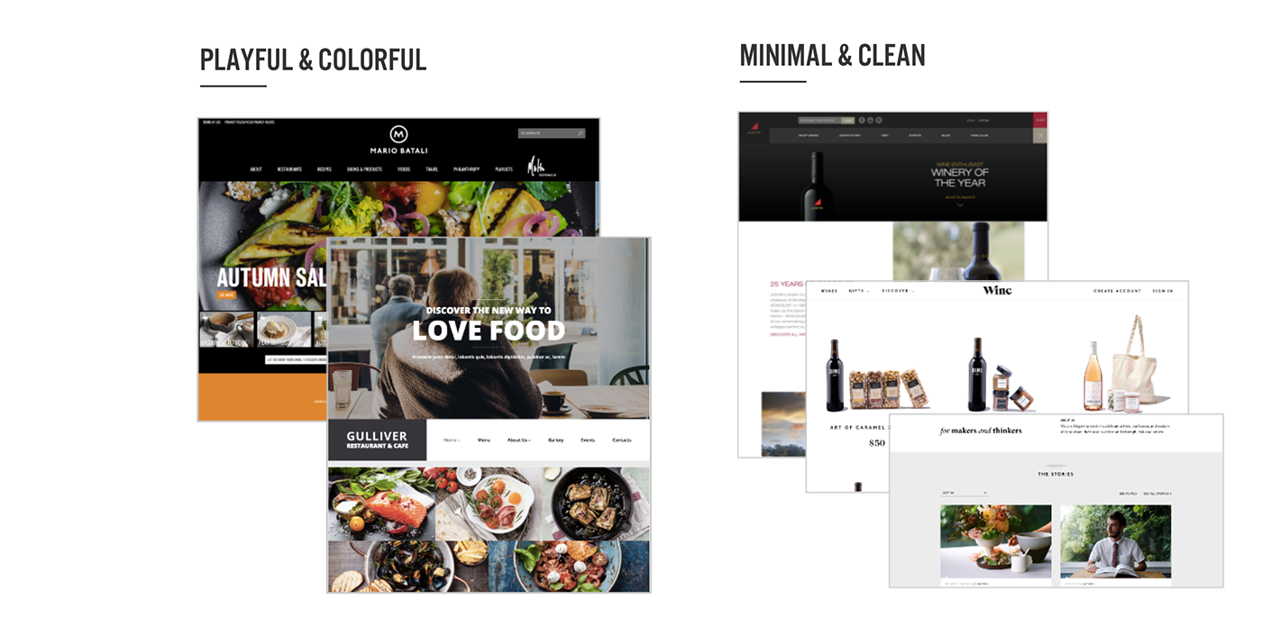
The client agreed that these principles accurately portrayed the essence of Fabio on the site. Next, we looked for inspiration from food blogs and celebrity chef websites. We discovered that food blogs tended to be colorful and photography heavy, bordering on overwhelming. There was often too little white space and large, blocky typography. Wine sites, on the other hand, were minimal and clean, utilizing large areas of white space and delicate typography to create a simple and elegant mood.
Since Fabio’s site was a combination of food and wine, we strove to combine the two aesthetics, keeping the site playful but clean. With our research and design principles in mind, I created three style tiles to present to our client.

This minimal style uses white space to create an airy and calm interface. The green herb embellishment conveys the Italian freshness that Fabio embodies.

This style is friendly and approachable, with instagram-style photography that resembles a food blog. The wine is displayed with its flavors or pairings to convey flavor information using simple visuals rather than through large amounts of copy.

This modern rustic style uses textures and and a combination of warm and cool colors to create a comfortable atmosphere. The client preferred this style tile over the others, since it fit Fabio’s personality perfectly
The client was pleased with my designs, and gave overwhelmingly positive feedback. Although this was a good sign, we soon realized that the client lacked a clear vision for the Fabio Viviani Wines brand. They imagined all of my styles working for Fabio’s website, which made it difficult to decide on a direction. I continued with a primarily modern rustic style because it best aligned with what I knew of Fabio’s personality. I also incorporated elements of the other two styles that the client enjoyed.
FINAL DESIGNS
In my final responsive designs, I used textured typography and backgrounds to create an organic warmth. I chose playful photos of Fabio that showcased his playful personality and passion for food. The simple iconography makes wine pairing easy and accessible. I even added an interactive element so the user could easily find recipes for different types of wine.

The homepage simplifies wines by displaying them with fruits and other flavors they contain. Recipe pairings are clearly indicated by simple food iconography. Various textured backgrounds and fonts convey a rugged charm, and splashes of vineyard imagery create a fresh, Italian feel.

Clean-cut wine and food photos with a “+” sign in between them emphasizing the importance of the pairing. Large, weathered typography paired with typewriter font keeps the page playful. From this page, you can either purchase the wine or see more recipes.

Users go through a simple and pleasant process of choosing a recipe pairing for their wine. A progress bar guides the user through the experience.
The desktop website is responsive for mobile, and does not lose its simplicity and charm when translated to a smaller screen. Check out the desktop prototype here.
WHAT I LEARNED
With more time, further user testing of the gamification portion of the site would allow us to measure its intuitiveness. Since we received little to no UX deliverables, I would collaborate with UX designers to create at least one persona to improve and guide future designs. Fabio Viviani Wines expects to launch their new site in 2017; check back for updates then.
This was my first client project, and we were given much less guidance from our client than I had expected. I realized that every client has different expectations from designers. For this project, our client was open to taking the brand in a number of directions, which gave us more creative freedom but made it difficult to decide on a design direction. In my Emotilink project, the client guided us to the exact brand they wanted, which gave us less decision making power but made design decisions easier. I am glad I got to experience both extremes of client work.
