As I was browsing through CrateJoy, I came across Magickal Folk and once I looked at the products they sell, it grabbed my attention because it is all about witchy and magic things. They get goodies to be able to perform rituals. Below is my project where I redesigned their logo and their homepage of the website, the checkout page, and the confirmation email, you'd get when an order is placed.
Magical Folk Redesign

Above is the design of the homepage of Magickal Folk. I was inspired mostly with the darkness. The products they sell is to perform rituals and are considered magical and dark. The look for website was inspired by that. I used the gold color to really highlight certain buttons like the "Order Now" or "Begin Your Journey." I also wanted to give the website itself the dark colors.
Checkout Page

This is the checkout page. I decided to go a little less traditional look. I added the "creepy trees" texture from the homepage and just center all the information for the checkout boxes.
Confirmation Page

This is where the website will go after an order is placed. I added the wood texture as a background picture and the raven at the top because according to Magickal Folk, the raven is an important part because it is a guide and will help throughout the process. That's why it's so big on this page.
Creative Process

When I first started coming up with the logo design, I was being too abstract. This were my first on-screen sketches of a logo.

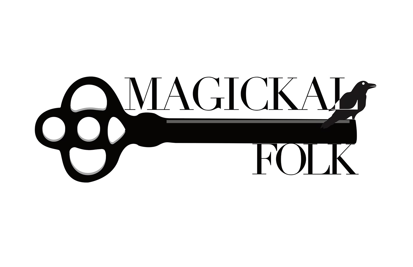
When I started cleaning up the logo and started adding words, I used the raven and the key more. According to the website, the raven symbolizes help. They are supposed to be with you guiding you throughout the journey. With the key, you are discovering the magick. That's why I incorporated both of those elements to make my final logo which is displayed at the

As I was starting out this project, I wanted to incorporate the colors green, gold, and silver because they remind me of earthy things, which was the mood I wanted to go for at first but that didn't work out. I ended up deciding on using only dark colors (black) and use gold as an accent color.

Here's the mood board.
Final Product