Introduction
For this assignment, we were tasked with creating a poster from one of the ancient exhibits at the Royal Ontario Museum featuring an artifact found within that exhibit. The lovely and talented Doug Darrah toured our class through the Japanese, Chinese, Byzantine, Roman, Egyptian and Grecian exhibits. I was overwhelmed by all the different fascinating artifacts from several different exhibits. I stayed after everyone had left just to study them all closer. Knowing we had to do this poster by hand with pencil crayons, I wanted to challenge myself with something intricate and interesting. When we were in the Byzantium museum, Doug begged us to do a mosaic. I loved the mosaics so much, I was happy to oblige.
Materials
- Canson Mi-Tientes paper
- Canson Mi-Tientes paper
- Faber-Castell Pencils
- Kneadable Erasure
- Smudge stick
- Graphite pencil
- Adobe Illustrator

Creative Process

The artifacts in the Byzantium exhibit were so large and ornate I thought it would be interesting to have a poster cropped in really closely, focusing on the intense detail put into each artifact. For my 9 thumbnails I did a mixture of ideas featuring sculptures and mosaics. 1, 6, 7 and 8 were approved. I decided to go with 1 - the closeup of the eyes of the mosaic of the goddess Artemis.

The original mosaic.

I also did a colour study with my Faber-Castells on the rough side of the Canson paper (admittedly, a messy attempt). I thought the rougher side would make the stones look more realistic. I chose a champagne coloured paper and stuck with earthy toned Faber-Castells.
Workflow

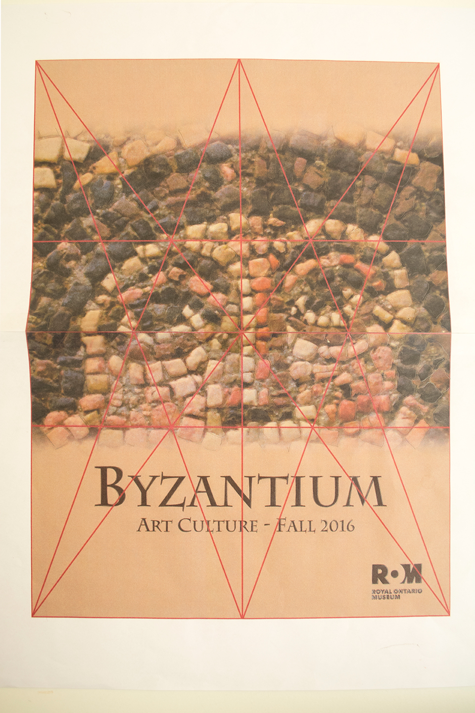
To make a mockup for the final design, I was provided an Adobe Illustrator poster template with the title and ROM logo already in place. I placed the original image of the mosaic I had taken at the ROM and cropped it in really tightly to the eyes. I also added borders at the top and bottom for a more intense, cinematic look.

Since my idea required the final product to stay absolutely true to the mosaic's stones and pattern, I scribbled graphite on the back of the mockup and then transferred it onto my final Canson paper. It needed to look exactly like the original or it would've just looked like a pile of rocks.

I started by laying down the colour of each stone very lightly so I wouldn't get confused and so I could see Artemis' face coming together in the very early stages. I added white to the top left and darker colours at the bottom right of each stone, giving a sense of source lighting and to make the stones pop out more. I used the smudge stick to help blend together the colours within a stone.

I kept reworking and reworking the colours until they looked as close to the original as possible. I then very lightly shaded the grout in between the stones and added a cast shadow at the bottom right of each stone.
Final Product

Conclusion
I was ecstatic with the final result of my poster. However, if you've looked at this poster as closely as I did for as long as I did, you'd have a hard time seeing the face, too (it's almost like a vision test!). But I know it's in there and I'm proud of the result. I'm glad I chose the design I did, it really challenged me in a medium I was not yet confident with and I've come out of it understanding a lot more about working with pencil crayons than I did when I first started.


