


Batch
– Brand Identity, Packaging
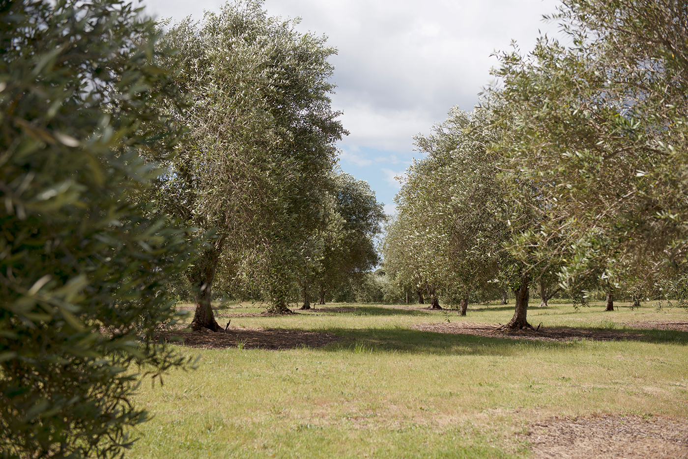
Batch is a self-initiated promotional project aiming to encapsulate who we are, as collaborators who excel in our client partnerships. Our relationship with the producers of a small-scale, locally grown olive oil from Mangawhai was the perfect vehicle for this. Olive oil symbolised in so many ways the qualities of partnership; it is a versatile product that enhances whatever it is matched with. The provenance of the oil, as an enterprise created by the community of Tern Point to grow, tend, pick and press the olive oil, brought the concept to full circle.
Making a Field Trip
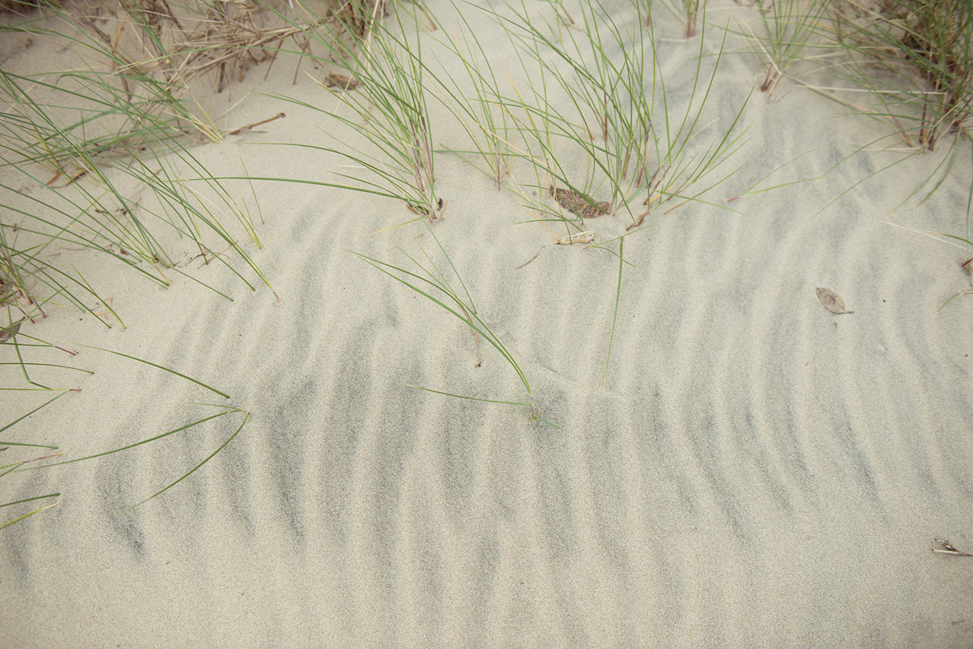
With any project we undertake, we consider it essential to the design process that we immerse ourselves in the brief at hand. The team made an excursion to Mangawhai to experience the groves and document the locale in which the olives are grown.
And what better excuse to make a day trip out to the beach, in the name of research?


Generating the Design
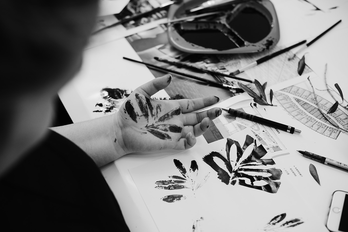
We wanted to reflect the natural and crafted aspects of the product – this is olive oil in its purest form, grown in an environment where the elements of sun, land and sea come together. As a whole team, we spent an inking session developing the logoform and abstract ink marks that represented these elements and would lend an organic, free-form feel to the design.


A Cohesive Visual Identity
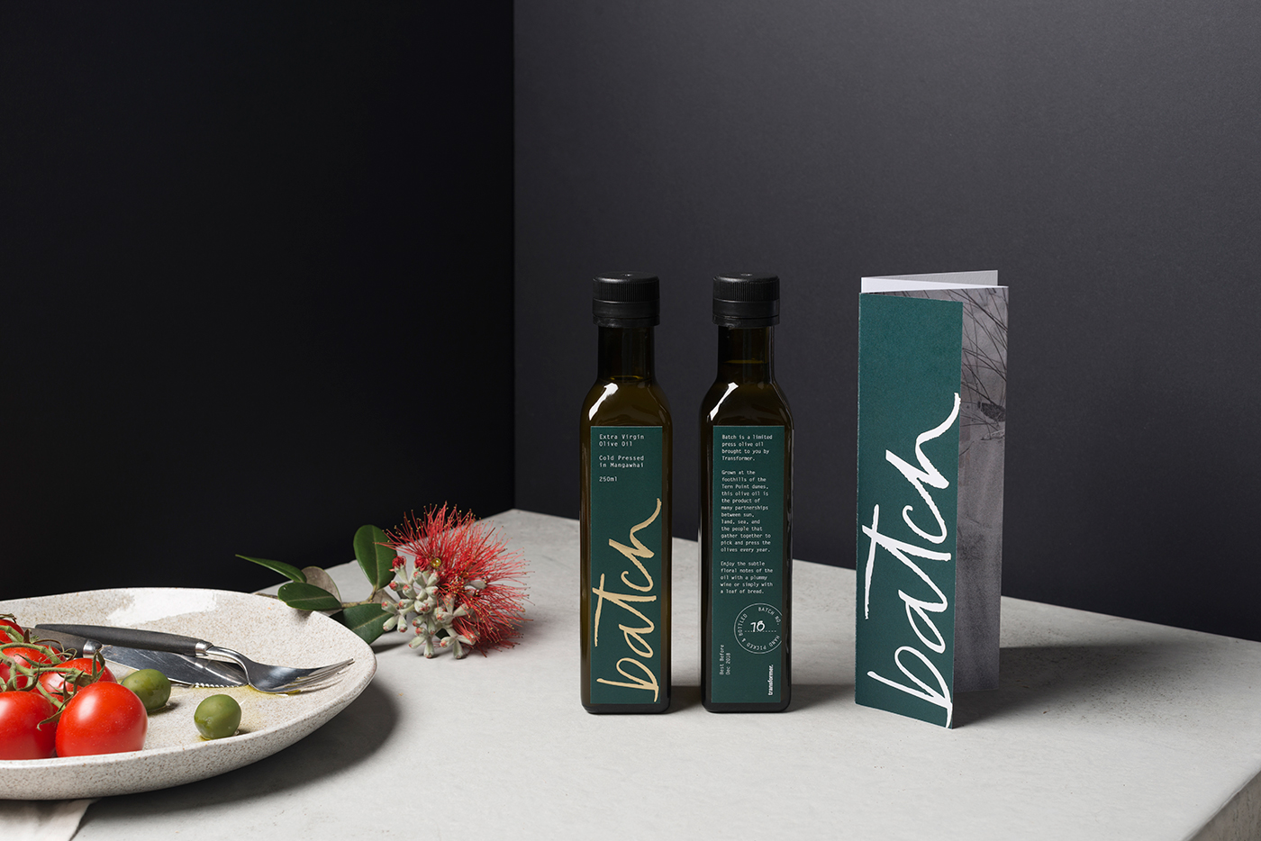
The hand-lettered logotype and ink marks were digitised as visual assets that could be applied to each component of the packaging, and within our social media content.


Telling the Story
We launched a teaser on social media spanning several weeks to build momentum around the product, including a Facebook Canvas ad that gave previews to the process and inspirations of the project. Content was structured around a sequence of photography from the road trip, ink assets and typography.
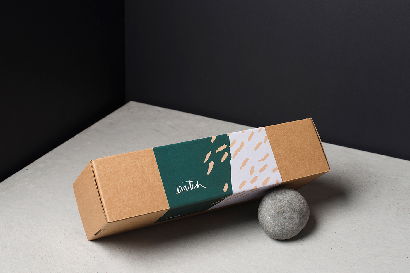

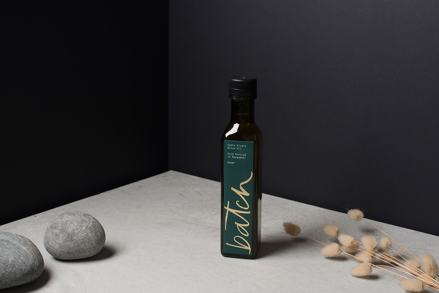
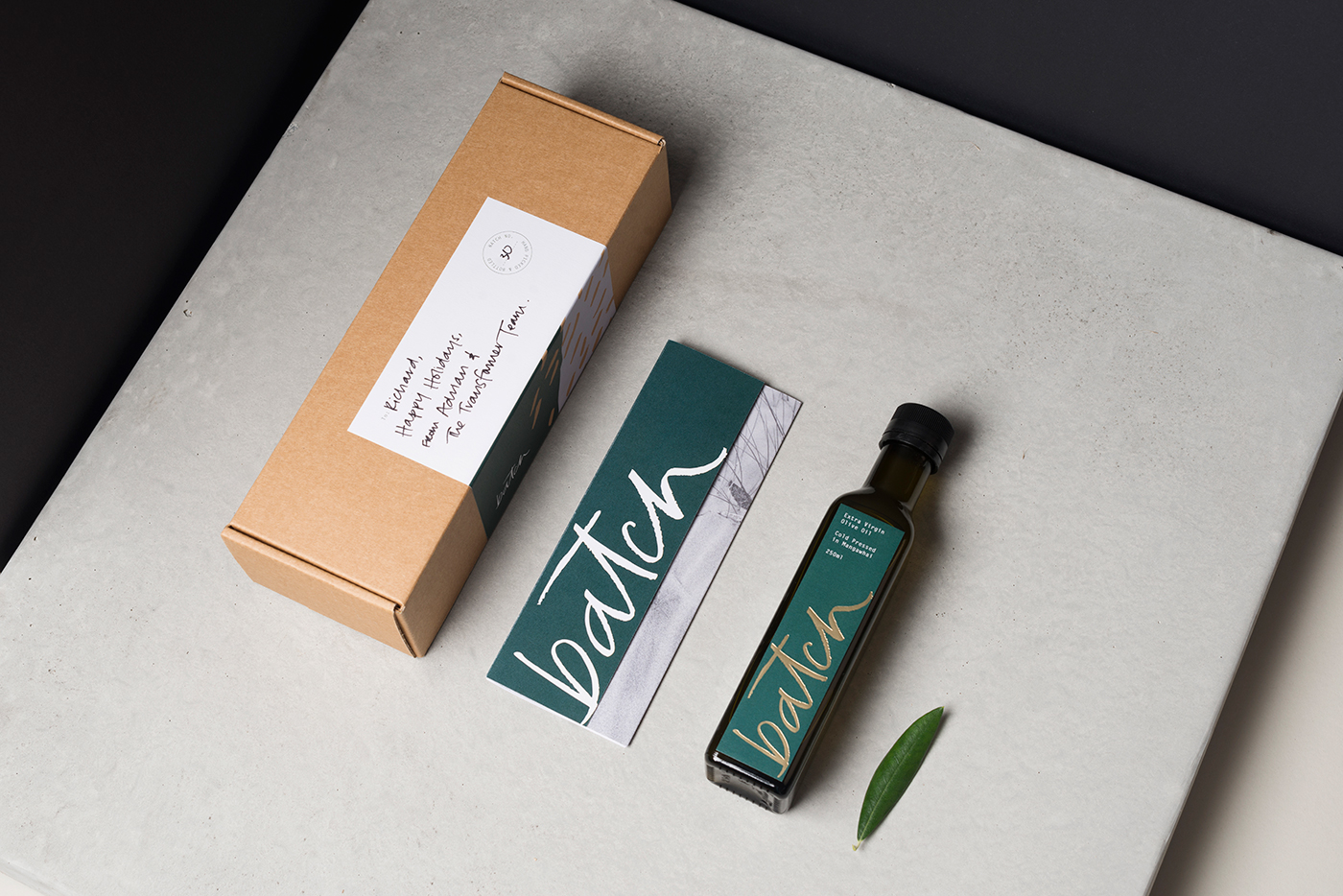
The Packaging
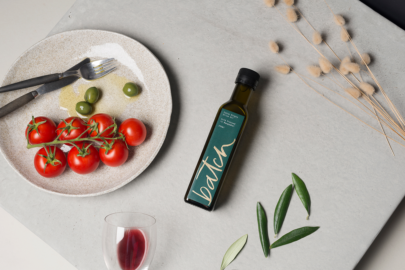
We chose to package the olive oil in a cardboard box, nested in wood shavings to reference the hand-crafted nature of the product. The bottle label was foiled in a champagne gold to offset the ‘spinach green’ dominant colour of the Batch identity. Another essential component to Batch was an accompanying accordion-fold pamphlet that described the origins of the project and product.


The Final Product
The finishing touch to Batch was to number and hand-write messages to the recipients directly on the bottle and box label.
Disciplines
Branding / Art Direction / Copywriting / Photography / Digital


