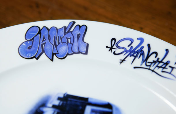
Together with the Pata Negra’s interior graphic treatment, we designed a dining set (tableware / napkin / cup) to match the street art “look-and-feel” of the restaurant’s atmosphere. Taking inspiration from Lovegrove & Repucci’s original New York and London tableware sets, we created a Shanghai version that fuses together traditional Jingdezhen blue / white porcelain, graffiti type design of Chinese characters, local-Shanghainese dialect slang, and other fun Spanish / Shanghainese culturally relevant elements.
We wanted to feature Chinese characters on the plates because we don’t see enough of them in the local street art scene in China – they are also just so much fun to play with in a graffiti type design style. The characters we chose represent an interesting linguist quirk that we’ve always been intrigued by: the transliteration of English phrasings into local Shanghainese dialect pronunciations. These phrases are not part of standard Mandarin, and some Shanghainese don’t even know that they originated from English pronunciations. Phrases like: 哇色 (wa se – worse), 烂糊面 (lan hu mian – love me), 着台型 (zhao tai xing – dashing), 混枪势 ( hun qiang shi – win a chance), etc. Other tags on the plates reference core Spanish elements of the restaurant, like: tapas, vino, jamón, etc.


The bus is a retro-style electric bus used in Shanghai in the 70s / 80s – we tagged it up with the Pata Negra logo,烂糊面, and a customized 南京路-巨鹿路 (Nanjing Rd. – Julu Rd.) travel line sign as the restaurant is located on Julu Rd.. The sidecar motorcycle used to be popular mode of transportation in Shanghai, and can still be spotted on the road her every once in a while. We tagged it up with 烂糊面 and the Pata Negra logo.