Project Background And Objective
As of 2016, there has been a lot of talk surrounding a potential move for the Oakland Raiders. They have called Oakland home since 1995 and have one of the most devoted fan bases in the NFL. Recently, Las Vegas has come onto the scene as a landing spot for the franchise and they are getting a lot of support.
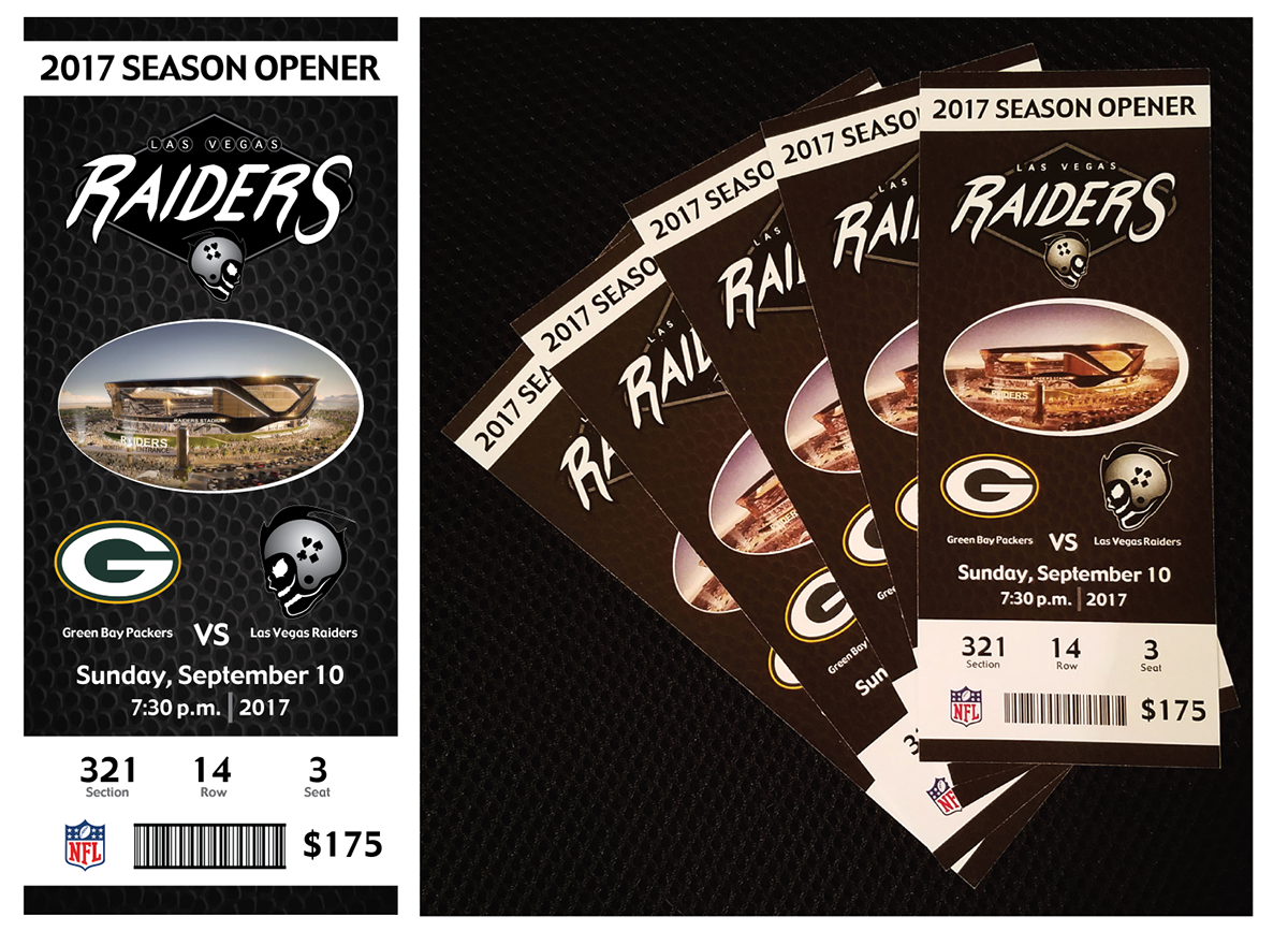
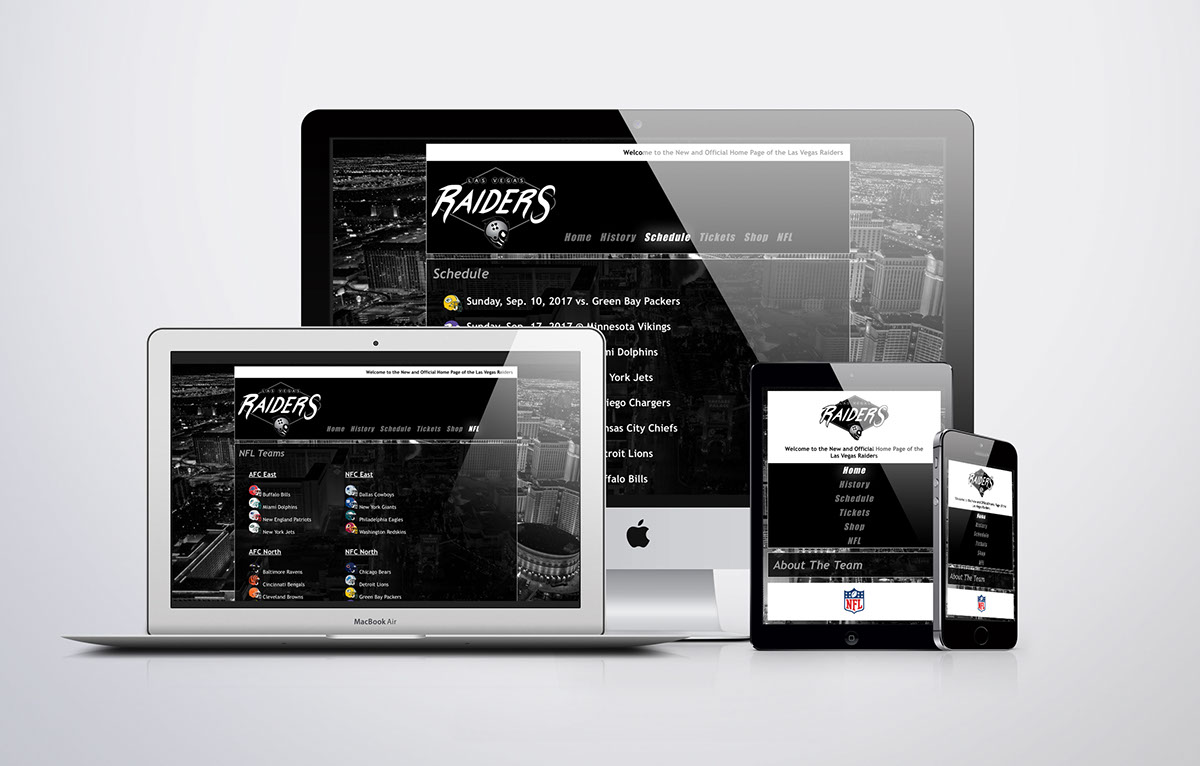
I decided to create a logo and a few marketing materials for the potential move to Las Vegas. Gambling is legal, Oakland has one of the oldest stadiums in the NFL and their is a lot of value that could be added to a franchise with a move to a bigger market such as Las Vegas. I also added a few pieces to my work such as a ticket stub, a mockup of the new field, a team website and even a t-shirt.
Research
I attempted to find a new team name/mascot for the Oakland Raiders, but with their extensive fan base and iconic Silver and Black color combination, I decided to keep the team name and colors and simply change the city from Oakland to Las Vegas. In addition to the iconic Raiders logo, I wanted to try and keep the "skull and helmet" look while giving it a fresh face lift; literally, in this case.
Concept
It did not take me very long to come up with a logo that I really enjoyed and felt was appropriate for not only the Raiders franchise, but Las Vegas as well. With Las Vegas a lot of things come to mind; "what happens in Vegas, stays in Vegas," "sin city," gambling, the Las Vegas Strip and even the "Welcome to Las Vegas" sign. I decided to base my design around the shape of the "Welcome to Las Vegas" sign and I incorporated my own font for the RAIDERS text, which was made entirely out of strokes.