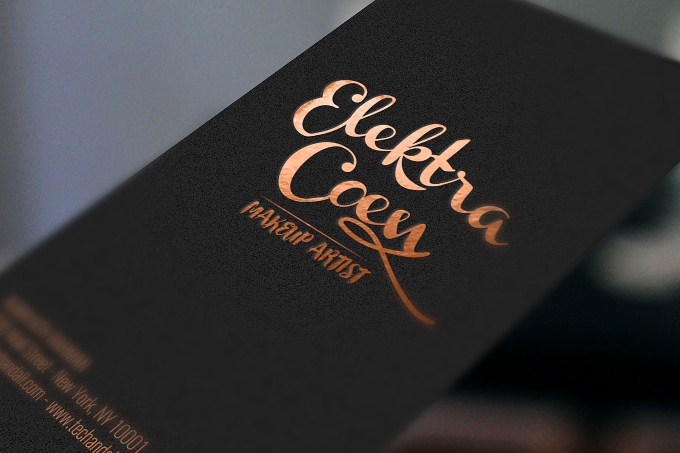
The project required to design a logo and a professional looking website. Elektra Coen style is simple, modern and fresh and that is reflected in her clientele, which is based mostly in the fashion industry.
The website has a clean layout and is easy to navigate. The site includes four sections; home, about, portfolio and contact. The primary branding colors for Elektra’s logo is black. This is because it reflects power, sophistication and seriousness. The hand made font used for the logo word-mark is curvy, fun and modern. The combination of the black color and the handmade font gives the perfect balance for the client’s branding.