Octave One
Identity, Promotion & Vinyl Artwork
Identity, Promotion & Vinyl Artwork
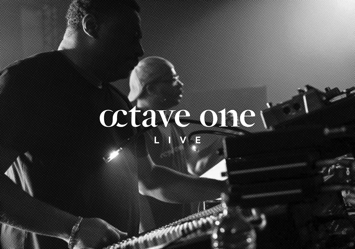
Resident Advisor recently named Octave One number 7 in their annual top 40 poll of the best live acts, commenting that the Burden brothers “play the cream of underground clubs as well as big-budget festivals, and their arsenal of classic Detroit techno strikes chords with both heads and casual fans”.
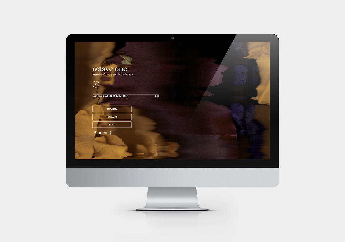
Octave One approached us for a rebrand, with the visual identity aiming to reaffirm their status as a standalone, live, electronic, headline act, whilst also having the ability to to connect with a younger demographic without alienating the existing audience.
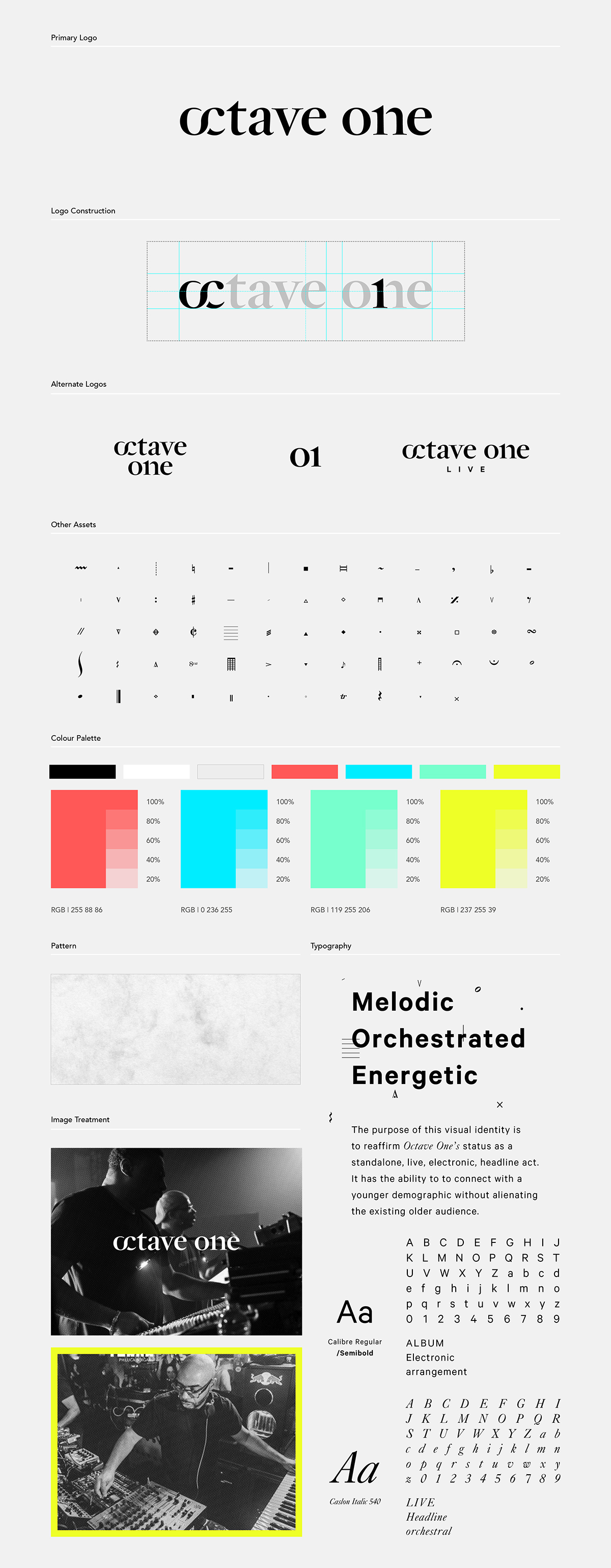
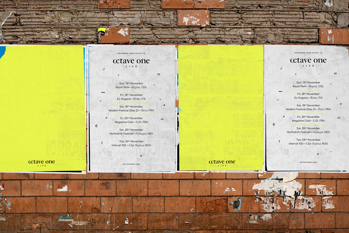
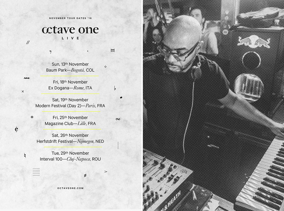
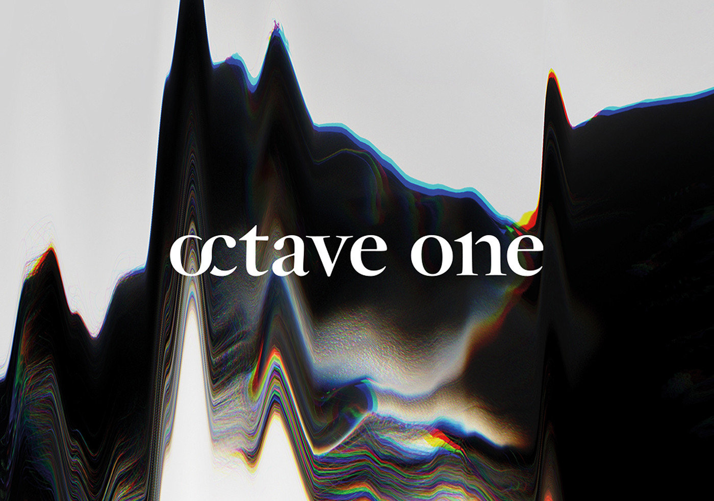
We wanted to reflect the juxtaposition of influences in their music - the deconstructed orchestral sounds mixing with techno, whilst also paying homage to the ingenuity of their technical live setup; aptly named ‘The Mothership’. Therefore, the logotype contains a cleverly integrated symbol for ‘octave’ and a numerical ‘1’. We also came up with a visual identity system loosely influenced by music in notation form and the symbols and shapes associated with this in an experimental and unexpected contemporary format. The brand values are communicated through the use of clean typography, minimal lines and a largely monochrome palette disrupted by occasional flashes of neon colour. Staves mix with typographic forms, sheet music becomes deconstructed and subverted and broken pieces of musical symbols are used as flourishes alongside clean type.
Octave One approached us for a rebrand, with the visual identity aiming to reaffirm their status as a standalone, live, electronic, headline act, whilst also having the ability to to connect with a younger demographic without alienating the existing audience.
We wanted to reflect the juxtaposition of influences in their music - the deconstructed orchestral sounds mixing with techno, whilst also paying homage to the ingenuity of their technical live setup; aptly named ‘The Mothership’. Therefore, the logotype contains a cleverly integrated symbol for ‘octave’ and a numerical ‘1’. We also came up with a visual identity system loosely influenced by music in notation form and the symbols and shapes associated with this in an experimental and unexpected contemporary format. The brand values are communicated through the use of clean typography, minimal lines and a largely monochrome palette disrupted by occasional flashes of neon colour. Staves mix with typographic forms, sheet music becomes deconstructed and subverted and broken pieces of musical symbols are used as flourishes alongside clean type.
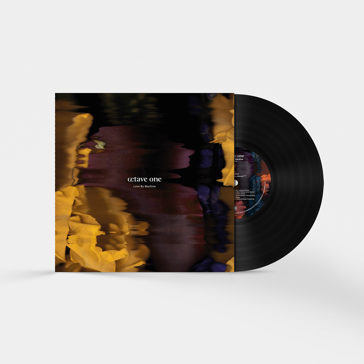
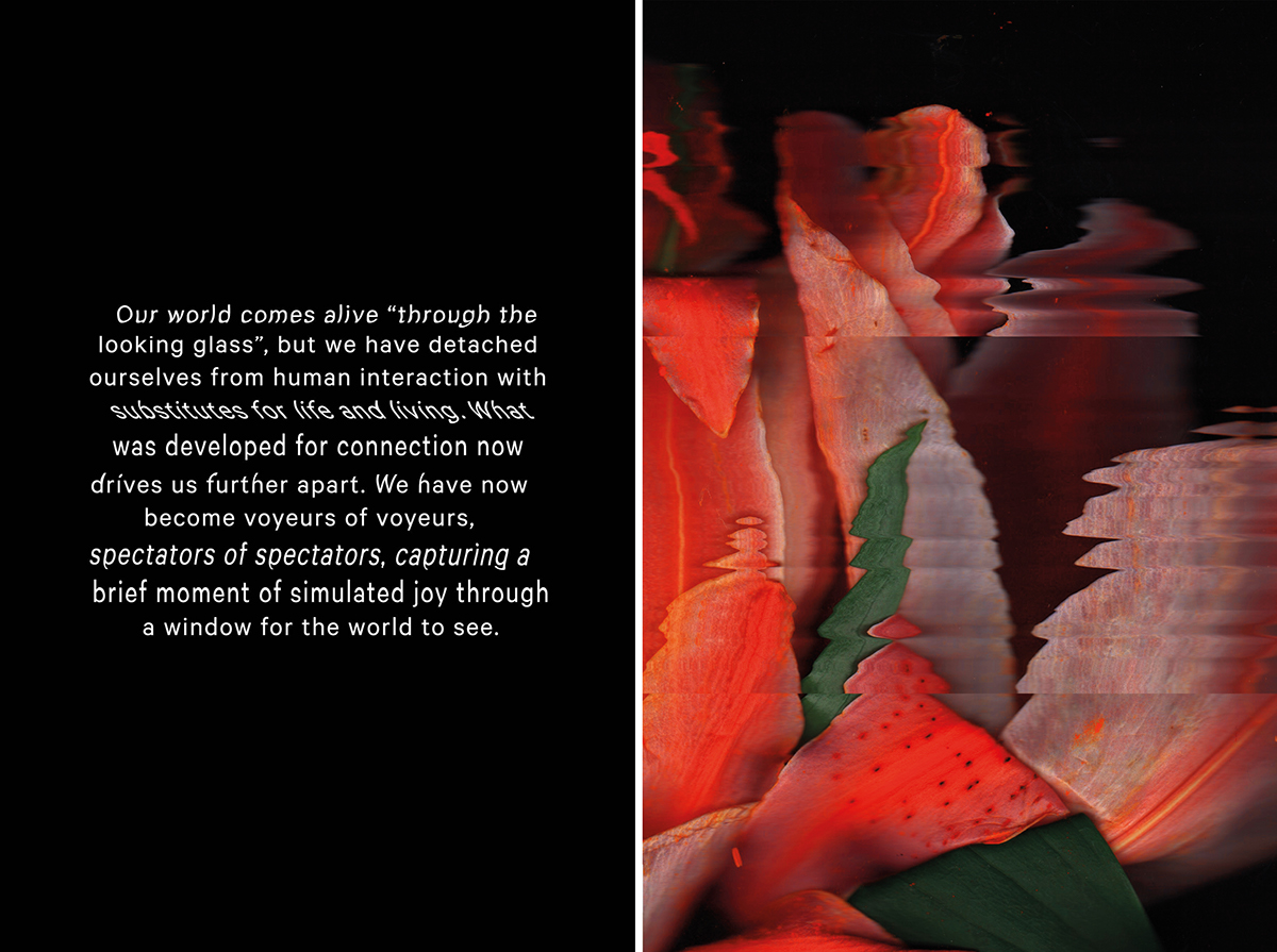
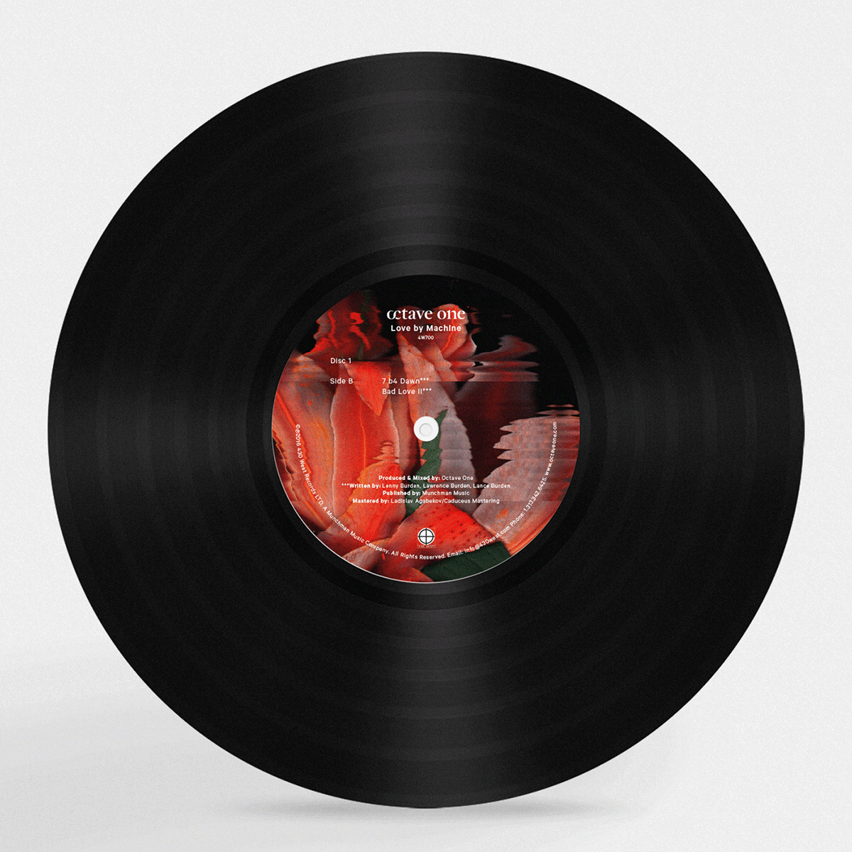
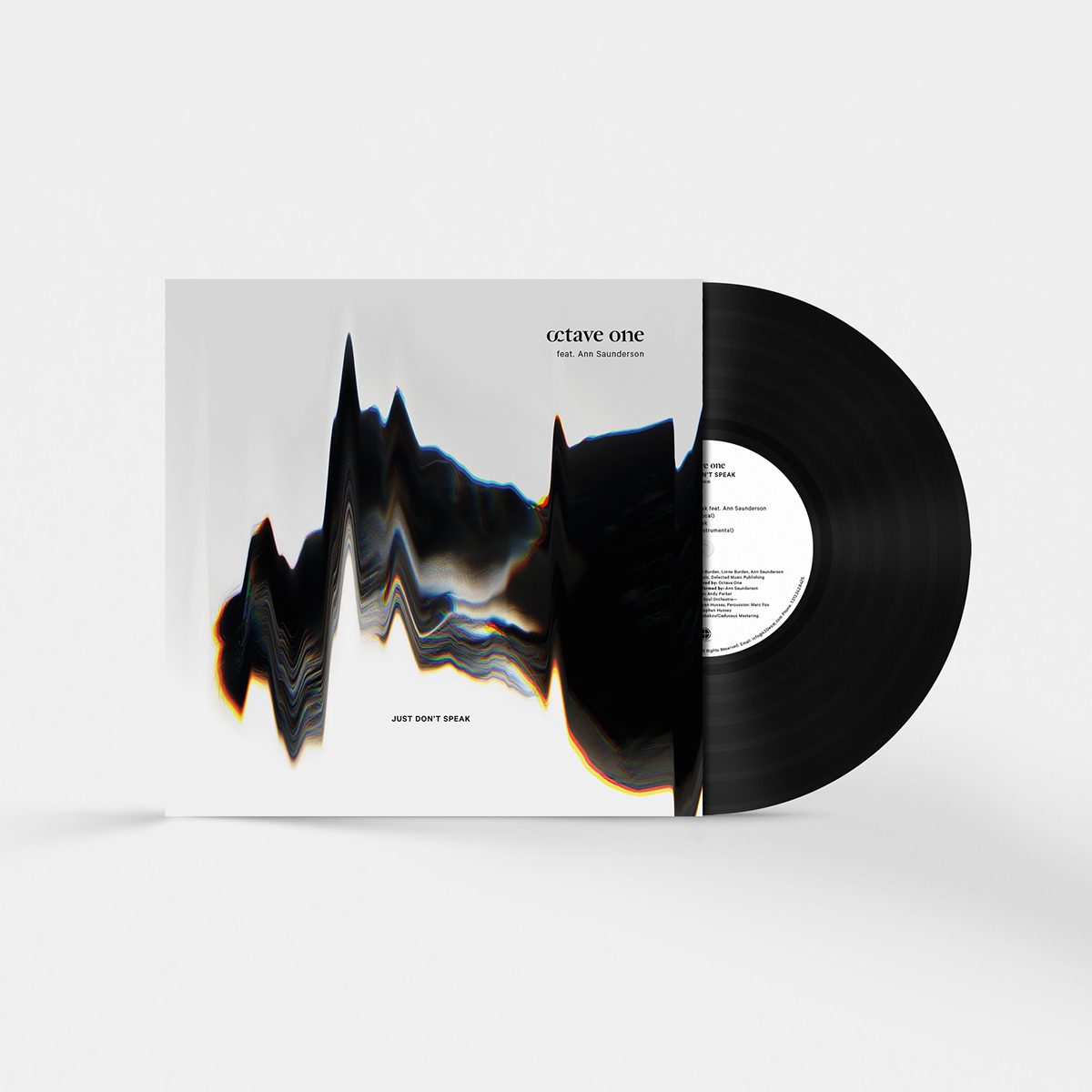
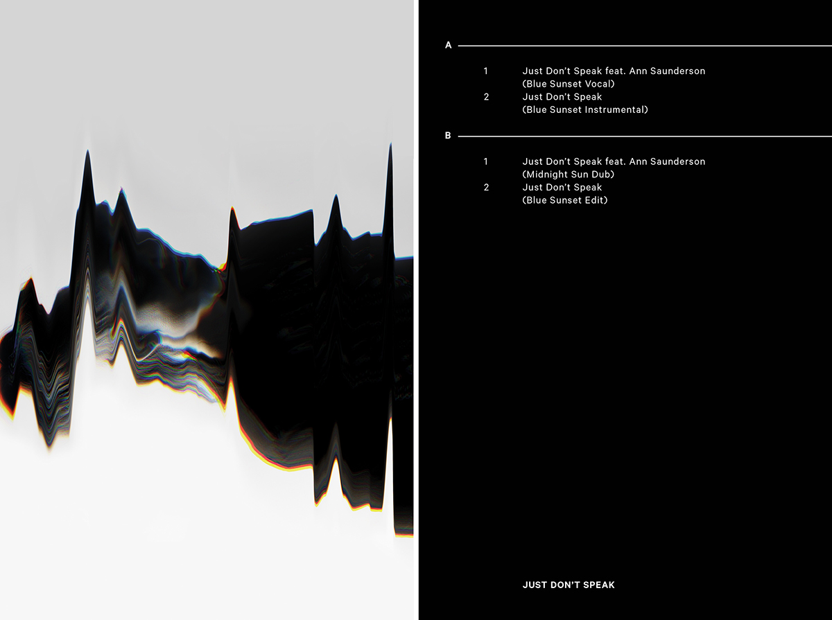
We were also commissioned to design vinyl and CD artwork for their EP ‘Love by Machine’, and the first single from this, ‘Just Don’t Speak’ (ft. Ann Saunderson). The backstory of the EP was that our world comes alive “through the looking glass”, but we have detached ourselves from human interaction with substitutes for life and living. What was developed for connection now drives us further apart. We have now become voyeurs of voyeurs, spectators of spectators, capturing a brief moment of simulated joy through a window for the world to see.
We took this central theme of the album and looked into how technology and the way in which we exist and share information online creates layers and layers of replicated information, gradually distorted and degraded in the process of copying and sharing. We started by creating a visual for the EP focusing on scanned and distorted flowers; a symbol of love literally altered by machine. The artwork was kept abstract, impactful and strong, with a focus on beautiful, intricate details and colours. We worked in the same theme on the single artwork, but incorporating the oppressiveness of the name ‘Just Don’t Speak’ into the art direction. We shot a portrait of a female facing away from the light, her face distorted by shadows, and then applied a high level of post-production and degradation, turning the visual into the shape of a soundwave formation to lend a sense of ambiguity.
Credits
Animation & Website by Rising Digital