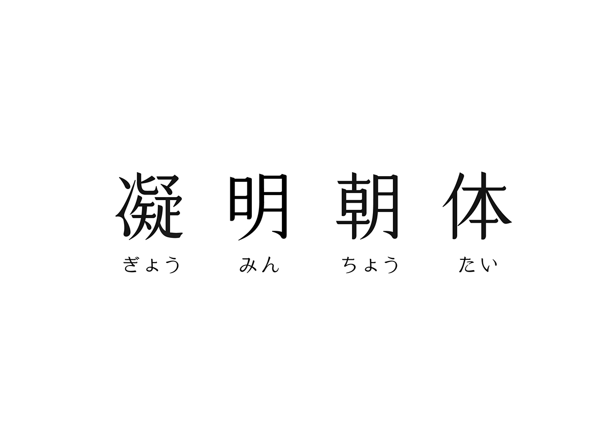
凝明朝体|Cream Mincho
AD+D:Bohan Shih
-
-
December, 2016
這個字體是來自於2015年底「瀚字選」標準字設計展的延伸。
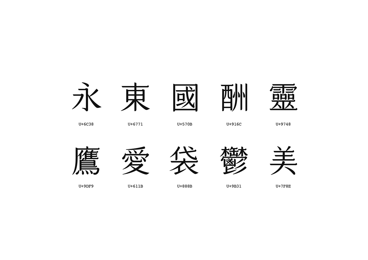
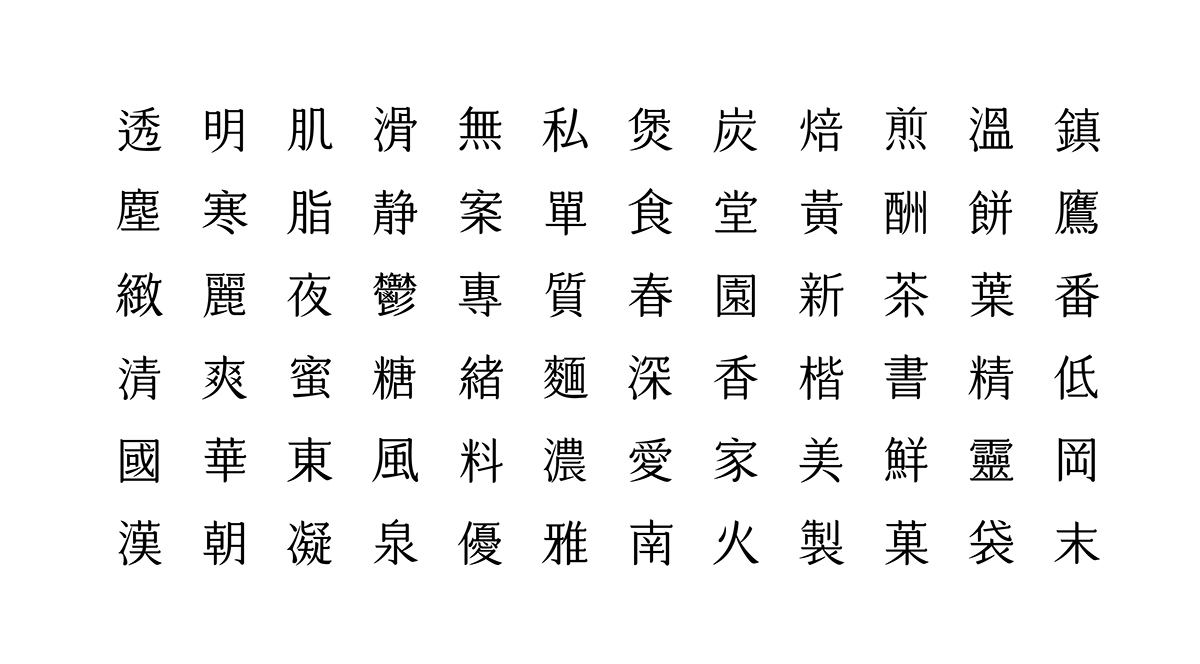
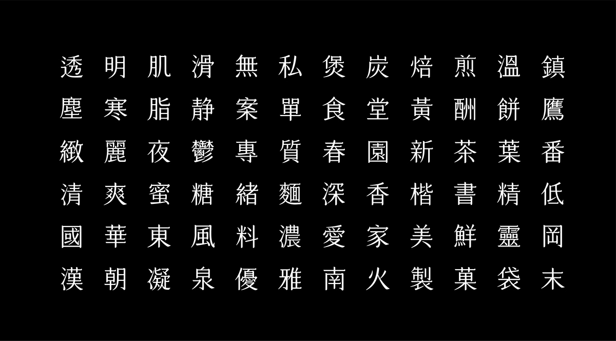
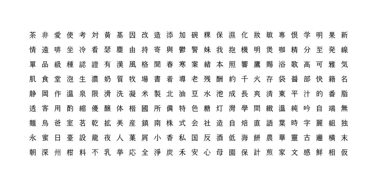
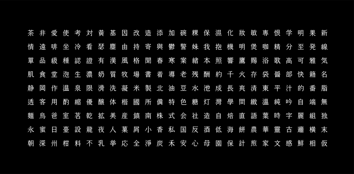
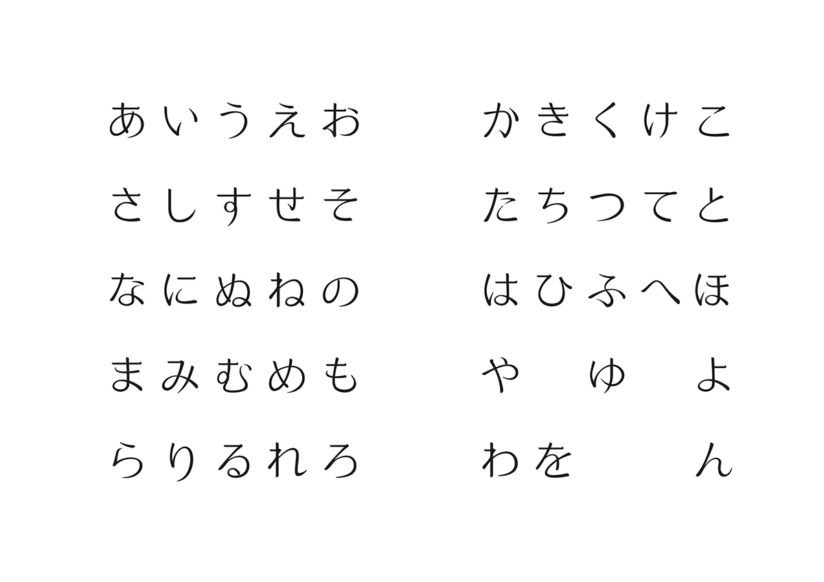
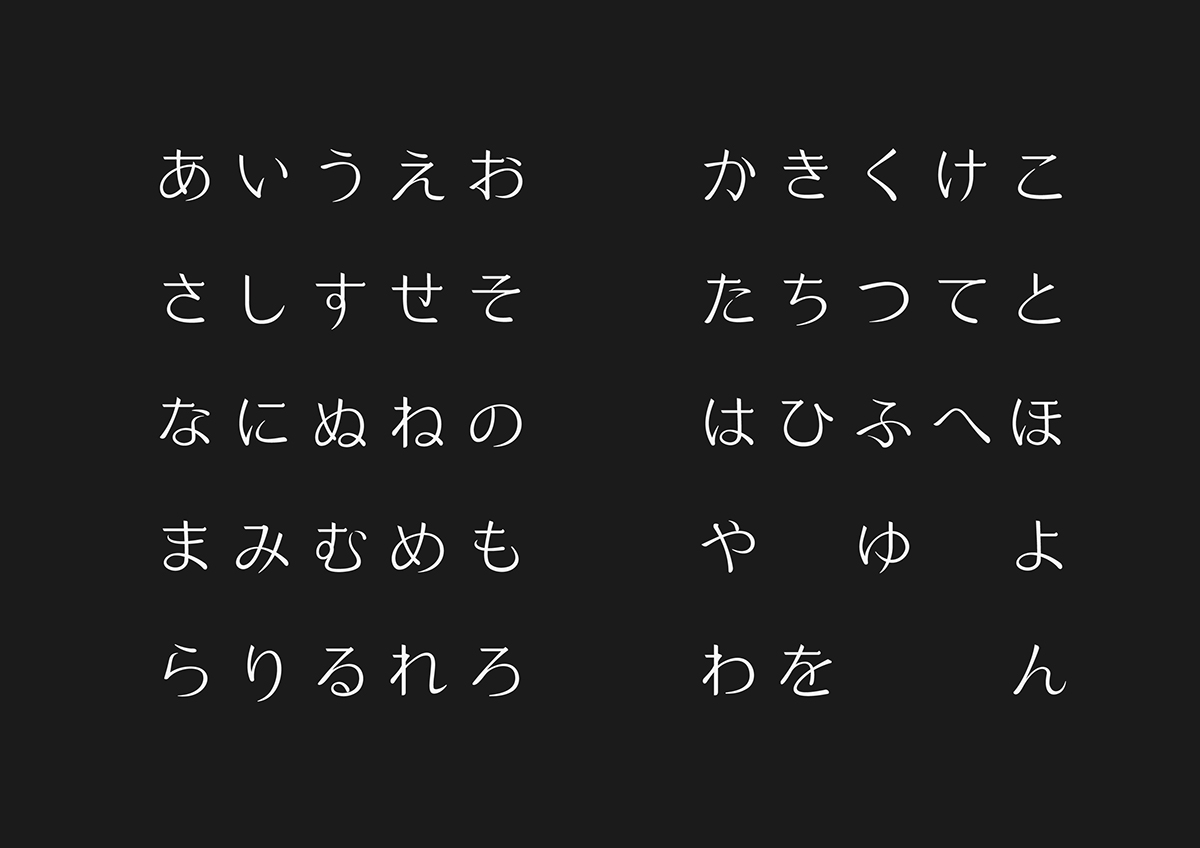
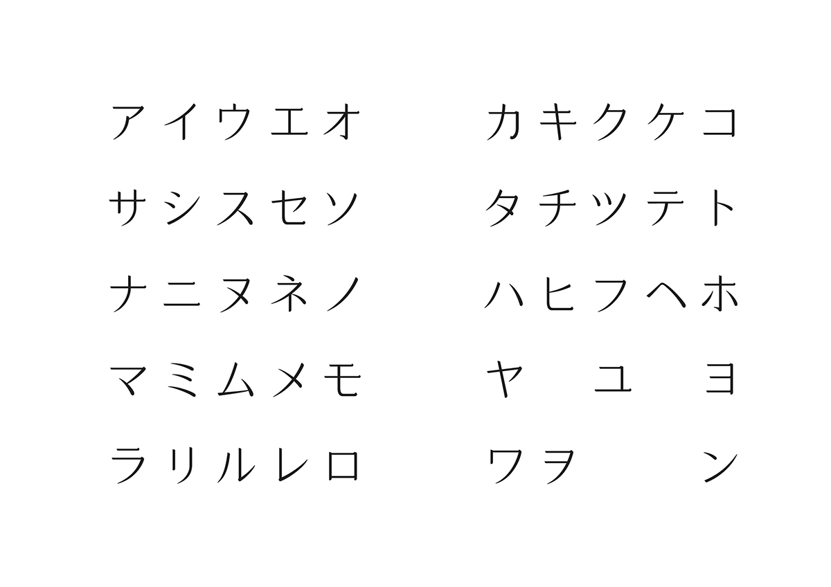
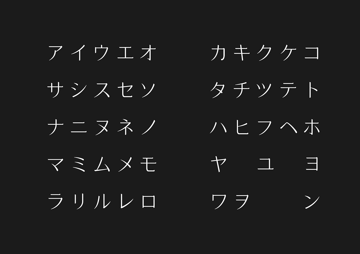
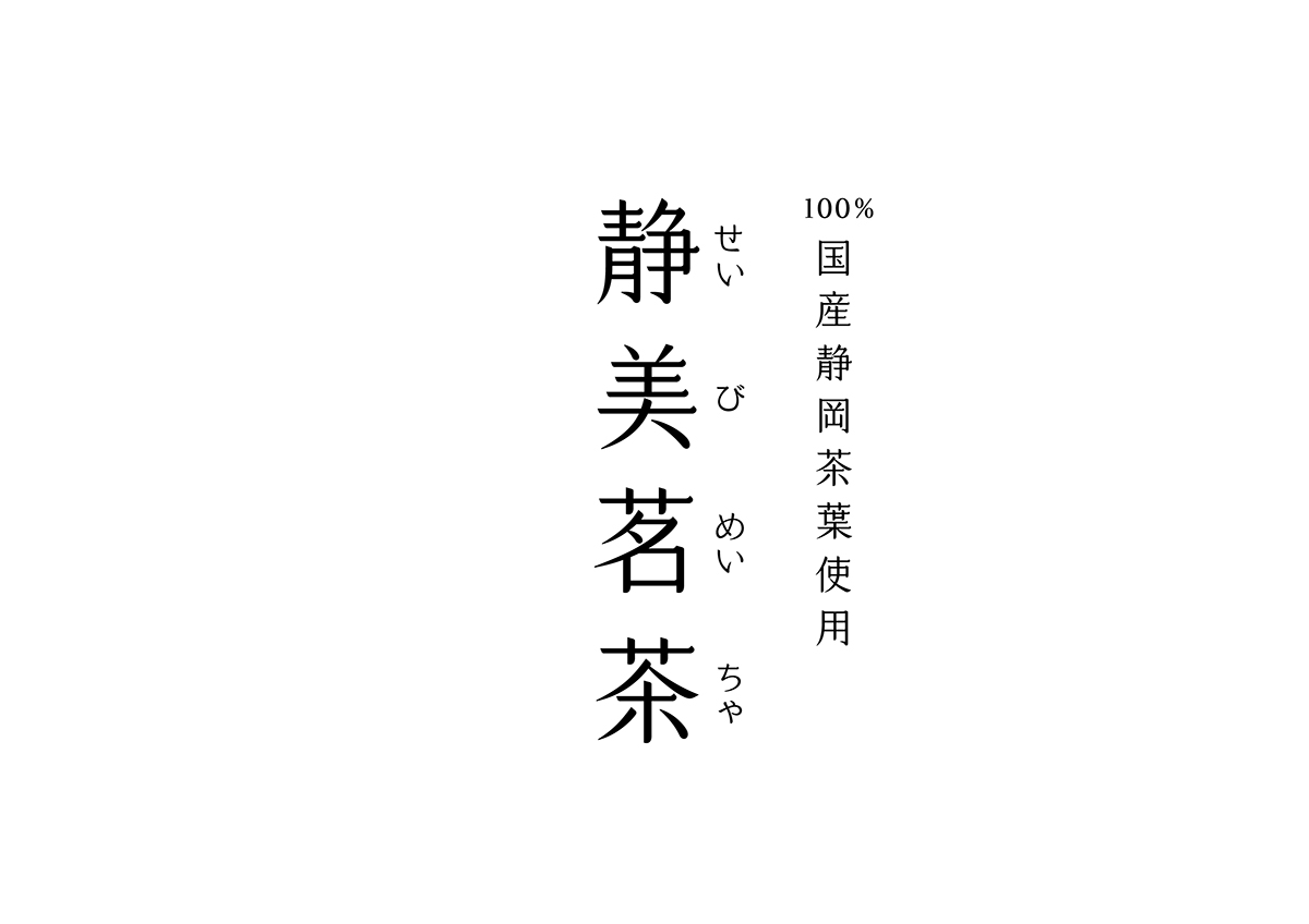
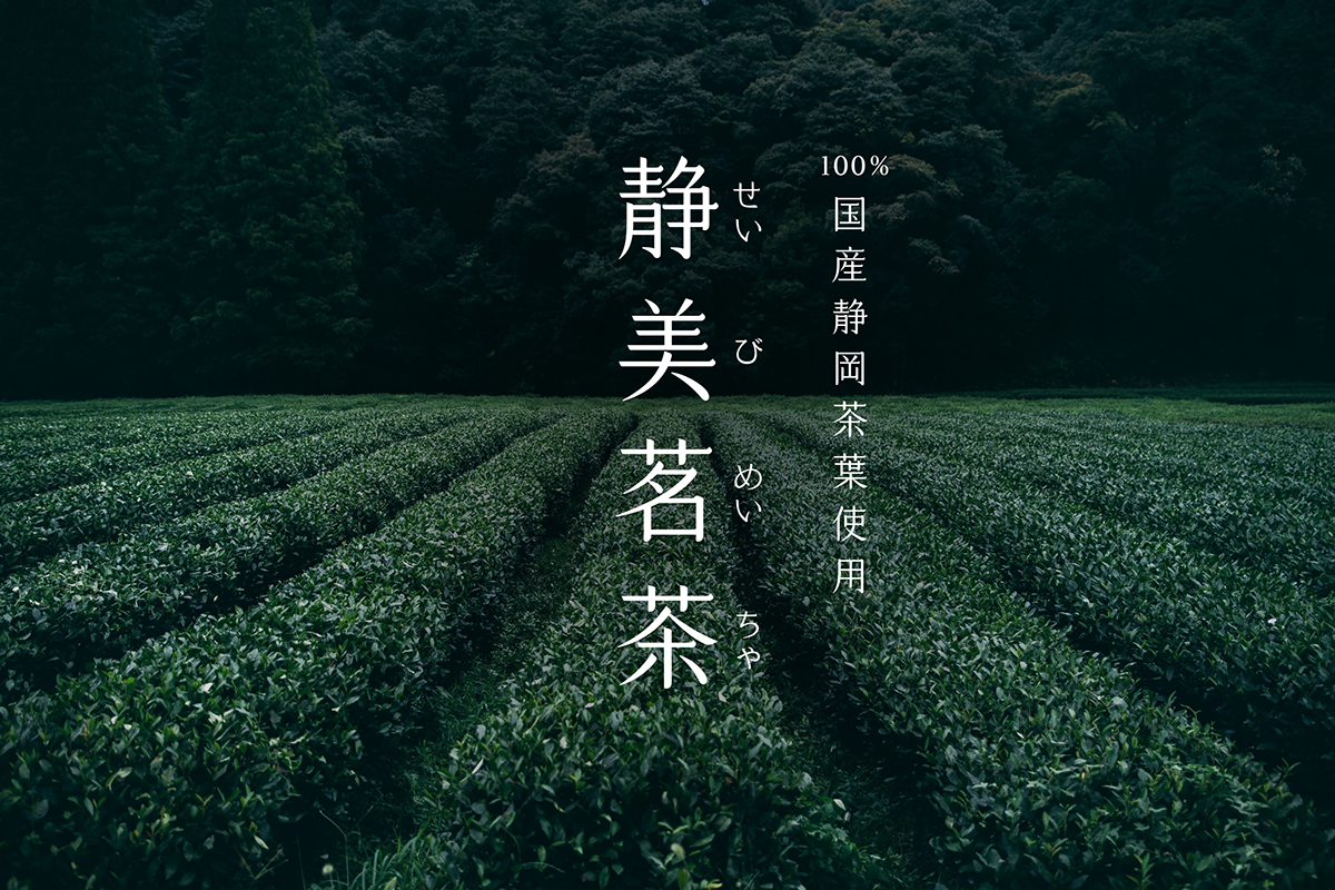
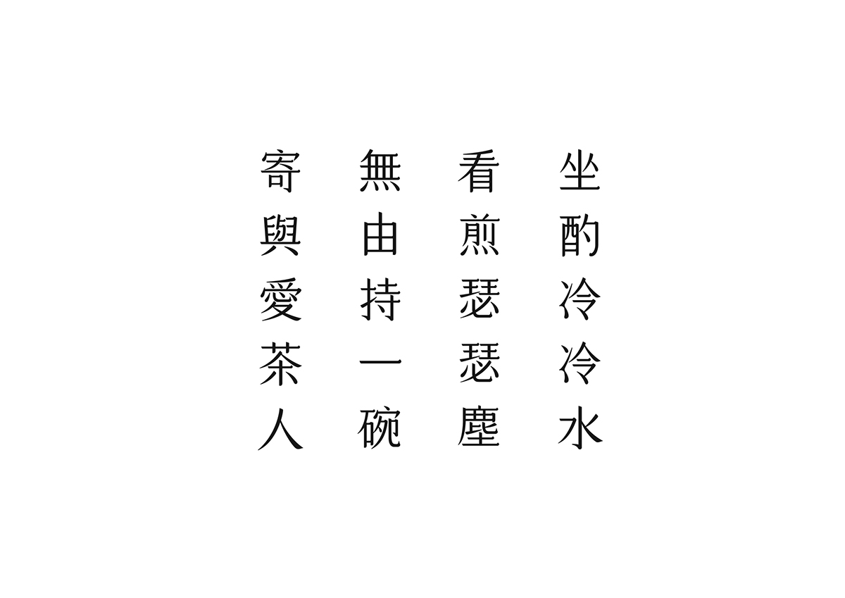
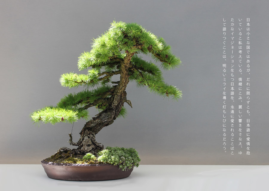
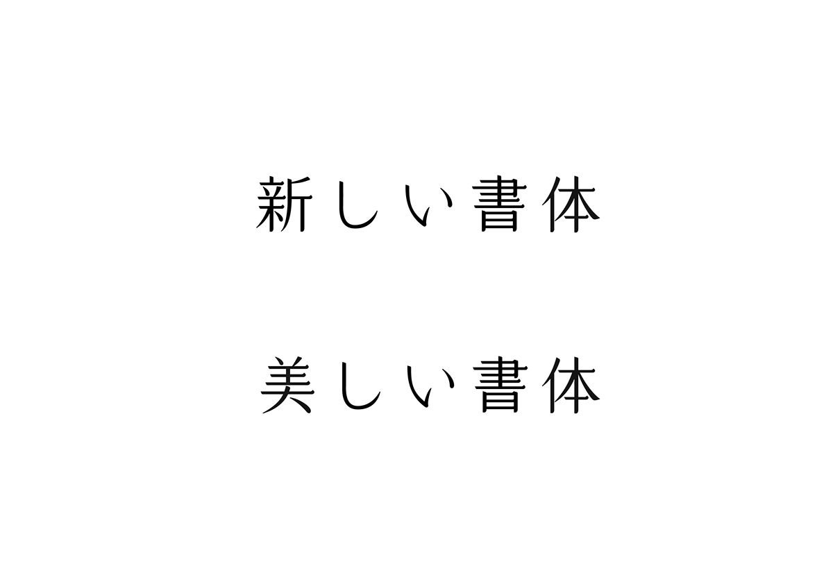
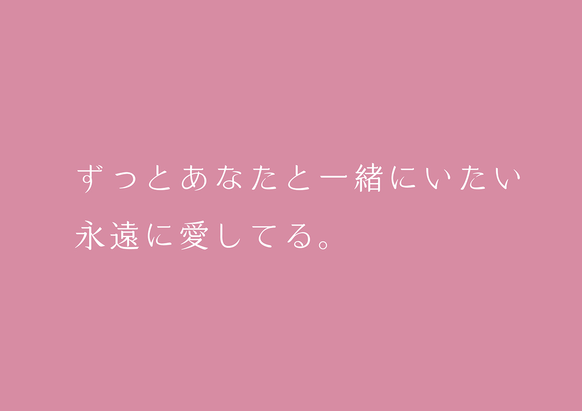
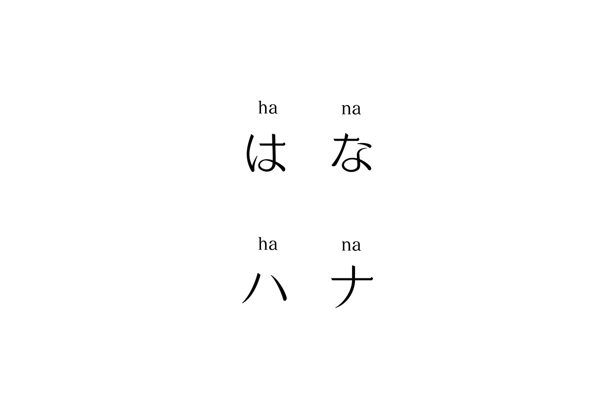
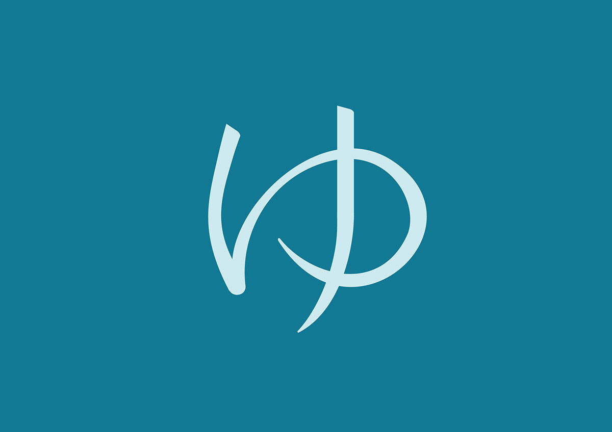
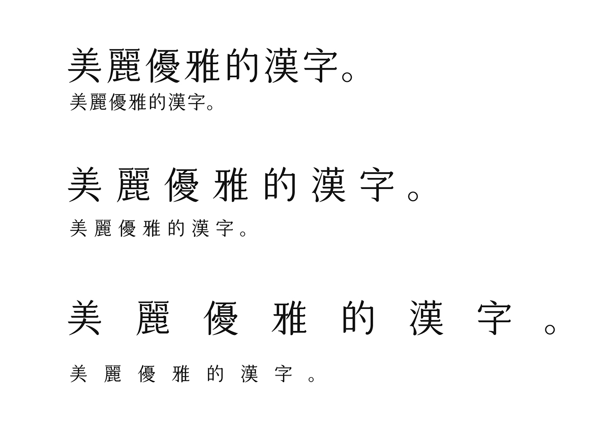
集結明體與楷體的優點,橫劃末端有如凝霜般翹起,是它最⼤的特色。放大來看,明體的感覺十分明顯,可作為標題⽤字;縮小來看,又有楷體的優雅,⼗分適合使用於書籍內頁之中。平假名的設計保留部分漢字筆劃的特⾊,是為了與漢字的風格做呼應。
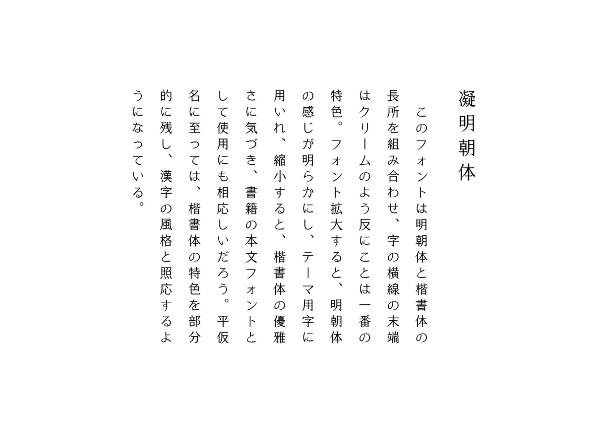
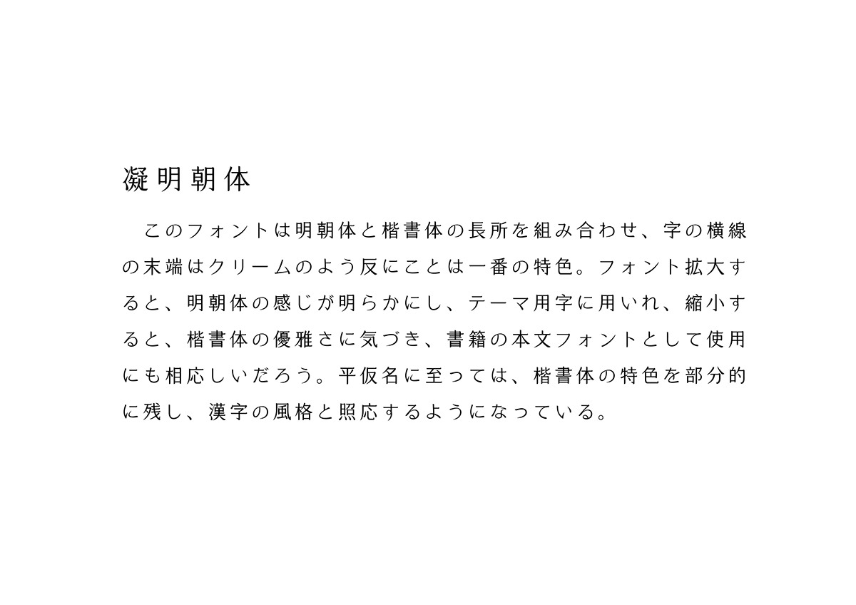
このフォントは明朝体と楷書体の長所を組み合わせ、字の横線の末端はクリームのように反ることは一番の特色。フォントを拡大すると、 明朝体の感じが明らかにし、テーマ⽤字に用いれ、縮小すると、楷書体の優雅さに気づき、書籍の本文フォントとして使用にも相応しいだ ろう。平仮名に至っては、楷書体の特⾊を部分的に残し、漢字の風格と照応するようになっている。
The particularity of the Cream Mincho consists in combing the merits of Mincho and Kai. Although Cream Mincho possesses the square figure, it looks slender and elegant. Besides, the name of Cream Mincho is derived from the cream look at the end of the horizontal stroke. Not only is Cream Mincho appropriately used for the title because of the obvious appearance of Mincho, but it also applicable for the content due to the features of Kai. As for the design of the Hiragana, maintaining the characteristic of the raise at the end of the horizontal stroke is for corresponding to the style of Chinese characters.
觀看更多:凝明朝体應用例
註:凝明朝体目前屬概念性創作,尚未進行字庫開發,目前僅能以客製方式製作