
Working with their existing logo elements, Secura wanted to build upon their heritage and brand equity whilst rejuvenating the logo to create something modern, fresh and aligning with the nature of their business as it currently stands.

Secura Hosting were undergoing a company-wide rebrand and decided that their logo was looking a little dated, it wasn’t truly reflecting the modern nature of their business.
Secura had five keywords they wished to visually portray through their updated identity.

The Secura team wanted to keep the isometric element, as this was the established mark of the brand, so it would be a case of evolution as opposed to revolution. We looked at what was working with their current logo, what elements could be stripped back or replaced entirely.
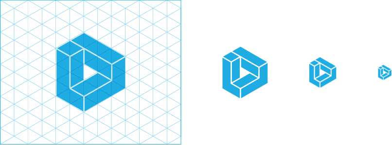
Whilst keeping true to the original structure, we recreated the isometric element, cleaning it up a little and adding slightly more space between the coloured sections. This meant that the mark would work better at smaller scales and and still keep its legibility when reversed and sitting on various background colours and imagery.
To get the correct tone of voice, we experimented with a number of typefaces to support the element and set the company name in. We opted for the strong, authoritative Gotham bold to give grounding and weight to the design.

The resulting design was a modern, clean and secure looking logo that evolved the Secura brand into something more professional and better positioned in the market place.


