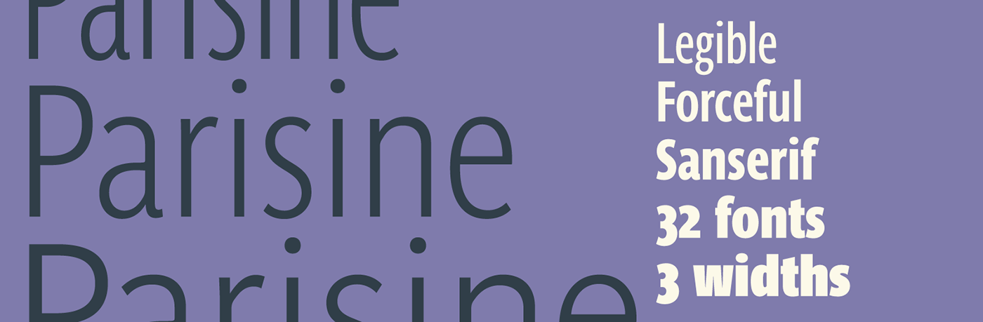

We are pleased to announce the publication of Parisine Narrow and Parisine Compressed! Parisine was born as the parisian métro signage typeface. This family of typefaces has become over the years one of the symbols of Paris as the Johnston for the London Underground or the Helvetica for the New York Subway. The Parisine was created to accompany travelers in their daily use: ultra-readable, friendly, human while the context is a priori hostile.

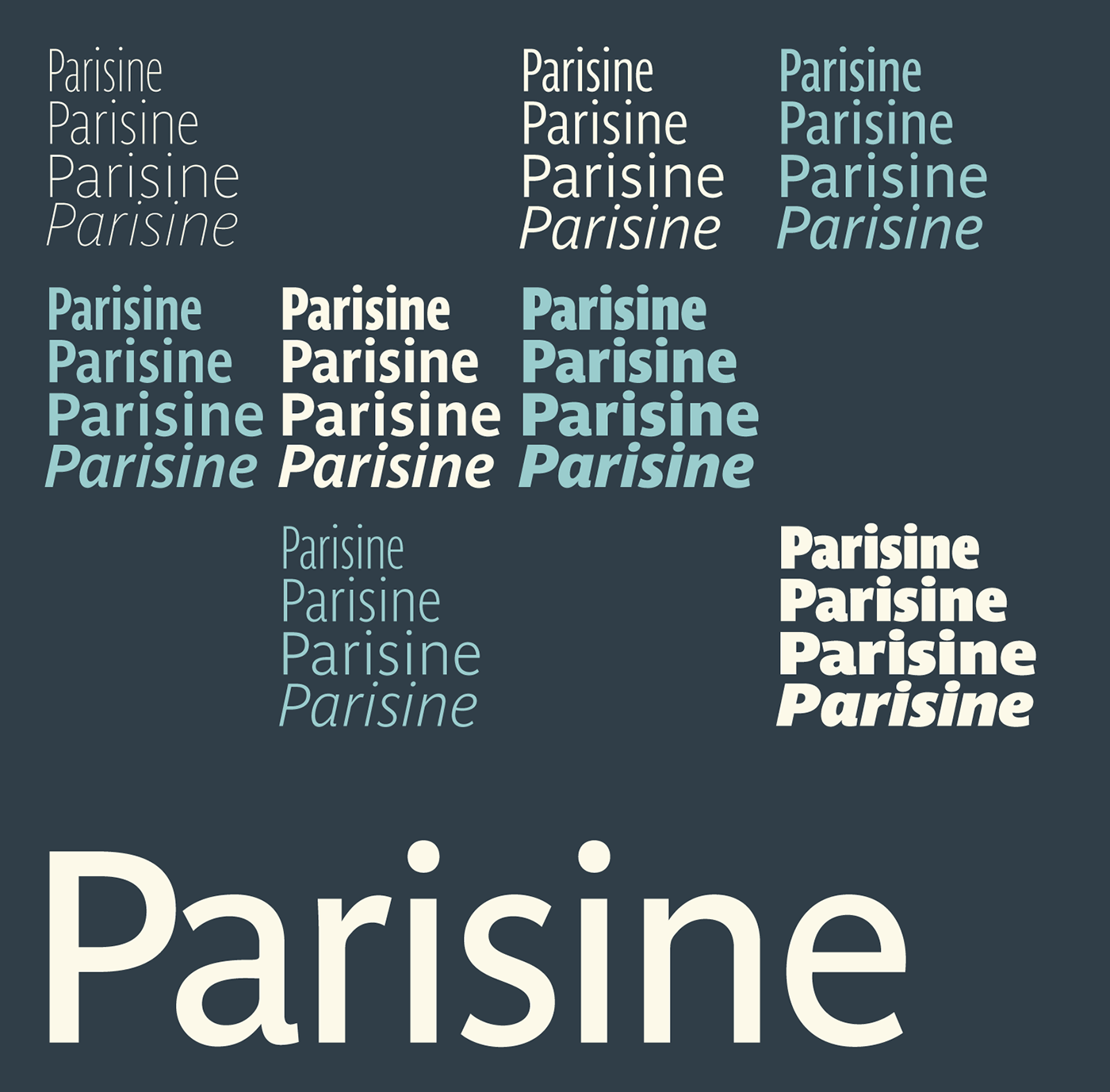
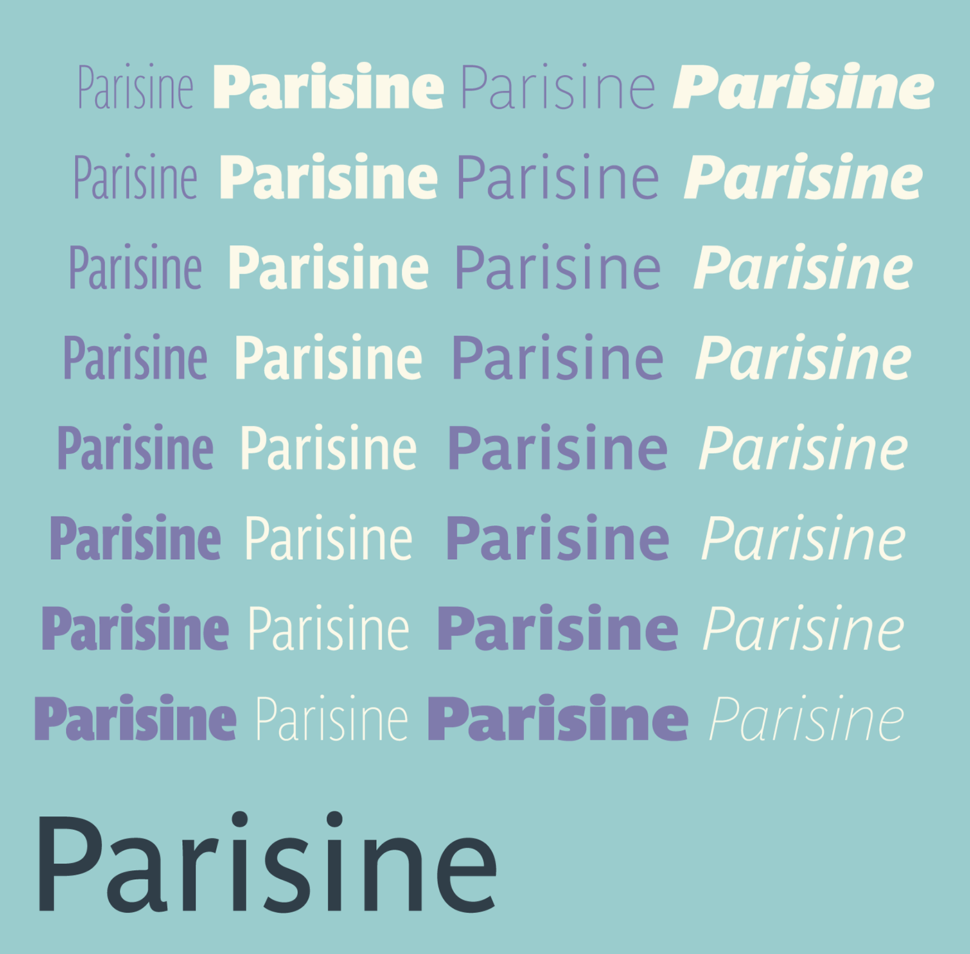

The typeface has been used for many years around the world for publishing projects, visual identity, interface design, unrelated to the metro, nor Paris! Moreover, Parisine remains in the leading group of the best sellers at Typofonderie. And many users, true Parisine fans have claimed narrower versions whereas already the typeface is intrinsically rather narrow. Their wishes are finally exhausted, with these new versions. The subtle lines and shapes of Parisine that made its success will be found in uses of powerful headlines such as in the magazine design, and web pages or posters.
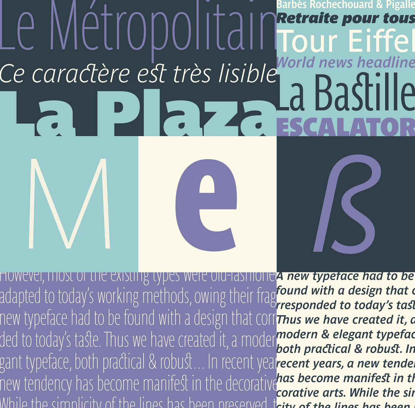
Parisine compared to Helvetica, used in early tests of the Paris metro signages in 1995:


This extension project in narrow version will have been particularly complicated, because it is never easy to add new things to an existing family not initially designed with this type of variables in mind. The team at Typofonderie started this project in September 2015, and we have several times restarted the project in order to find the design that best respects the original Parisine while being different.
Benjamin Blaess who conducted the project can testify the numerous changes in our design strategies over the months. Indeed, certain details of shapes, counterforms, and terminations different according to the greases of the original hunts could not be strictly declined. It is these challenges that make us realize our human limitations to quickly find the right way. As for other projects, Superpolator will have been an important tool that accompanies our work as designers, allowing an increased exigency during design as well as production. The key will have been to imagine a design process set up via Superpolator requiring two steps to produce the final versions: a first version that starts from raw sources that leads to a second version allowing to produce the optimal final versions. The process may seem less bizarre, if we know that the Parisine family started from the unique Parisine Bold created in 1996. The other family members having drawn in 1999.
Roxane Gataud and Joachim Vu have also taken positive action in developing the best design possible within the team, working alternately on design development, kering and final production with Benjamin Blaess. Of course, having designed Parisine original in 1996, then 1999, I took part in these new developments, and its regular reinstatements, remaining the living witness of the soul of Parisine. We confirm with the Parisine Narrow and Compress that a type design project requires a team that knows how to share and exchange for a single purpose, the required quality.
In the coming months, we hope to see the astonished uses of Parisine!

The Parisine OpenType fonts are available in our exclusive PRO version. Download the Parisine specimen in pdf format for full details of these Advanced typography functions. You may enjoy the Try-out versionavailable too.
→ € 55 for any of Parisine styles
→ € 146 for the Parisine or Parisine Narrow or Parisine Compress mini Family of 4 fonts
→ € 267 for the Parisine Narrow or Parisine Compress Family of 8 fonts
→ € 993 for the Parisine Full Family of 32 fonts
→ € 146 for the Parisine or Parisine Narrow or Parisine Compress mini Family of 4 fonts
→ € 267 for the Parisine Narrow or Parisine Compress Family of 8 fonts
→ € 993 for the Parisine Full Family of 32 fonts
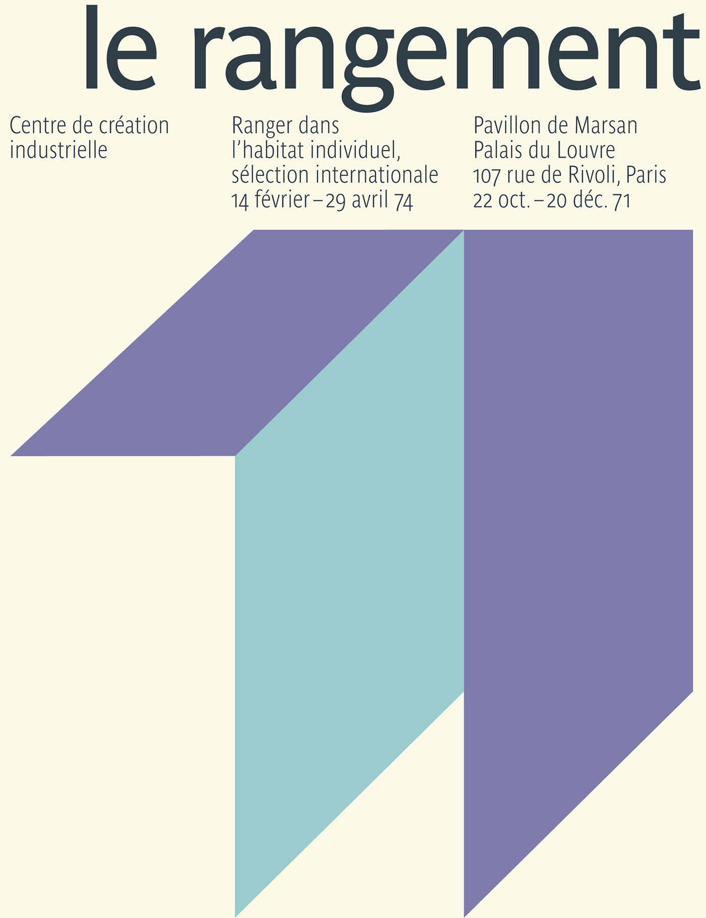
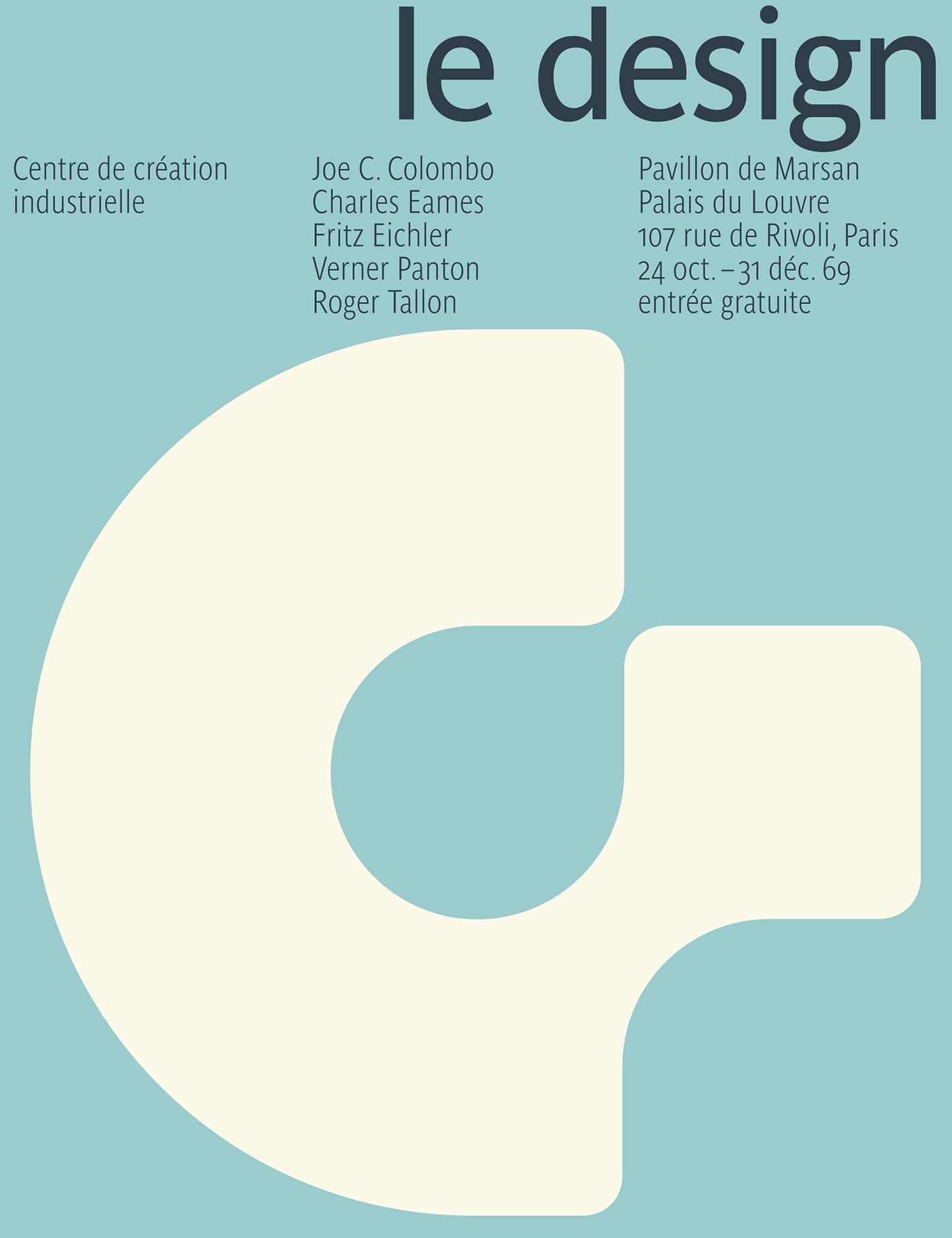
Parisine and Parisine Narrow used in cover versions of Jean Widmer posters serie designed in early 70s for the Centre de création industrielle: