
Logo Redesign
The Problem: The original logo posed a problem because it was difficult to identify as a counterpart of the Florsheim Shoe brand. The biggest discrepancy occurred when looking at the logo printed on the insole of the shoe and the word "kids" took hierarchy, instead of "Florsheim" (original shown below). The kids' logo was in need of an upgrade that better reflected the Florsheim parent-brand, while still maintaining a degree of playfulness.
The Solution: The Florsheim name needed to be more prominent. I developed a new kids' logotype using existing elements from the brown Florsheim logo. This allowed the new kids' identity to be viewed as an extension of Florsheim Shoes, rather than its own brand. I applied a sketched/scribbled treatment to the Florsheim logotype and crest for a playful quality that effectively reflects the kids' brand and the shoe styles.
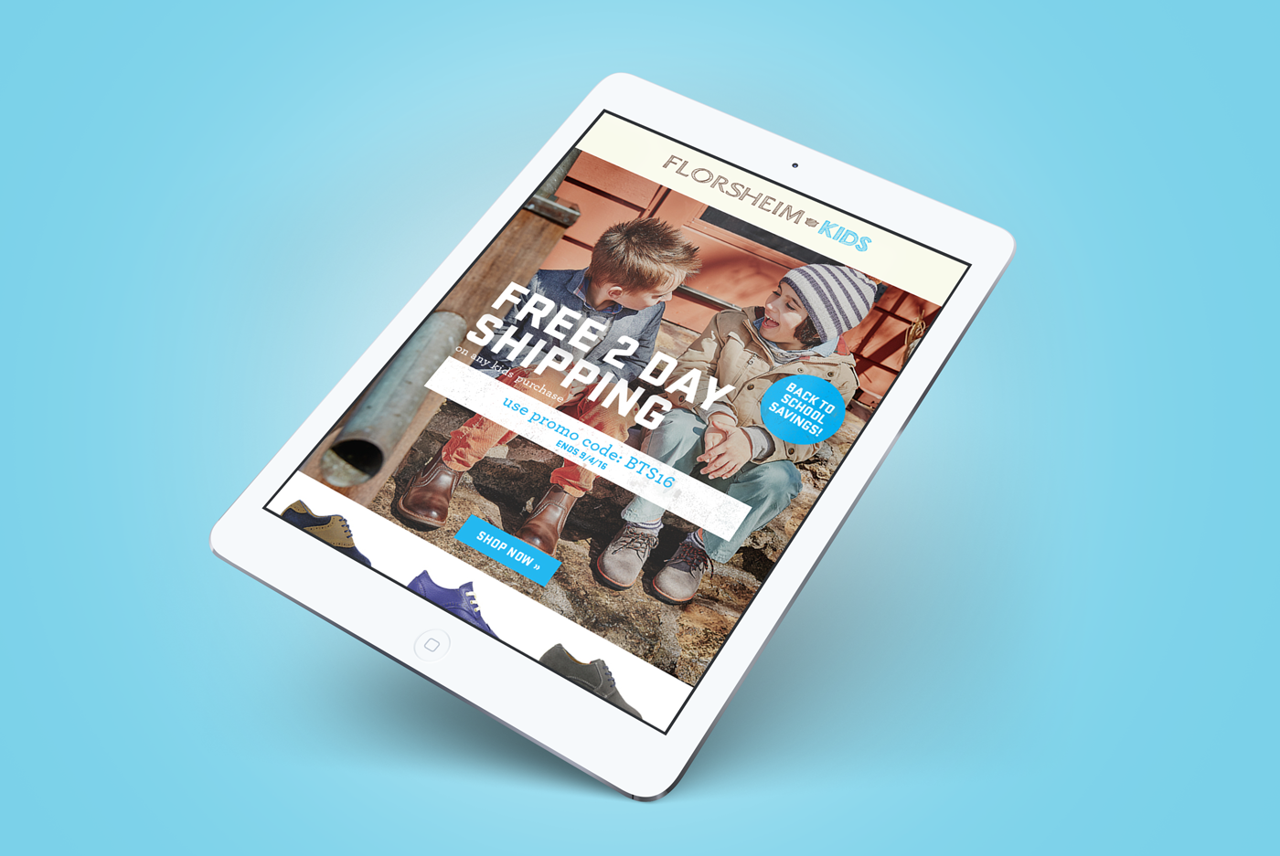
The new logo's implementation is an ongoing transition, especially on product, and old logos can be seen on a few of the assets here.

Re-Designed Kids Logo

Florsheim Brand Logo

Original Kids Logo


Client: Florsheim Kids, Weyco Group (florsheim.com)


