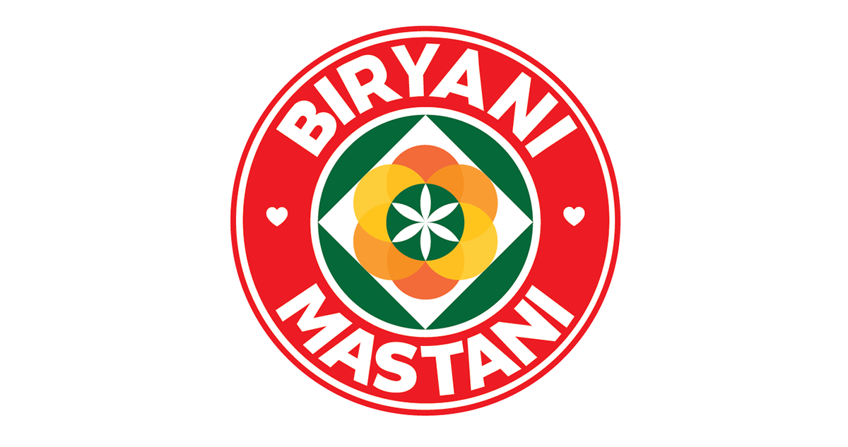
When the structure of our world is governed geometrically, what could be more natural than to design a logo using
geometry, a spatial language that can depict the idea of bringing everyone together to experience a beautifully layered biryani.
Keeping this in mind, various patterns with overlapping shapes from the Mughal era were explored that
can evoke a positive, supportive environment and also depicts the concept of layering in biryani.
The overlapping/layering of circle forming a flower in the middle represents the layers of flavors. The idea of having a flower
formed in the center is an intriguing way to represent how each layer (flavor) is combined together to make a biryani that
is beautiful and cultural. Also, it best describes the idea of bringing people belonging to different
race on the same table. The circularity of the logo brings movement and invites people to our restaurant that it’s a
pleasant and a secure space to be in. Circularity and angularity are opposite yet interrelated geometrical
forces like male and female, but their fusion in the logo as a pattern
reflects harmony, unity and strength.


Box Design

Bag Design


Facebook Cover
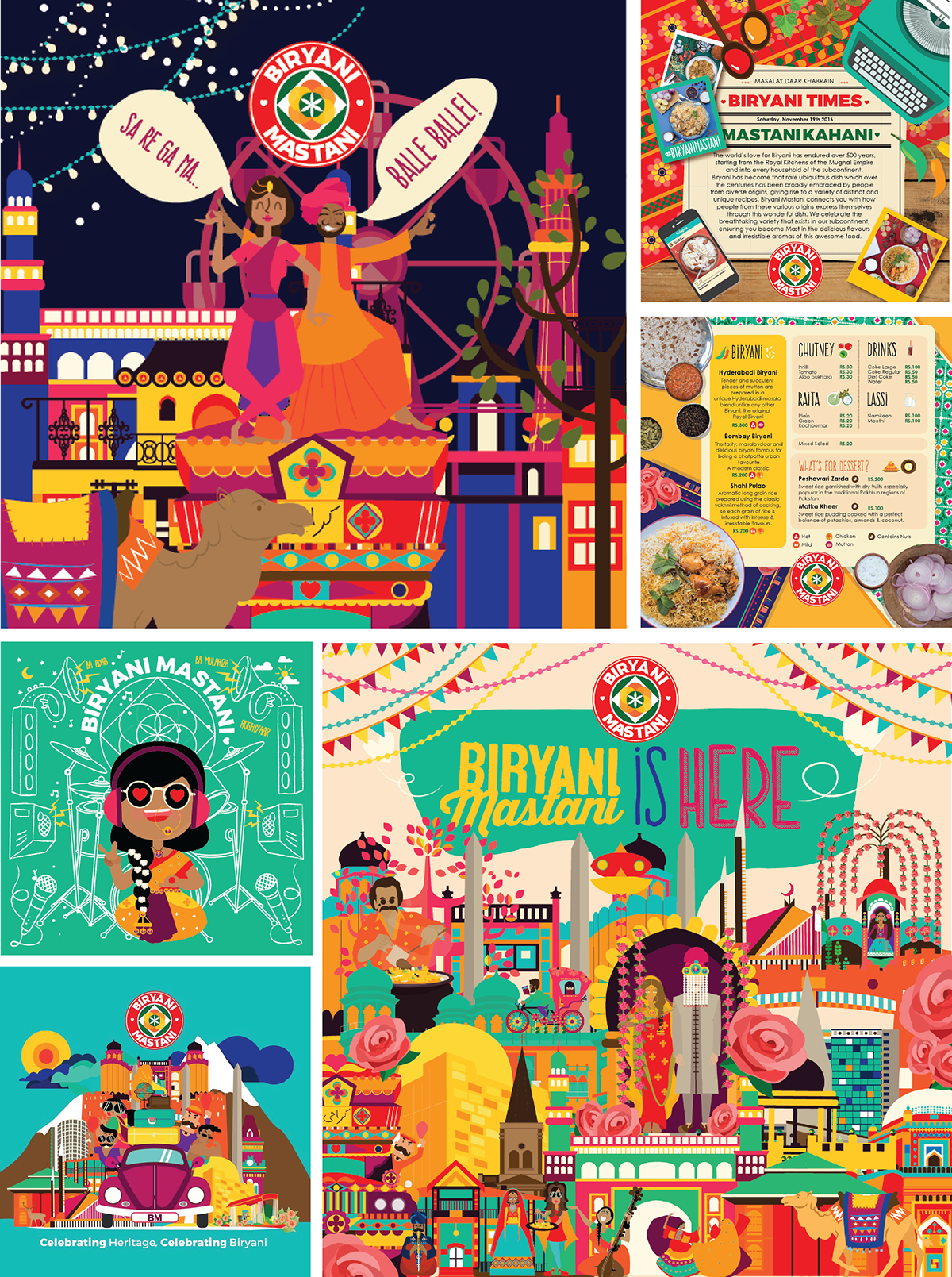
Fun Posts
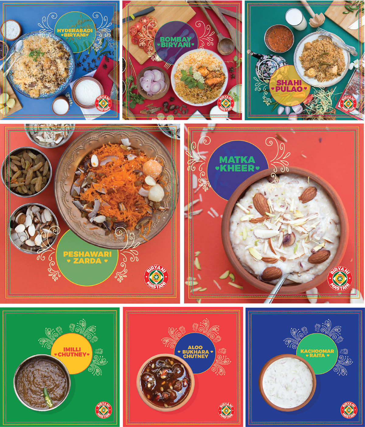
Product Posts

