


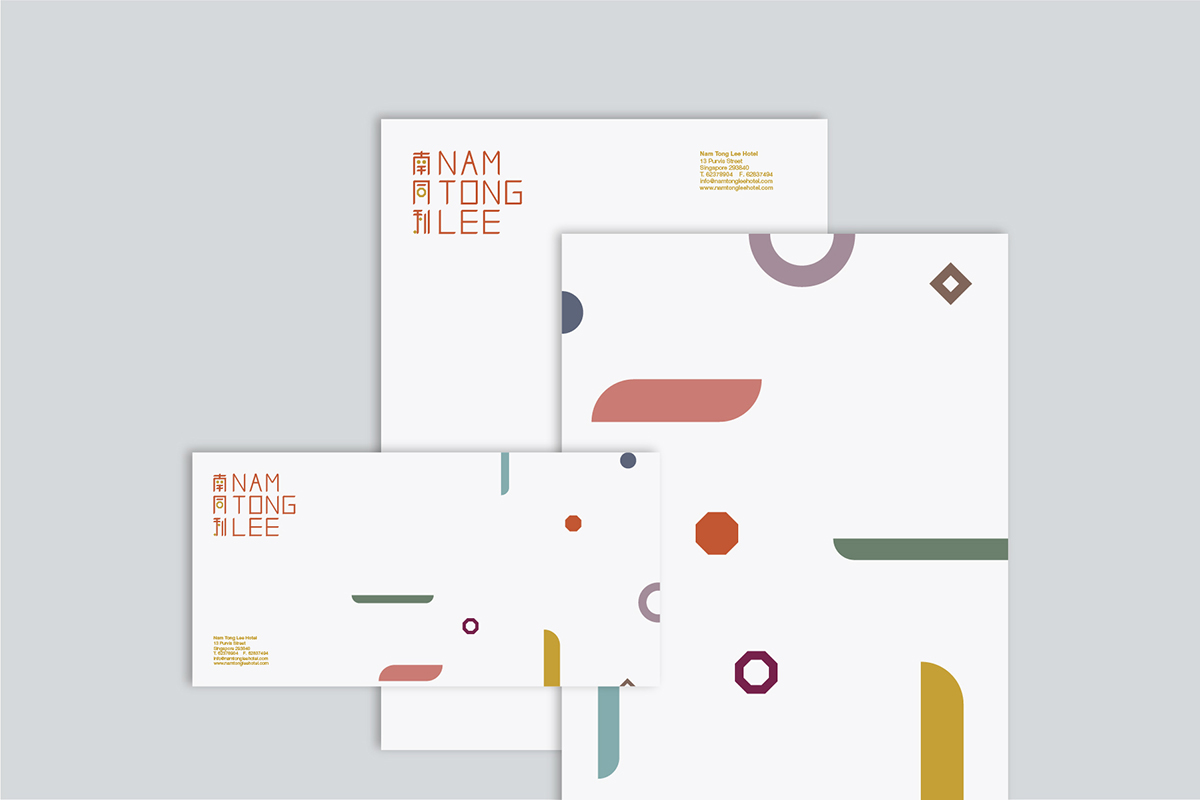
Proposed identity system for Nam Tong Lee, a heritage building, along Purvis Street, conserved and redeveloped into a boutique hotel.
To reflect the conservation process of the heritage building, as well as the relationship between history and contemporary culture, the visual identity of Nam Tong Lee integrates tradition and modernity.
The original Chinese Nam Tong Lee characters were used as an authentic starting point, but reconstructed with the introduction of basic geometric shapes. The bespoke English typeface, and supporting graphics, derived from the characteristics of the customised Chinese characters, portrays the fresh, unique state of the boutique hotel and its offerings.


With the variety of graphics and shapes, the logotype exists in a variety of individualistic permutations. Each permutation represents the exclusive yet diverse experience of each guest at the boutique hotel. The identity system becomes a mirror of Nam Tong Lee and its rich, varied surroundings.


Client
Adonis Group
Creative Direction
Hanson Ho
Art Direction
Stephanie N.
Brand Identity/Graphic Design
Hanson Ho, Stephanie N.
Completed at H55, Singapore


