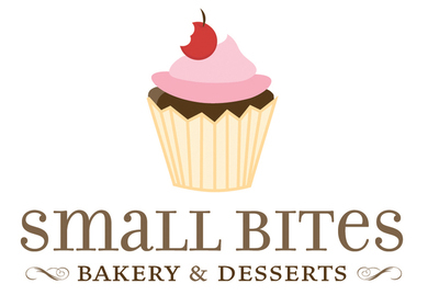
The identity for Small Bites had to convey the fare the business produced as well as the scale.
A cupcake -- a classic, recognizable small dessert -- was chosen as the icon. The cupcake was topped with a cherry with a small bite taken out for a play on the company's moniker. The type choice for the logo keeps a balance between the light-hearted feeling of enjoying dessert with the authority
of a business.