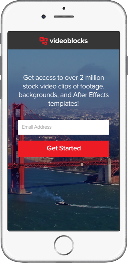
First screen you see when you come to the URL. The main goal was to increase emails captured so I designed a very simple and straightforward form to get the user started. If more info is needed below the fold are some bullet points and other sample content to view.
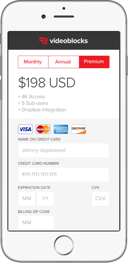
After entering email the user is taken to the payment portal where they can choose their plan type with a few bullets explaining each upon selection.

Trying to increase usability I chose a numeric keypad for credit card entering rather than using the standard iOS keyboard.

If any information is entered wrong a warning pops up upon submission asking the user to check their entry. After looking at this later I realize having some sort of check or X symbol in each field to give real time feedback might have been a good option as well.

This is an error page that shows up if something goes wrong after submitting payment. Again looking back it would be better to stay on the payment page and just highlight which field was wrong which would also prevent the user from having to re-enter all of their information again.
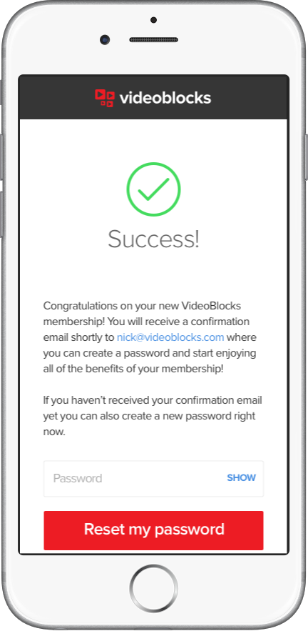
We ask for a password after a confirmed registration since it ends up being an unnecessary extra form if it's in the beginning of the sign up flow.


