When I first saw the Solo Stove, I was "Wow!".
The product was beautiful, innovative and environment-friendly.
But, the logo of Solo Stove, it was a just shape of fire.
I wanted to try to make it more meaningful and look like more Solo Stove.
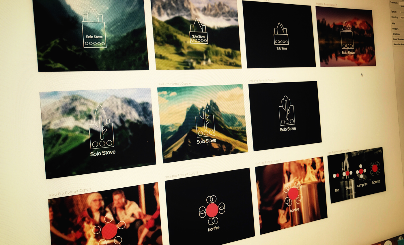
I've created a line icon that can be used as a logo and also can be used in the user interface.

The Solo Stove is great.
Main customers are the people who enjoy outdoor activities.
and very easy to store and use.
Solo Stove uses tree branches as a fuel on the roadside, not oil or batteries.
Nevertheless, you can use fire longer and have a better firepower.
In short,
Solo Stove is simple, environment-friendly and good firepower.
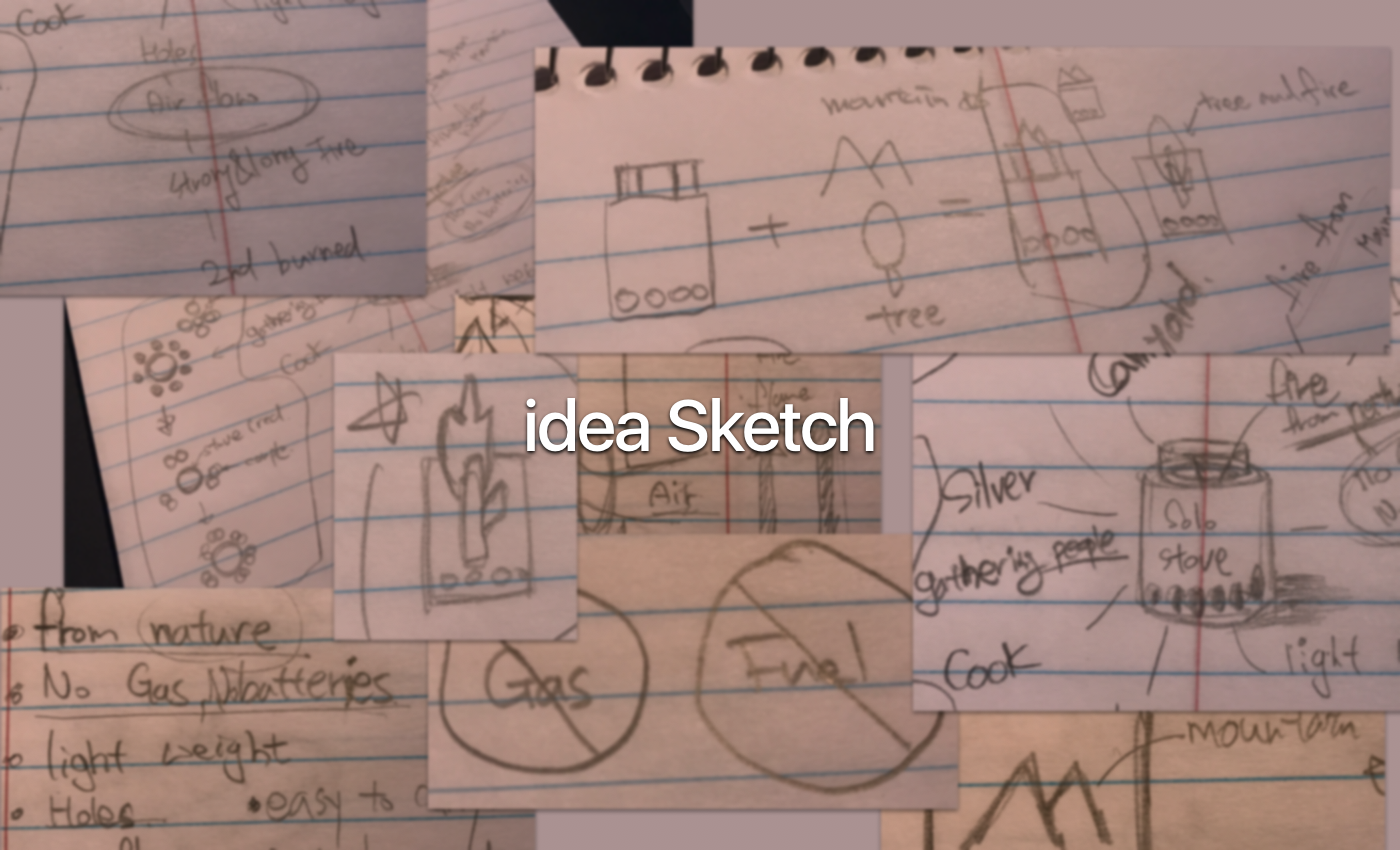

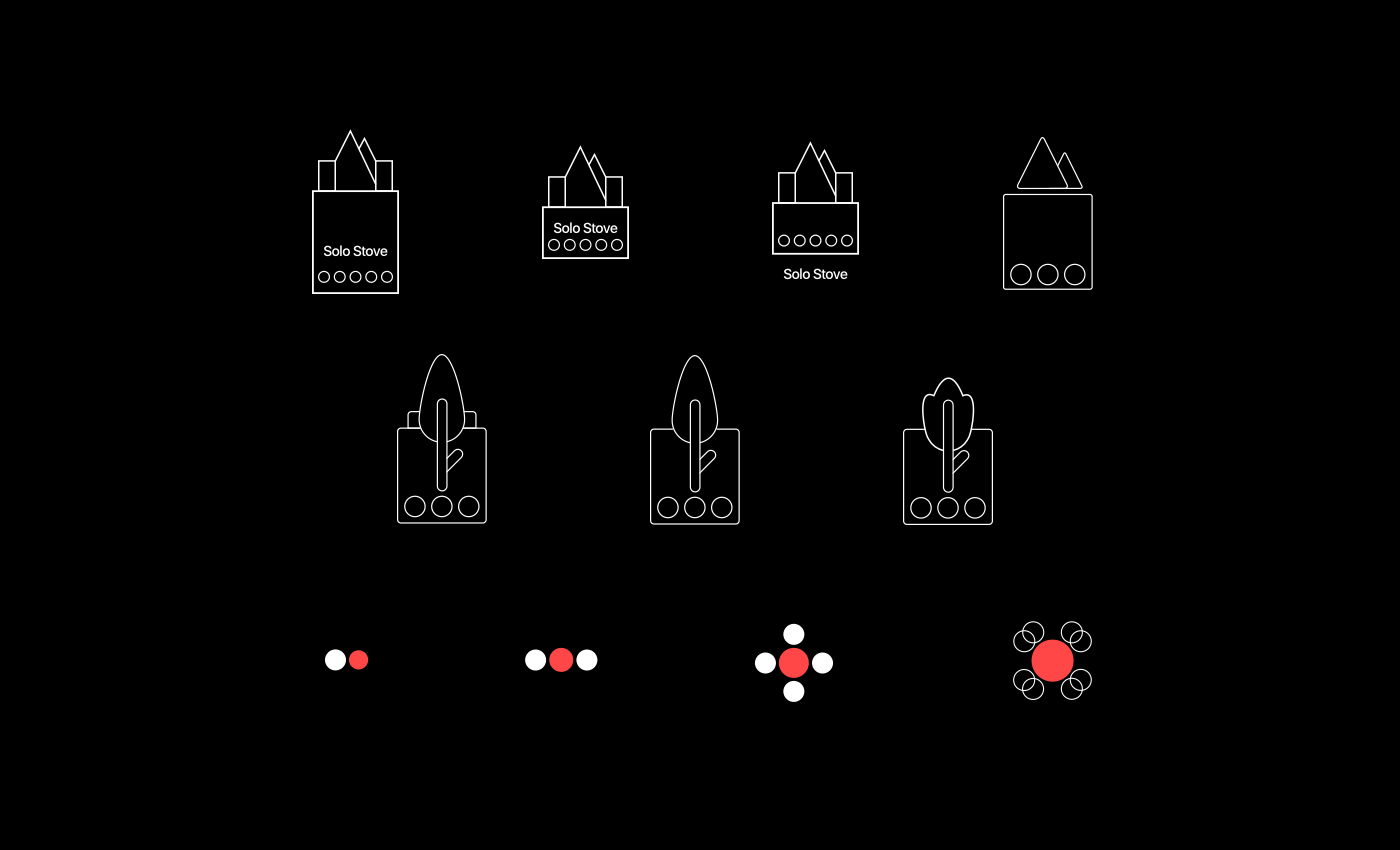
My main idea was to use a stove, mountain, and tree.
Stoves mean products,
mountains mean environment-friendly and places are used heavily, trees mean fuel and also environment-friendly.
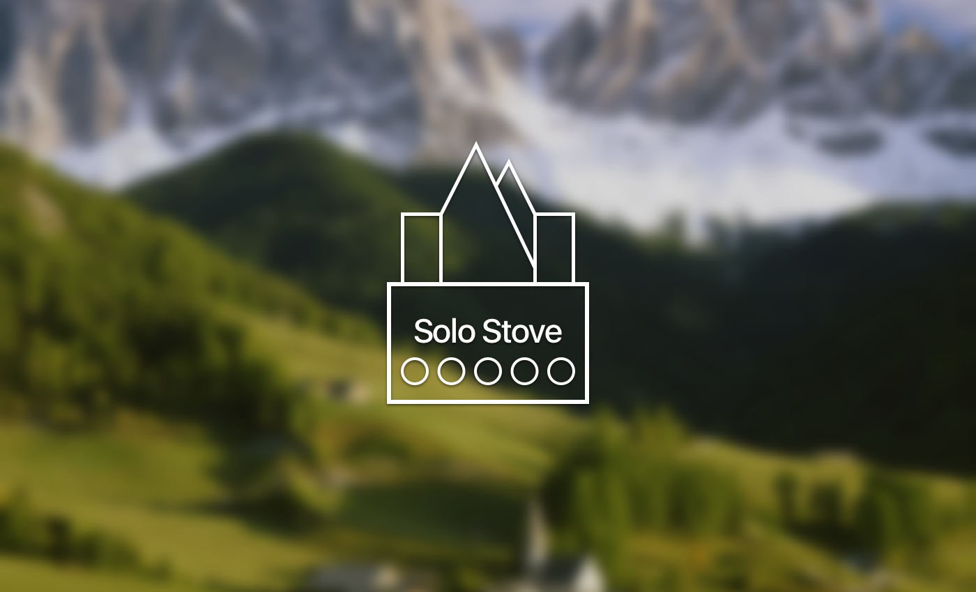
Due to the arrangement of the circular holes, the square represents the Solo Stove.
The shape of the mountain gives a friendly and natural feeling, and at the same time, the mountain looks like a flame on the stove when the stove is burning.
Angled corners make you feel neat, raw and firm.

I got rid of letters on the stove to make it clearer.

more simple and rounded corners make the Icon friendly feeling

I put the tree on the stove instead of a mountain.
It looks like a branch is burning. the feeling is good.
It looks like a branch is burning. the feeling is good.
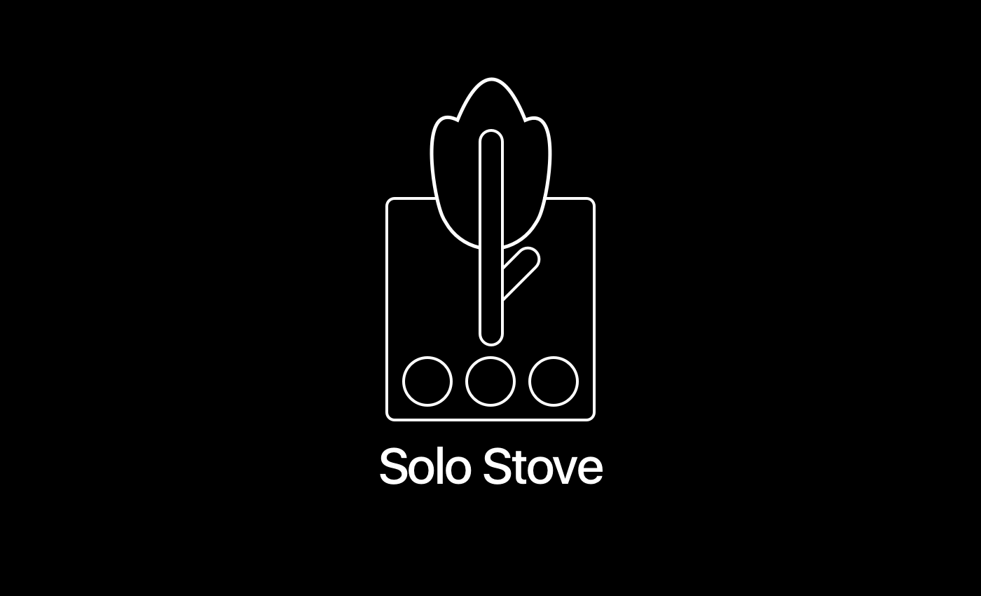
I changed the shape of the flame. it looks like a flower.

This icon has every meaning like a stove, holes, tree, mountain, flame, and also simple, easy, environment-friendly.
Solo stove has four kinds of products depend on the size.
I designed icons for the distinguish each of them.

The idea was a connection between Solo Stove and user.

Overlapping circles means that couples sitting close.