


The concept of Identity for “Power Camp”,
a triathlon family training camp
The aim of this camp: collaboration of experienced triathlon sportsmen or people who are only planning to start, for experience sharing and receiving new emotions. The target audience are men and women from 25 to 50 years old.
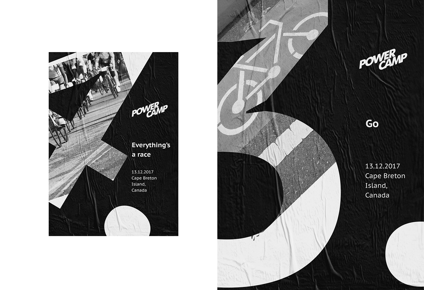
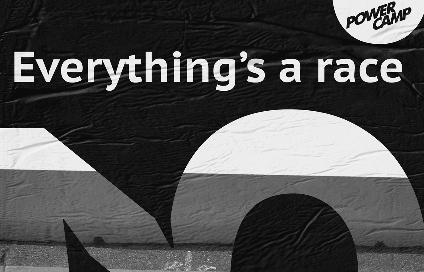
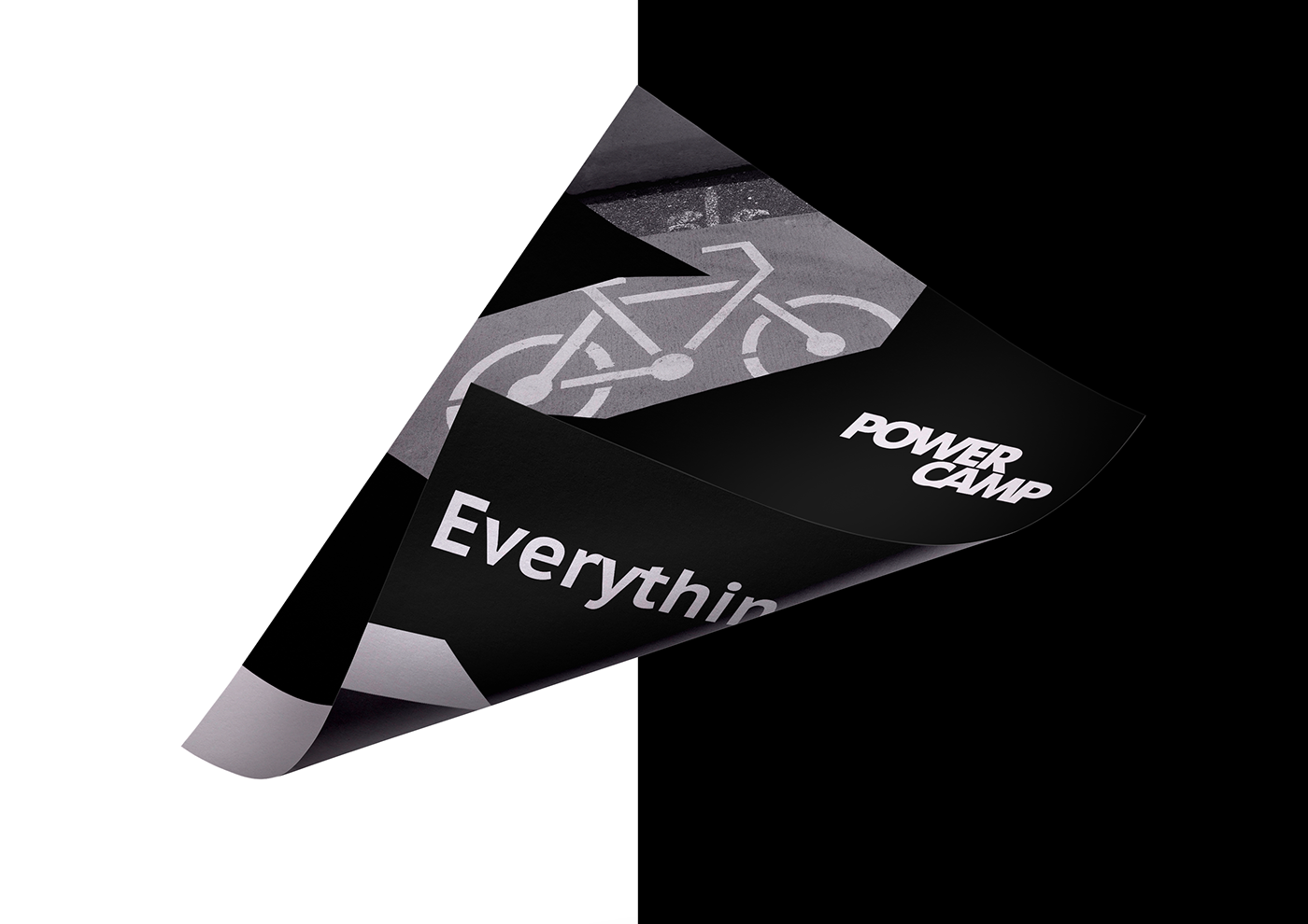
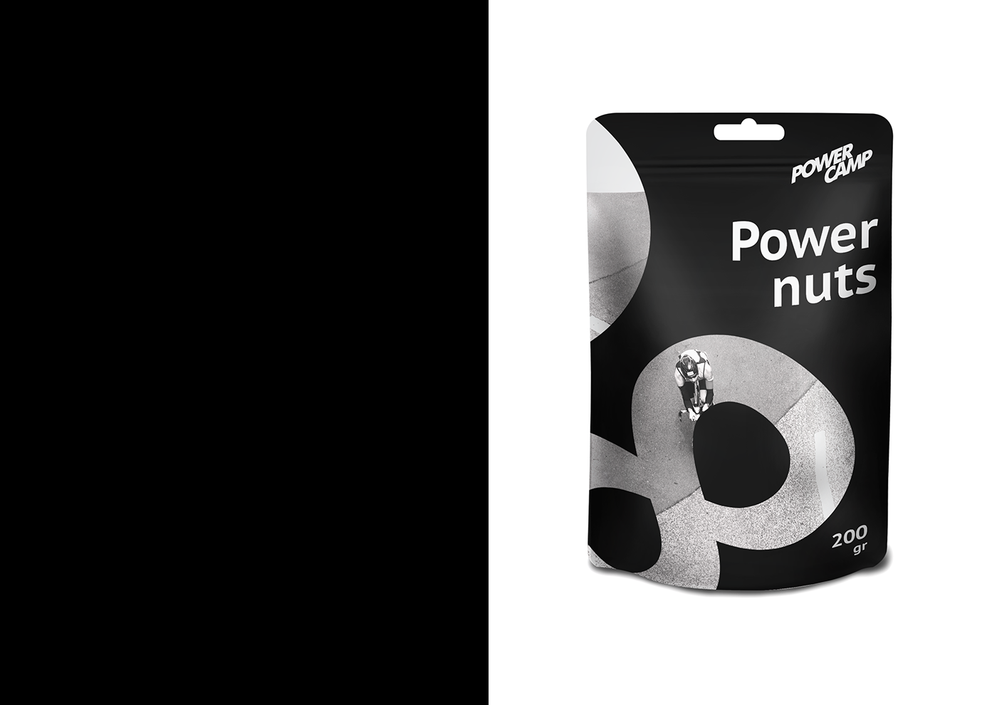
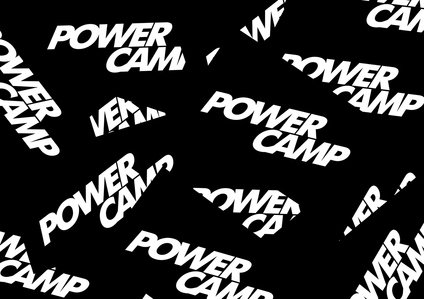
The basics of a logo configuration is movement and velocity. In identity I used numbers. Any kind of sport is connected with numbers: whether it’s distance, speed or date of competition.
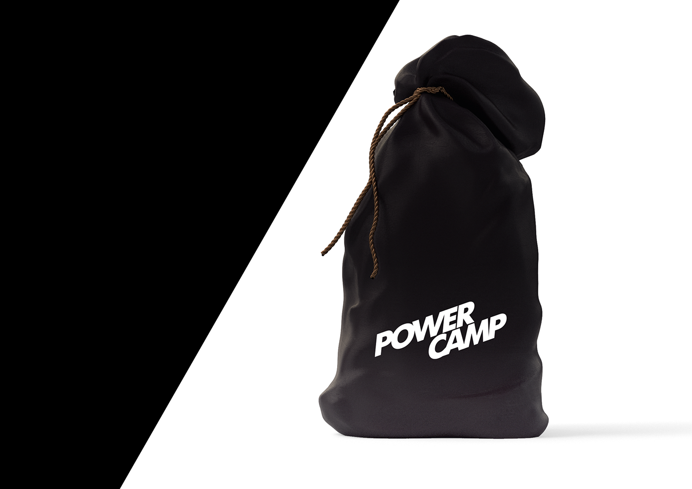
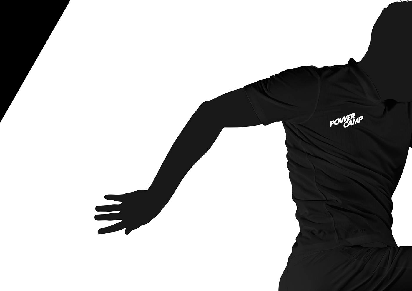
I wanted to show that sport itself is much more important than the way you look, that’s why sports wear and other equipment are in monochrome colors.


Credits:
Art direction: Marco Ivanyk
Design: Snizhana Chernetska
Thank you!


