
About the Project
PROBLEM. Coaches of running teams juggle multiple low-tech tools as they battle busy work that leaves little time to achieve coaching goals. They bounce between paper on clipboards and multiple spreadsheets as they rekey information into web forms. Finding volunteers, recording results, communicating with parents, administering finances, and planning practices/meets/meetings leaves little time to coach.
CHALLENGE. Create a smartphone app that frees coaches to coach.
CHALLENGE. Create a smartphone app that frees coaches to coach.
My Role
I handled all UX roles in this project including user research, prototyping, visual design, usability testing, and research evaluation.
> User Research

The initial research was heartening! Topping the list were the need to simplify busy work, find volunteers, and communicate effectively.
Empathy Map

Interviews clarified the issues that put pressure on coaches: scholarships were at stake; the job was impossible without volunteers; whenever there's a problem (from an injury to no water at the finish line), you have to handle it immediately without dropping balls already in the air.
Personas

A target user of the app as Head Coach and Parent of sons who ran, Bruce needed help with school bureaucracy and busy work if he was to achieve lofty goals.
> Content Strategy & Information Architecture
Sitemap
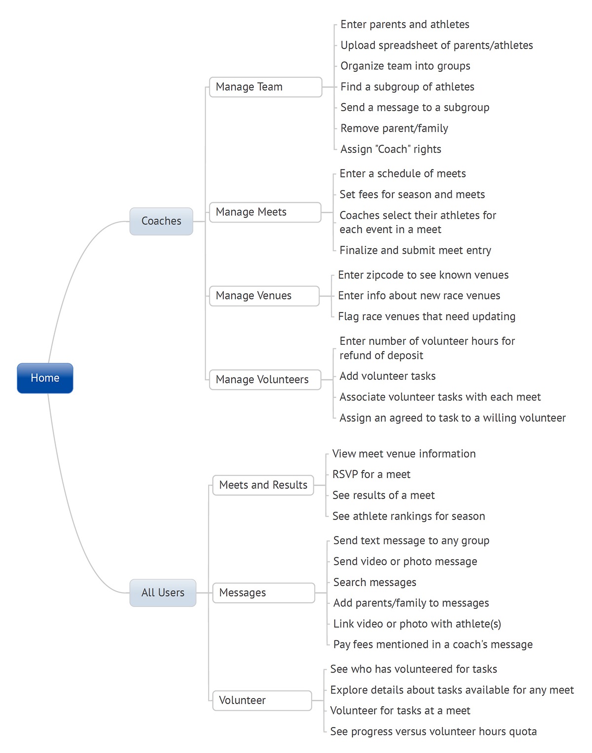
The sitemap structure was more complex than expected. I went into card sort with trepidation.
Card Sort
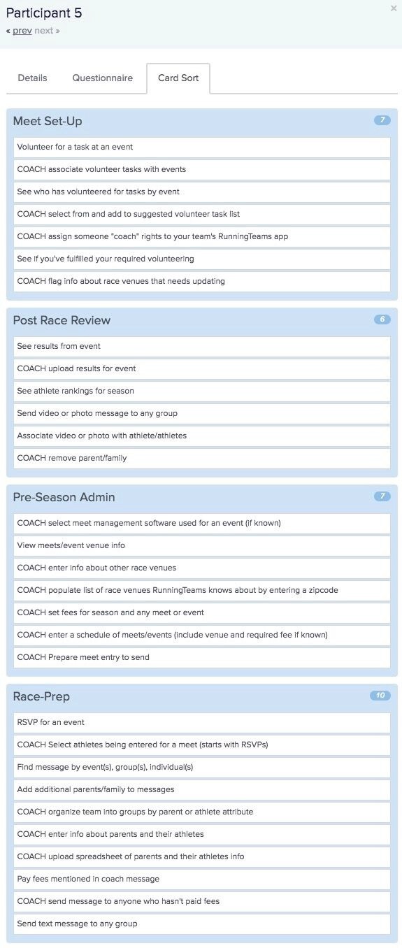
Card sort was a disaster! No one took the hint in my instructions to separate Coach tasks from Parent tasks. But wait: only 1 abandon! The Similarity Matrix looked reasonable. I'll be darned. SUCCESS!!

Look at this! The things that shouldn't be grouped weren't. Many that definitely should be grouped were grouped by 100% of sorters. The 25 and 50%s on the right-side downslope need reconsideration. Do they fit, and if so, where?
> Sketching, Wireframing, Prototyping
Sketching
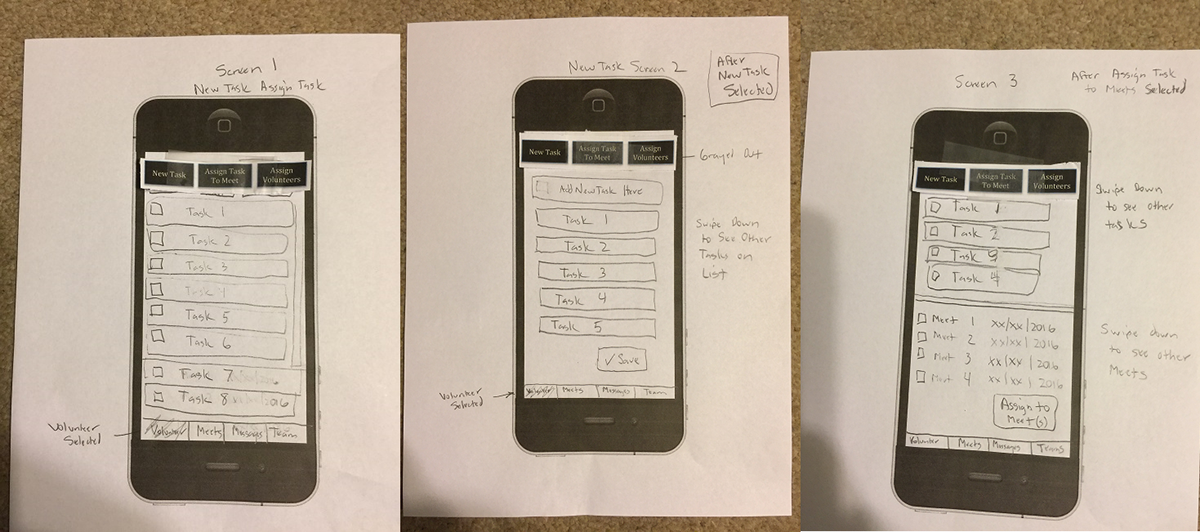
Tasks clarified, I quickly sketched wireframes. No reason to redo these iterations despite the upside-down iPhone frame.
Prototyping
Before Debugging After Debugging

Among the many things my mentor Andre helped me with was correcting the undersized iOS App image generated by Axure RP. Selecting a hidden viewport setting solved the problem. Creating an interactive prototype requires rapid debugging and iteration, and you'll see more of my work further down the page.
> Visual Design
Style Guide
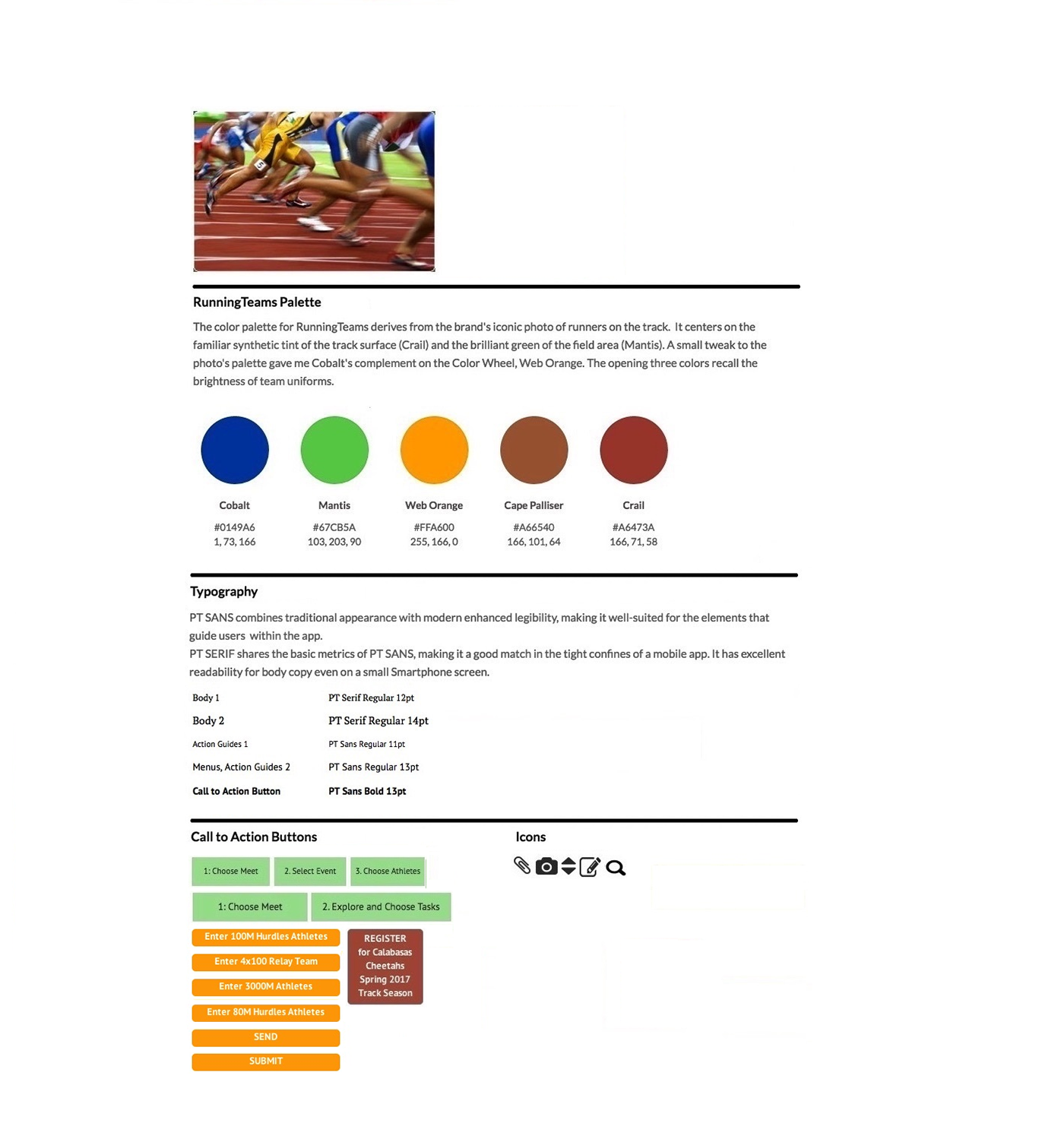
Dimensions of the thin buttons fattened up to 44 pixels to accommodate touch interfaces since this version of the style guide. I didn't include the logo because I typically outsource logo design, but you can see my quick placeholder elsewhere in the portfolio.
> Research Evaluation
Usability Testing
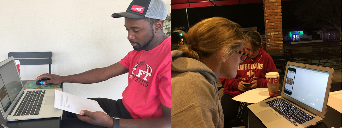
Testers were polite but astute. Too polite, probably, because they rated their satisfaction with assigned tasks no lower than a 3 of 5. One pointed out that NO ONE would volunteer for a task based on its name only. Another rated a task a 4 even after having to hunt for where to begin in 3 menus.
Usability Testing Iteration
I produced this iteration based on testing feedback that parents needed to explore available tasks in detail before they'll volunteer. Still work to do on Visual Design.
Task: Add Meet

The Add Meet task for a 7-team league's 3-way meet was rated extremely satisfactory by all testers.
Task: Add Venue
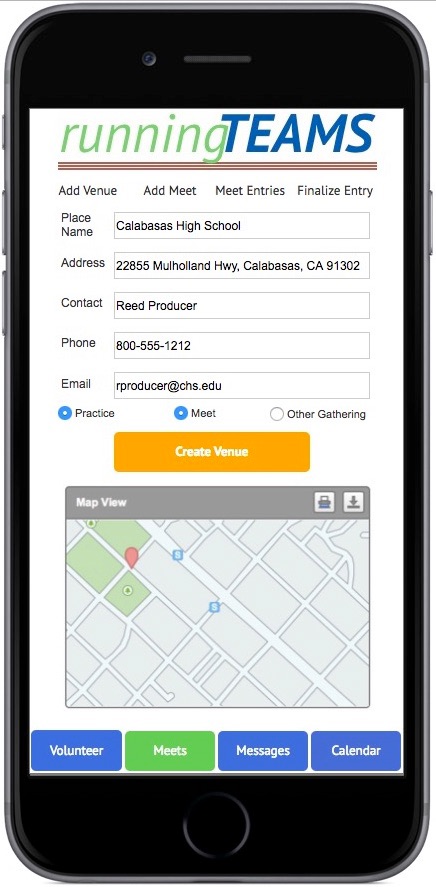
Adding a Venue useful for practices, meets, or other gatherings also got a 5. But a tester pointed out that a venue good for Track & Field wouldn't necessarily work for Cross Country. Separate radio buttons coming next rev.
Improved Communications

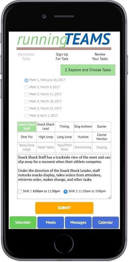
Users believed real-time sharing of messages about practices, changes in logistics, phone photos taken during meets, volunteer reminders and so on would help ease communication and spark interest in parents.
Task: Meet Entry of an Age Group Relay Team
This video shows how the clickable prototype handles Meet Entries for a relay event. The coach gets to choose from athletes conveniently sorted by their best times. Users liked it, but wanted options for an A-team and a B-team. Another iteration ahead.
The good news? All the Coaches and Parents who helped with usability testing want to know when they can start using the app.
It's Come A Long Way

Thanks for coming on the UX journey with me, encapsulated by the sketch, wireframe, prototype transformation above. Feel free to connect with me if I can answer any questions. -- Kevin Strehlo
