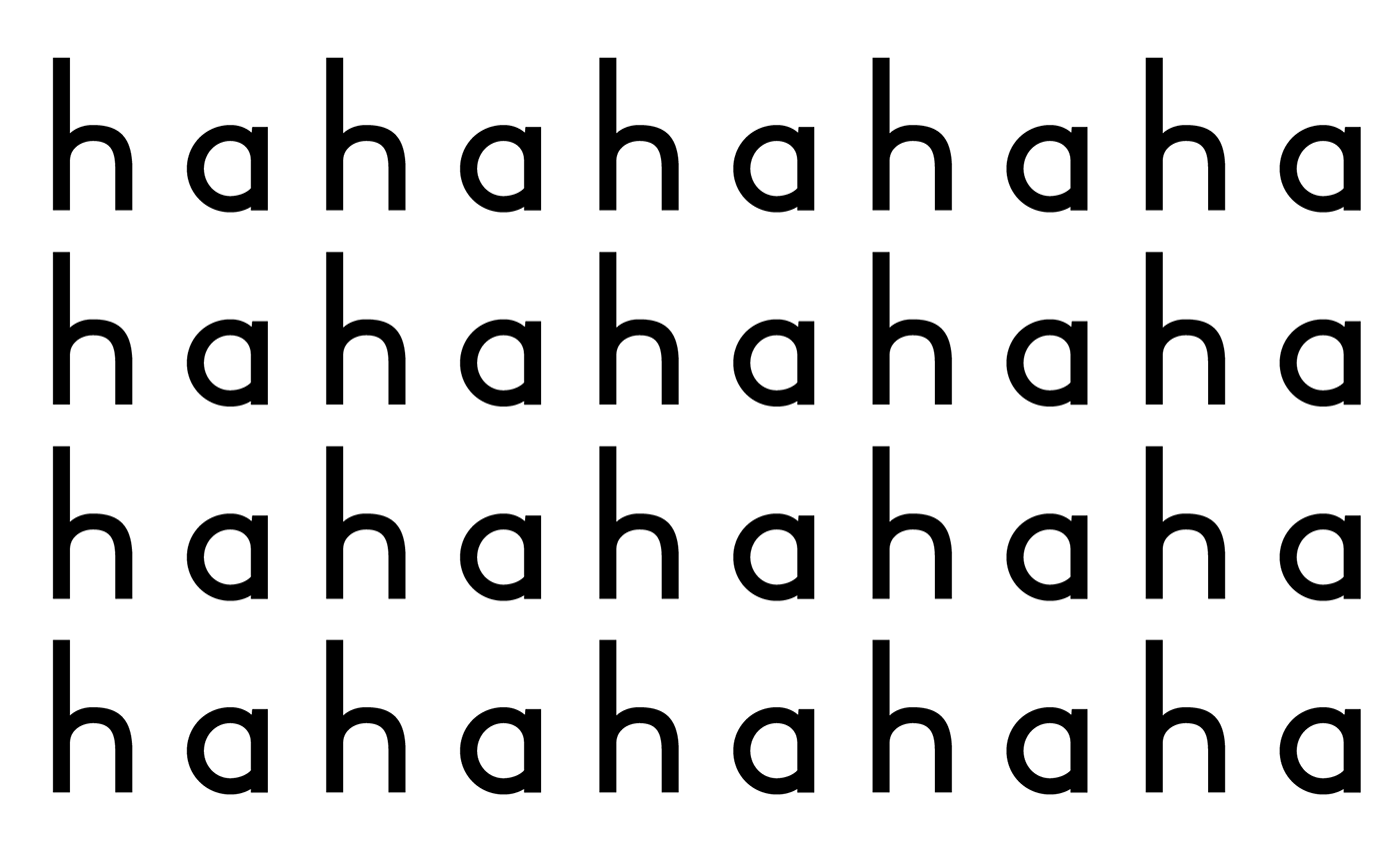
In the summer of 2016, I designed my first typeface Quake.otf. Currently it comes in one weight and has ninety-nine total glyphs. It is designed with the intention to be used for corporate identity with some eccentric elements.
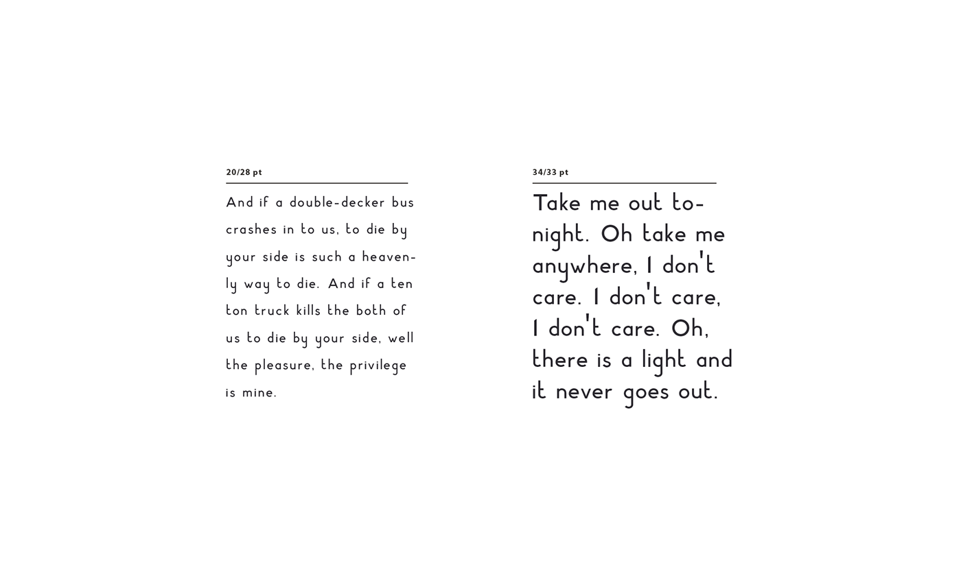
Words taken from: There's a Light that Never Goes Out by The Smiths
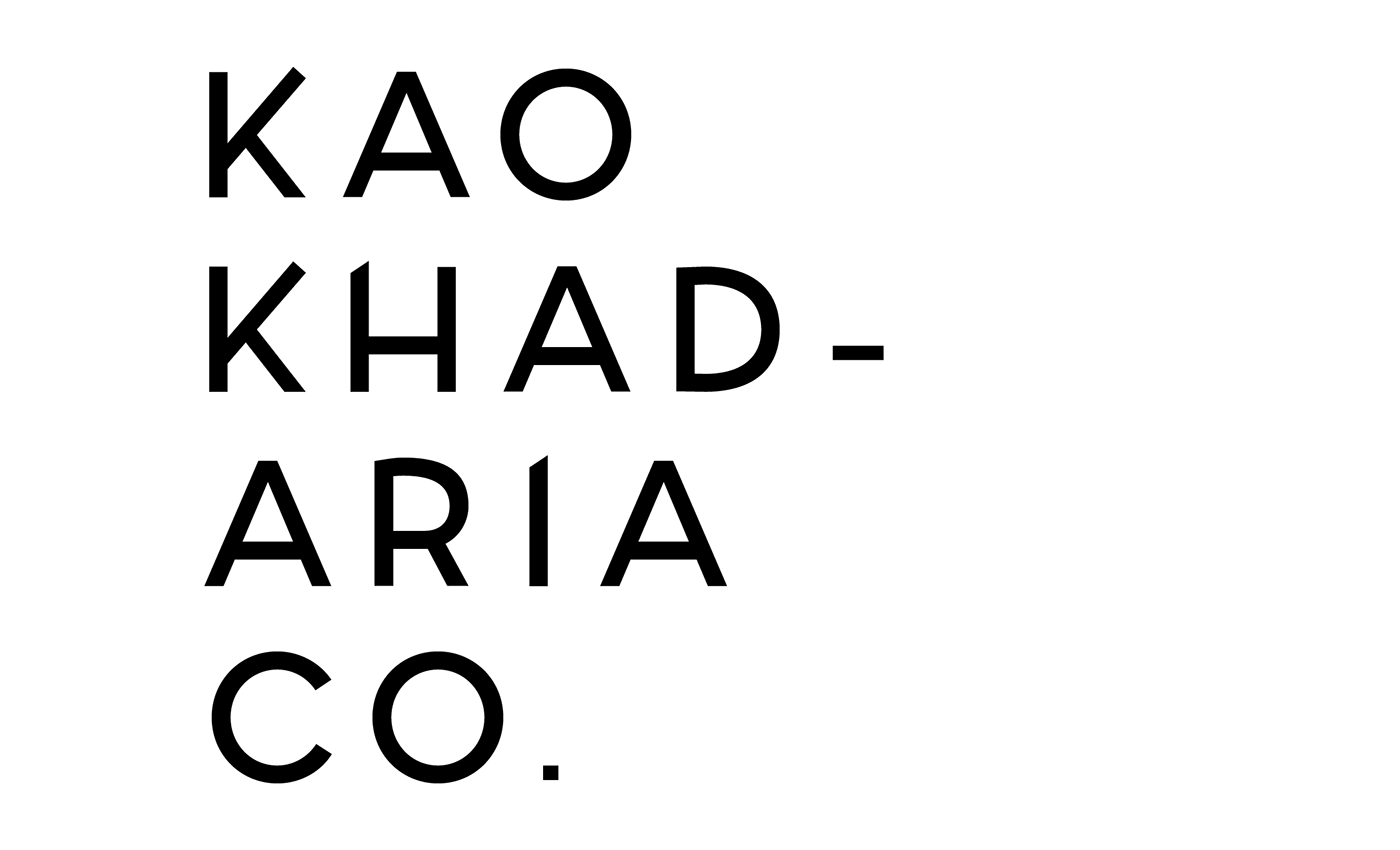
Example application of Quake.otf in corporate logos.
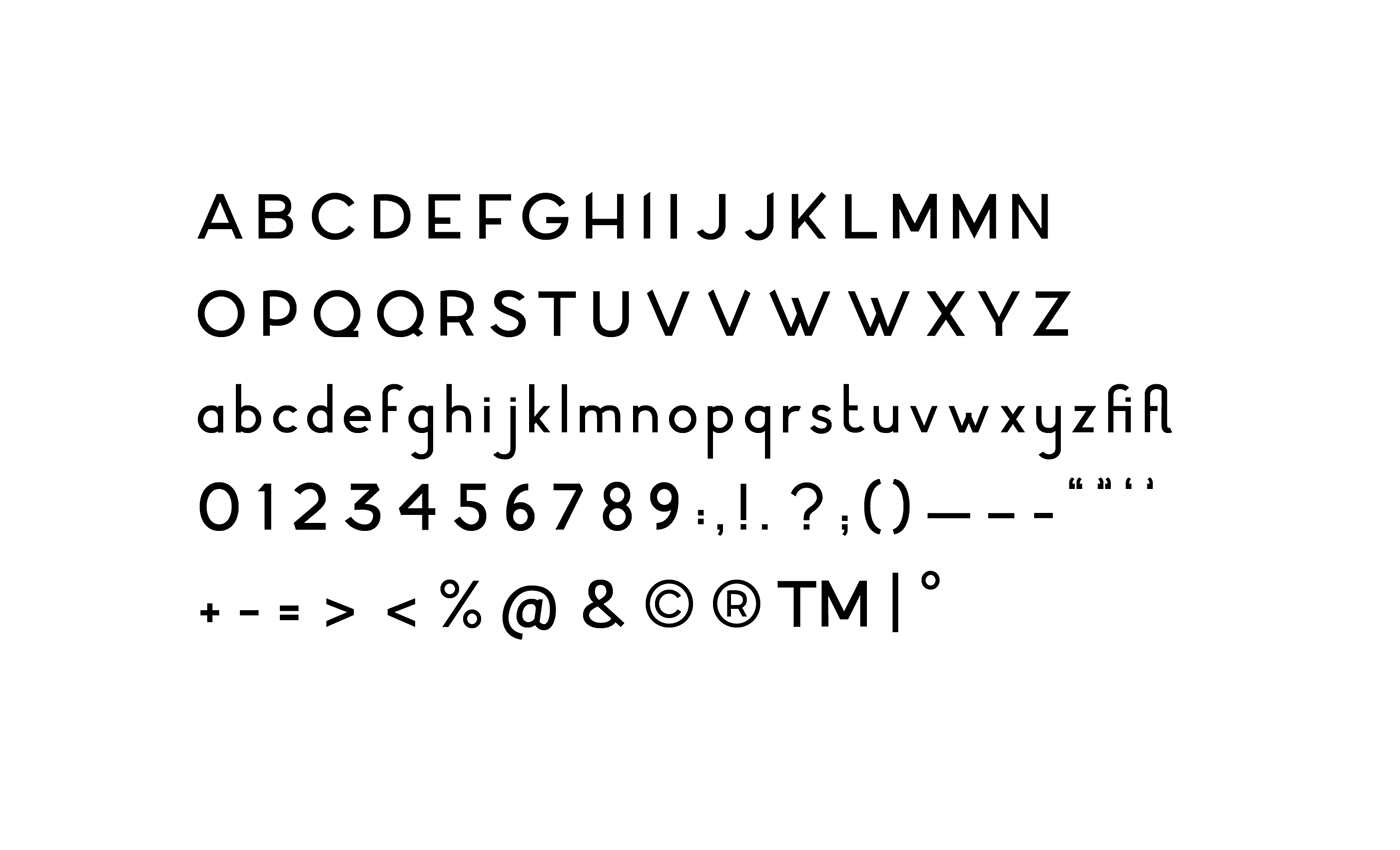
Full set of glyphs