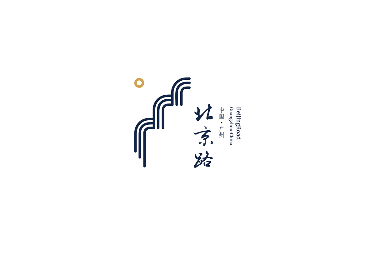
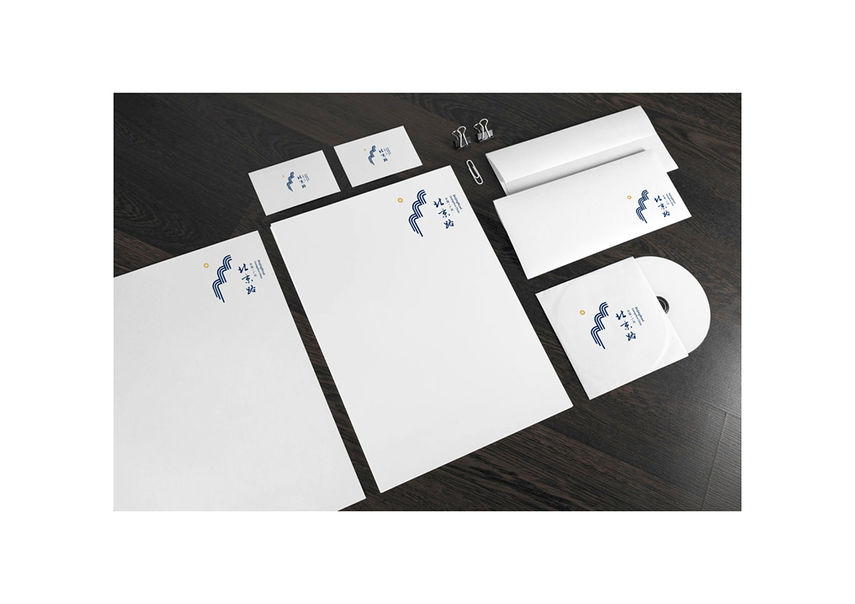
The new main-logo.
Long-History, interesting is the ingredient in a fresh new identity for a brand that offers to fascinate the modern way of travel.
Interesting, simplicity, ingredients come together at Beijing Road (Guangzhou), the innovative signage that offers fresh travel to go. I with Jiner, Fermentedbeans and Kai have created a new brand identity for Beijing Road that spotlights the unique landmark architecture in a clean, interesting of a feature. The launch of the new identity is being introduced with the government, but they stilly in a decision process.
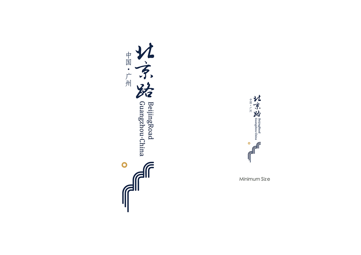
The new sub-logo.
The new Beijing Road logo pairs and word mark with the “landmark pattern”: the word is from the local celebrity, while “landmark pattern” include a bunch of meaning. 1. The circle stand for the traditional culture of Nanyue — Wansuiwadang 万岁瓦当, it also represents the sunrise scenery. 2. The flowing lines express the drip statement of Tonghudilou 铜壶滴漏, also represent the source of the Pearl River.
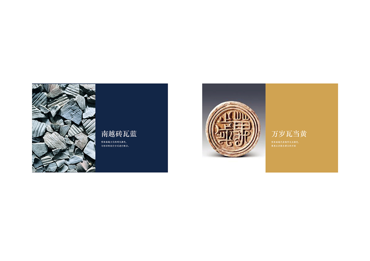
Source of color.
The color of dark blue and golden are inspired from the landmark of Nanyue culture. The two color run through the whole new visual system.
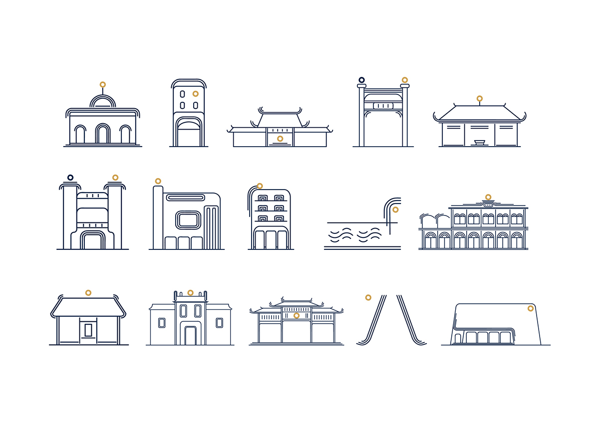
Throughout the system, the golden circle suggests the feature of traditional culture, the dark blue line help organizes the elements of signage. This distinctive system easy accessibility. The flexible signage system can be customized for a variety of building locations.

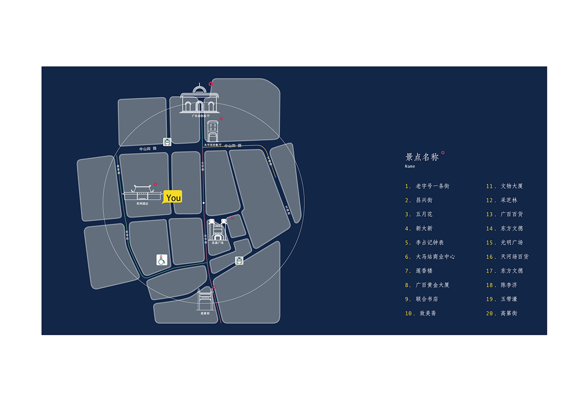
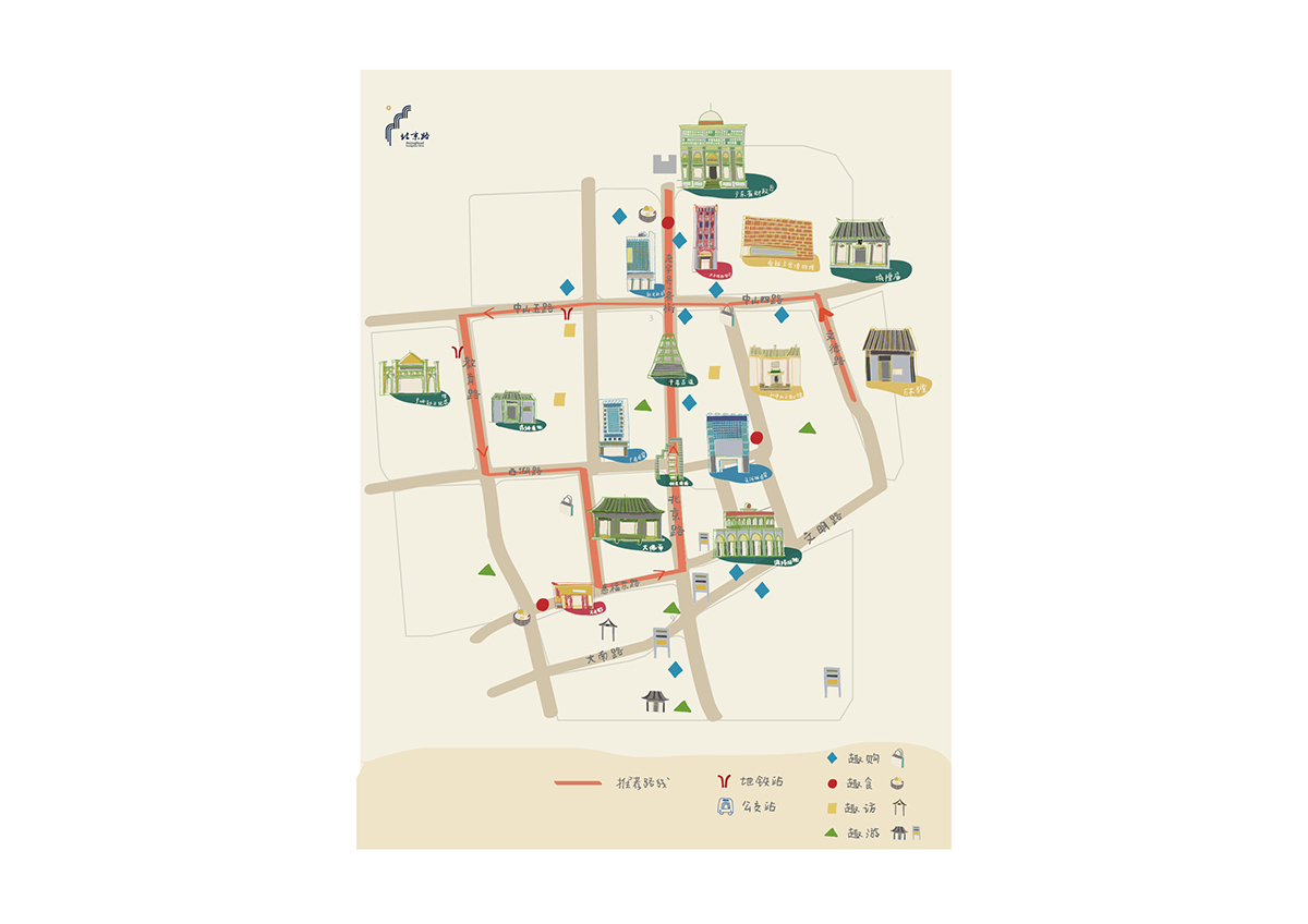
Map.
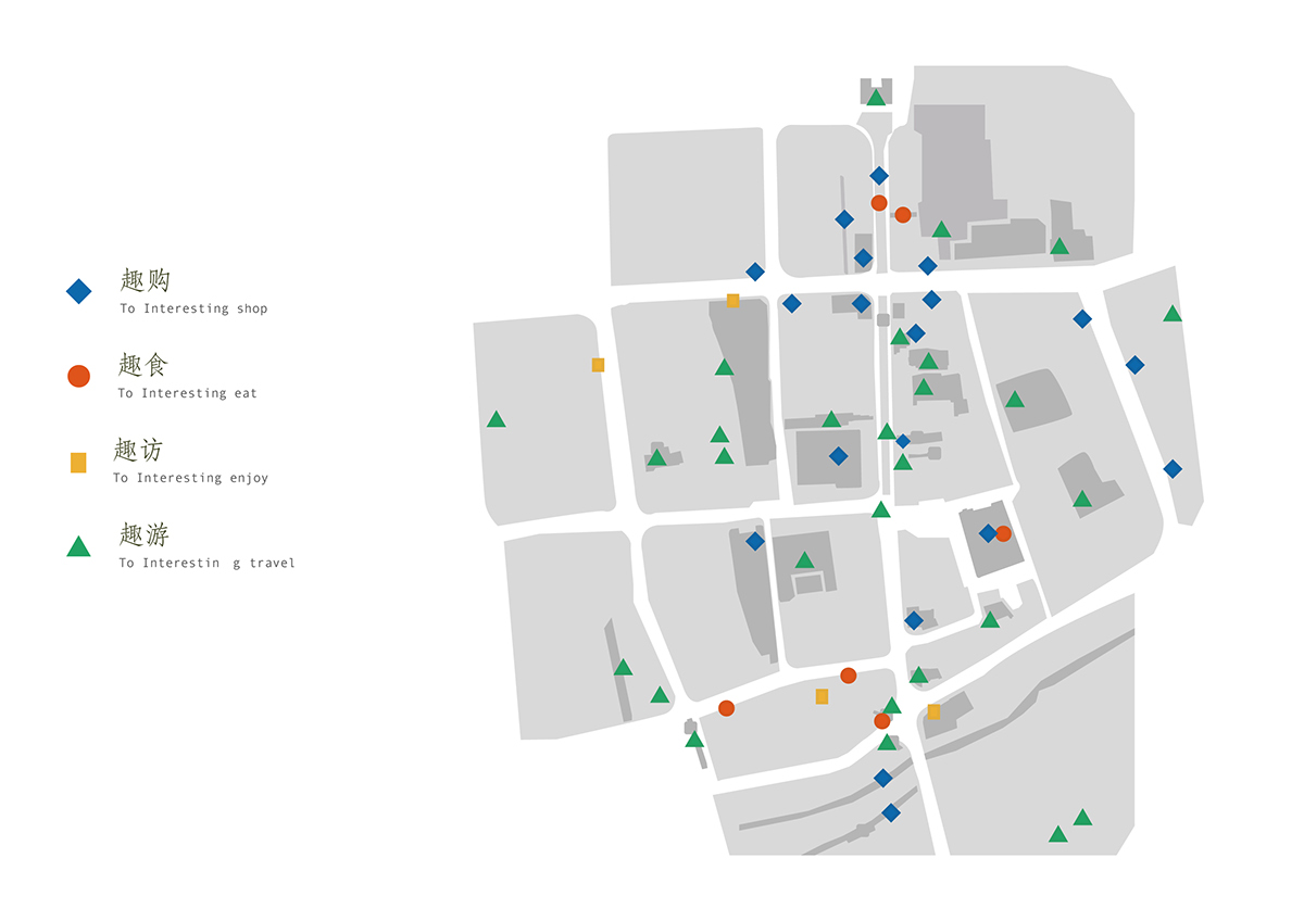
Information graphics offers a convenience take-away map.
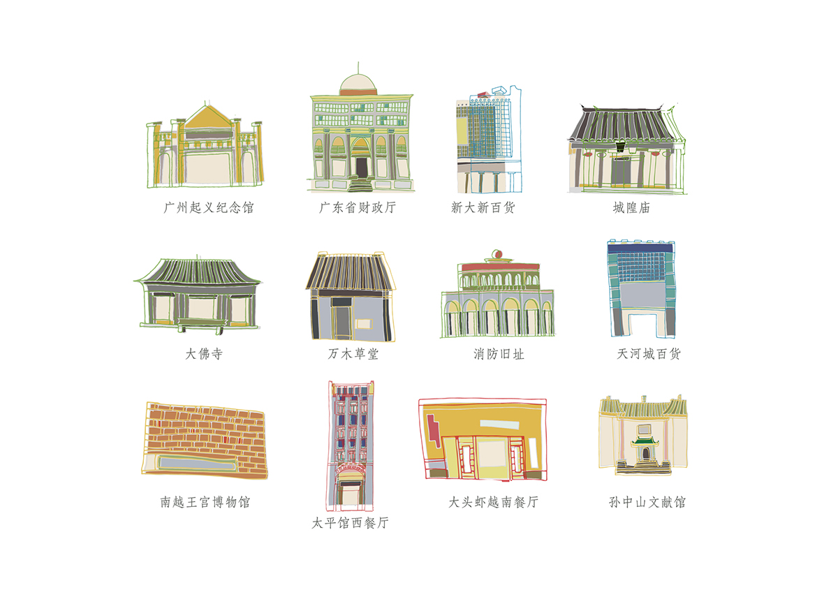
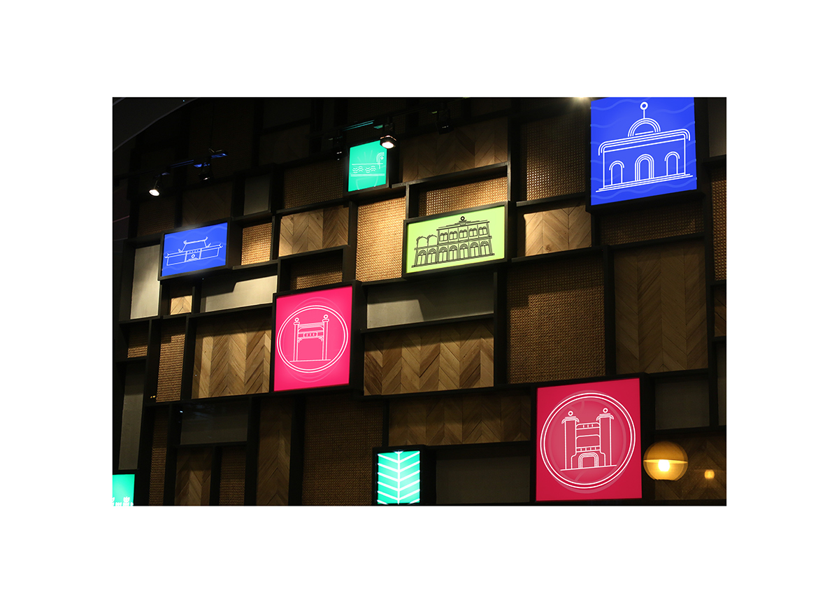
Illustration for landmark building.
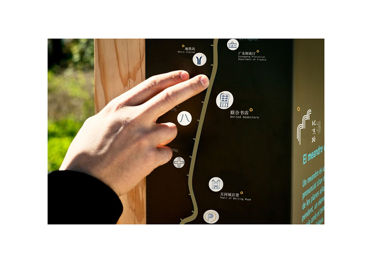
Signage at the outside building.