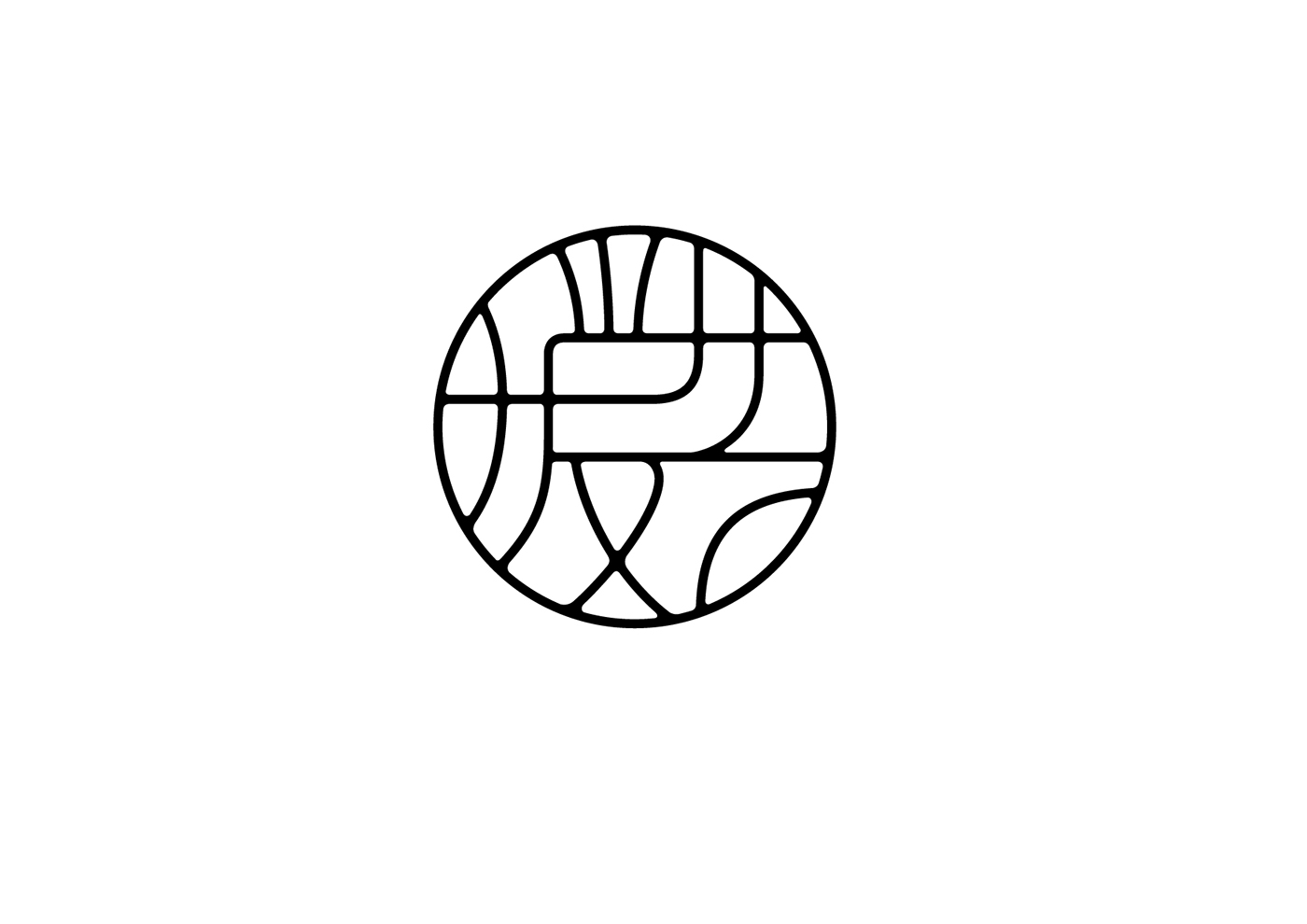
形:暖艺标志以圆线为轮廓结合“暖”与“艺”变换构成而出,极具中国风。
意:汉字“暖”与“艺”的图形化代表暖意品牌,线与线的穿插、流通寓意品牌起到的桥梁作用,窗格、竹编等意向亦
传递出品牌属性。
色:标志在颜色上采用“木”色,暖暖的色相低调不张扬,既象征着中国民间手工艺人又折射出大地的色彩。
SAGE COLLECTIVE (暖艺) is a New York-based retail studio providing curated collections from some of the best studios and artisans in Asia. Through their broad range of luxury lifestyle goods, they serve to identify a contemporary space for traditional ingenuity.
Form: The logo of Sage Collective (暖艺) consists of two elements: the circle and two Chinese characters within. Two characters inside of the circle are “暖” (nuan) and “艺” (yi), meaning “warm” and “arts and crafts” in Mandarin. The strokes of both characters are designed to connect and interweave with each other.
Meaning: The circular form represents that everything comes in a full circle. The interwoven strokes within the circle explain the role of Sage Collective, which is a bridge that connects/showcases Eastern cultures to the West. The look of the logo also resembles traditional Chinese window screen.
Color: The logo uses a neutral beige color with a subtle and warm earthy hue. It is not only the color of nature, but also the color of traditional materials used by Chinese craftsmen, such as bamboo, textiles, and clay.
www.sage-collective.com