
ahq VI - Rebranding
2016
Client : ahq e-Sports Club, Taiwan
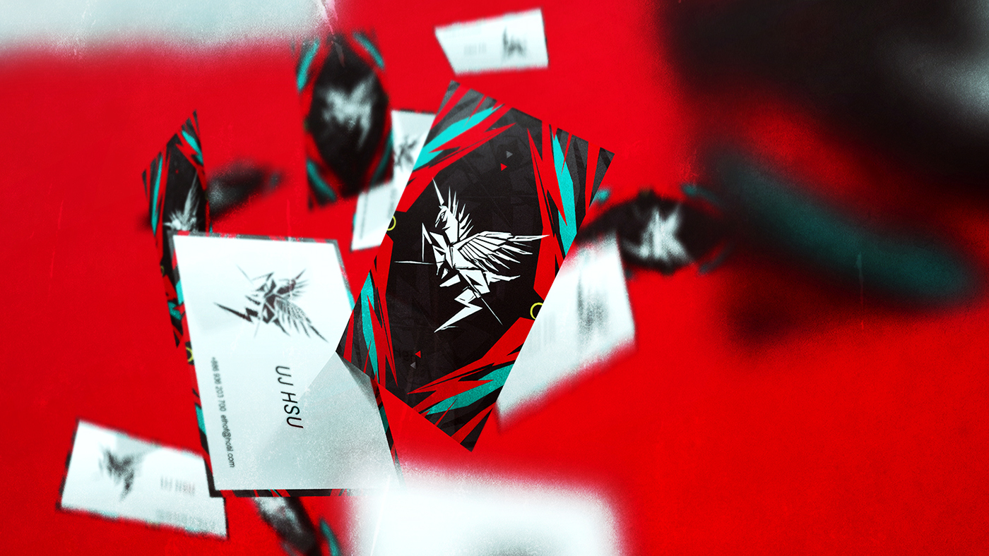
Concept and design : ujhsu


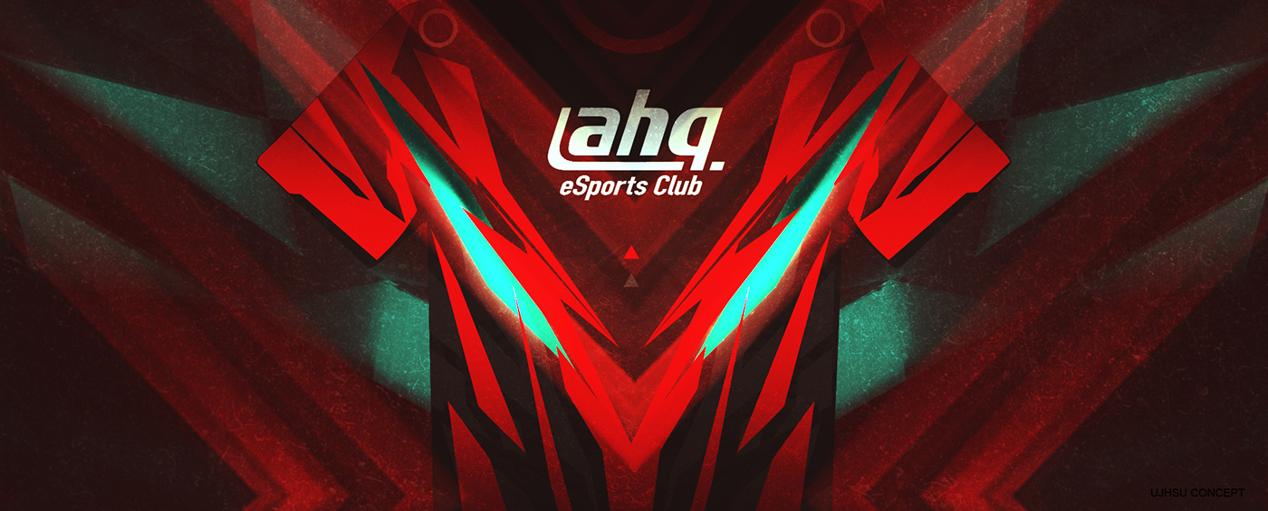
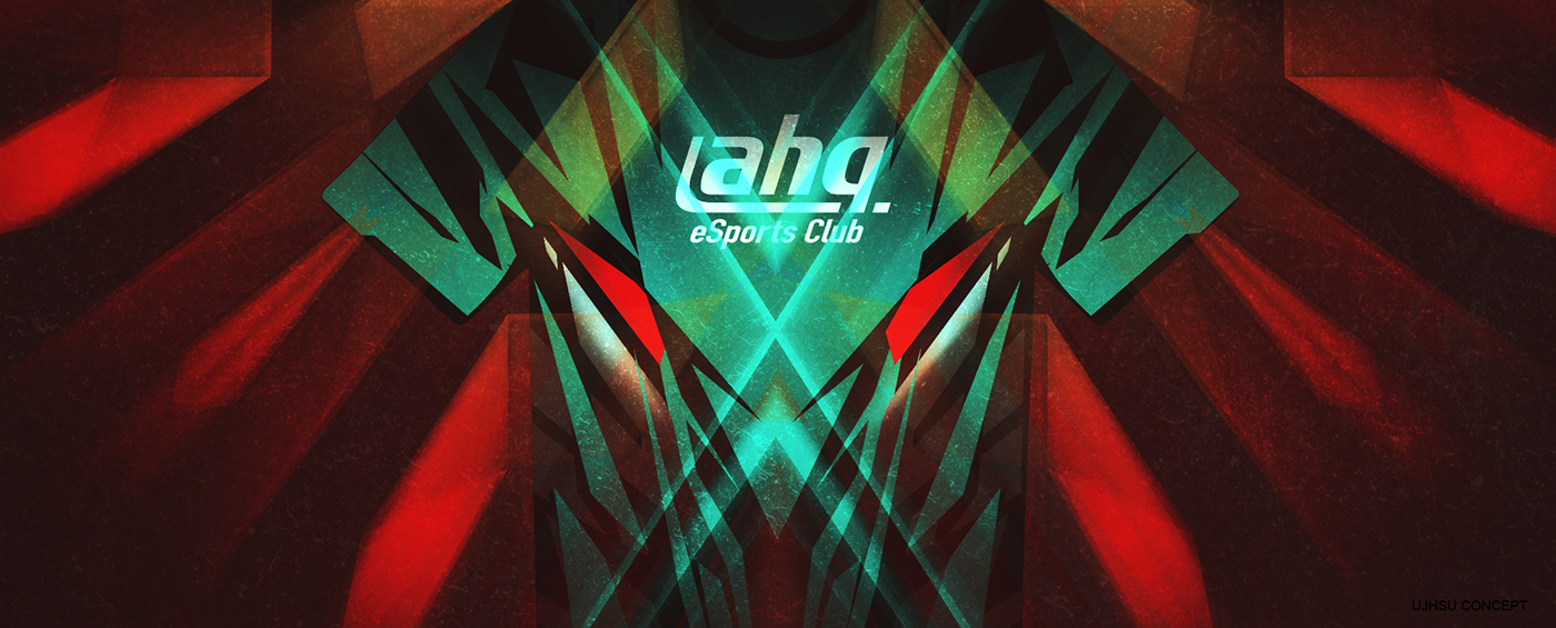
T - Shirt Design
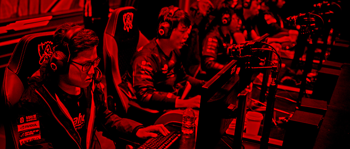
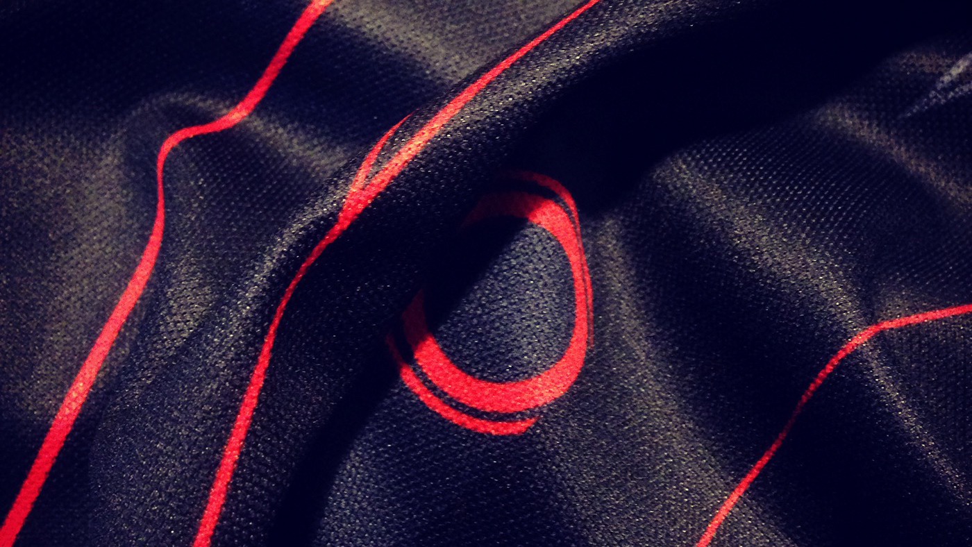
這次戰T呈現ahq logo的不同視覺感受,不使用側⾯的天馬,以正面天⾺的頭像做設計主軸,象徵正面迎戰對方的迫力。設計細節延續天馬logo的電路圖概念,但呈現不同的⾊彩感覺,因此不使用⼤紅色塊,雖然一樣是紅⾊呈現設計,但有低調的科技感。
I hope that this time the T-shirt design can show different visual perception (ahq logo)
Pegasus's front picture, as the design of the spindle, a symbol of the positive impact of the force.
Design details, continuation of the concept of circuit diagram, In order to show a different color feel, so do not use a large area of red blocks, but in black design. Have a low sense of science and technology.

Keep working.