Nile
Service and Experience Design
Service and Experience Design
Nile are a UK Service and Experience Design agency. They consult on all touch points in a user journey from initial contact to continued committed relationship. I was commissioned to rebrand them with a unique identity that would show their understanding of the unique journeys that we all take within businesses and consumer experiences.
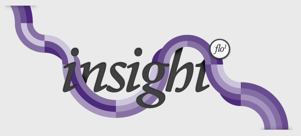
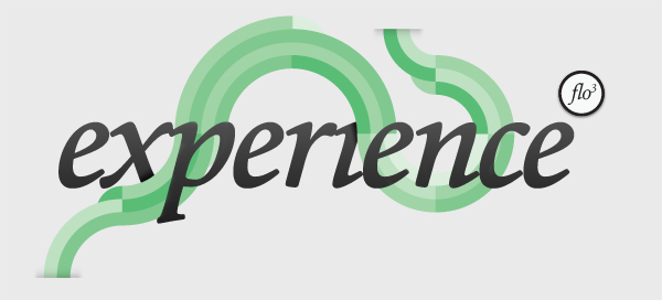
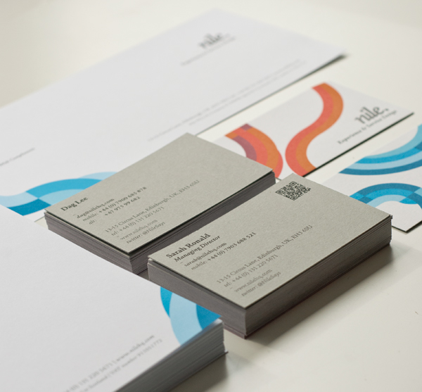
To begin I thought about the role of a journey and different historical paths. The river Nile fitted the journey concept while also being the dramatic and mythical location. I presented this name alongside the concept of the 'Flow' device. The 'Flow' is designed to sit alongside their core business model supporting it visually. The 'Flow' represents the journeys that a user can take. Illustrating that each journey is unique and can be entered at many points but the journey should be unified.
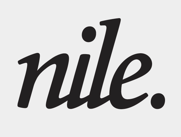
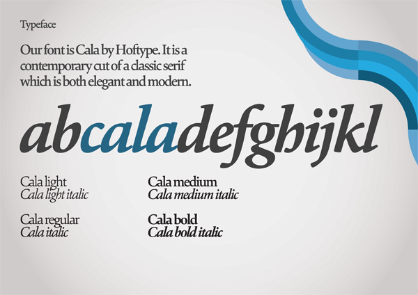
The mark itself is a derivative of the serif typeface Cala. I spent time matching the serifs and spacing between the letters to create a smooth linked mark. I also duplicated the tittle above the i for the fullstop to balance the left serif on the n.
Work completed while at Line Digital (www.line.uk.com)
To begin I thought about the role of a journey and different historical paths. The river Nile fitted the journey concept while also being the dramatic and mythical location. I presented this name alongside the concept of the 'Flow' device. The 'Flow' is designed to sit alongside their core business model supporting it visually. The 'Flow' represents the journeys that a user can take. Illustrating that each journey is unique and can be entered at many points but the journey should be unified.
The mark itself is a derivative of the serif typeface Cala. I spent time matching the serifs and spacing between the letters to create a smooth linked mark. I also duplicated the tittle above the i for the fullstop to balance the left serif on the n.
Work completed while at Line Digital (www.line.uk.com)
Logotype

Brand guidelines

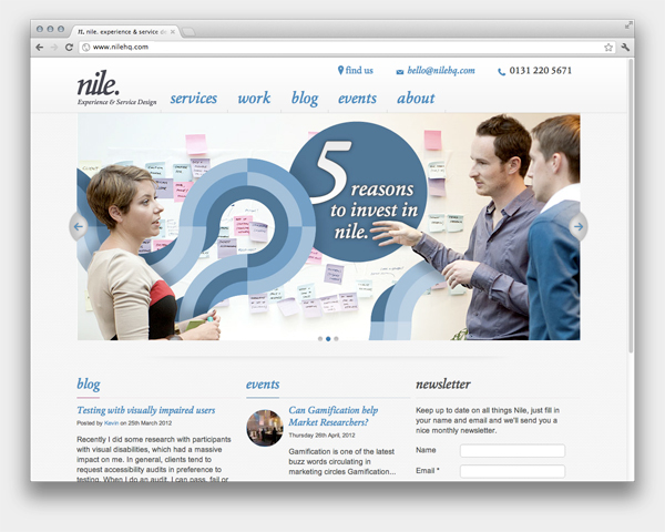
Website
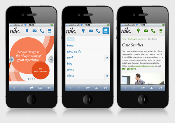
Mobile view of site


