Client
UniFly is a belgian company specializing in aviation software development. The primary goal of UniFly is to bridge the gap between manned and unmanned aviation by facilitating the safe integration of drones into the global aviation system.
Challenge
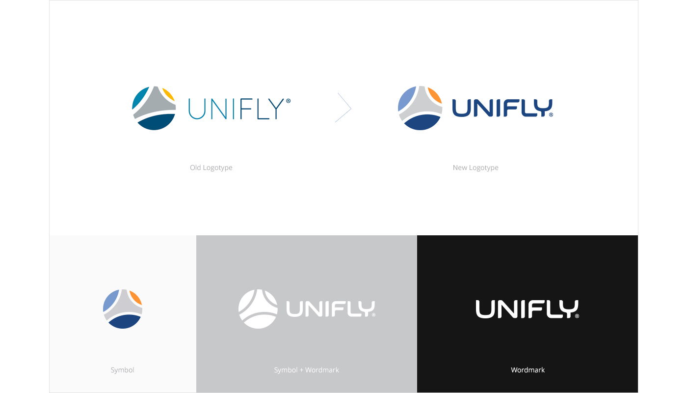
The client contacted us as they were complaining that their brand look is not “consistent”, “original”, they also felt that it is “boring” and “repetitive”. The challenge was to keep the existing look and feel of the brand, but to make it look more professional and trustworthy.
Branding
The UniFly identity is guided by simplicity, openness and clarity. We used visual elements in a very simple way, free of clutter and complexity. This thoughtful, reductive approach helped keep the brand applications focused on the messages rather than on heavy visuals.

Color Palette
The UniFly color palette encompasses a selection of primary and secondary colors.
It was developed from a diversified color scheme with bright colors to represent the warm and welcoming nature of the brand.

Typography
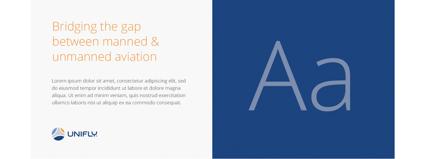
Just like the other elements, a consistent and correct use of typography ensures that the brand doesn’t lose identity when applied to different media and materials. The core typeface is Open Sans. It was chosen because of it’s neutral and friendly appearance, and last but not least, it’s good readability across print, web and mobile.
Images
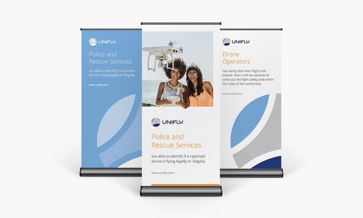
For the UniFly visual system our team employed empowering photography and CGI that reflects the nature of aviation, reliability and friendship. The places and people depicted in the photographs feel exciting and welcoming, and underscore the passion that exists throughout the UniFly brand.

Brand Guidelines
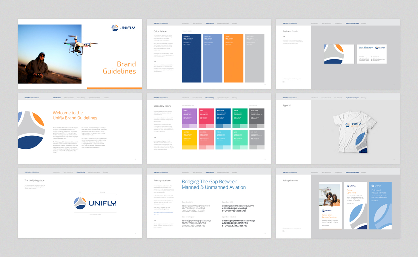
We developed Brand Guidelines to ensure a consistent expression of the Unifly brand across all applications. The following guidelines are essentially a set of rules that explain how the Unifly brand works, including advices on usage of the Unifly logos, color, imagery, and fonts.
It helps make sure that all marketing tools have the same overall look and feel, which not only reinforces Unifly’s credibility with it’s customers, but it also makes Unifly stand out from the crowd.
Stationary
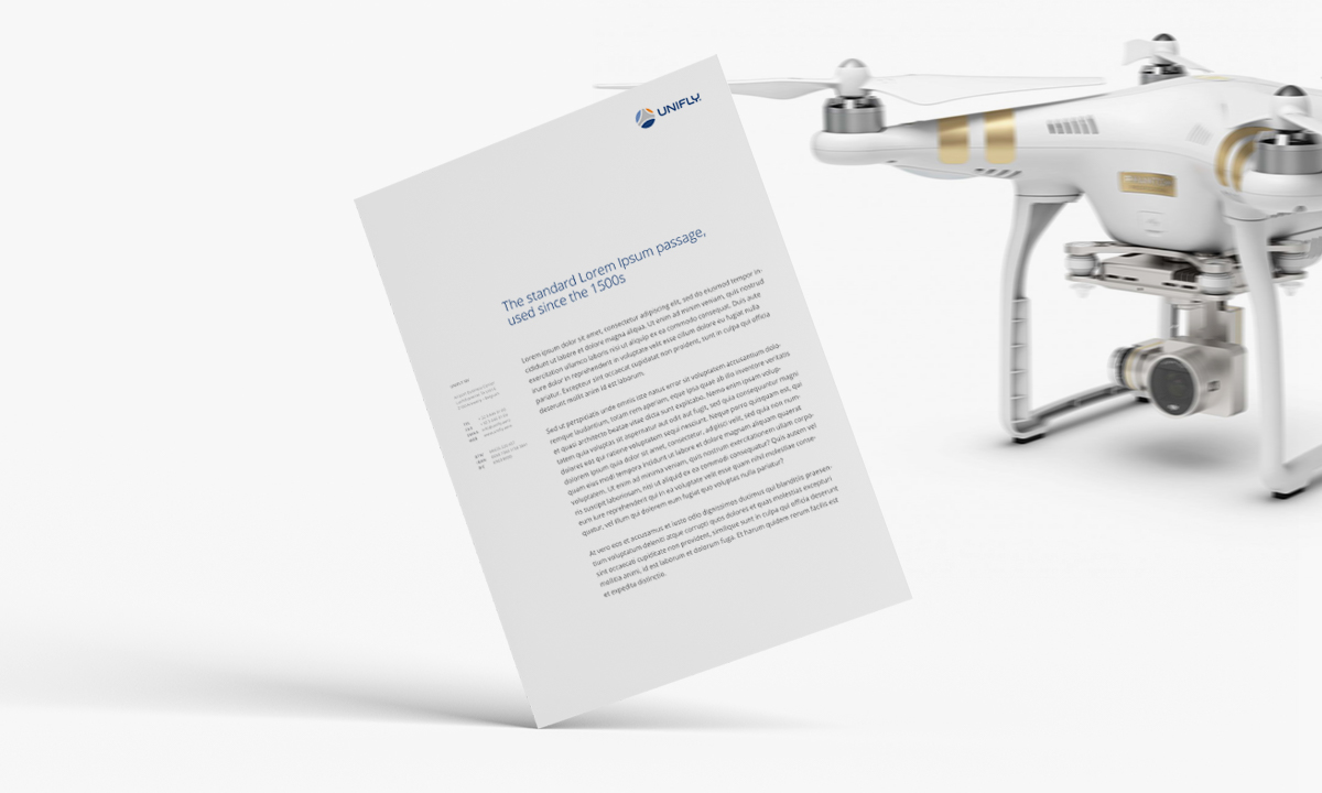
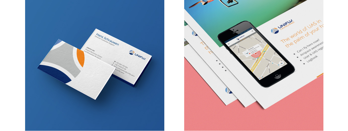
We made sure that every single product is consistent and relates to the brand nature of UniFly. The typography and the supporting graphics were carefully designed to provide a pleasant experience without sacrificing any of the other elements. The business cards were printed on textured matte paper. The letterhead was intended to be very simple and very easy to read.

