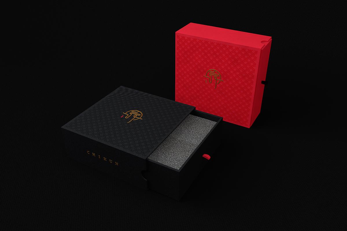
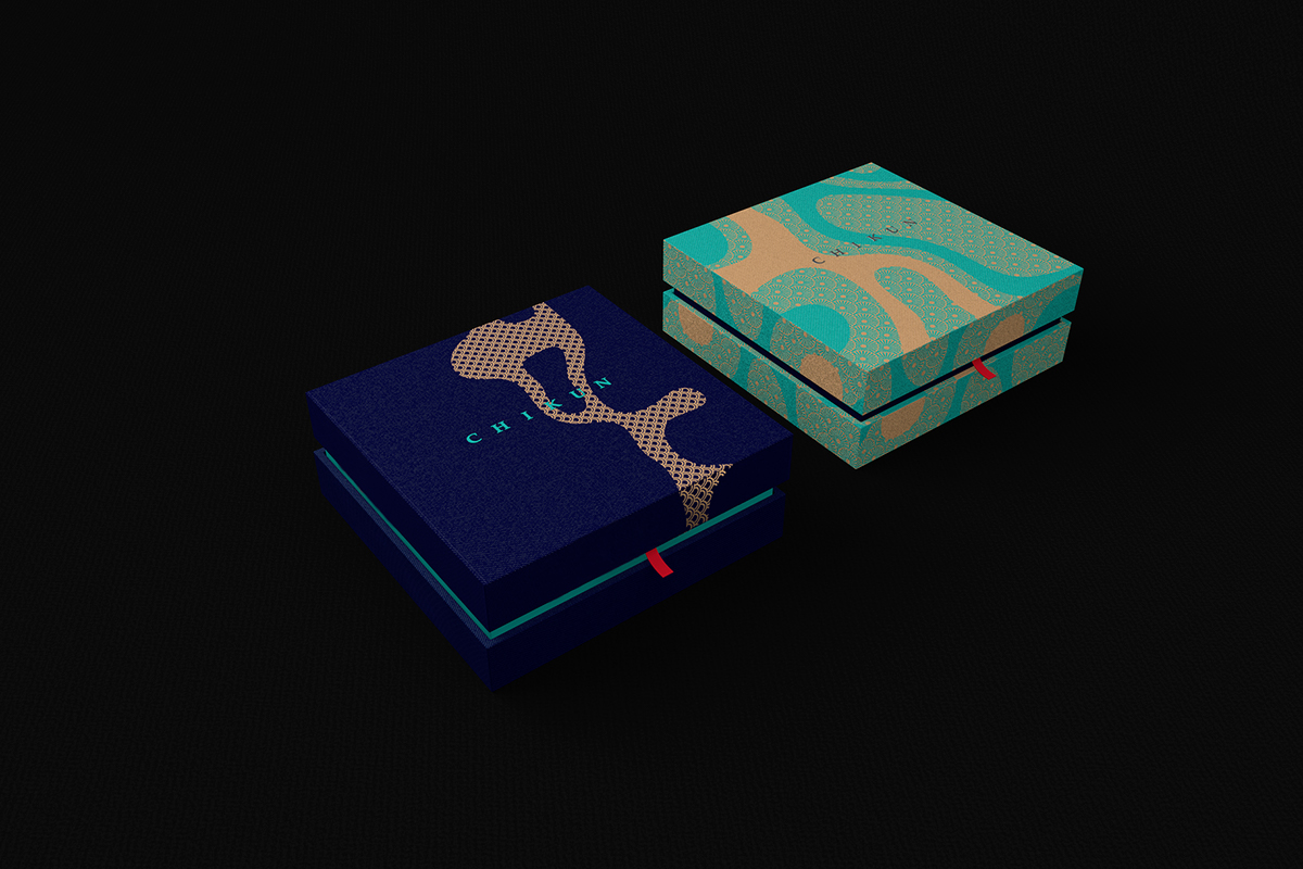
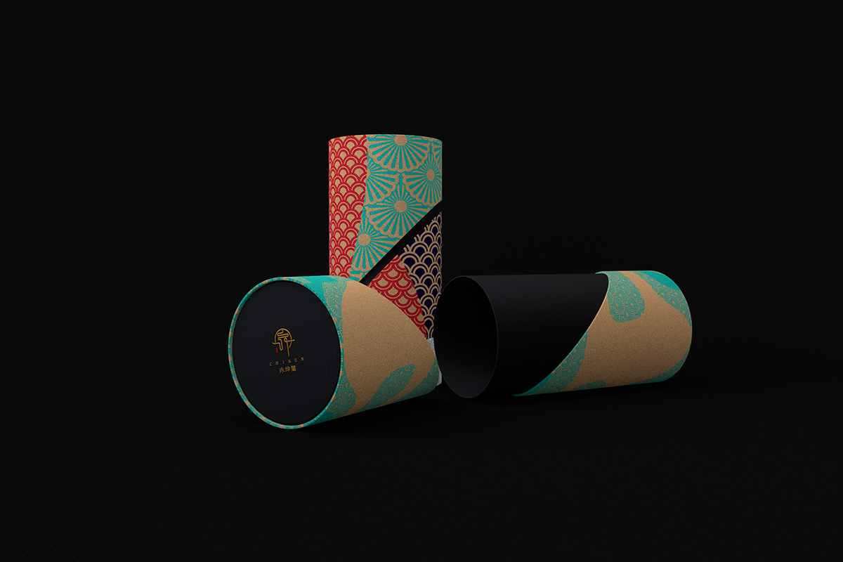
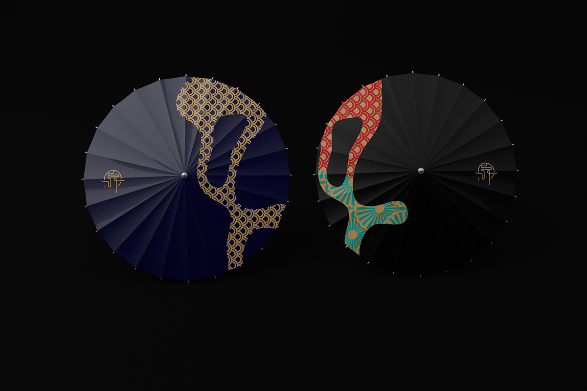
Beyond Design彼安迪作品之《赤坤阁》品牌形象设计
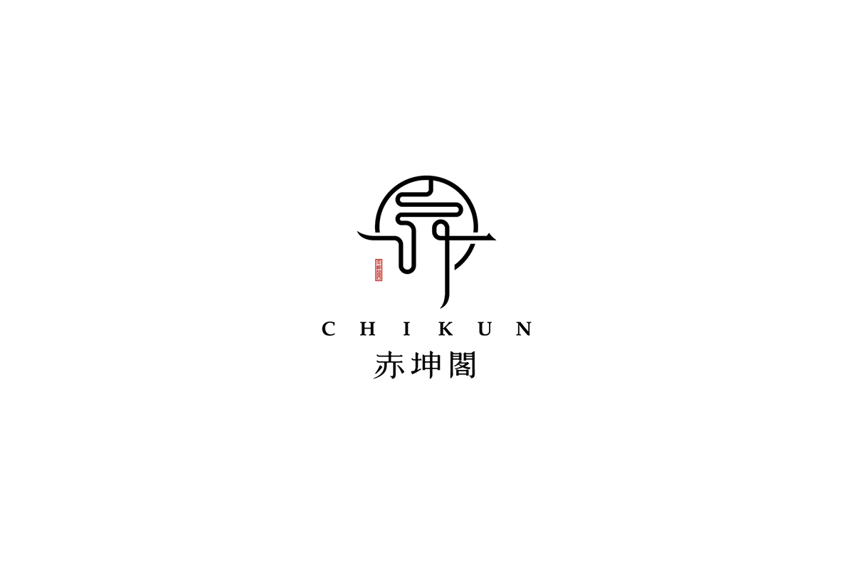
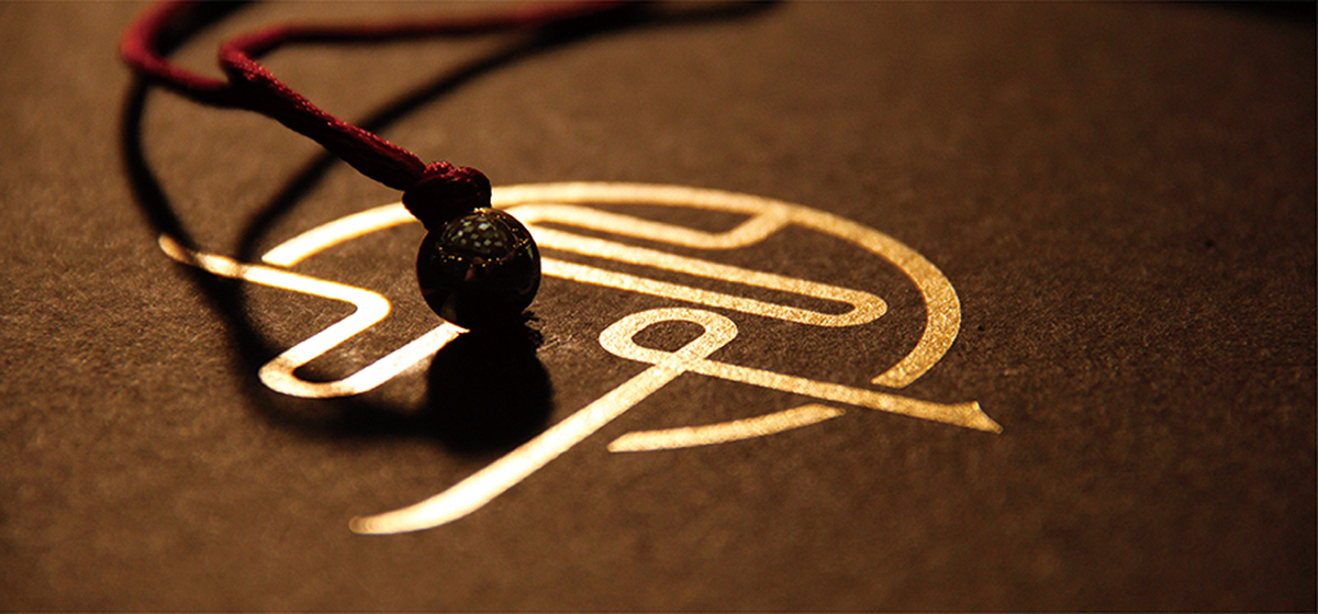
这是以射箭为核心的综合休闲会所,设有简餐和茶水区,标志释义为亦形亦字,亦境亦界,行云流水,
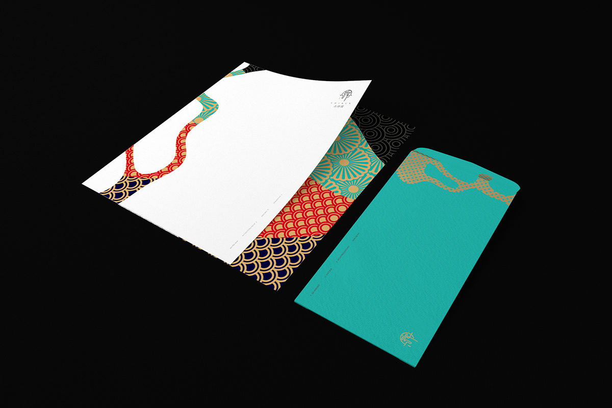
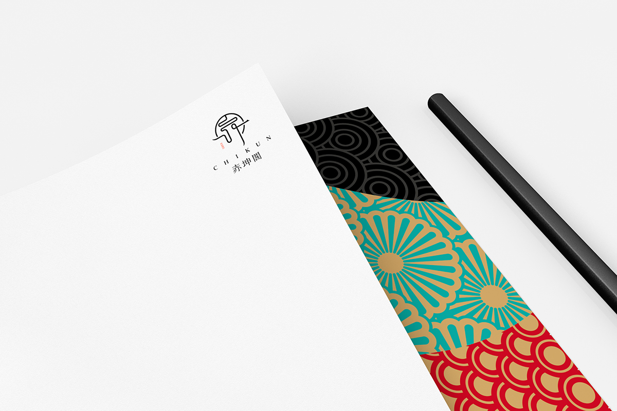
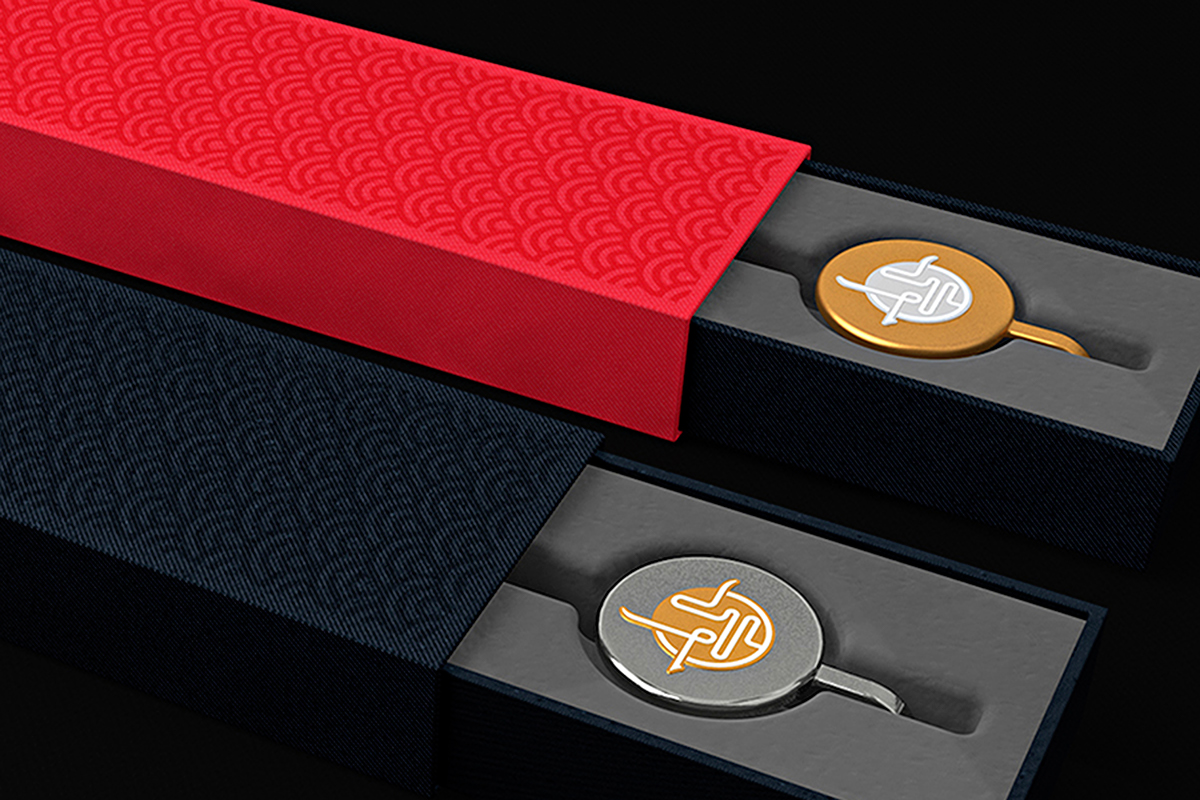
以“赤”为视觉核心,字为箭、形为靶,二者为一,传承民族传统文化精髓,彰显现代奢华气质。
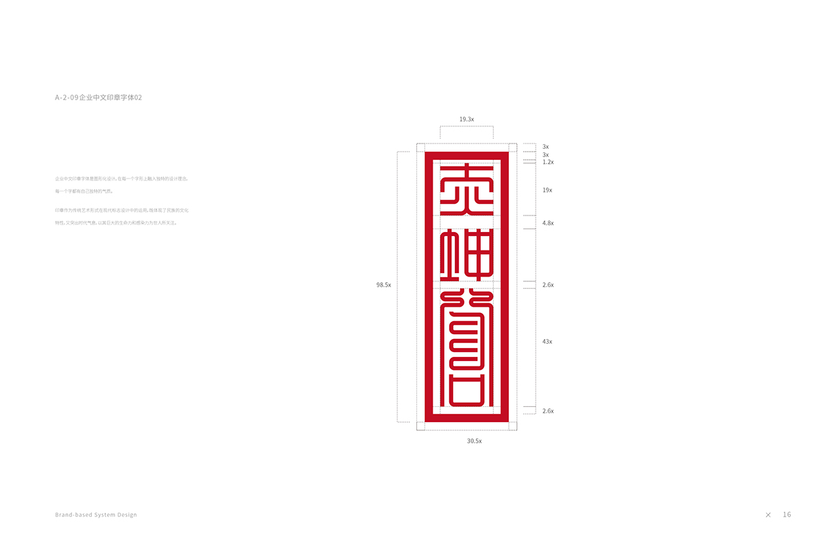
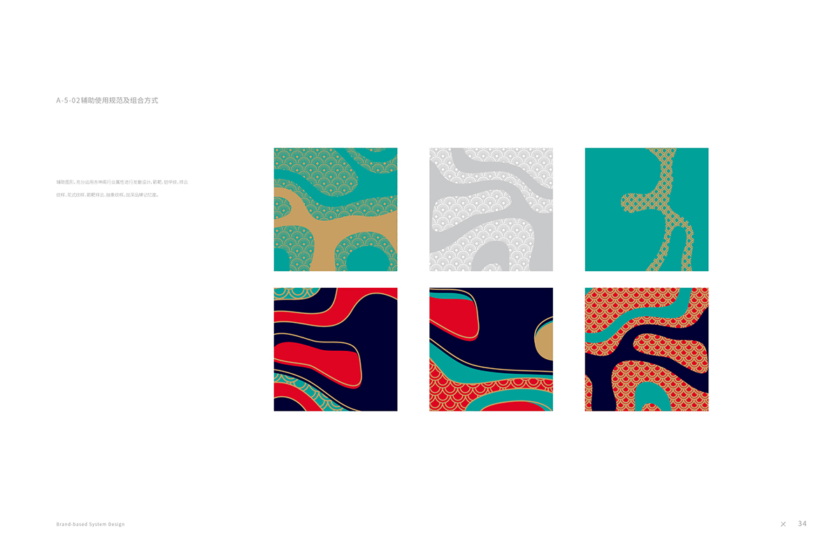
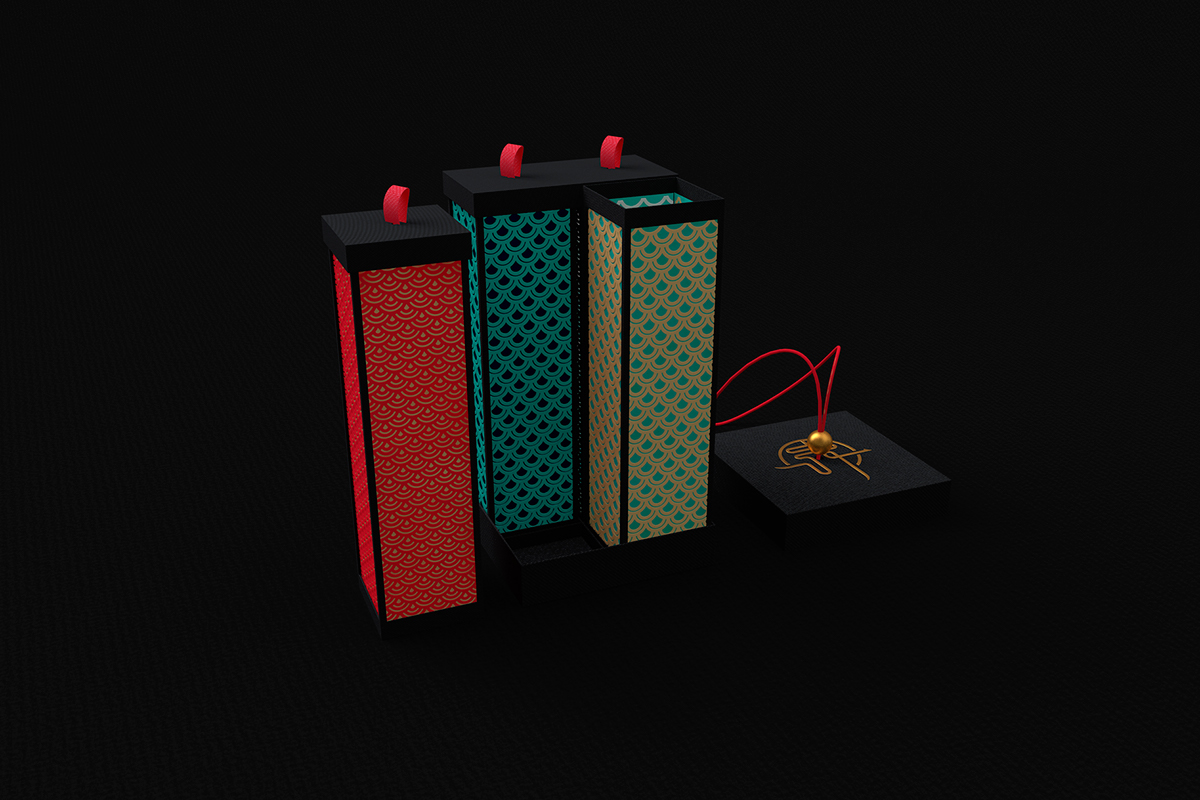
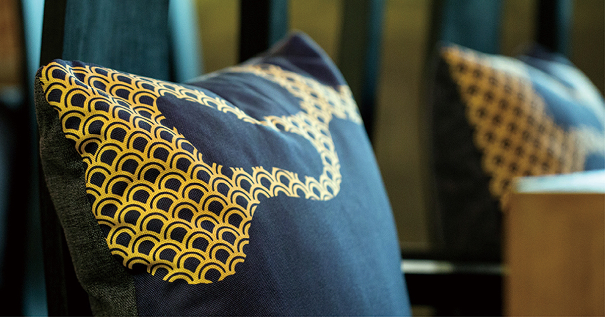
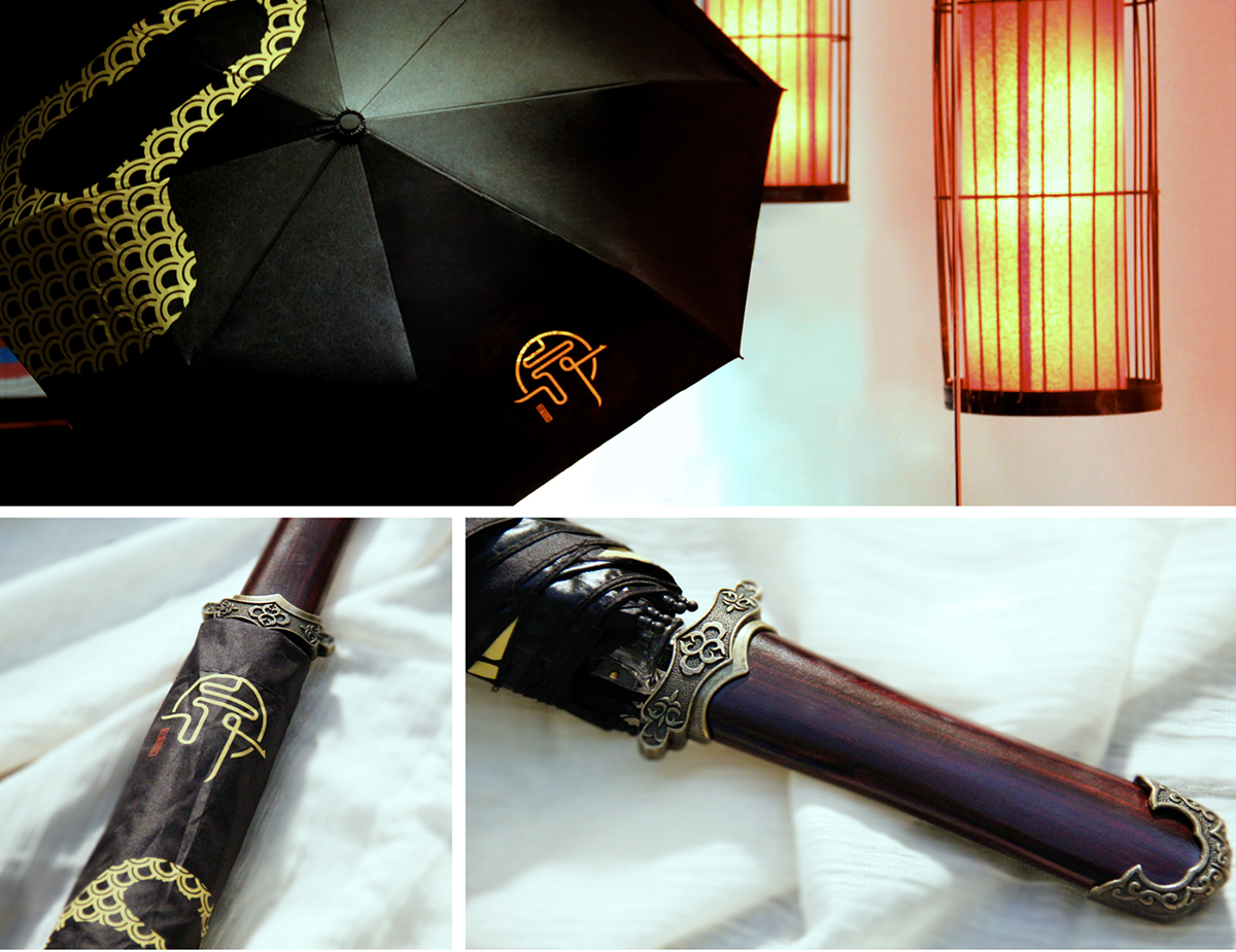
经过对中国古代传统射箭的研究与理解,品牌延伸部分充分运用箭靶、祥纹、铠甲纹等辅助图形来表达“赤坤阁”的文化内涵和品牌属性,在感受中国传统射箭文化的同时,为消费者提供丰富的视觉体验。
Chikun
Chikun, which provides the simple snacks and is equipped with the Pantry Area, is comprehensive entertainment center with the core business of archery. The logo of Chikun, smooth writing, can be understood by the shape and the characters as well, which manifests the condition and the level as well. With the Chinese character “Chi” as the visual core, the perfect combination of the character as the arrow and the shape as the target, inheriting the essence of Chinese traditional culture and revealing luxury temperament.
Through the research and the understanding of Chinese traditional archery culture, the extension of the logo fully adopts the auxiliary graphs, like the target, auspicious and armor patterns, etc, to
express the culture connotation and brand attributes, which will bring the knowledge of Chinese traditional archery culture and a rich visual experience for customers.