


MCKNGBRD is a Los Angeles based brand making premium cases for laptops and tablets. The ambition is to design and manufacture highly versatile cases that combine the functional ingenuity more commonly associated with precision products with the finish of the high-end fashion world. The result is a product that, in contrast to many of the related products on the market, actually protects the device it holds and one that, from an aesthetic perspective, is just as well adapted to the boardroom as weekend hiking.
Founded in 2014 by Navid Mokhberi, we have been involved in the project since the very start. Our project started with the naming of the brand. Starting with a comprehensive list of potential alternatives, the final choice fell upon Mockingbird. The brand name is both semantically and phonetically related to the name of the founder, with Mokhberi meaning ’messenger’ or bearer of news’ in Farsi. Adding to that, the (Northern) Mockingbird, a bird native to California, is one of nature’s most skilled adopters, know for mimicking the songs of other birds and the sounds of insects and amphibians, in their hunt for food. This versatility is clearly linked to the products, being one of their primary characteristics. Furthermore, the shell protecting the unhatched bird and feathers sheltering its mother is a nice allegory of the products' main purpose; protection and panache.
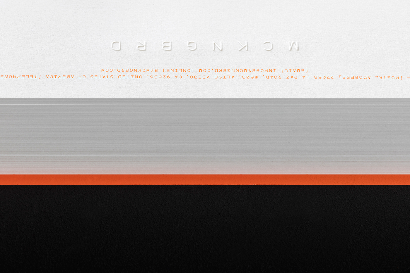
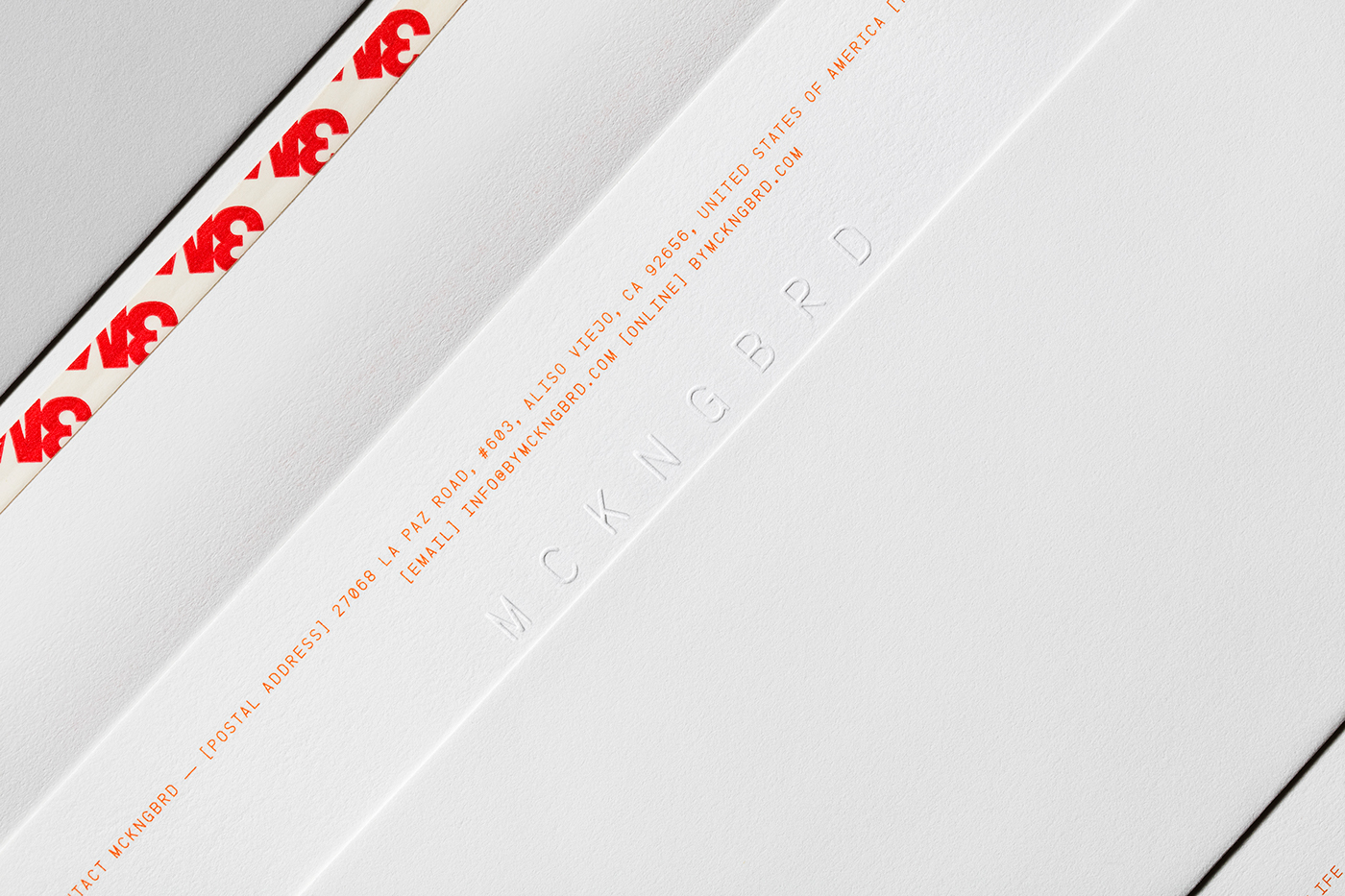
By removing the vowels we created a shorter and more distinctly unique wordmark, prompting the reader to interact with the brand through filling the gaps in the familiar word.
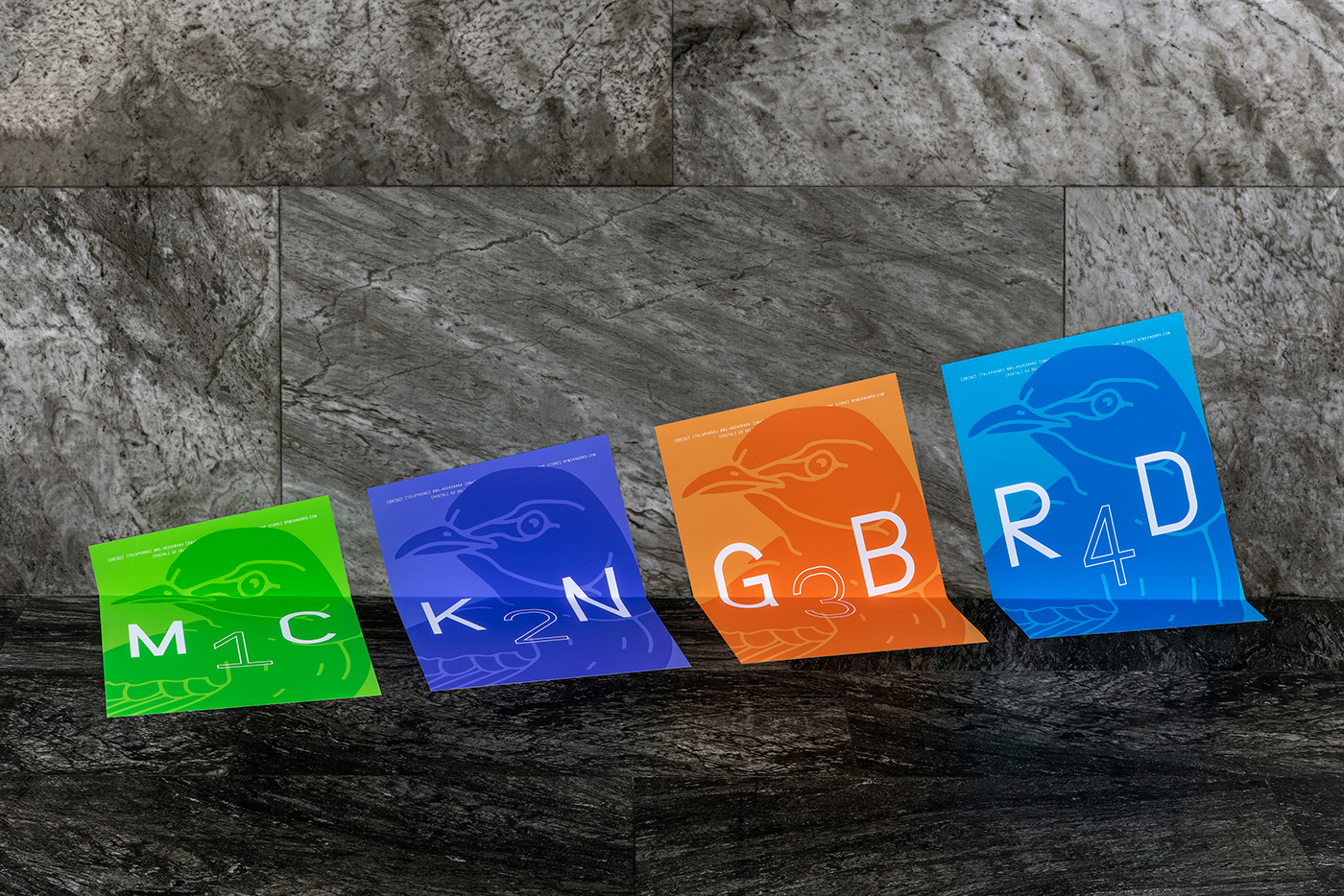
The primary colour palette is made up of three colours; black, white and orange/copper. In physical applications, the orange colour is sometimes replaced with copper foil. A secondary colour palette offers a wider range of options for campaign material and includes a bright green, blue and purple.
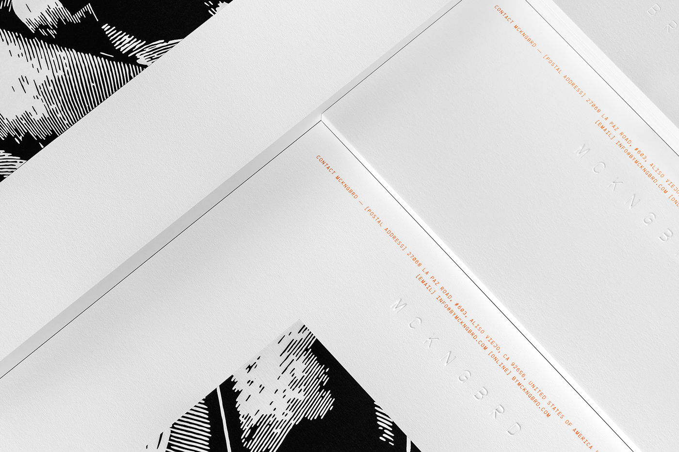
An elegant range of stationery was designed, using subtle means to great effect. Archival quality paper of 100% cotton was used, both for its elegant look and feel and because of how well it responds to blind embossing. Bespoke envelopes were designed and manufactured, to hold letters and invoices.
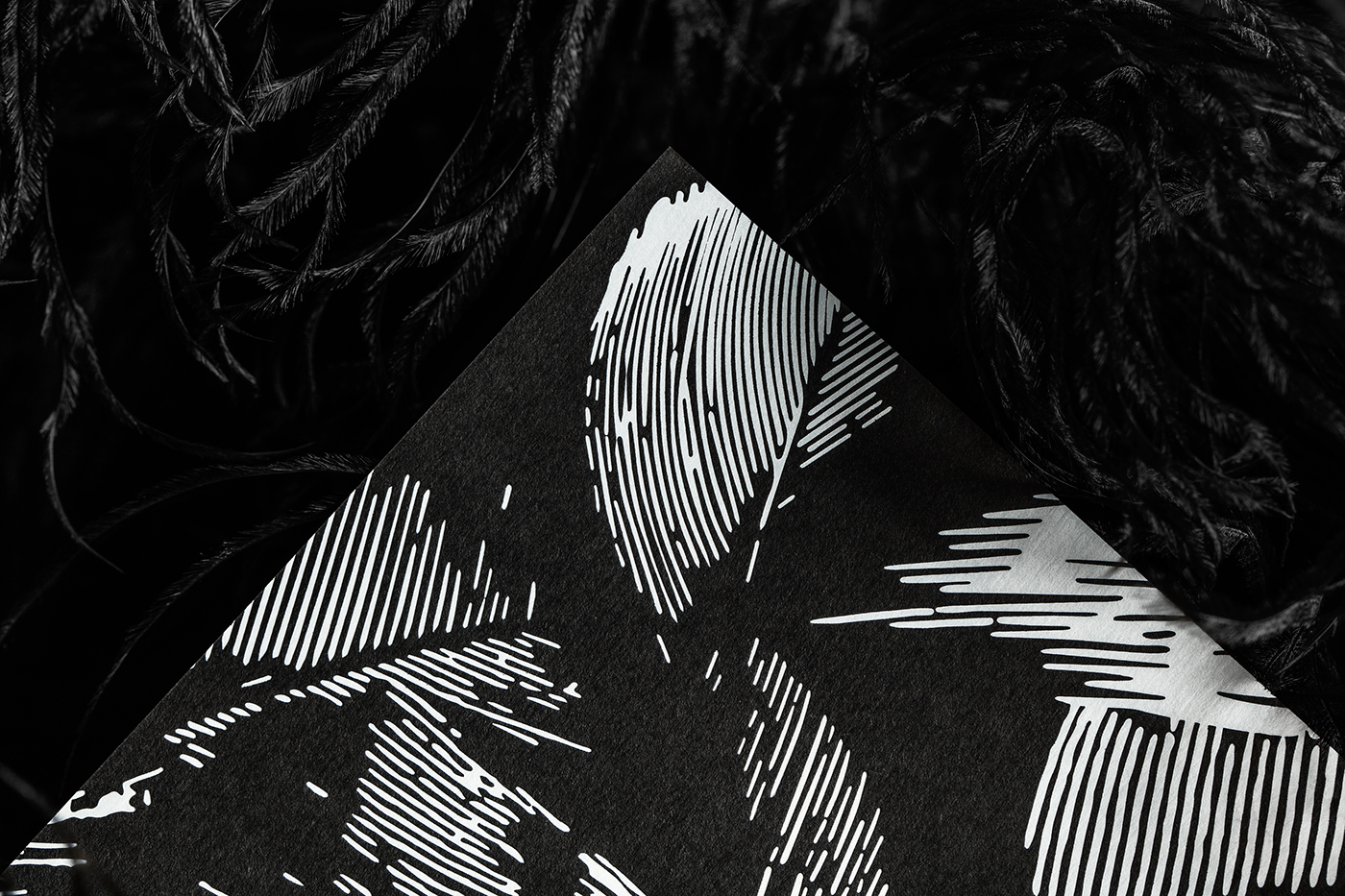
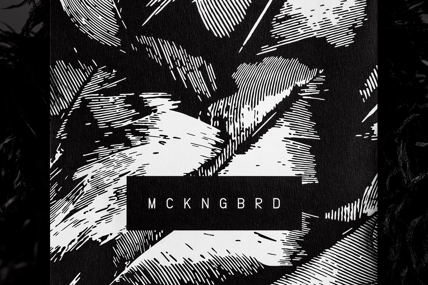
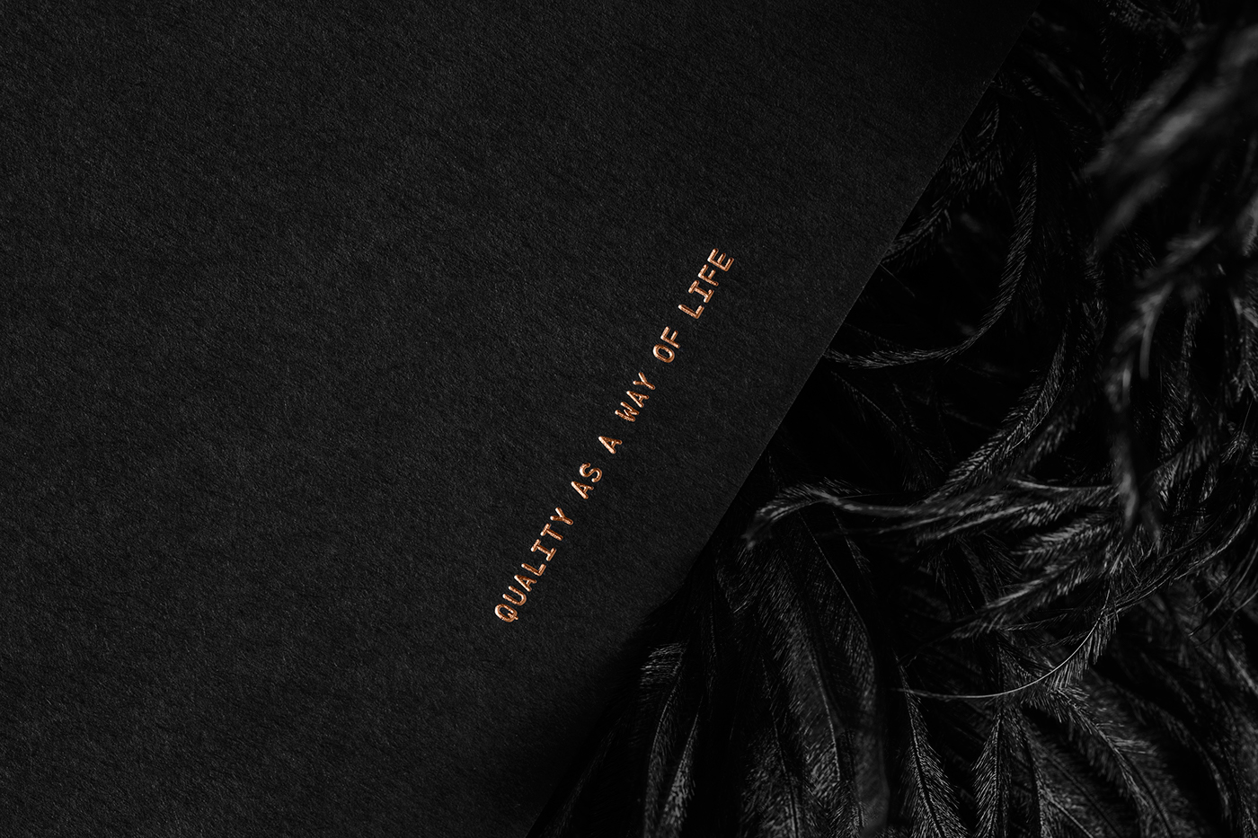
Also included in this case study is a promotional card that is to be given out with each purchase, sometimes with a small thank you-note from the founder himself. The card features an abstract illustration of feathers that have been flatfoiled onto Fedrigoni Ultra Black paper stock. On the reverse, the contact details are copper foiled, with the brand tagline - ’Quality as a way of life’ - in the bottom of the page.
Lundgren+Lindqvist is continually working with MCKNGBRD on expanding the visual identity. Moving closer to the first product release, we now focus on the packaging and webshop.
Please visit our website for bigger images and more work:
www.lundgrenlindqvist.se
www.lundgrenlindqvist.se


