
Packaging work for Brahmaputra Teas, a fictional company selling single-origin Indian teas. Our namesake, Brahmaputra, is a river that flows along the Assam Valley in Northeast India, a lush tea-growing region where we source our teas. Just as the river nourish and hydrate the soil to let crops grow, we aim to deliver honest, unadulterated tea from select estates to give you the best benefits of great-tasting single origin tea.
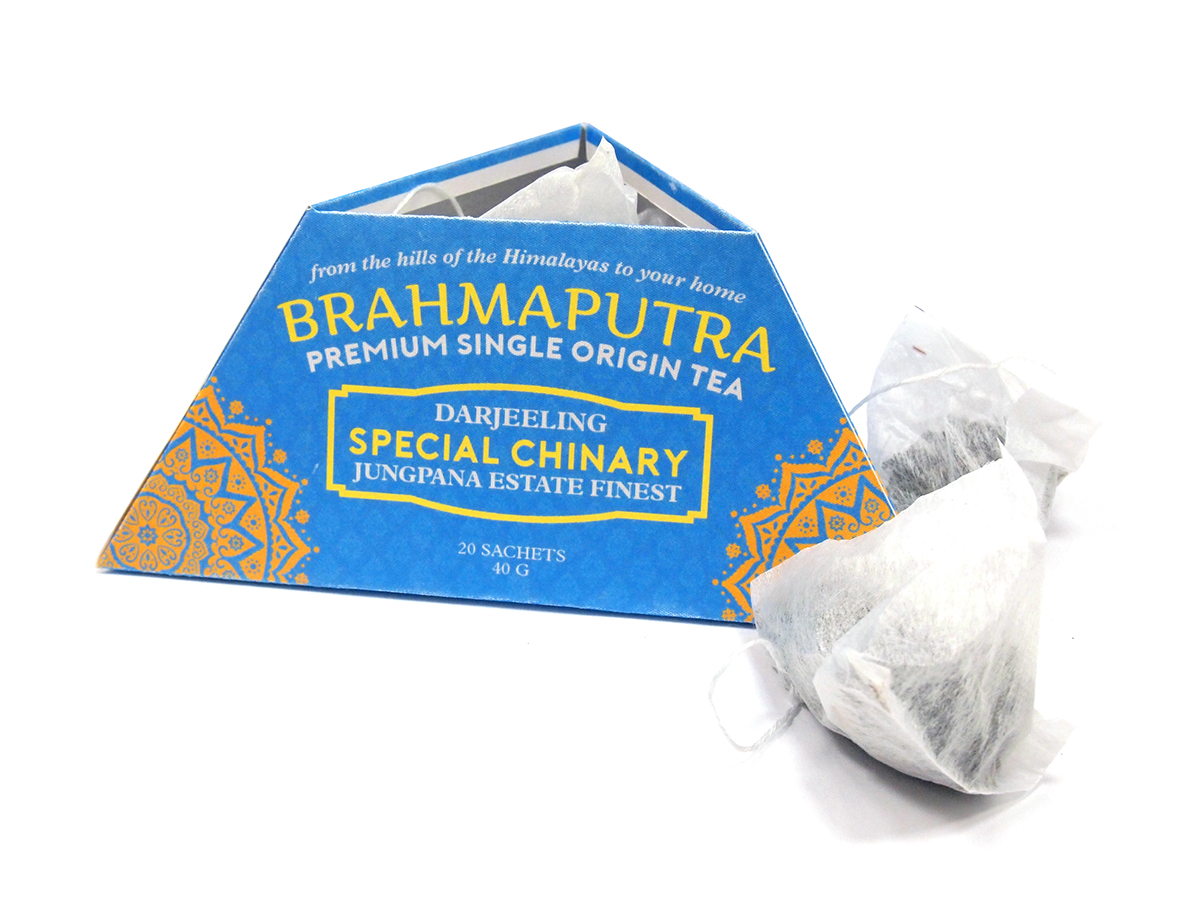

BRAHMAPUTRA tea’s design concept is a triangle, as a reference to our tagline “from the Himalayas to your home”. Since the specialization of the company is tea from that region, it is apt as well. A triangle shape is also an echo of the tea sachet shape that is used to package the product, which is also triangular. The type of triangle is same-side (equilateral) triangle, to provide more stability around the base, and looks like a mountain but is also grip-able by the top, a feature that will not be there had a more mountainous shape (wide-based triangle with a more than 90 degree angle top) been chosen. The color scheme is chosen to reflect Indian aesthetics by the palette of green, blue, and various shades of yellow that is also reflective of the natural – yet – flavorful quality of the products. As for the pattern, the whole body is covered by really small repeating semi-transparent white pattern to give dimension to the packaging.


