Positioning concept
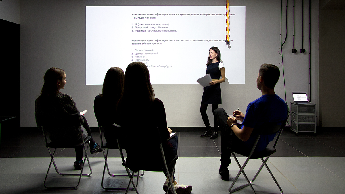
Technopolis is a twin brother of another educational project, Technopark, the positioning and corporate identity of which was developed by our agency back in 2013. The projects have been implemented in different universities in Moscow and St. Petersburg but retained common ideology and purpose. This similarity made the work a lot easier: we recovered the old work files from the archive, updated the information during a business meeting in Odnoklassniki, and adjusted the existing positioning.

Education in Technopolis focuses on the development of practical skills, with theory playing a secondary role. This emphasis on practical skills, technology, and development of creative potential is what distinguishes this project from conventional university education.
Visual identification concept
We faced the challenge of finding an idea that would reflect the most remarkable aspect of the course, which is education of creative professionals who are willing to look for unique solutions, think big, and let their creativity flow. There is no place for ordinary performers. Hence the approach to the solution: search for associations, metaphors, and images on the subject of creativity.

Our idea was to fuse graphic art and programming together. Creativity and its relationship with the IT field were manifested in the key idea of showing great artistic masterpieces as if they are being brought to life by coding.

The concept of “creation by coding” was checked for compliance with the advantages of Technopolis, which were supported visually and in terms of meaning: practical focus — through the process of painting creation, fundamental university, education — through everlasting artistic masterpieces, advanced technologies and methods — through digital style and code.
This idea was represented graphically, with code echoing the theme of a “digitized” picture. It’s an inside joke, and only a savvy person can see that a masterpiece has been brought to life using code rather than a brush.

We came up with a way to stylize copyrights for any programming language taught in the project in order to show off the technology stack. Copyrights show the affiliation with a professional circle that has its own form of communication, inaccessible to outsiders.

The themes of paintings depend on the information media and are embedded in context, outlining benefits for students or providing a fresh view of common educational and professional situations.

The style of images correlates well with the IT industry. The easy-to-maintain graphical principle allows new media to be created without the help of a designer or illustrator. All you have to do is choose a painting, index the image in Photoshop, and apply the project’s brand color. Even a programmer can do that.

A geeky style deserves a geeky typeface. Roboto Mono is a monospaced font that programmers use to write code. All characters have the same width, which means they are positioned exactly one below the other. This makes text formatting much easier and requires no additional makeup tools.

The copyright, first-level headers, and main text are aligned left, as code always is. This is another tiny component of the “digital” visual style.

We picked a four-color palette and developed guidelines for its application in order to avoid overcomplicating the corporate style that is abundant in graphics and text. The images are always tinted blue to emphasize their association with the IT field. Texts are typed in black letters against a white background. Crimson color is used to accentuate certain elements.
Logo
The corporate style is graphics-heavy, so we proposed a neat logo with a minimalistic caret sign. This creates an effect of real-time programming.


The main version of the logo for digital media is animated. The abridged version featuring only the initial letter and the caret is best suited for compact offline materials.
Corporate identity media
Only students of the Polytechnic University are admitted to Technopolis, so we used student ID codes to check the status of their owners. In case foul play is detected, a warning is displayed that denies access to education with a metaphorical image below the code.

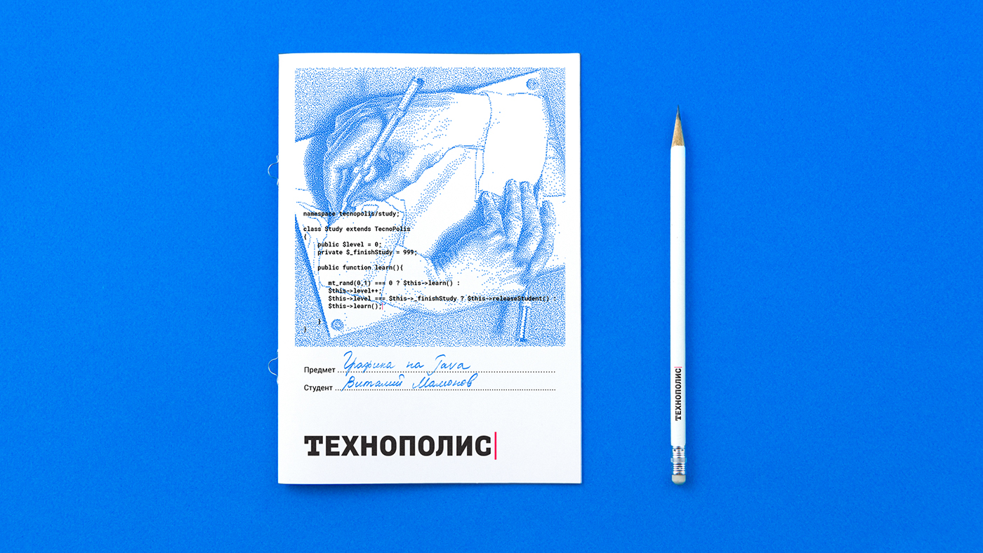
Escher’s lithograph on the student’s book highlights the seriousness of education, while the code on it serves to test the student’s skill level. If the level equals a 999 variable (which means the course is complete), the student graduates. If not, he continues his education with the project.

Raphael’s School of Athens is our attempt to communicate the message that the project gives students the knowledge required to go all the way from a student to a professional. The code is a classic machine learning algorithm that uses metric — a distance between two points in a Euclidian space.

All students get free T-shirts upon admission. The T-shirts features Julius Schnorr von Carolsfeldng’s The Fourth Day of Creation accompanied by a classic phrase that introduces you to the world of coding: “Hello, world”.

Working on the concept, we carefully selected the appropriate themes, paying attention to the tiniest detail. For example, a phone charger features Zeus, the god of thunder and lightning from a painting on an ancient Greek amphora drawn by an unknown artist. The image is bolstered by code, which communicates a message: if the current charge level is below 10, then we ask for electricity from Zeus, if it is 10 or above, we stop worrying about the fate of the device.

Souvenir badges are informal symbols of such programming languages as Java, PHP, and Ajax. With the latter we made the same mistake as the Amsterdam-based football club sharing the same name: instead of Ajax, their emblem features a portrait of Menelaus. That would be a good party joke for art historians and programmers.

A QR code with the initial letter could pass for a fragment of another masterpiece magnified to the point of becoming completely unrecognizable. It serves the purpose of directing those who are interested to the project website.

Our client also made a touching request: they wanted the project’s St. Petersburg origin to be reflected. We approached this challenge with a great deal of humor by adopting the stereotype of the city as a capital of cultural and art history and designing images with recognizable characters and landmarks. For instance, we used a portrait of Peter the Great (the Polytechnic University is named after him) in invitations to the open house day, while the code opened a window to Europe.

Website
Before getting to work on the website, we discussed the development of a visual concept in the Web and the general rules of working with elements with the Nimax team. We offered advice and were happy with the results.

These are the happy students of the inaugural class of Technopolis. Everything we did, we did for them.


