

Sievert Electrical Contractors Branding
Core Mark
• Bold ‘S’ Shape
• Reminiscent of twisted wire
• Rectangle shape represents circuit
Features
• One clean typeface
• Modern look and feel
• Bold for readability
Colors
• Bright green to stand out
• Contrast with charcoal black
• Straight forward, modern and clean

Corporate ID including standard letterhead, envelope and business card.
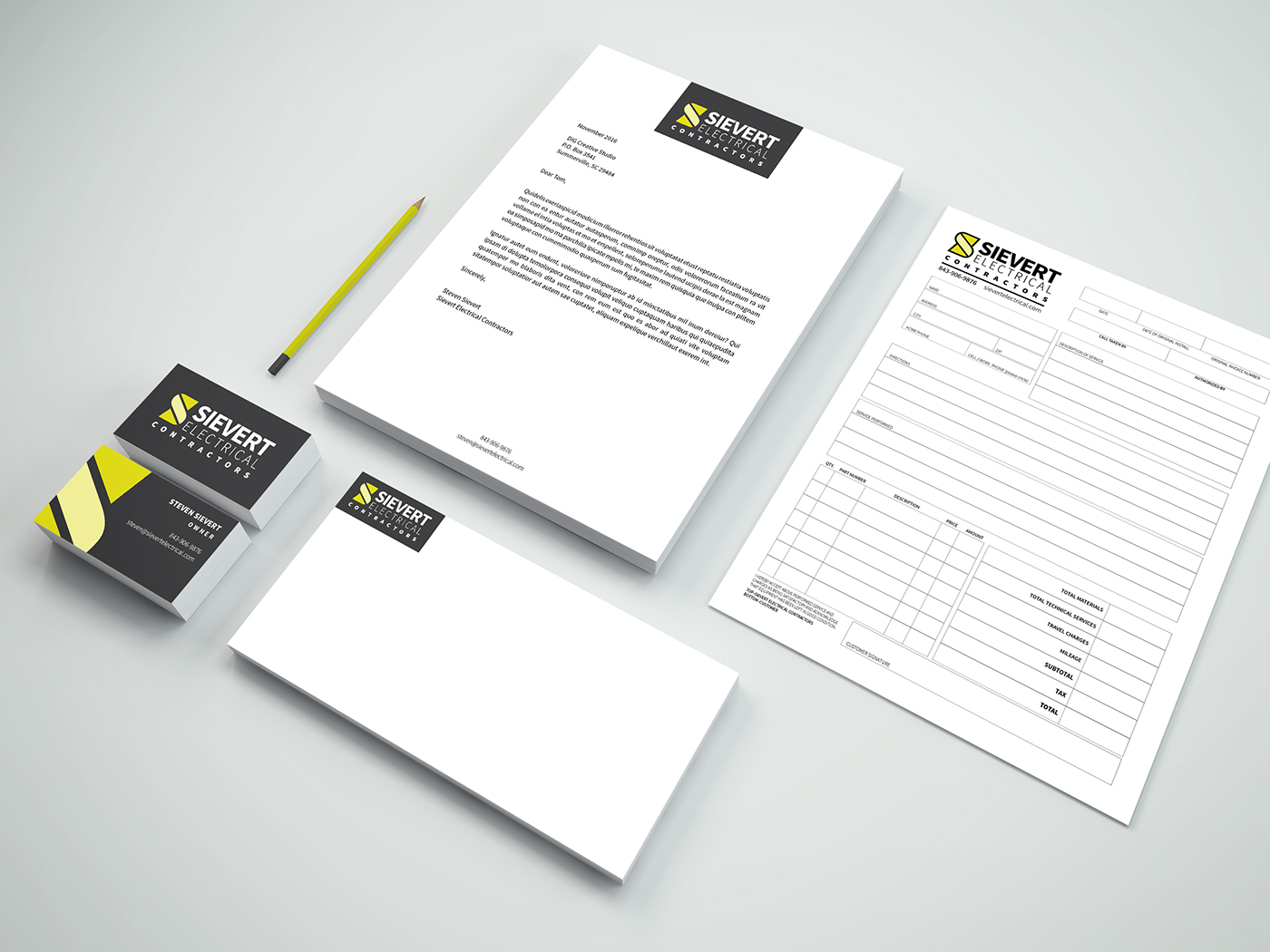
The second version of corporate ID including letterhead, business card, envelope and invoice sheet.
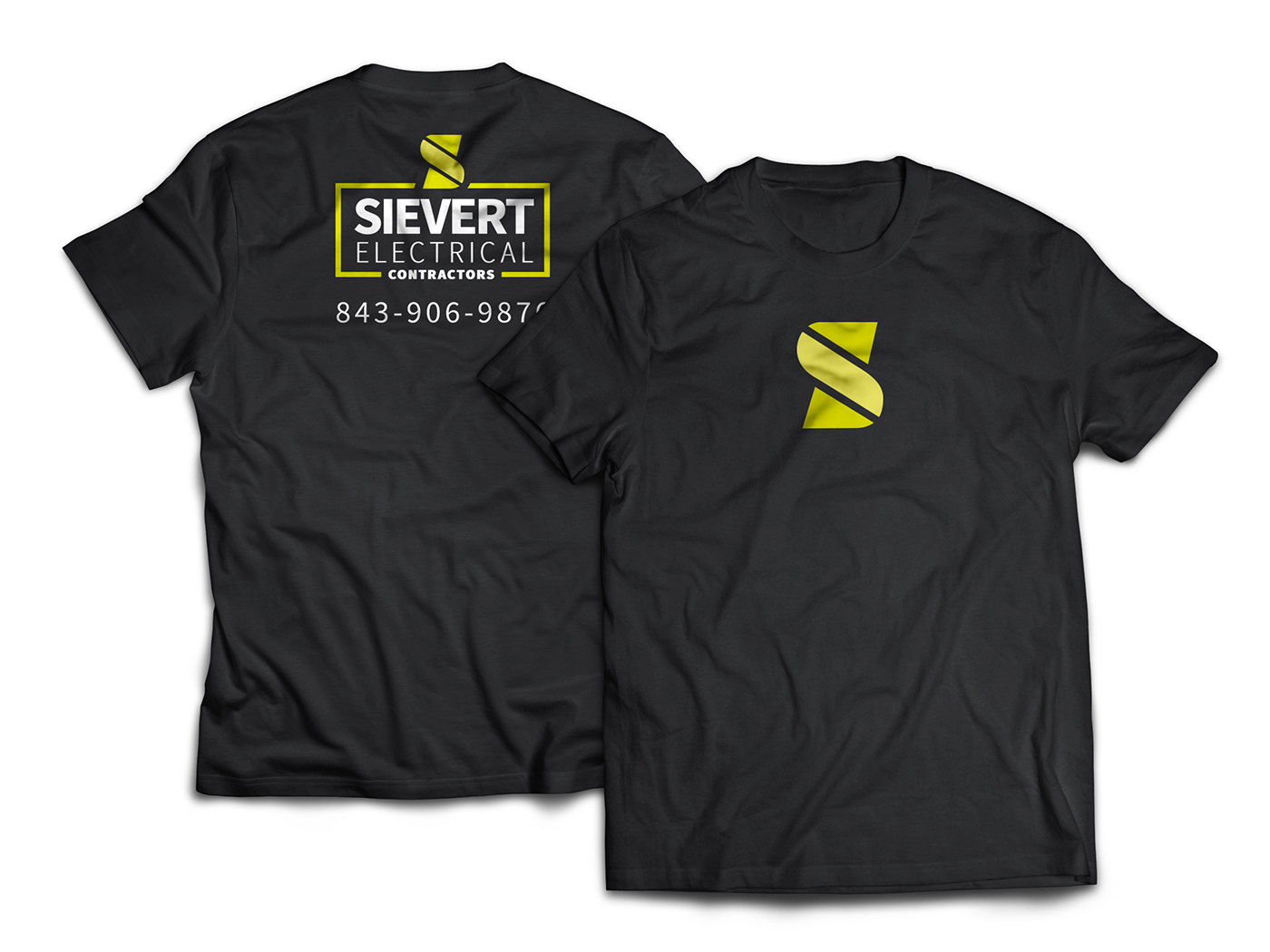
T-shirt design employees wear.


