BRIEFING
Eko is a Japanese company with headquarters in Tokyo, offices in Europe and the USA and an increasing presence in other markets. It is dedicated to the development, manufacturing and sales of sensors and systems in areas focused on environment quality, climate/meteorology, renewable energy and material characterization and analysis.
The company asked Erretres. The Strategic Design Company to take on its rebranding project with the goal of redefining its values and consolidating its global position by developing its strategy and creating its visual identity. Other needs included a new tagline, the verbal identity and the definition of key messages.

The concept
The new brand transmits the key attributes: movement as a force for reinvention, as well as the attribute of origin as a value of the new global positioning.


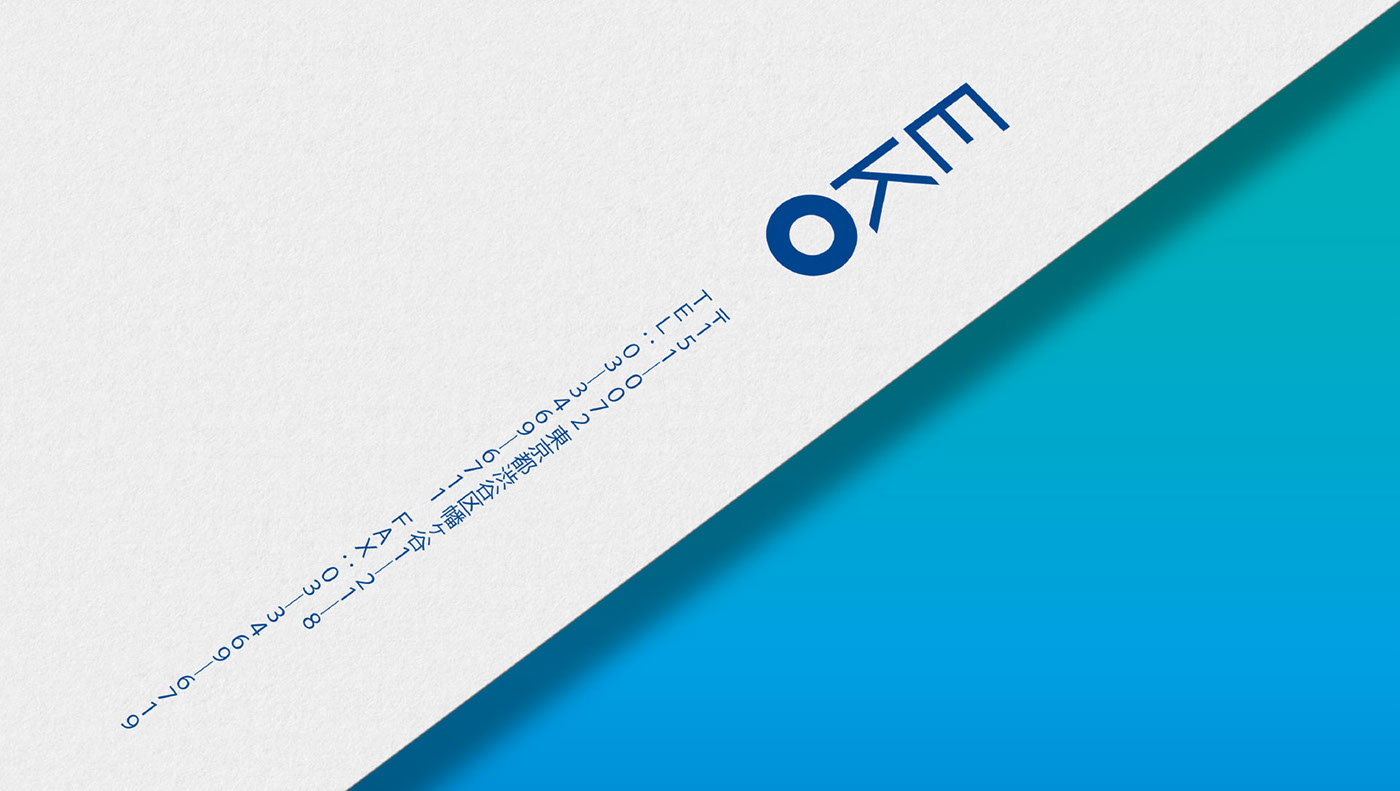
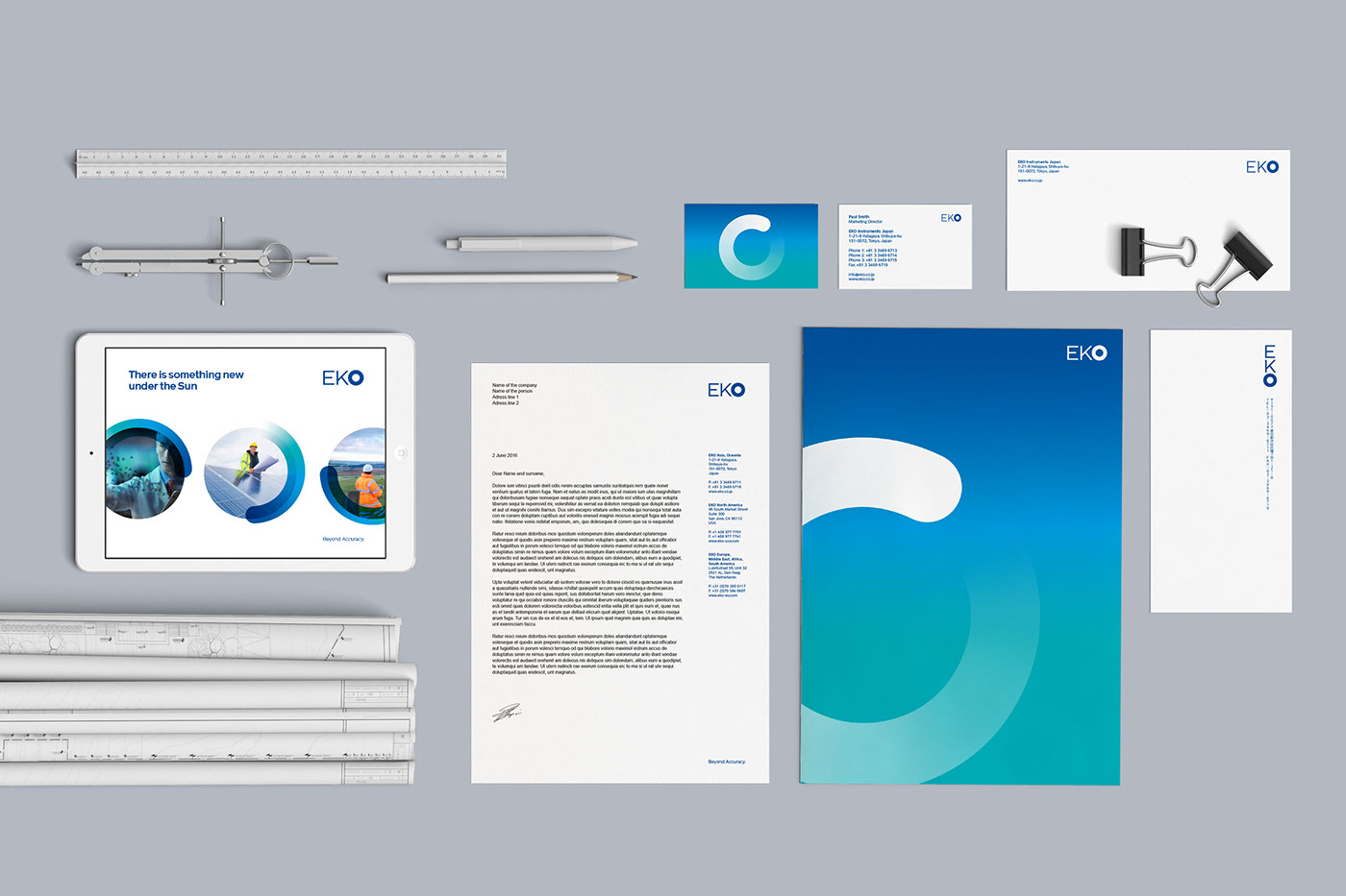
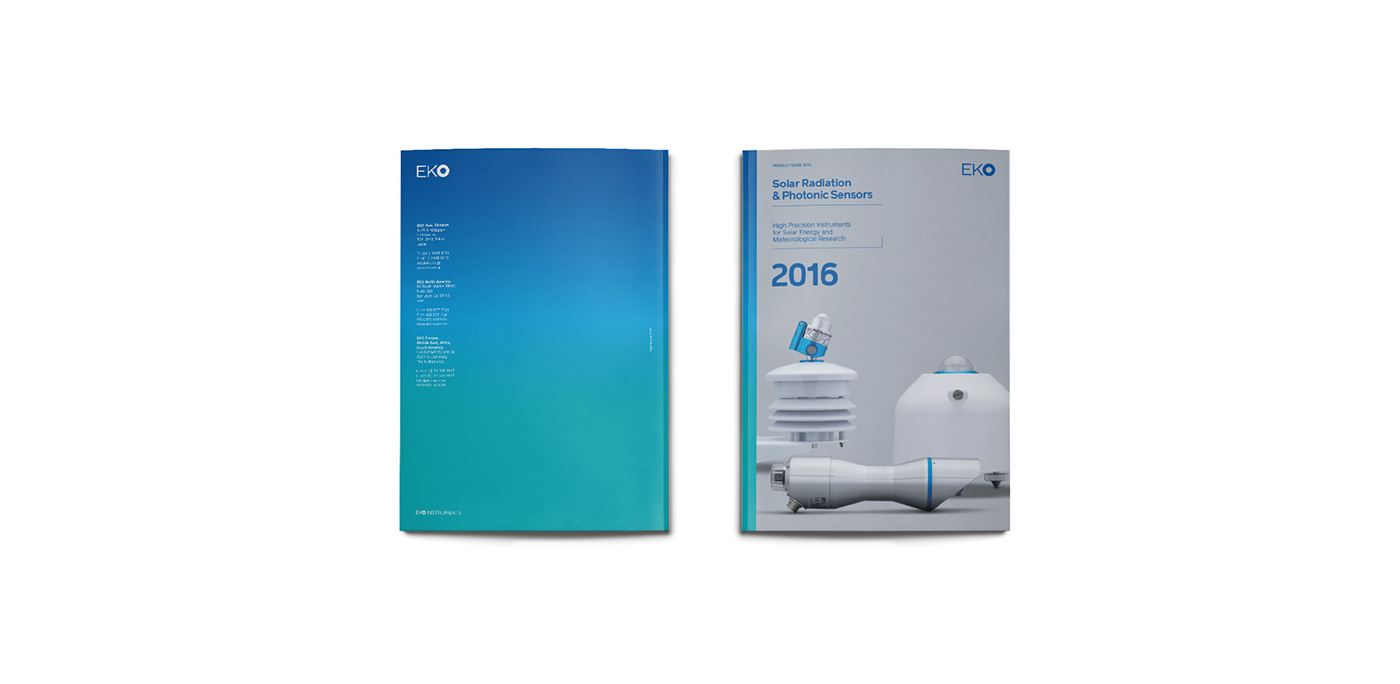
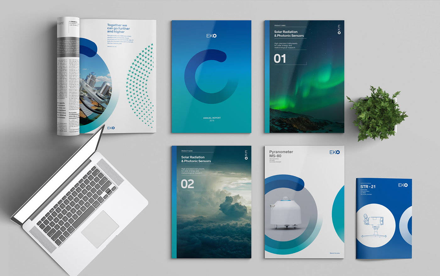
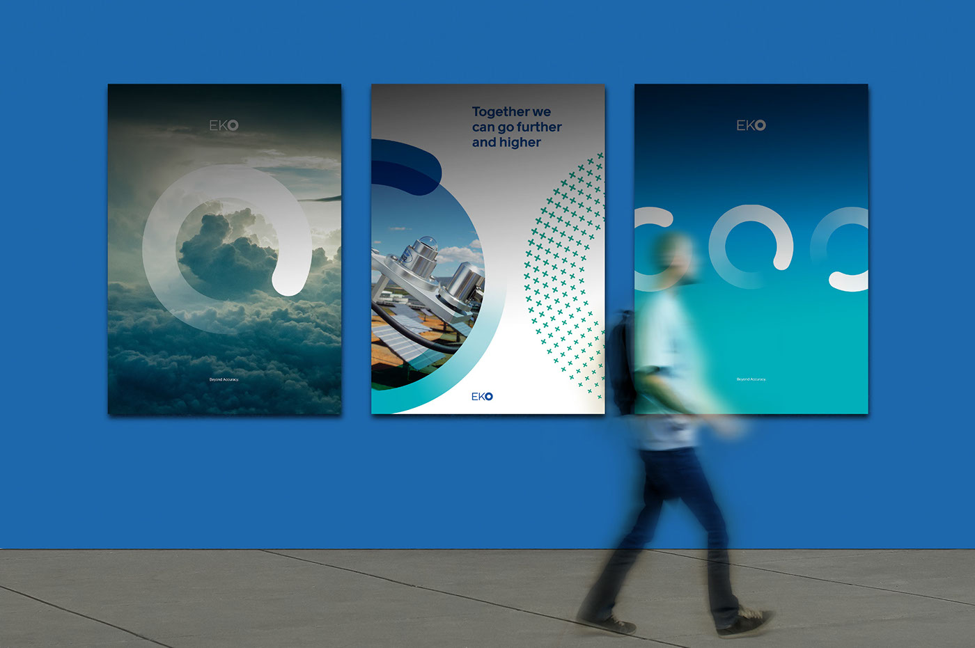
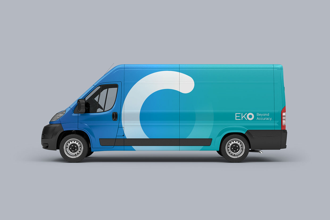
The logo and the graphic system
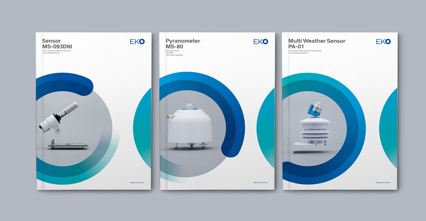
The logo highlights the “O” as the main element, which turns into a colour-grandient dynamic circle to be implemented on the rest of the identity material.
The secondary graphic element is an “O” filled with particles.

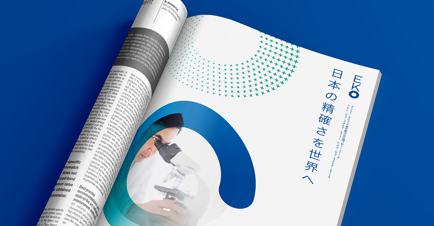
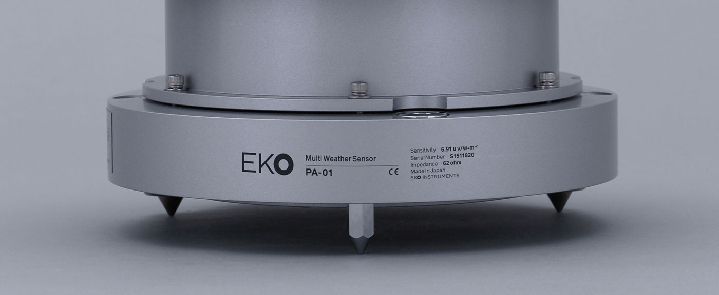
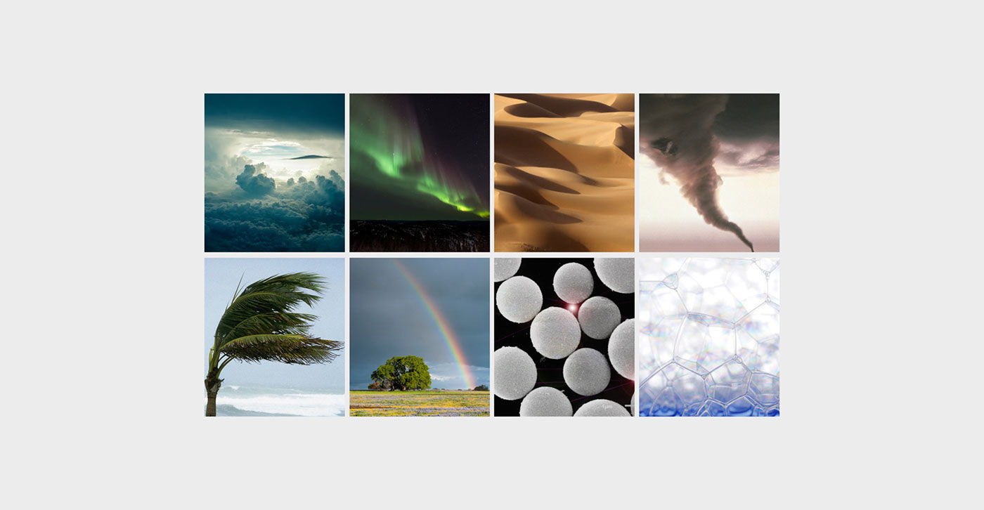
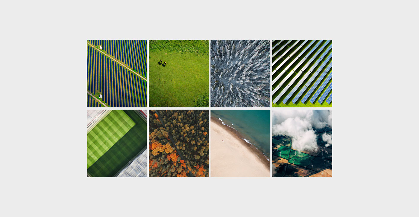
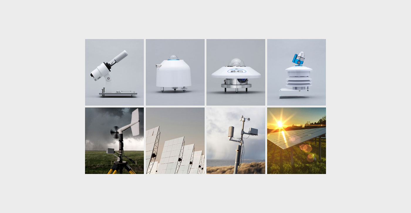
Photography
Besides the conceptual photography aligned with the values, tone of the brand and the industry, the product photography must communicate the idea of technology, precision, quality and the future, through a style that is both modern and detailed.
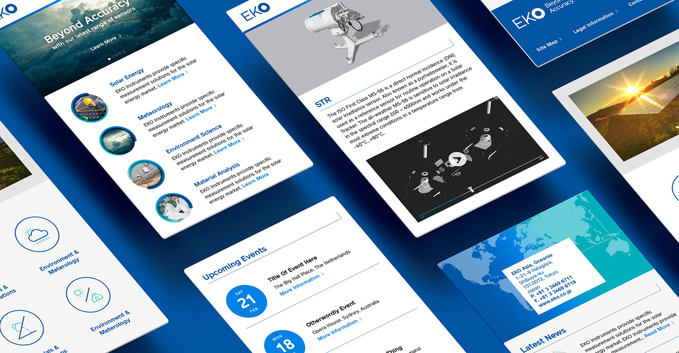
Illustrations
Precise data, icons and product information need to be clearly transmitted. Plain Illustrations and diagrams in the corporate colors become essential for reinforcing the identity. Clarity and efficiency to highlight the attributes of precision, quality, cutting-edge…